The network for creativity
Join 1.25M professional creatives like you
Connect with clients, get discovered, and run your business 100% commission-free
Creatives on Contra have earned over $150M and we are just getting started
Back to feedPost
Um Lugar Brasileiro is a interior design studio that brings nature into indoor spaces through a biophilic and sustainable approach. The brand reflects warmth, optimism, and reliability, creating interiors that feel both welcoming and environmentally conscious.
With a strong commitment to sustainability, Um Lugar Brasileiro incorporates natural materials, green elements, and eco-friendly solutions. The visual identity should communicate this harmony with nature while maintaining a professional and inviting presence.
A place to feel at home, inspired by nature, and built on trust.
This is Um Lugar Brasileiro.




Thank you Ciro 🚀

Nice!
Thank you Chanmol!

Está muito bem concretizado. Parabéns!
Obrigada, Vera!
The network for creativity
Join 1.25M professional creatives like you
Connect with clients, get discovered, and run your business 100% commission-free
Creatives on Contra have earned over $150M and we are just getting started
Challenges
View all


Related posts

Brand identity design for Adventum Fitness, a fitness and personal development brand built around physical performance, mental fitness, and personal growth.
The challenge was to create a visual identity that could bring strength, movement, discipline, and personal development together without falling into the usual fitness branding clichés.
The identity was developed as a cohesive visual system across logo design, typography, color, graphic elements, and supporting brand assets, giving Adventum a distinctive and consistent presence across digital and marketing applications.
Full case study available on my Contra profile.
#BrandIdentity #BrandDesign #FitnessBranding #VisualIdentity #LogoDesign #BrandStrategy #GraphicDesign #BrandDesigner #FitnessBrand #PersonalDevelopment


More visuals from the rejected brand direction I shared earlier.
Really good to see this direction resonating with so many of you. It was one of our favourite explorations to build, from the narrative behind it to the visual world that brought it to life.
Great work doesn’t always make the final cut, and sometimes the reason has little to do with the quality of the direction.
Curious why this one was rejected? I’ve shared the story in the first comment✨

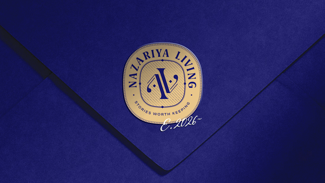
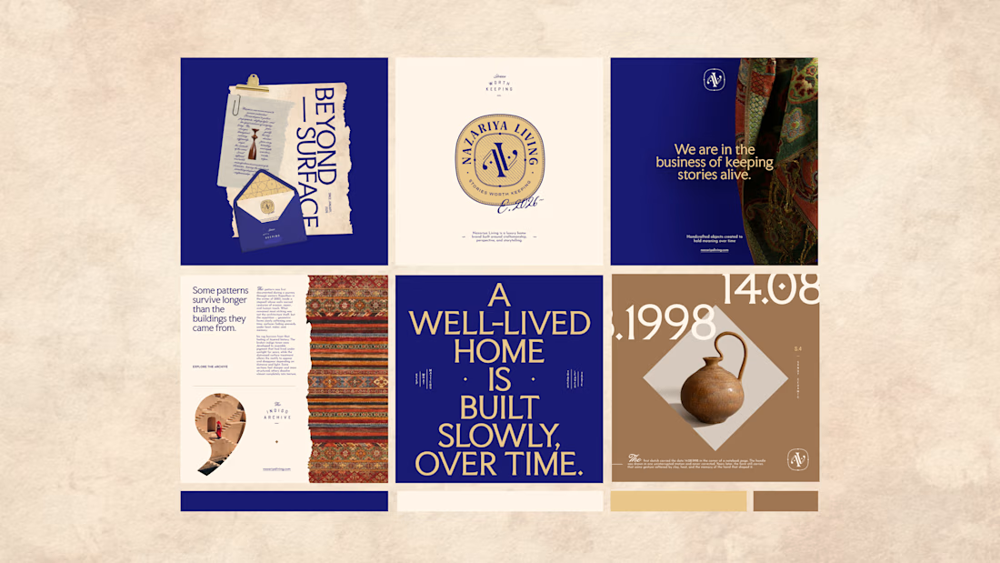
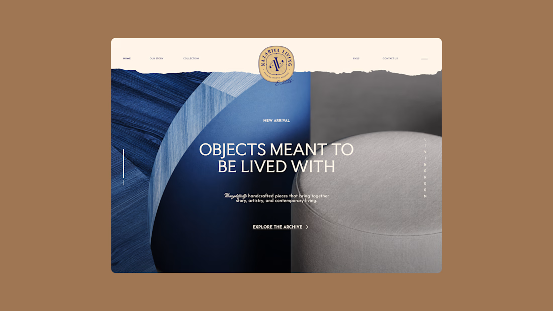
Nazariya Living is a premium carpet and home décor brand shaped by craftsmanship, culture and the stories objects carry into our homes.
This direction brought that idea to life through a seal-inspired logo, archival textures, unexpected colours and editorial typography, creating...

AR Logo design | Unused logo for sale
This exclusive, unused logo is now available for purchase.
You’ll receive unlimited free revisions, all high-quality logo files, a brand style guide, and full copyright ownership documentation.
This logo will be sold only once and will never be resold.
If you’re interested, send me a DM and we can discuss the next steps.
© 2026 Logomast. All rights reserved.
Designed by Khairul Islam.

nice work
