The network for creativity
Join 1.25M professional creatives like you
Connect with clients, get discovered, and run your business 100% commission-free
Creatives on Contra have earned over $150M and we are just getting started
Back to feedPost
Taste Test

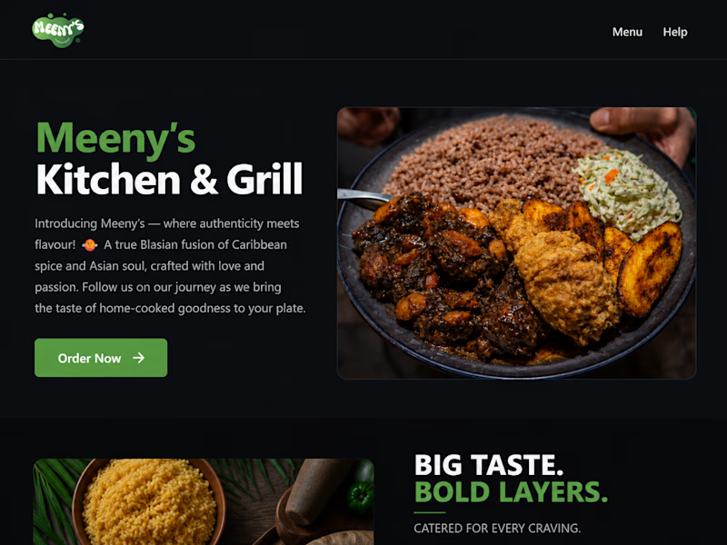
Trying out different styles for a restaurant landing page that I'm working. Witch do you think is better?


4 voted
13%
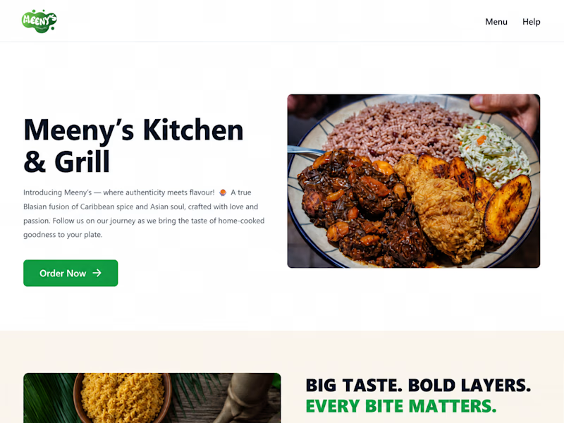
28 voted
87%
32 votes
Closed

love the drak mood
It's my favorite too.

I like the dark version better.
Thanks

Dark for sure. The food photography pops way more against the dark background — feels like the light version competes with the imagery.
I like the dark version too.

Two version for different mode

Dark all day!
Thanks. I like that one more too.
Same for me.

Dark. Got my vote

Dark
Same for me.

The dark one is better because it's easier to read.

For me i think dark
Same for me
The network for creativity
Join 1.25M professional creatives like you
Connect with clients, get discovered, and run your business 100% commission-free
Creatives on Contra have earned over $150M and we are just getting started
Trending

Claude
Claude has entered the design space. How are you using Claude Design?

Contra University
Learn from expert creatives how to earn more using next-gen AI tools.
creativeaiflow
Creative AI workflows are evolving. What tools do you use, and what are their strengths and weaknesses?
freelancerlife
Freelancer life is wins, pivots, and everything in between. What’s yours right now?








Related posts

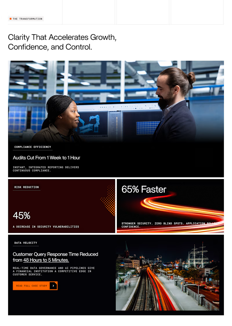
Which layout for Case study highlights grid looks better 🤔

62 voted
67%
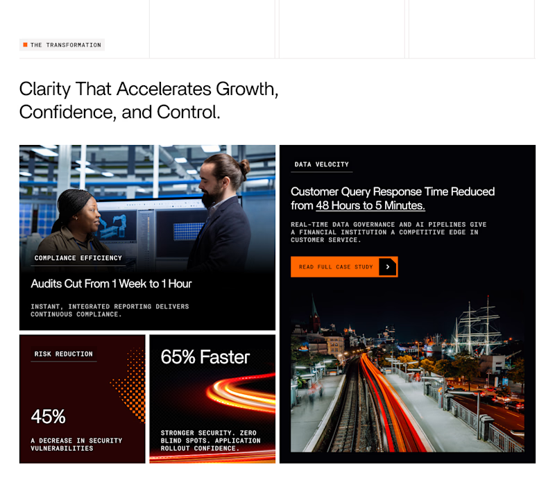
31 voted
33%
93 votes
Closed


Option one just flows better.

I build the brand system before the site — so the product can scale without breaking visually as it grows.
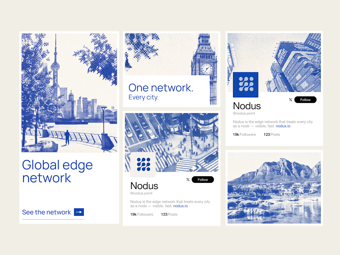
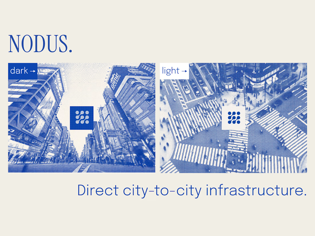
Nodus treats every city as a node. The core asset is generative: any city renders in the same halftone style — London, Tokyo, Cape Town, or any city added later. New market, new visual, zero drift.
Covers logo, color, type, the city-node visual language (static + motion), web direction, and social templates.
System first, so everything after it scales.


Obsesseddd


Really excited to share this one. Stay tuned for a video showcasing the whole site, but even better, why don't you just experience it for yourself: https://thebluehorizon.ai/
These guys have received over 1 billion impressions on their videos and they came to us to make their website match the caliber of work they put out at an inhuman rate.


That website is incredible.