The network for creativity
Join 1.25M professional creatives like you
Connect with clients, get discovered, and run your business 100% commission-free
Creatives on Contra have earned over $150M and we are just getting started
Back to feedPost
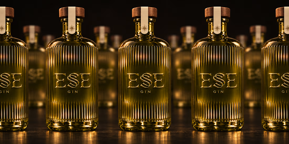
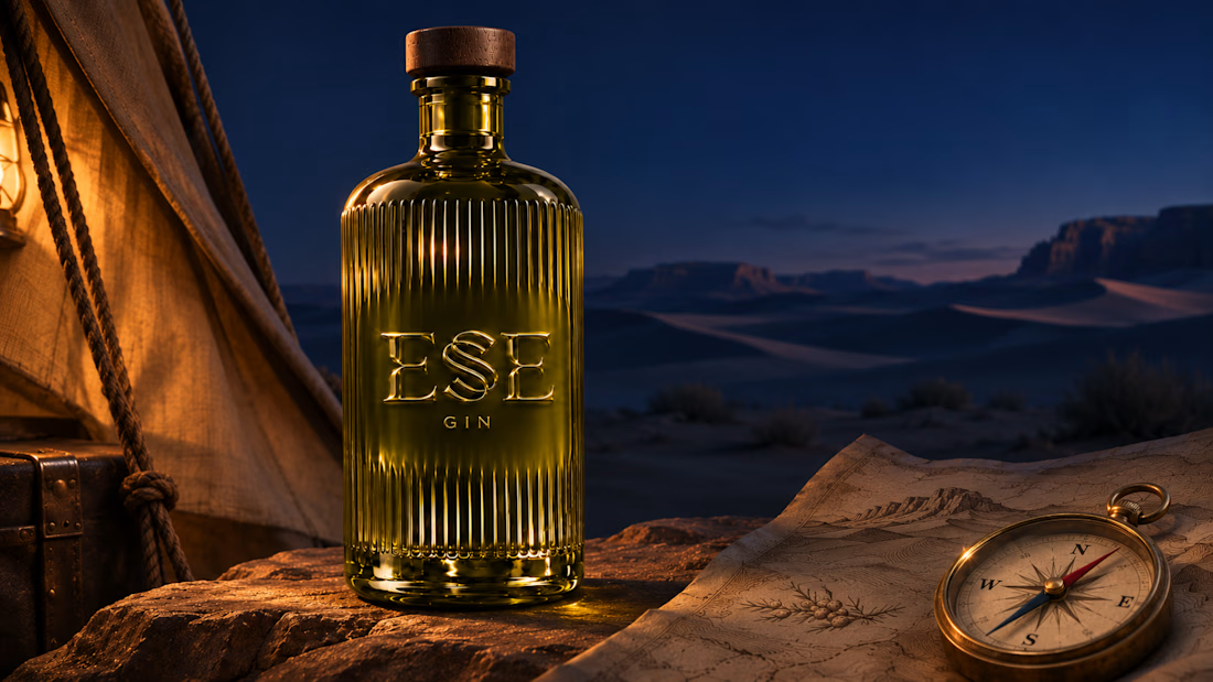
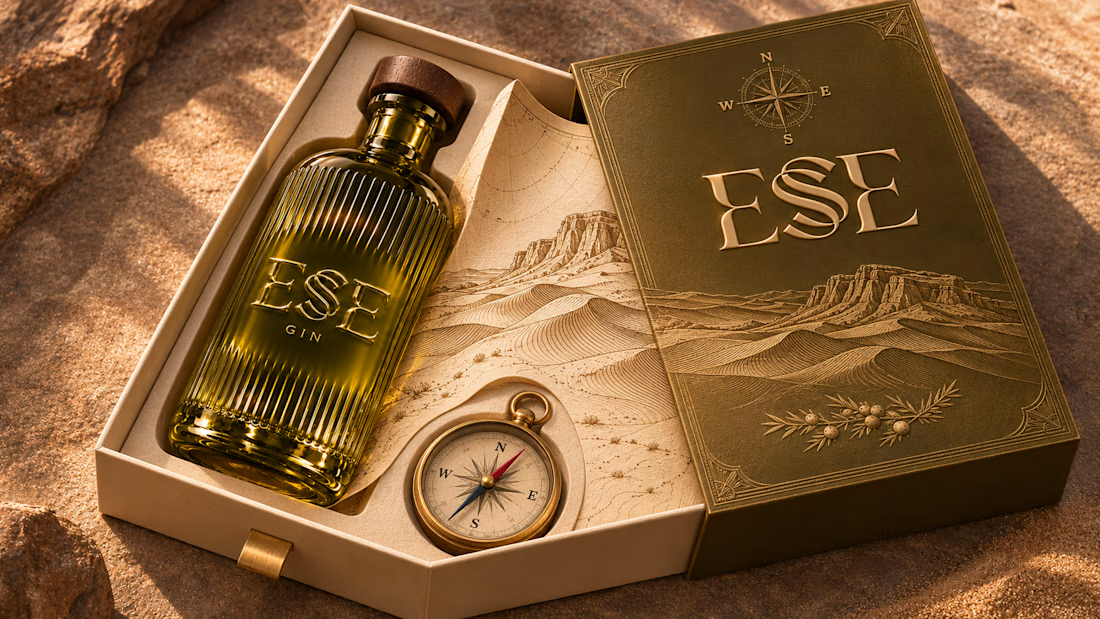
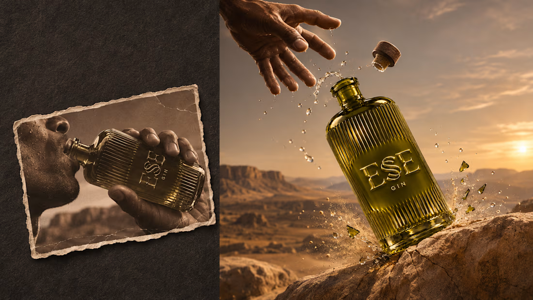
I designed the identity for ESE GIN around the curve of a dune ridge. In the custom wordmark, two sharply cut E forms frame a sweeping, double-stroked S. On the bottle, the letters rise from the olive glass itself. As the light shifts, it catches one edge of the S and then the other.
Across the packaging, the curve of the S returns in contour lines engraved on walnut cases and traced across warm ivory paper. A brass compass sits beside the bottle in the presentation box, and its compass rose reappears on the neck seal. The campaign follows the same bottle from sunlit sand to a lantern-lit camp at dusk, letting the desert light reveal a different detail in each scene.



That dune curve is lovely.


thank you 😍
The network for creativity
Join 1.25M professional creatives like you
Connect with clients, get discovered, and run your business 100% commission-free
Creatives on Contra have earned over $150M and we are just getting started



Related posts


Branding & Visual Identity for AirCon West based in London.
Designers! Present your work with motion! It breathes life into your work and conveys your ideas in a dynamic way.
Use free online motion tools to do it.
My favorites:
https://animos.app/
https://arqe.ai/
https://orelin.app/editor
https://openvid.dev/en
(Or animate it yourself, like I did here using EffectCraft!)


Nice work!!

Pulsix started with a question: how much of a sportswear identity can you fit on the front of a cap?
I designed the brand around an angular X with a pulse cut through its center. On a pink cap, the chartreuse X can stand alone. On a billboard, the photograph and “Future is now!” headline take the lead. In this loop, the black Pulsix logo anchors a moving grid of apparel, campaign graphics and digital layouts.
My roles: Brand Designer, Graphic Designer, Motion Designer.
Tools: Adobe Illustrator, Adobe After Effects, Figma.
Where would you try the X first: on the cap or in motion?


I'd try it on the cap first. Motion can borrow the pulse cut once the static X proves it holds up at small sizes, and the watch face already hints that it does. Did the pulse line change shape between the cap and the animated loop?

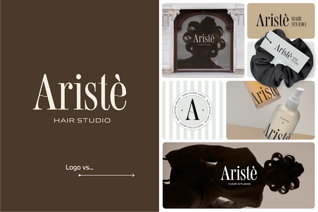
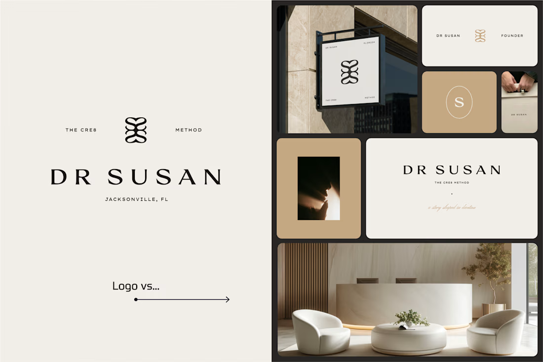
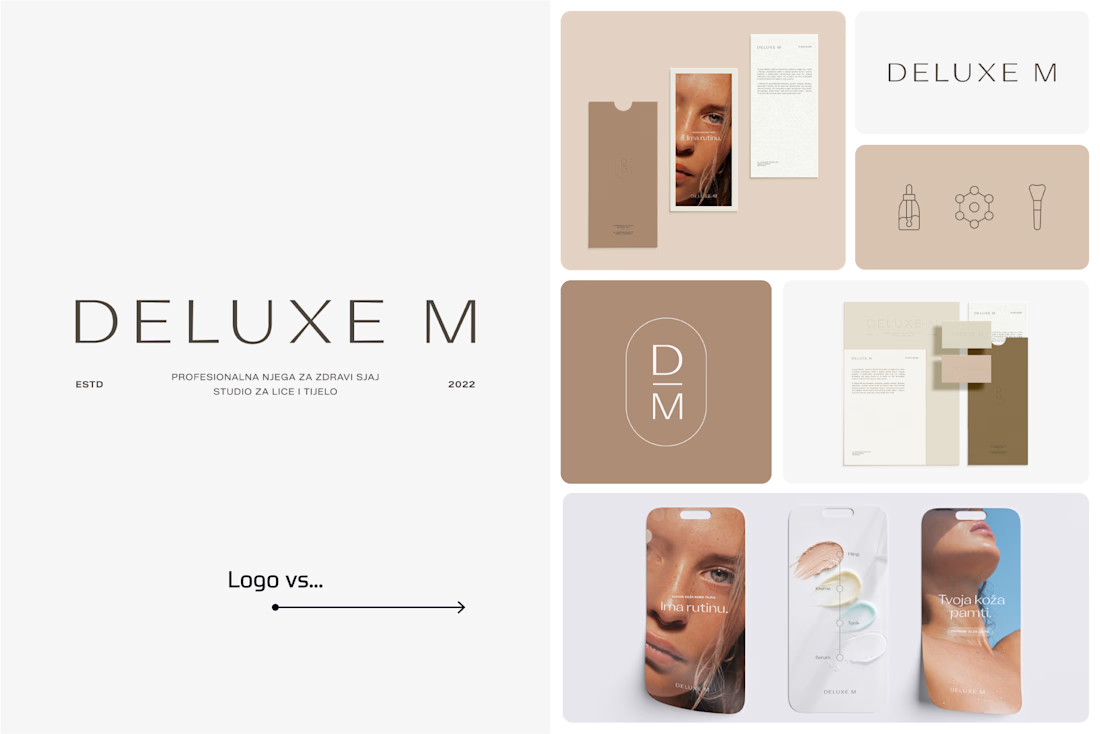
A logo is one thing. Giving it a whole personality is another. 👀
I picked a few of my branding projects to show what happens beyond the logo.
First, the logo on its own. Then, the full visual identity: colours, typography, graphic elements, patterns, packaging, and all the little details that make each brand feel like itself.
Because I don't want a logo to just look good sitting on a presentation slide. I want to see what it can become when it gets out into the real world.
Every project has a different story, personality, and visual direction. And that's probably my favourite part of brand design: figuring out how to turn one initial idea into a whole visual language.
Swipe through and meet the logos, then their bigger personalities. ;)
A logo is the starting point. The fun really begins after that.
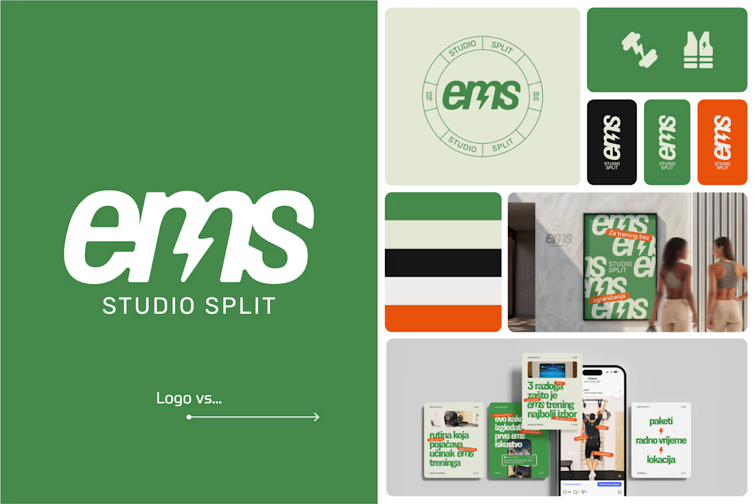

Clever use of the lightning bolt in the EMS logo!