The network for creativity
Join 1.25M professional creatives like you
Connect with clients, get discovered, and run your business 100% commission-free
Creatives on Contra have earned over $150M and we are just getting started
Back to feedPost
Taste Test


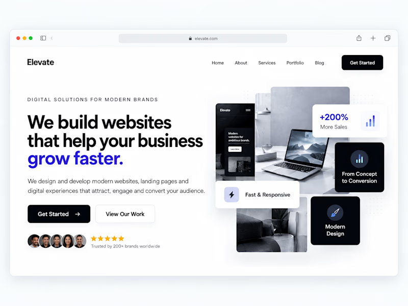
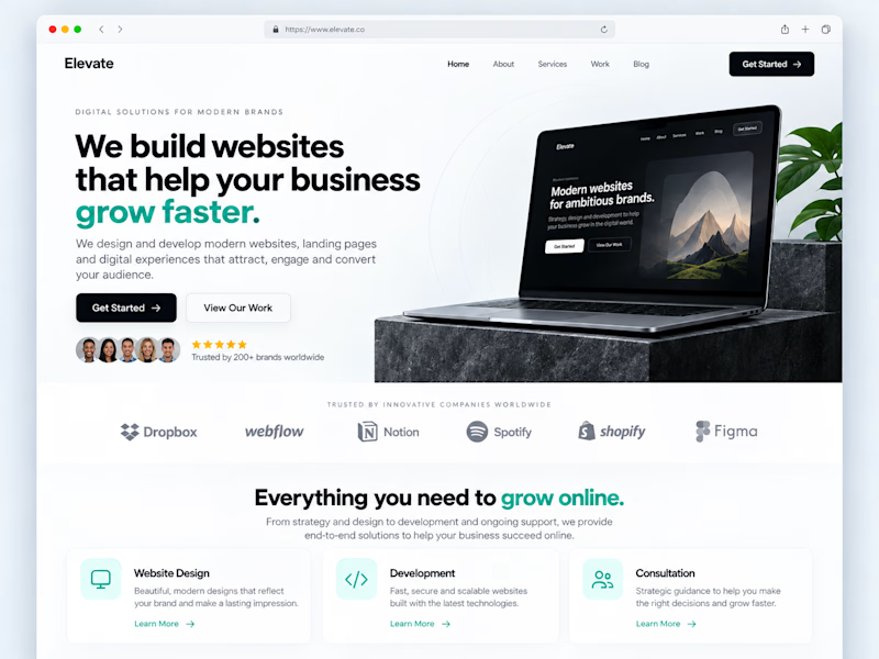
One of the easiest ways to make a website feel more professional:
Give your content more room to breathe.
Not every empty space needs another button, graphic, animation or paragraph.
Good spacing helps create:
• Better visual hierarchy
• Easier readability
• Clearer CTAs
• A more premium feel
Sometimes improving a website isn't about adding more.
It's about knowing what to remove.
Designers: do you prefer spacious layouts or more content-heavy websites?
#WebDesign #Webflow #UIDesign #Figma #WebsiteDesign
1 voted
33%
2 voted
67%
3 votes
Closed

The top one has more visible details I like it Victor ❤️❤️
Thank you Mostafa, I'm glad you liked it.
Pardon ❤️

Thank you!

Outstanding work! The level of thought, craftsmanship, and attention to detail throughout this project is exceptional. Every element feels intentional and contributes to a cohesive visual experience. Truly inspiring.
Thank you Stephen!

I definitely prefer spacious layouts. Good use of whitespace creates stronger hierarchy, makes the content easier to scan, and often gives the whole website a more premium feel. Less can really be more in design.
The network for creativity
Join 1.25M professional creatives like you
Connect with clients, get discovered, and run your business 100% commission-free
Creatives on Contra have earned over $150M and we are just getting started











Related posts

Two camera distances for the same Movable Ink cut. One leans in, one shows the whole layout. 1 or 2.
10 voted
50%
10 voted
50%
20 votes
Closed
2 is more stunning the animations feels unique and that's unbelievable 🎉🎉🔥🔥
great job Blahomyr❤️❤️

Poster Club turns a simple event template into your own print. I built two working Flutter versions and recorded the same editing flow in each.
Print Room: calm, editorial, with a mounted canvas and bottom tools.
Cutout Playground: bold, playful, with loose prints and tools at the edge.
Which one would you rather use?
What made the difference?
Grab it for free:
https://contra.com/products/cUHBysMu-poster-club-free-flutter-ab-ui-kit


37 voted
60%
25 voted
40%
62 votes
Closed

Print Room looks great!!

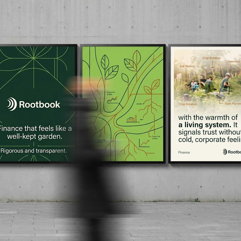
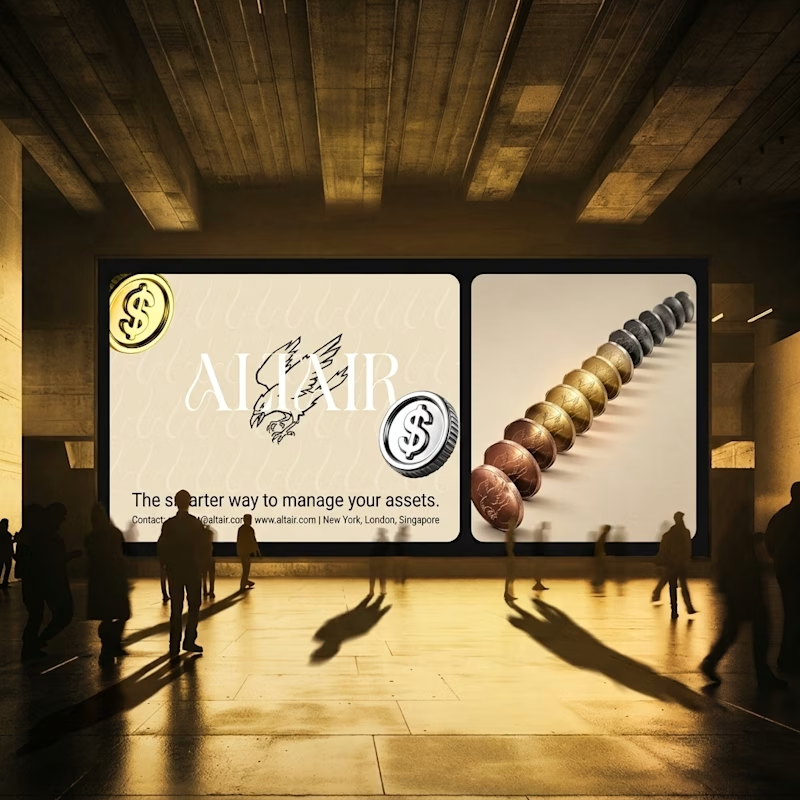
What does trustworthy finance look like to you?
A) Rootbook: Finance that feels like a well-kept garden.
B) Altair: The smarter way to manage your assets.
Two finance brands I’m designing, two completely opposite worlds. Which one gets your money?
28 voted
61%
18 voted
39%
46 votes
Closed

Rootbook wins for me. A finance brand that feels like a well kept garden is such a refreshing idea.