The network for creativity
Join 1.25M professional creatives like you
Connect with clients, get discovered, and run your business 100% commission-free
Creatives on Contra have earned over $150M and we are just getting started
Back to feedPost
Taste Test
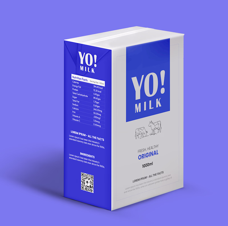
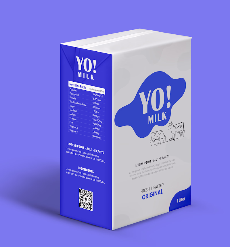
Structured vs. Fluid: Which brand identity speaks to you? 🥛✨
I recently experimented with two distinct visual directions for a modern dairy brand, YO! MILK, playing with geometry, white-space, and shelf impact.
Option A: Features a bold, structured blue block that anchors the typography for a premium, clean look.
Option B: Uses an organic, fluid splash shape paired with subtle cow-print watermarks for a playful, dynamic vibe.
If you saw these on a supermarket shelf, which one are you reaching for?
Let me know your pick in the comments! 🥛
2 voted
100%
0 voted
0%
2 votes
Closed
The network for creativity
Join 1.25M professional creatives like you
Connect with clients, get discovered, and run your business 100% commission-free
Creatives on Contra have earned over $150M and we are just getting started
Related posts
How do you capture the essence of a brand and communicate it visually?
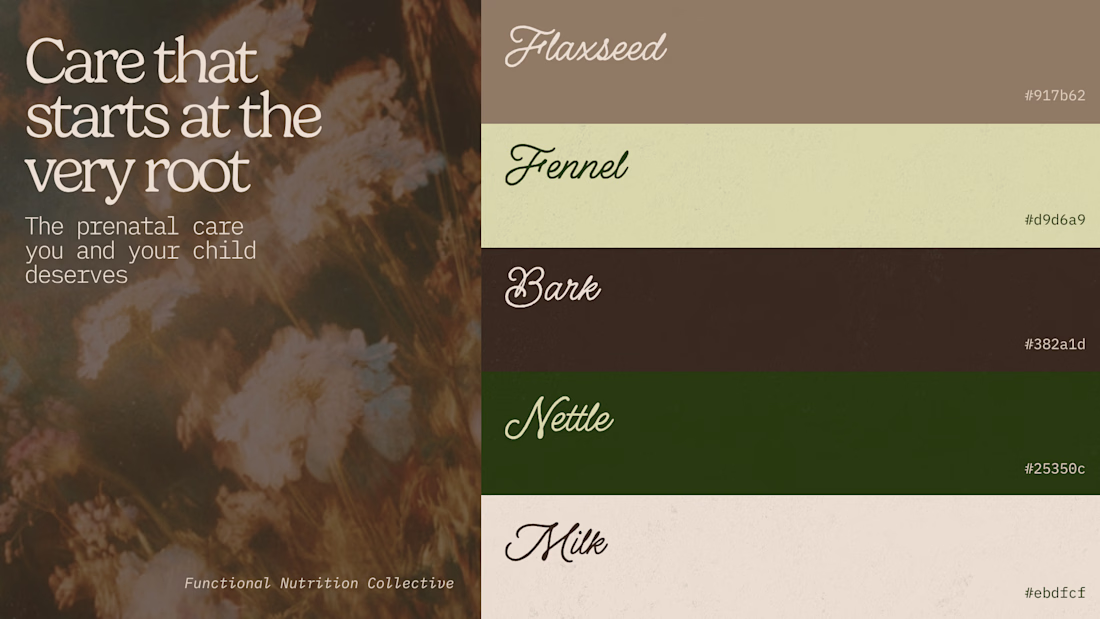
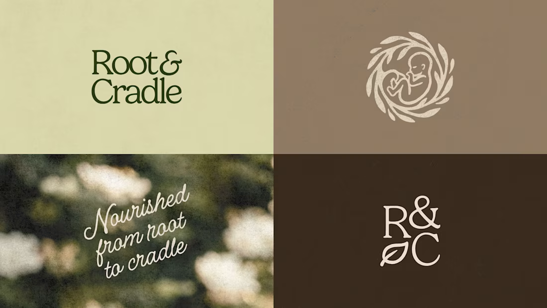
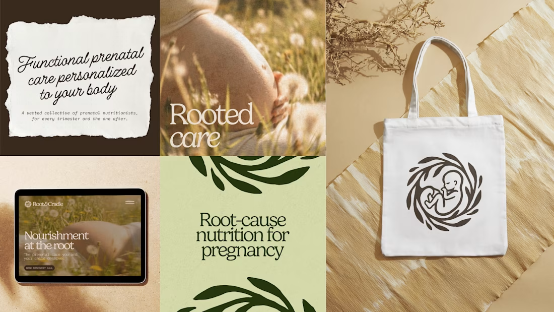
Prenatal care nutrition tends to either fall into an overly clinical or overly childish direction, and both felt unaligned to Root & Cradle, which is a functional nutrition collective for pregnant women.
Their approach is root-cause focused and more holistic than typical prenatal nutritionists. To make them stand out we hone into this strength and express it through their visual identity, through earthy tones, cozy textures and approachable typography.
For this project I used Illustrator to create the logo, pair the colors and fonts, and Flora to create the logomark and imagery that would bring life to the brand.
How do you make sure your brands feel unique while staying true to the industry they're in?
Very kind! 💛
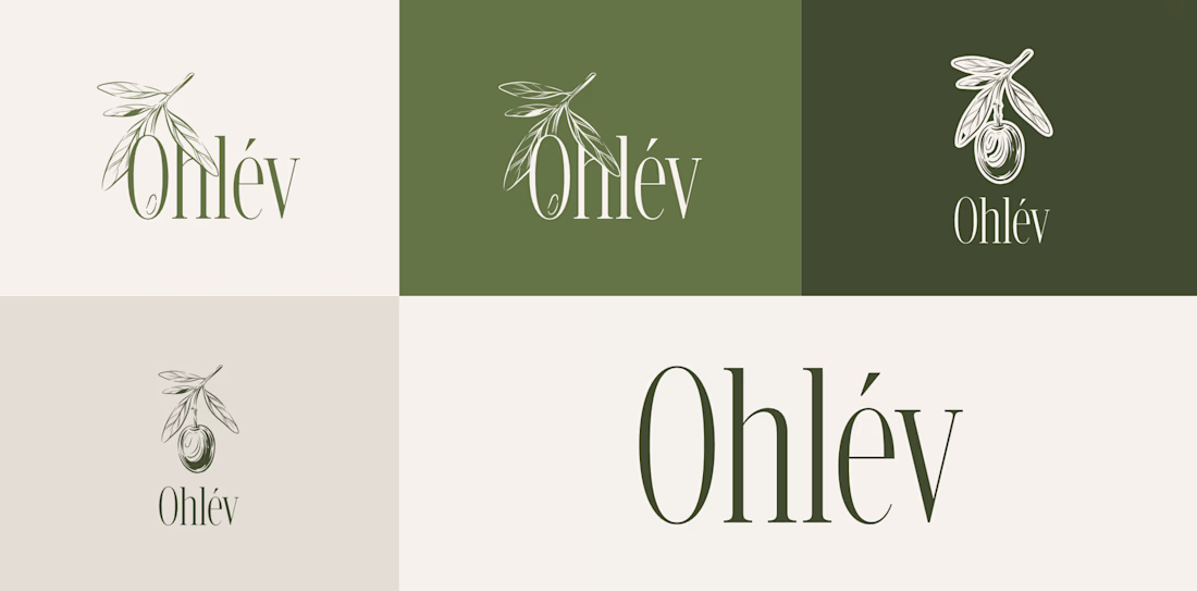
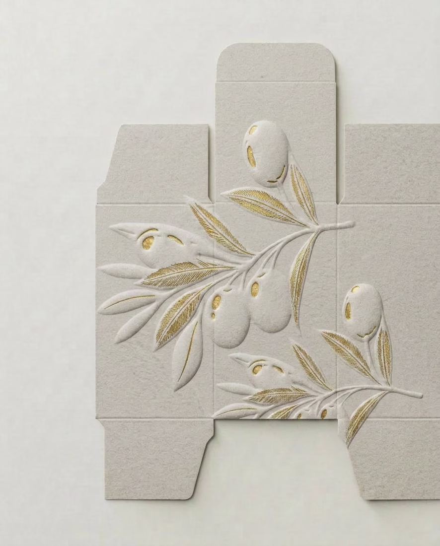
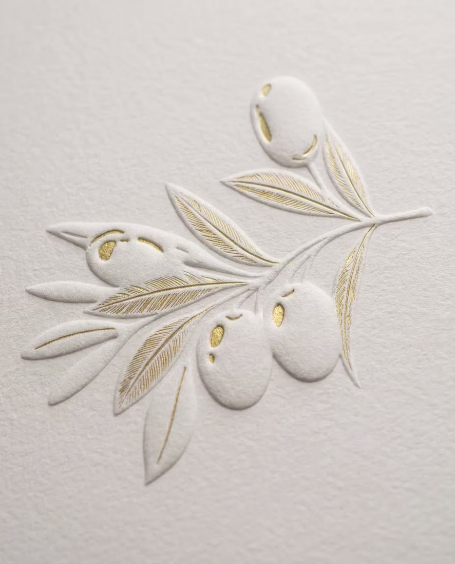
How do you design a skincare brand inspired by olives… without making it look like olive oil? 🤔 🤌🏼 That's the challenge I'm currently working through!
The hero ingredient naturally brings to mind food, kitchens, and grocery shelves. But this brand belongs in a premium skincare space.
So instead of focusing on the fruit itself, I'm exploring the Mediterranean lifestyle, botanical illustrations, tactile packaging, earthy color palettes, and editorial typography to communicate the ingredient without feeling edible.
This project is still a work in progress, but I thought it would be interesting to share the exploration before the final result.
Curious... if you had to communicate olives without illustrating an olive, where would you start?
I would add a big focus on fonts with a thoughful brand voice, tone & style that describes what the brand is through catchphrases and headlines!
✌️ Two directions, one brand. Which logo speaks louder to you?
Sometimes the smallest shift in layout, weight, or spacing changes the whole feel. I'd love to hear which one catches your eye first.
Drop your pick below: 1️⃣ or 2️⃣ ?
6 voted
75%

2 voted
25%

8 votes
Closed
One line
Trending
Claude
Claude has entered the design space. How are you using Claude Design?
Contra University
Learn from expert creatives how to earn more using next-gen AI tools.
fifaworldcup2026
The World Cup is here and the whole world's watching. How are you designing for the world stage?
creativeaiflow
Creative AI workflows are evolving. What tools do you use, and what are their strengths and weaknesses?
freelancerlife
Freelancer life is wins, pivots, and everything in between. What’s yours right now?