The network for creativity
Join 1.25M professional creatives like you
Connect with clients, get discovered, and run your business 100% commission-free
Creatives on Contra have earned over $150M and we are just getting started
Back to feedPost

🇸🇦 Sales in Saudi Arabia | Shopify Services Worldwide 🌍

The network for creativity
Join 1.25M professional creatives like you
Connect with clients, get discovered, and run your business 100% commission-free
Creatives on Contra have earned over $150M and we are just getting started

Challenges
View all


Related posts

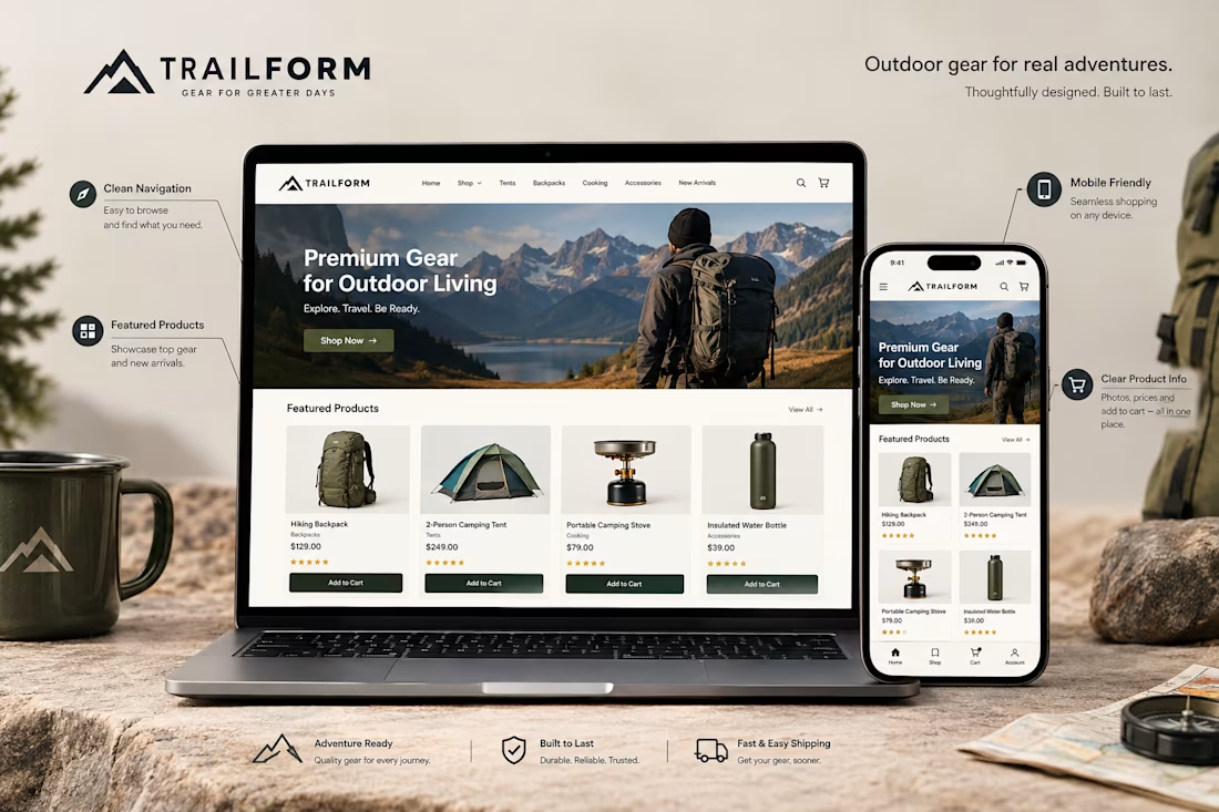
A Shopify store might look great on a computer but feel completely different on a phone.
That's why mobile optimization matters.
When reviewing a store's mobile experience, I pay attention to things like:
→ Easy to use navigation
→ Readable product descriptions
→ Clear product images
→ Buttons that are easy to tap
→ Proper spacing between sections
→ Product pages that fit the screen
→ A smooth path from browsing to checkout
The goal isn't just to make the desktop design smaller.
It's to make the store comfortable and easy to use on a mobile device.
Because customers should be able to browse products, understand what they're buying, and take the next step without unnecessary frustration.
A good mobile experience is an important part of good Shopify design.
Have you ever left an online store because it was difficult to use on your phone?

Absolutely. A smooth mobile experience can make the difference between a customer buying and leaving.


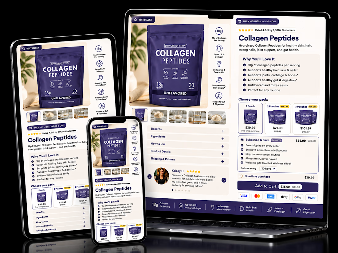

The pack-size tiers sitting right next to Subscribe & Save is the right order. Anyone already comparing 1, 2 or 3-pack is primed to pick a cadence too, so showing both choices together nudges toward the higher-LTV option without it feeling like an upsell.

Nice work!
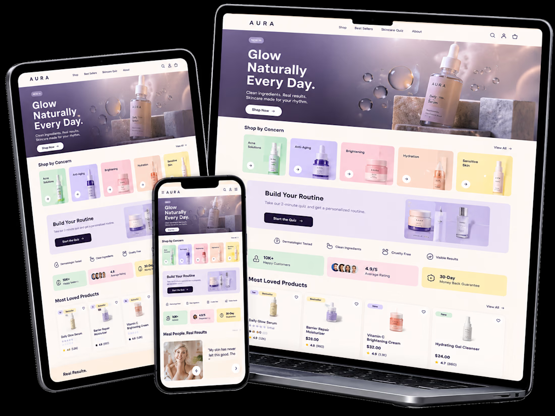
What if a skincare website could look beautiful AND make shopping effortless? ✨
I recently designed a premium, Gen Z-inspired skincare website concept for Purely Prep.
Instead of just creating an attractive homepage, I focused on what matters in eCommerce: building trust, simplifying product discovery, and creating a smooth path to purchase.
Here's what I designed:
✨ Premium, mobile-first UI/UX
🛍️ Quick Shop and conversion-focused product sections
💜 Interactive skincare routine finder
⭐ Customer review and video testimonial layouts
🎥 Shoppable video sections
🛒 Product bundles and purchase reassurance
This is an independent design concept built with Lovable, not a completed client project or live Shopify store. The framework is designed with future Shopify implementation in mind.
Explore the interactive concept:
https://purelyprep-by-whizwaydigit.lovable.app
I'm a Shopify Designer & CRO Specialist helping eCommerce brands create beautiful, conversion-focused shopping experiences.
Building a skincare, beauty, or wellness brand? Let's connect. I'd love to help bring your vision to life.
Designed by WhizwayDigit 🚀
#Shopify #WebDesign #CRO #eCommerce #UIUX #Lovable