The network for creativity
Join 1.25M professional creatives like you
Connect with clients, get discovered, and run your business 100% commission-free
Creatives on Contra have earned over $150M and we are just getting started
Back to feedPost
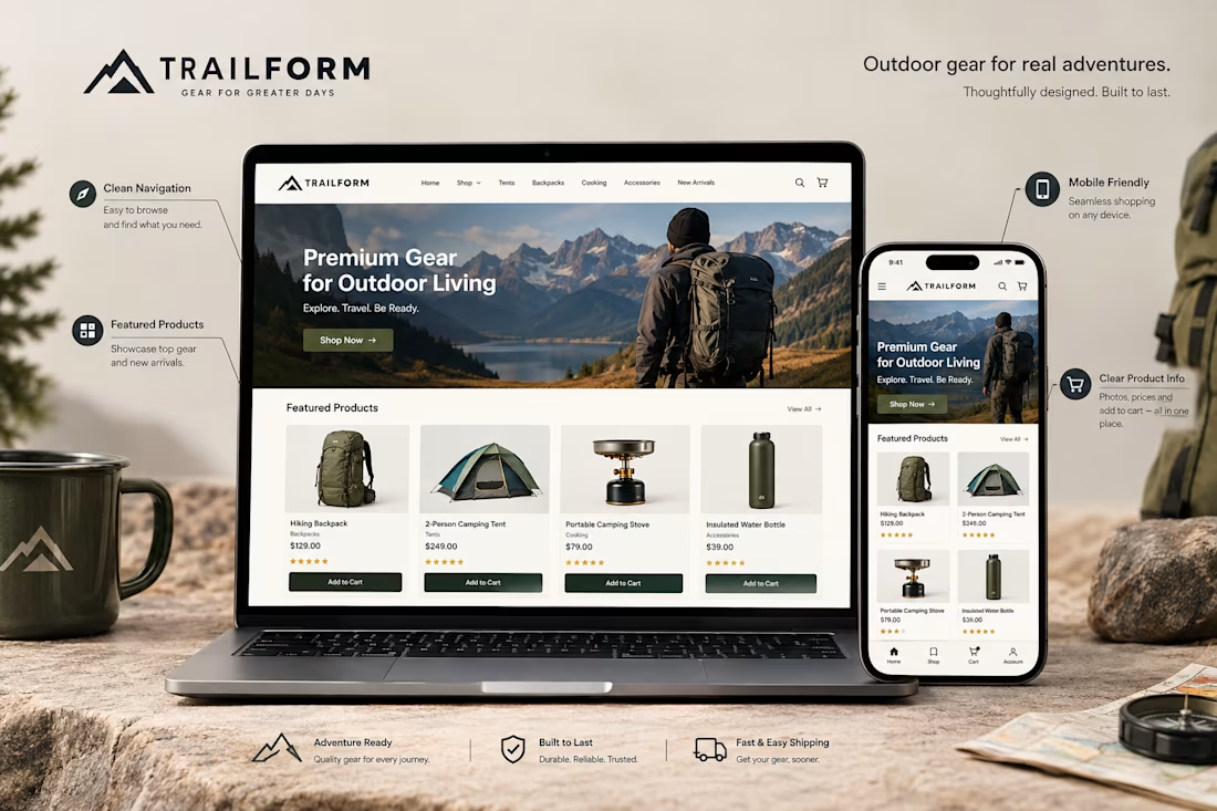
A Shopify store might look great on a computer but feel completely different on a phone.
That's why mobile optimization matters.
When reviewing a store's mobile experience, I pay attention to things like:
→ Easy to use navigation
→ Readable product descriptions
→ Clear product images
→ Buttons that are easy to tap
→ Proper spacing between sections
→ Product pages that fit the screen
→ A smooth path from browsing to checkout
The goal isn't just to make the desktop design smaller.
It's to make the store comfortable and easy to use on a mobile device.
Because customers should be able to browse products, understand what they're buying, and take the next step without unnecessary frustration.
A good mobile experience is an important part of good Shopify design.
Have you ever left an online store because it was difficult to use on your phone?


Absolutely. A smooth mobile experience can make the difference between a customer buying and leaving.

Definitely. If a store is frustrating to use on mobile, even great products may not be enough to keep customers.


the tap target point is the one stores keep getting wrong — i'd check the checkout button size on a real phone before anything else

Exactly. If the checkout button is hard to tap, even interested buyers can get frustrated and leave.
The network for creativity
Join 1.25M professional creatives like you
Connect with clients, get discovered, and run your business 100% commission-free
Creatives on Contra have earned over $150M and we are just getting started





Related posts
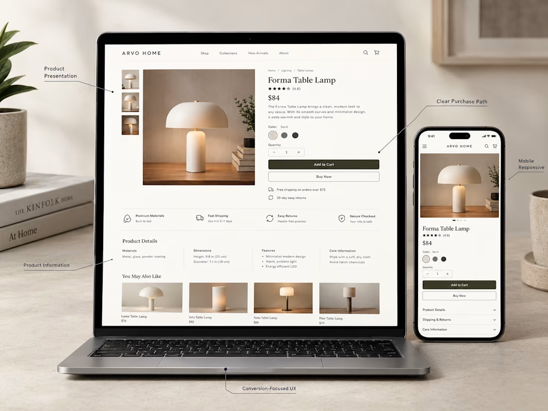
A product page has one important job:
Help the customer understand the product and feel confident enough to take the next step.
For this Shopify concept, I focused on the things that matter most:
→ Clear product photography
→ Easy to understand product information
→ Visible pricing
→ Simple variant selection
→ Strong Add to Cart placement
→ Useful product details
→ Trust building information
→ A clean mobile experience
A product page doesn't need to be overloaded with information.
It needs to present the right information in the right order.
That's where good e-commerce UX makes a difference.
What would you improve first on a Shopify product page?
Exactly. The right information in the right order can make the buying decision much easier.


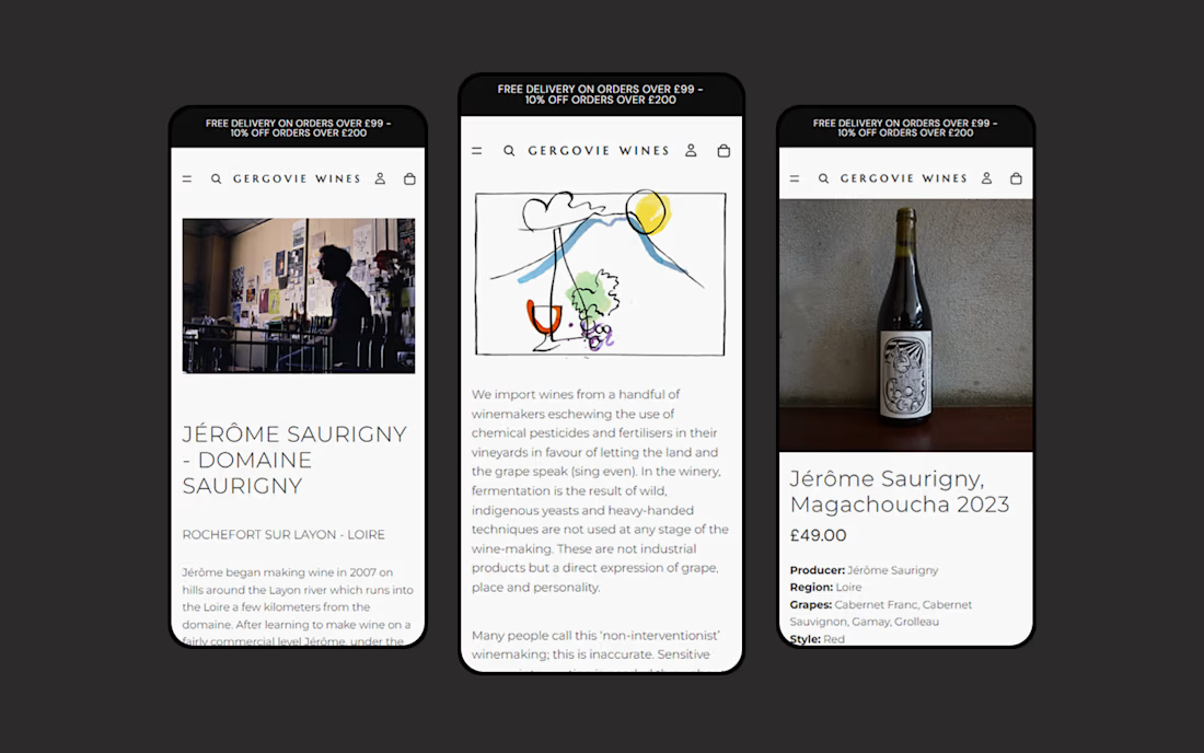
Gergovie Wines partnered with GreenBerry to migrate their existing Squarespace website to Shopify, creating a new ecommerce storefront for their wine collection.
The project brought products, content and key pages into Shopify, with a responsive design that makes browsing wines and placing orders straightforward across mobile and desktop.
The new website gives the Gergovie Wines team an easier way to manage their catalogue, orders and website content, while providing a flexible foundation for the business to grow.


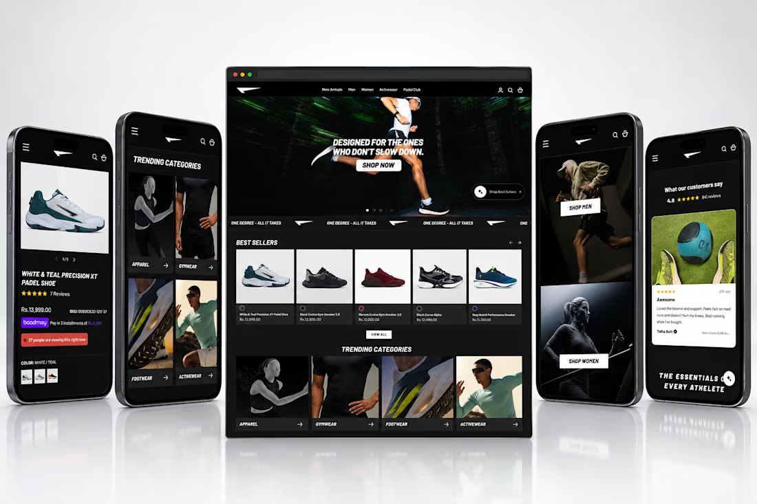
OneDegree Website Revamp on Alchemy Theme
Redesigned and optimized the OneDegree Shopify storefront on the Alchemy theme, focused on improving product discovery, engagement, and conversion. The project covered layout restructuring, content integration, and on-site personalization to create a smoother path from browsing to checkout.
Key Contributions:
1. Optimized 31+ product pages with CTR-focused layouts.
2. Integrated custom UGC video content to build trust and engagement.
3. Applied advanced conversion rate optimization across key pages.
4. Implemented personalized product recommendations to lift cross-sell and AOV.
Tools: Shopify, Alchemy Theme, Liquid, JavaScript