The network for creativity
Join 1.25M professional creatives like you
Connect with clients, get discovered, and run your business 100% commission-free
Creatives on Contra have earned over $150M and we are just getting started
Back to feedPost
A product page has one important job:
Help the customer understand the product and feel confident enough to take the next step.
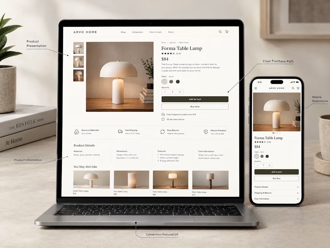
For this Shopify concept, I focused on the things that matter most:
→ Clear product photography
→ Easy to understand product information
→ Visible pricing
→ Simple variant selection
→ Strong Add to Cart placement
→ Useful product details
→ Trust building information
→ A clean mobile experience
A product page doesn't need to be overloaded with information.
It needs to present the right information in the right order.
That's where good e-commerce UX makes a difference.
What would you improve first on a Shopify product page?


Exactly. The right information in the right order can make the buying decision much easier.

Glad you got that 😊

Exactly. The right information in the right order can make the buying decision much easier.
Yes, thank you so much
🚀 🧠

I would start with the unanswered question nearest the Add to Cart button: what is included, which variant fits, and when it will arrive. Then I would check the email-to-page handoff on mobile. If an email promises a specific product or offer, the landing page should make that...
Exactly. Answering those key questions near the CTA can remove a lot of hesitation and make the buying journey smoother.
The network for creativity
Join 1.25M professional creatives like you
Connect with clients, get discovered, and run your business 100% commission-free
Creatives on Contra have earned over $150M and we are just getting started





Related posts


Top-notch design.


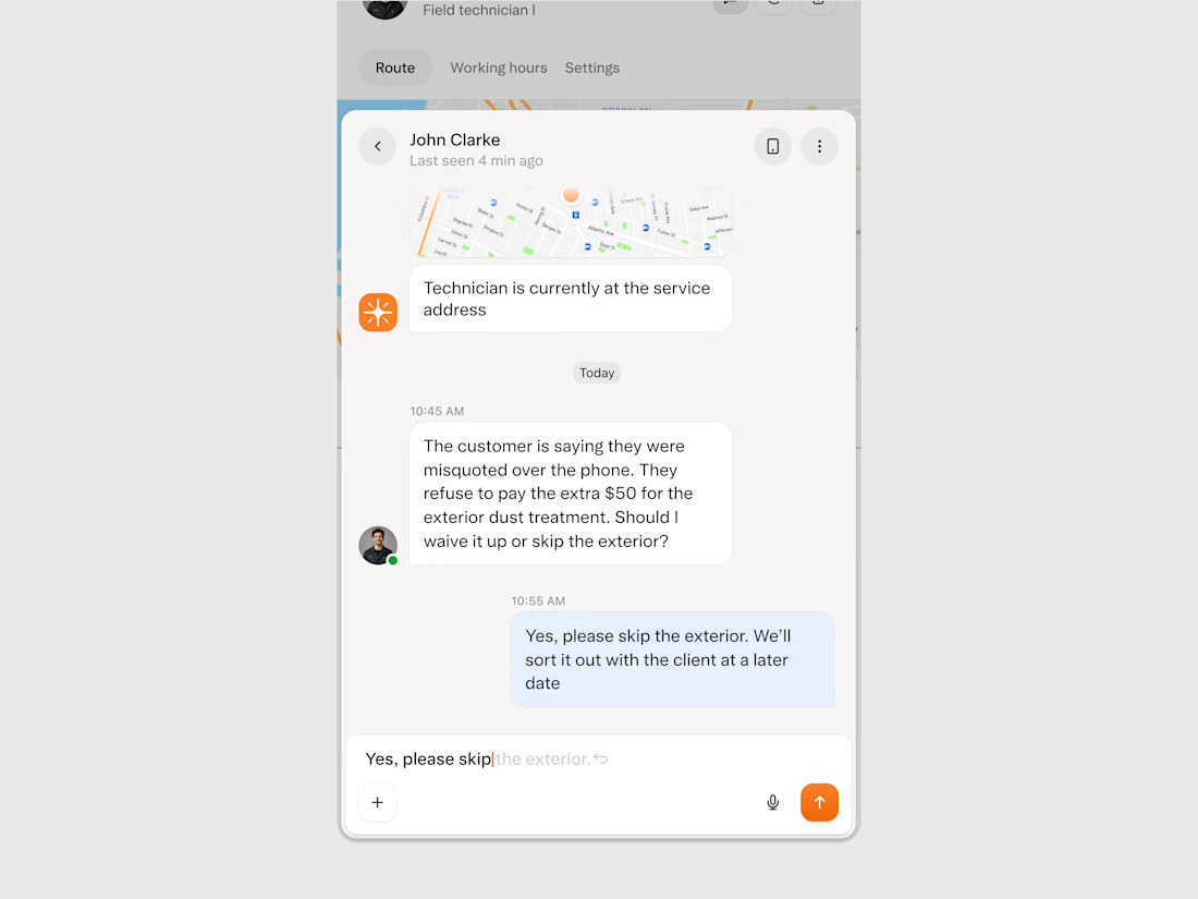
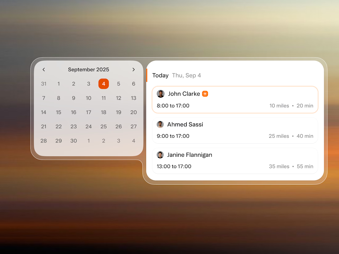
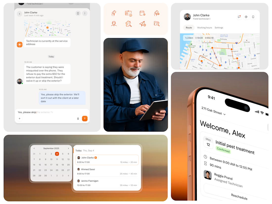
Solea came to us in September at seed stage with a clear idea: scheduling is the core business problem, and AI is the right tool to solve it. They needed a design partner and within 24 hours of our first call, we completed a design test to prove we could move at their pace.
After launch, pest control businesses using the platform started running more appointments per day with the same headcount and reported a 10x ROI on the switch.
Solea signed their first national customer within 6 months, raised a $10M Series A, and we are continuing with them into the next phase.

I'd like some outside eyes on a choice in my booking chat for a driving school.
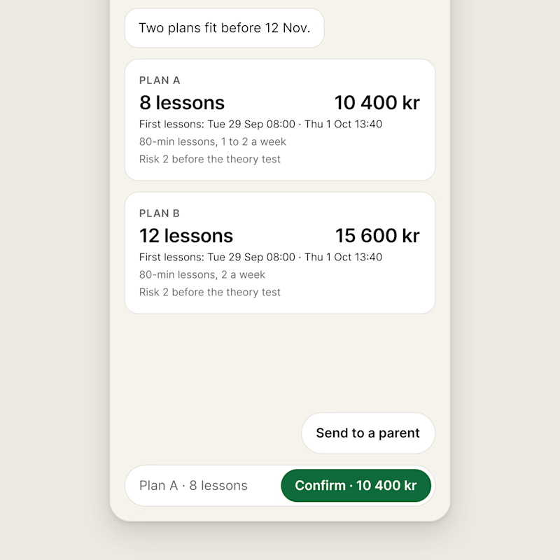
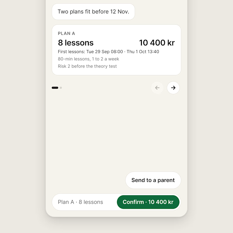
After a few questions, the chat offers the plans that fit before the learner's driving test. In this case two plans fit.
A shows both plans at once, one under the other.
B shows one plan at a time with a pager, and the Confirm button carries the price of the plan in view. B is what's live now.
Which one would you rather pick a plan from?
Try it yourself: https://halvkoppling.lovable.app
6 voted
67%
3 voted
33%
9 votes
Closed

stacked for convenience and pager for aesthetic