The network for creativity
Join 1.25M professional creatives like you
Connect with clients, get discovered, and run your business 100% commission-free
Creatives on Contra have earned over $150M and we are just getting started
Back to feedPost

New brand identity for Cadvel, a data analytics startup that sells real-time infrastructure to enterprise teams.
The idea was simple: data comes in raw and leaves structured. So the logo is a stack of bars in different lengths, stepped like a pipeline, and everything else grows from it. That includes one typeface (Suisse Intl), a deep green and ivory palette, a 28-icon set built on the same bar geometry, and signage, print and three social directions: 3D, ASCII pattern and gradient.
Result: a B2B data brand that looks as engineered as the product behind it.


Amazing work, Kris!

Great work! Really loved the design language!

The concept is so well thought out. Using data pipeline logic to design the actual logo is the kind of idea that makes perfect sense in hindsight. The B2B aesthetic feels engineered, not just styled.

Amazing project! Love the logo animation

This is outstanding. You nailed every detail!! I looove how you animated the assets.


Amazing work🔥👏👏

Incredible work—so smooth and clean!

Really smart concept. Turning the raw-to-structured data journey into the core visual system makes the identity feel genuinely connected to the product, not just styled around it. The icon system built from the same geometry is a great touch too.

the logo explained it self

This deserves more than just liking, this deserves to be featured! 🏆 Translating raw data ingestion into a stepped pipeline logo mark is pure design brilliance.

The pipeline logic carrying all the way through to the icon set and social directions is the part that makes this feel like a system rather than just a logo with some assets bolted on. With a concept this tightly reasoned, was there a competing direction early on that also made...


Nice
The network for creativity
Join 1.25M professional creatives like you
Connect with clients, get discovered, and run your business 100% commission-free
Creatives on Contra have earned over $150M and we are just getting started







Related posts


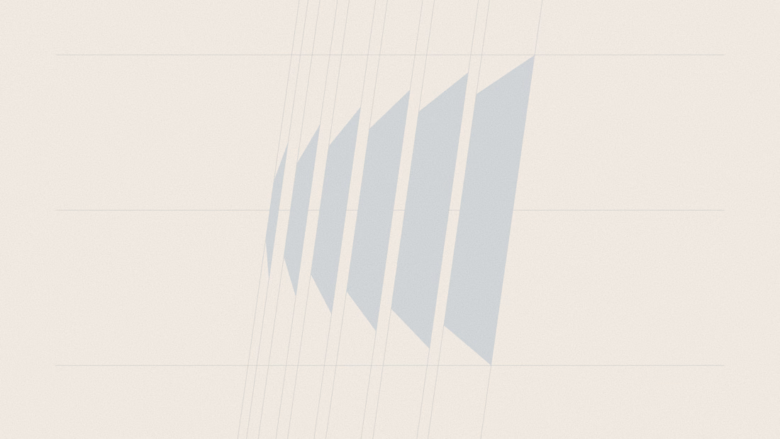
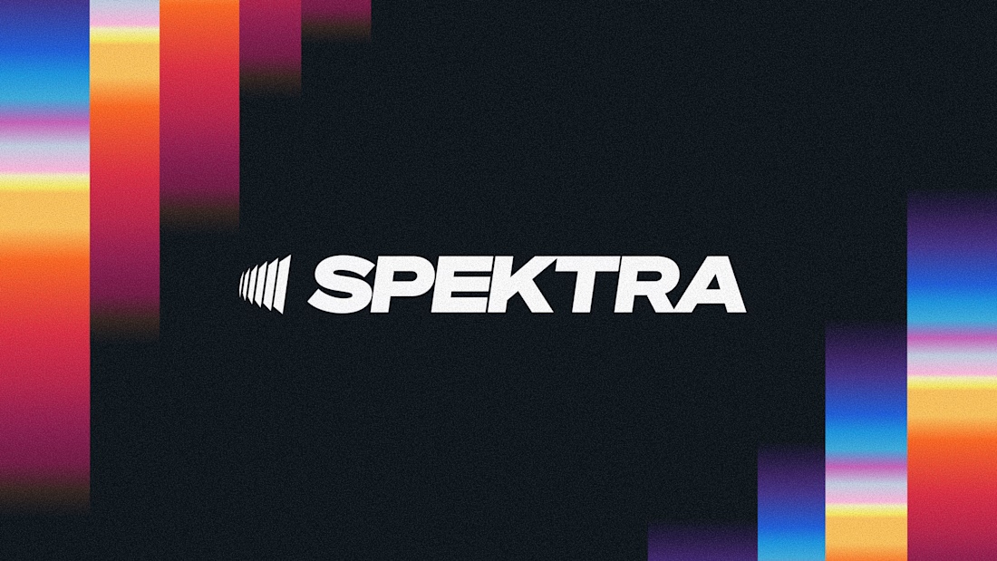
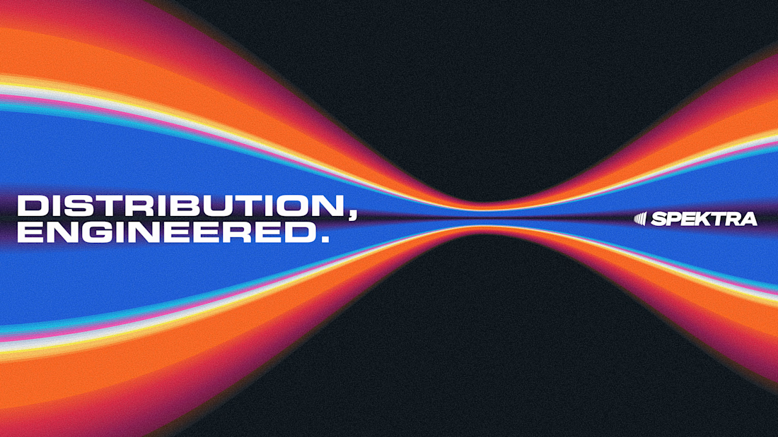
A closer look at the Spektra logo I designed.
The mark fans out from a narrow point, while the wordmark leans forward. together, they give it a sense of movement without needing much detail.
There’s a lot of color in the wider identity, so the logo holds its own in plain white. Simple geometry with enough weight to stand up to everything around it.

This is fire, Daniel
The logo conveys the story


Clark Baldwin Travel is a bespoke luxury travel agency, planning trips through personal relationships with the world's top hotels — Rosewood, Aman, Waldorf Astoria, Belmond, and others. I designed the full website, positioning the agency as a trusted insider rather than a booking platform.