The network for creativity
Join 1.25M professional creatives like you
Connect with clients, get discovered, and run your business 100% commission-free
Creatives on Contra have earned over $150M and we are just getting started
Back to feedPost

Interactive Services section Layout for Northstar Grid ⚡
When your platform handles everything from asset monitoring to predictive forecasting, your website can quickly turn into a cluttered wall of text. We help deep tech and infrastructure startups structure their multi-layered capabilities into clean, high-impact interfaces that command absolute authority and stop buyer drop-off.
These new "Our Platform" module explorations for Northstar Grid are designed to organize a sprawling feature suite into a unified, crisp narrative.
Our structural strategy for this component:
Progressive Disclosure: We utilized a clean accordion framework to hide layout noise, letting prospects dive deep into specific platform tracks (Forecast, Recovery, Copilot) on their own terms.
Kinetic Typography: We are testing bold, oversized typographic anchoring to give the technical interface a confident, enterprise-grade weight.
Visual Framing: Merging sharp contextual imagery with high-contrast active states (like the vibrant green accent lines) to guide the user's eye effortlessly through the product's capabilities.
Tools & Stack: Figma (UI/UX Design)
Building a multi-product technical platform but struggling to organize your features cleanly? Let's fix that. Check out our agency's services below to see how we can collaborate.


The network for creativity
Join 1.25M professional creatives like you
Connect with clients, get discovered, and run your business 100% commission-free
Creatives on Contra have earned over $150M and we are just getting started



Related posts

Photographer Portfolio Website
"Capturing light, emotion, and the moments you never want to forget." That line set the tone, and the layout follows it.
The hero is one motion-blurred portrait washed in red. The photographer's name runs across the bottom in a condensed white face, so large the screen cuts it off. The photo keeps its soft focus, and the name still reads first.
Thin grid lines split the page into narrow columns, and the small copy sits justified inside them. The loose photo gets a strict structure to lean on.
A single round red button with an arrow sits right on the letters and marks where to go next.
Designed by the Hue & Machine team.
#WebDesign #Photography #PortfolioWebsite #EditorialDesign #Typography #UIDesign #ProductDesign #CreativeDirection #ResponsiveDesign #FigmaDesign


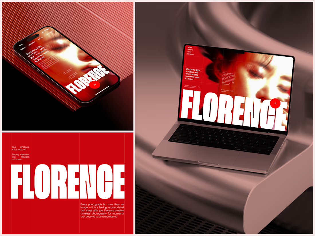

The heavy condensed white FLORENCE over the red portrait is bold, and keeping the same red across phone, laptop and type tile makes the case study read as one system. Did the red come from the photographer's own work, or was it your call?

Rebuilt my portfolio with AI and added new case studies.
Brand, web, and product UI. All custom coded, all in one page.

One page with brand, web and product UI together is a strong move. Clients see the range without clicking around. Rebuilding mine with AI coding tools taught me the same thing: the speed lets you spend the saved time on the case study writing, which is what actually wins work.

A website hero and motion identity concept for Cycle.
The experience takes the viewer through seven historical eras in one continuous forward journey, while the logo, camera path and core composition remain consistent.
The concept explores how a static identity can become a living digital experience through motion, environment and interaction.
Workflow included Spline, Claude via MCP, Midjourney and SeaDance.
Available for brand identity, motion and digital design projects.


I fall in love, It is like Encarta, but 1000% better