The network for creativity
Join 1.25M professional creatives like you
Connect with clients, get discovered, and run your business 100% commission-free
Creatives on Contra have earned over $150M and we are just getting started
Back to feedPost
Taste Test

Two takes on the same idea.
We have our favorite. What's yours?
39 voted
53%
34 voted
47%
73 votes
Closed

both are pretty good!!

A is my favorite

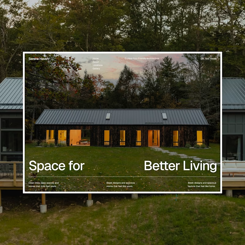
Will go with as the heading says, Space for better living, it looks better in spacing


A

Going with A

A is the better than B

B One

I love B😊

What cool and fluid characters!

Excellent Work brother

I would go with A

very impressive design

A is more focused and well aligned


Both are top tier ❤

Definitely B for me

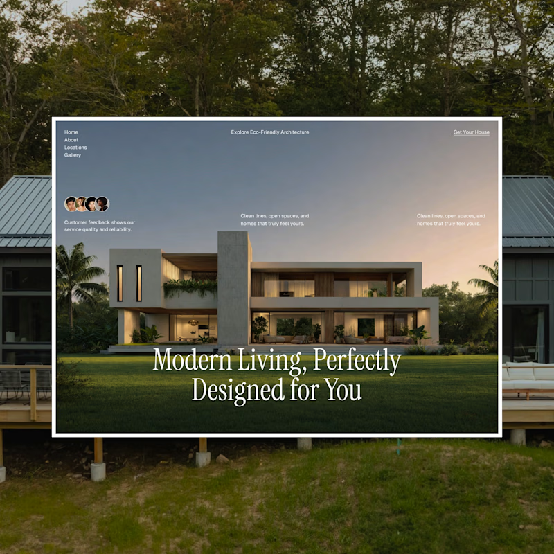
A for me. Splitting "Space for" and "Better Living" to frame the house turns the headline into part of the composition, and the warm window glow at dusk sells the feeling of living there. B is cleaner and the social proof block is a smart touch, but the centered serif ends up competing with the architecture for attention.

Going with A 🔥
Simplicity is just complexity, hidden well.


Outstanding work !


The first concept is more user centric and minimal.

The network for creativity
Join 1.25M professional creatives like you
Connect with clients, get discovered, and run your business 100% commission-free
Creatives on Contra have earned over $150M and we are just getting started

Challenges
View all


Related posts

Client’s choice vs. Designer’s choice 👀
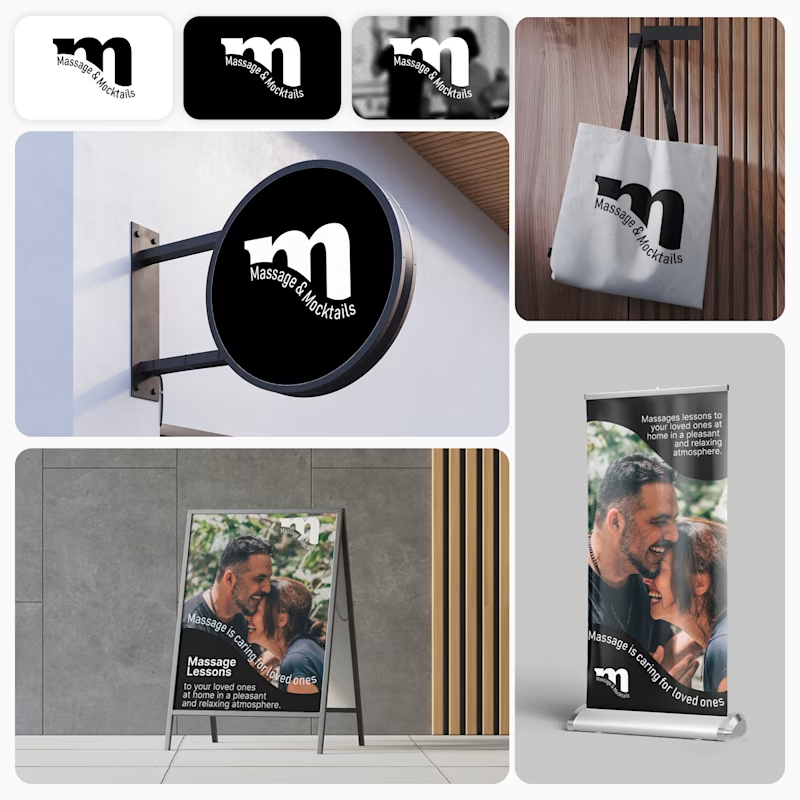
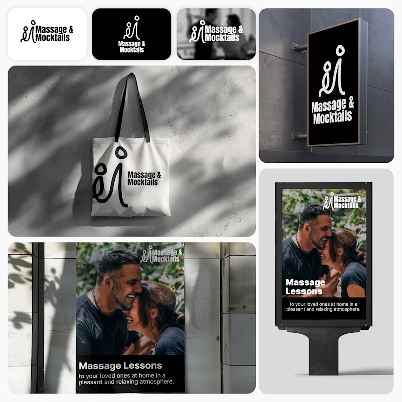
I’m currently working on a branding project for Massage & Mocktails — a concept built around couples learning massage together in a relaxed, social atmosphere.
These are two early, black & white directions from Stage 2 of my branding process, before moving into color, typography, and the full visual system.
The interesting part?
My client chose Concept 1. I chose Concept 2.
Now I’m curious what other creatives think.
Which direction would you choose — 1 or 2? And why?
Sometimes the most interesting part of branding is seeing how differently a client and a designer respond to the same brief.
21 voted
44%
27 voted
56%
48 votes
Closed
Concept 2 for me. That interlocking figure mark reads as two people meeting, which is the actual brief here, so it gives you more to build a system on. Concept 1 is the safer, more literal pick, which is usually why clients reach for it.

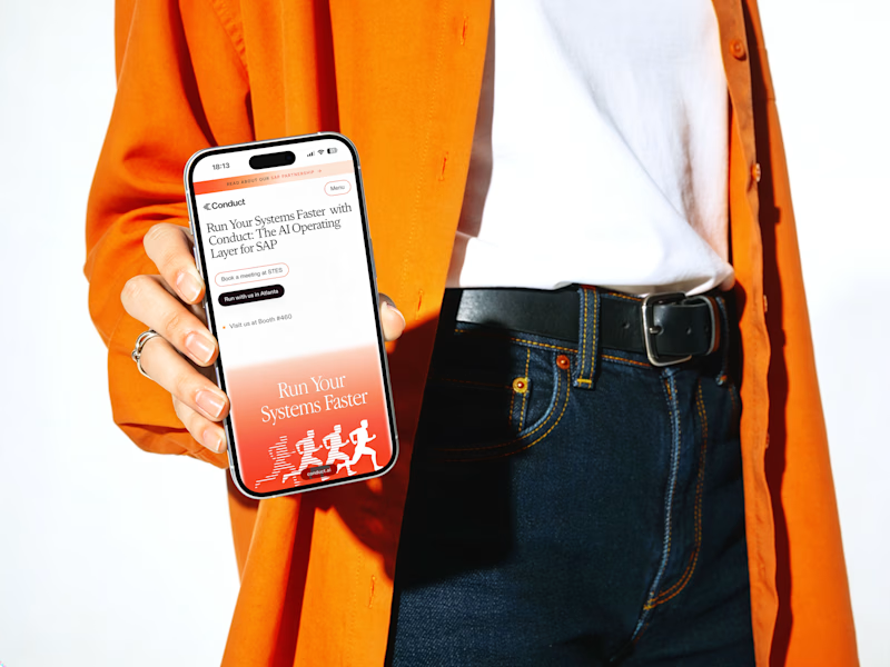
Which cover gets your vote? 👀
I’m finally sharing this case study and I’m stuck between these two.
1 or 2? Which one would you click first? 👇

14 voted
34%
27 voted
66%
41 votes
Closed


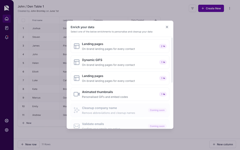
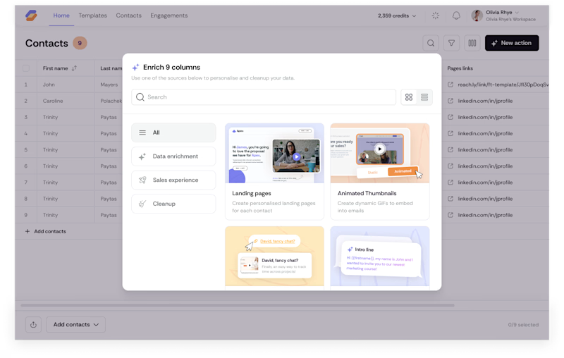
A quick taste test.
I rebuilt this enrichment picker to scale from 6 flat rows to 40+ options without slowing anyone down spot what changed beyond the coat of paint. Icons replace credit counters so people scan by type, not by a number that means nothing until you click in. A search bar shows up because a list that works at nine choices breaks at forty. Tabs split by intent (Data enrichment, Sales experience, Cleanup) instead of dumping everything into one scroll, and the cards carry a visual preview instead of a text label, so you know what you're picking before you commit credits to it.
Nothing here is decoration. Every pixel is doing a job.
What's the first difference you caught?
3 voted
16%
16 voted
84%
19 votes
Closed

after..