The network for creativity
Join 1.25M professional creatives like you
Connect with clients, get discovered, and run your business 100% commission-free
Creatives on Contra have earned over $150M and we are just getting started
Back to feedPost

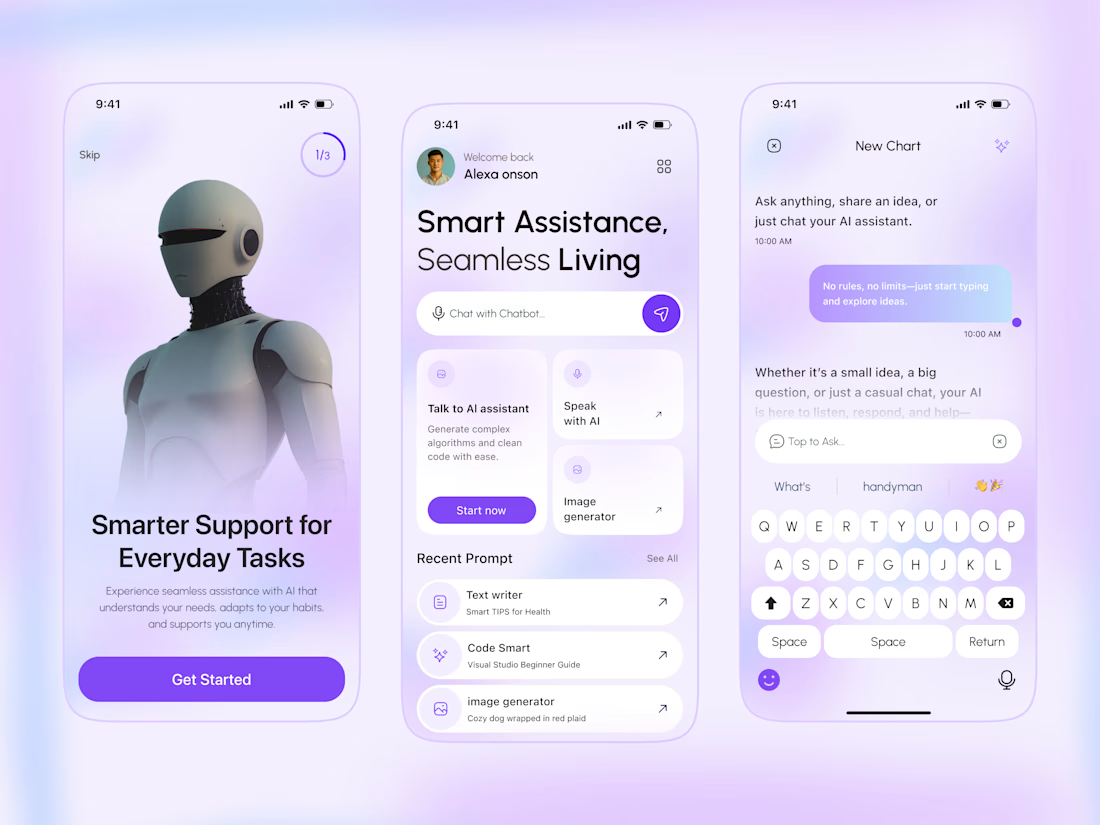
✨ Virtual Personal Assistant App — UI/UX Design Concept
Introducing a modern and user-friendly AI assistant mobile app concept designed for a seamless digital experience.
🎨 Clean and minimal UI
📱 Modern mobile app screens
💜 Soft purple gradients
🤖 AI chat and smart assistant features
💬 Simple navigation and intuitive interactions
My goal was to explore a clean interface that makes AI assistance feel simple, accessible, and enjoyable.
What do you think of this design? I'd love to hear your feedback!
#UIUXDesign #MobileAppDesign #Figma #AIApp #ProductDesign

Awesome!
The network for creativity
Join 1.25M professional creatives like you
Connect with clients, get discovered, and run your business 100% commission-free
Creatives on Contra have earned over $150M and we are just getting started

Challenges
View all


Related posts

Turning a workspace into an atmosphere makes such a difference. ✨
Love the warm lighting, layered details, and cozy mood here. It feels less like a desk setup and more like a space you’d actually want to spend hours creating in. 🔥


What would your workspace look like if you turned it into an ambient little world?
I recreated my actual workstation in Midjourney, with a little extra colour, mood lighting, and cinematic polish.
The warm desk lamp, cooler screen glow, my keyboard, books, and all the little...

Shielda is a mobile cybersecurity app that helps small businesses detect and respond to digital threats in real time.
The experience makes security easier to manage for non-technical users. Clear threat statuses, high-contrast visuals, and actionable alerts help business owners understand what needs attention and decide what to do next.
See the design: https://dribbble.com/shots/27792730-Mobile-App-Cybersecurity


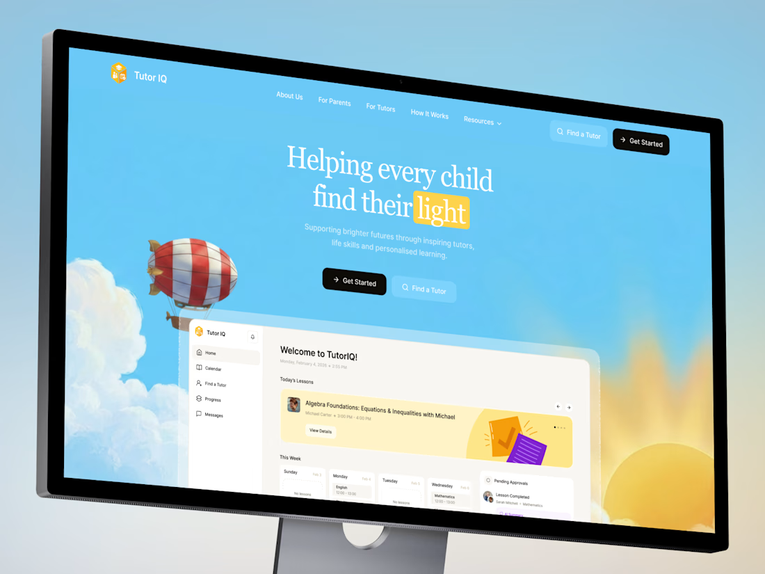
Your votes are in! Here's the final TutorIQ website ☀️
Thank you to all 20 of you who voted on the two concepts 🏄🏼♀️ It was close: 55% chose light and playful and 45% chose softer and calmer.
The final version mixes the two moods. Its bright colors are from the playful first concept. From the second one, it took the serif headline and the product preview on the first screen.
Quick context: TutorIQ is an AI tutoring platform for UK families. It matches each child with a tutor based on how they learn. Our task was a website that attracts parents and tutors before the platform launches.
Every parent comes with one question: 'Is this the right place for my child?' So the first screen answers it with the product itself. Parents see the lesson schedule and the AI summary they get after each lesson.
Now it's your turn 👇🏻 What would you keep from this version? And what would you change?

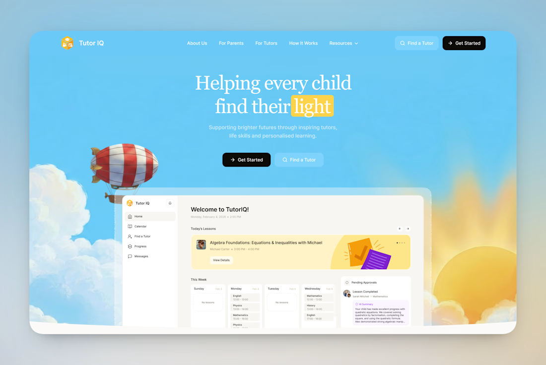

Keep: the “light” metaphor, a single idea that earns trust before the product appears. Change: contrast.