The network for creativity
Join 1.25M professional creatives like you
Connect with clients, get discovered, and run your business 100% commission-free
Creatives on Contra have earned over $150M and we are just getting started
Back to feedPost

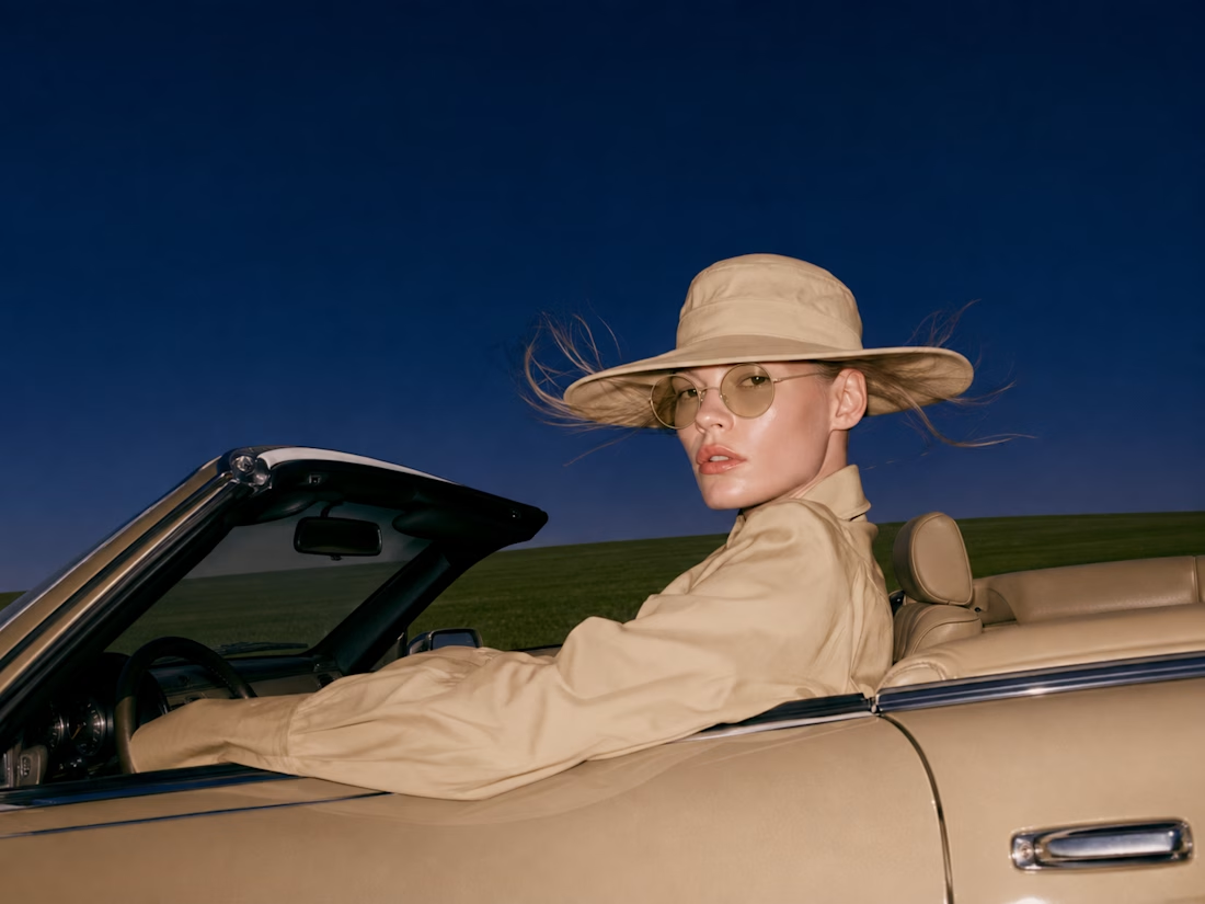
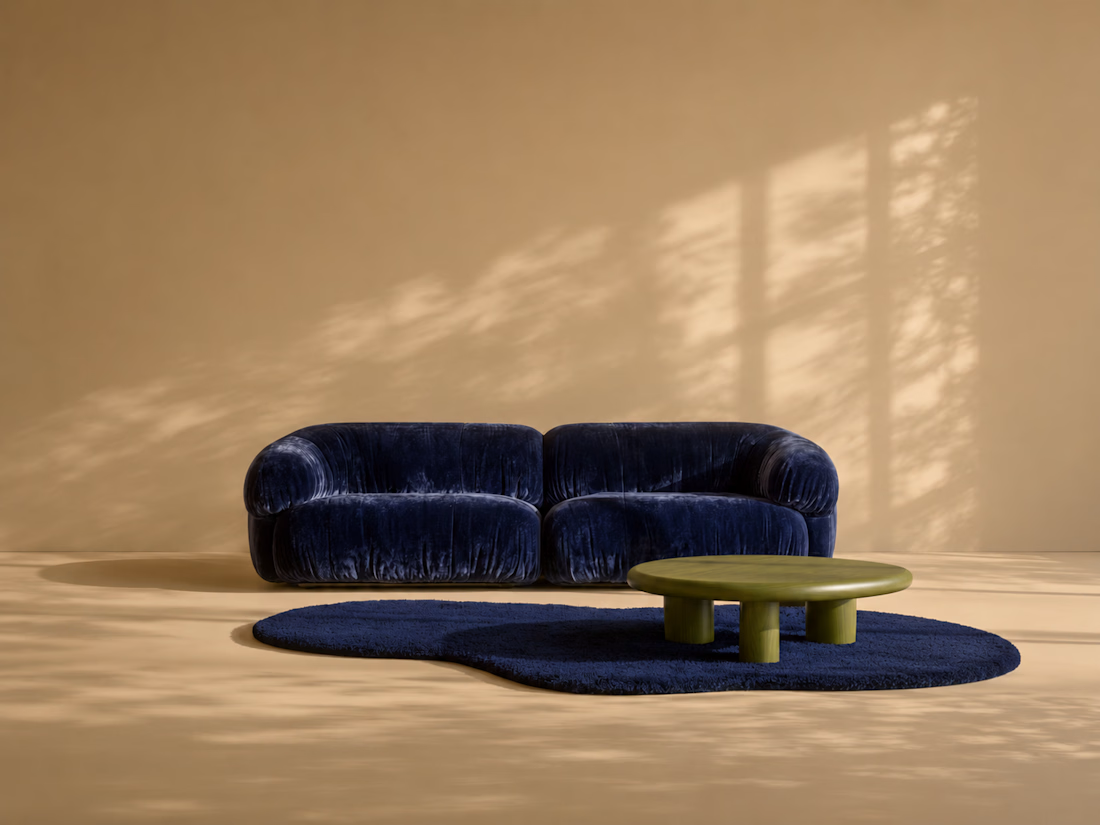
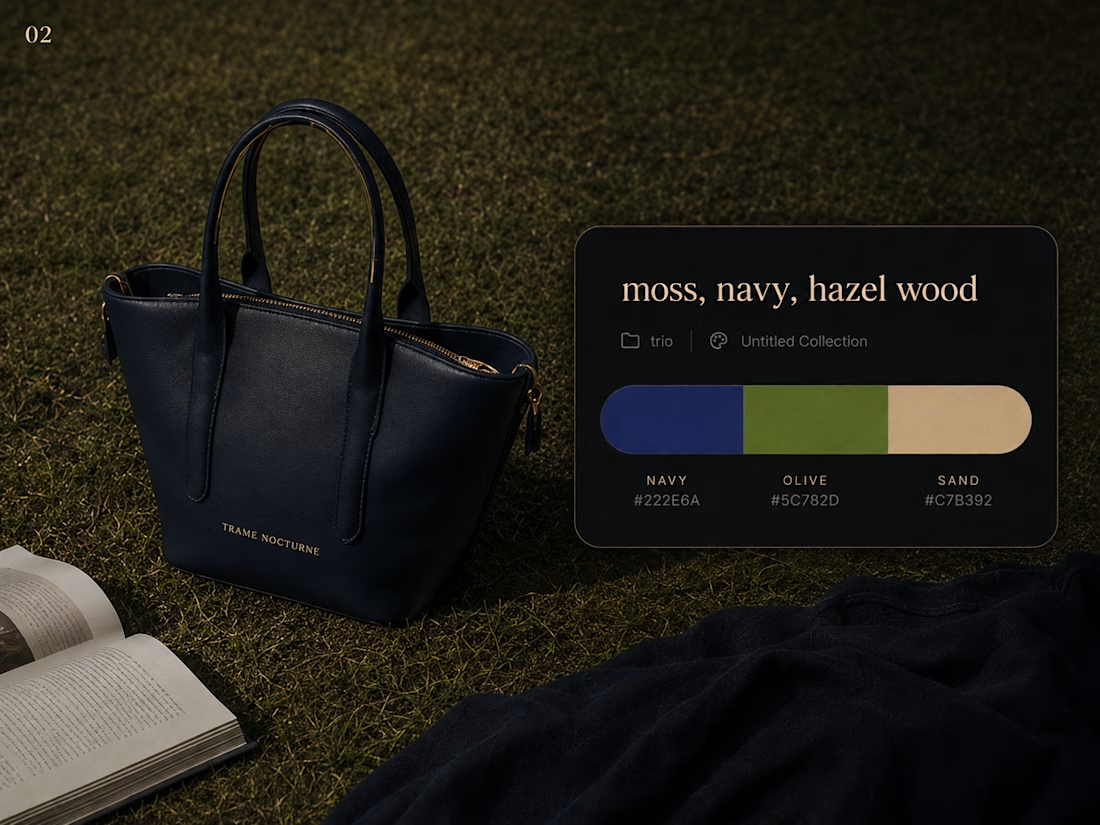
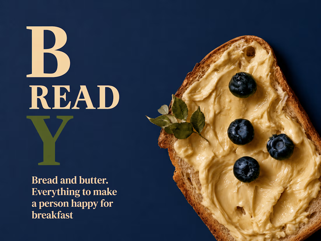
THREE COLOUR SYSTEM — Cross-Category Visual Direction
A visual identity study exploring how one restricted colour palette can move consistently across fashion, product, interiors and advertising.
OBJECTIVE: Build a coherent visual universe using only three dominant colour families — navy, olive and sand — across multiple creative categories.
The project demonstrates how colour direction can maintain brand recognition even when subject matter, scale and visual format change.
VISUAL DIRECTION:
NAVY provides depth, structure and visual authority.
OLIVE introduces an organic, slightly unexpected counterpoint.
SAND softens the system through warmth and neutral space.
Rather than repeating the same composition, the palette becomes the connecting element between fashion portraits, accessories, interiors and advertising imagery.
Self-initiated visual direction study created to demonstrate cross-category campaign thinking.


The network for creativity
Join 1.25M professional creatives like you
Connect with clients, get discovered, and run your business 100% commission-free
Creatives on Contra have earned over $150M and we are just getting started
Trending
retrofuturism
Share your favorite designs from the past exploring the distant future. Or your own take on the aesthetic 🚀
halftone
Dots. Texture. Grain. Let's see your designs using the halftone technique.

Midjourney
Creatives are showing off what they're making with Midjourney.
colorgrade
Video editors sound off: How do you enhance the mood of your video in color grading?





Related posts

Which of these hero sections look visually more balanced and premium to you?
16 voted
53%
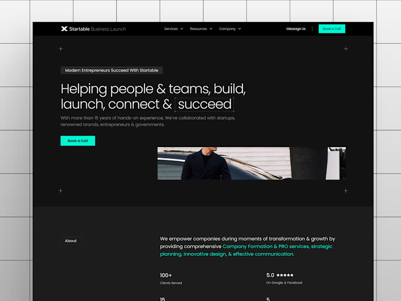
14 voted
47%
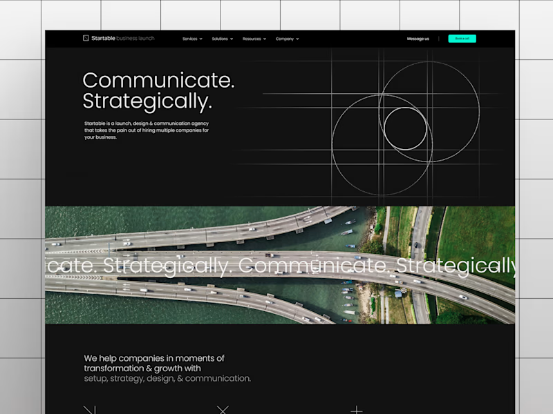
30 votes
Closed


Option A feels beautifully balanced with its proportion and layout hierarchy, giving the layout an ultra-clean, elevated, and premium feel

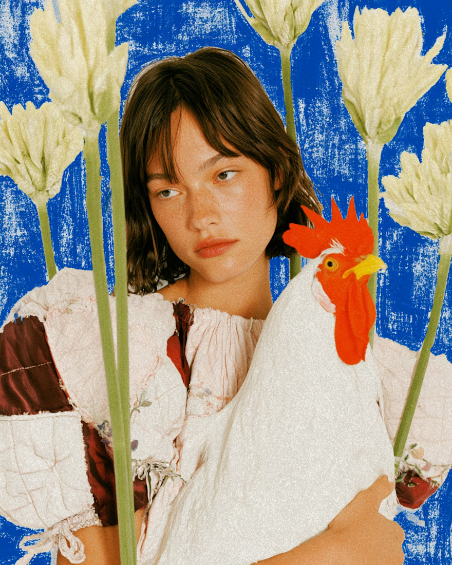
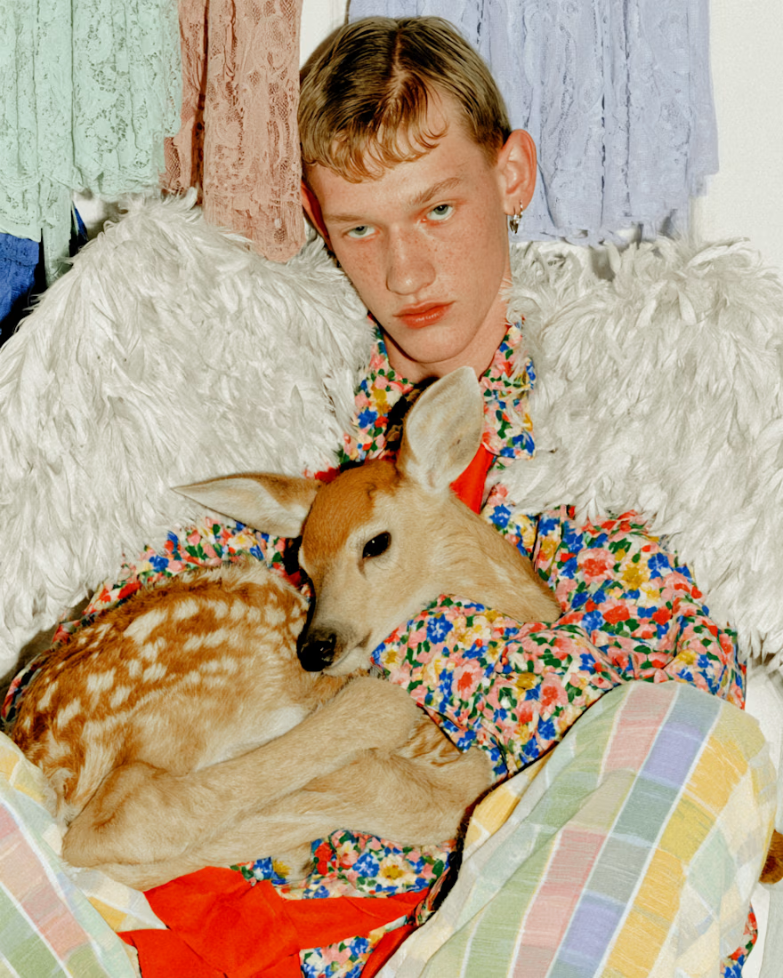
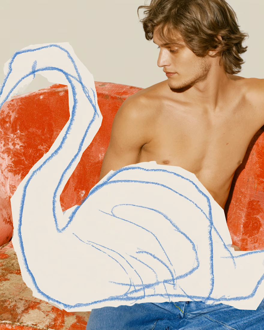
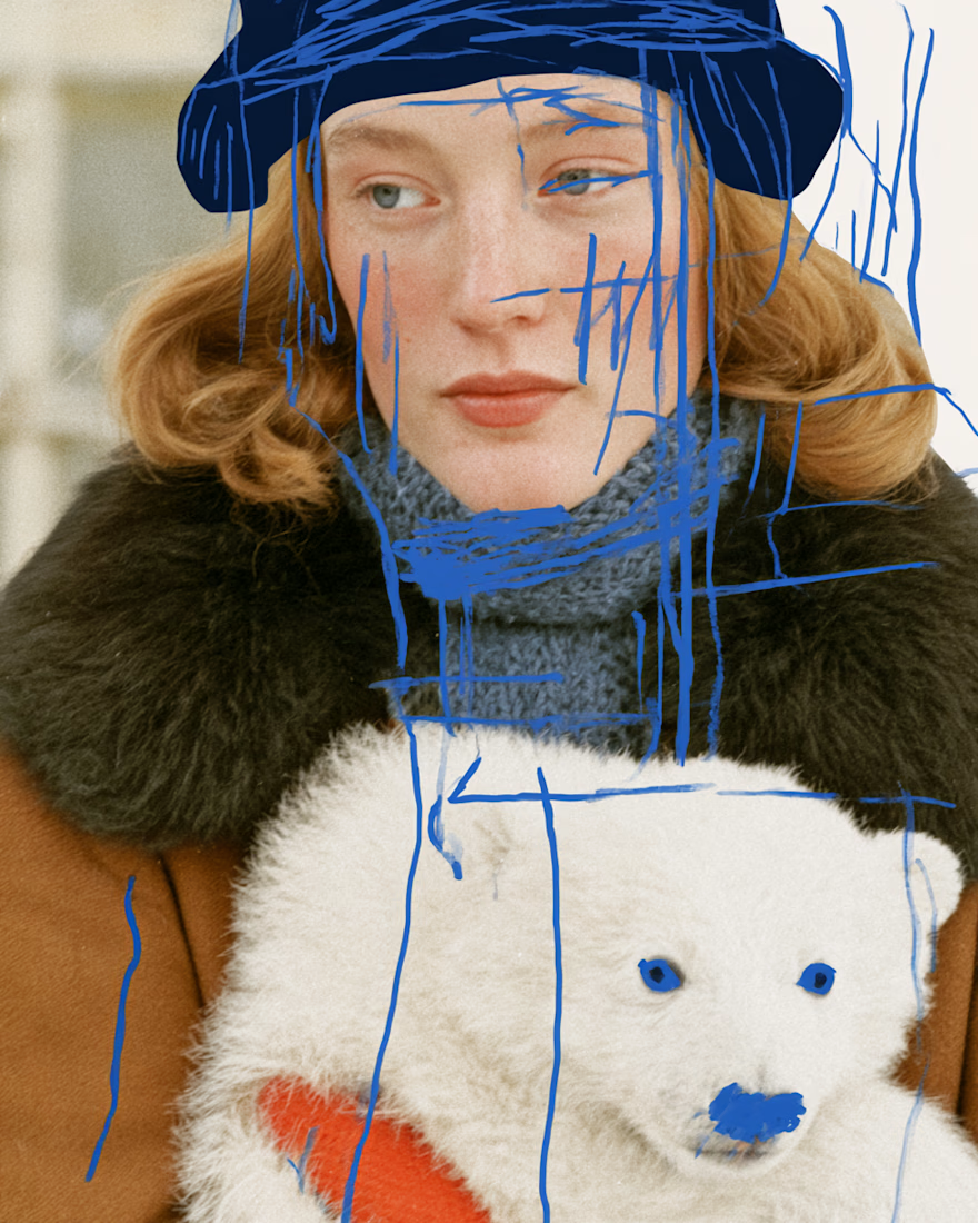
Experimental AI editorial series created with Midjourney, blending vintage fashion photography with hand-drawn elements, surreal details, and playful visual storytelling. ✨🖍️

Awesome 👍

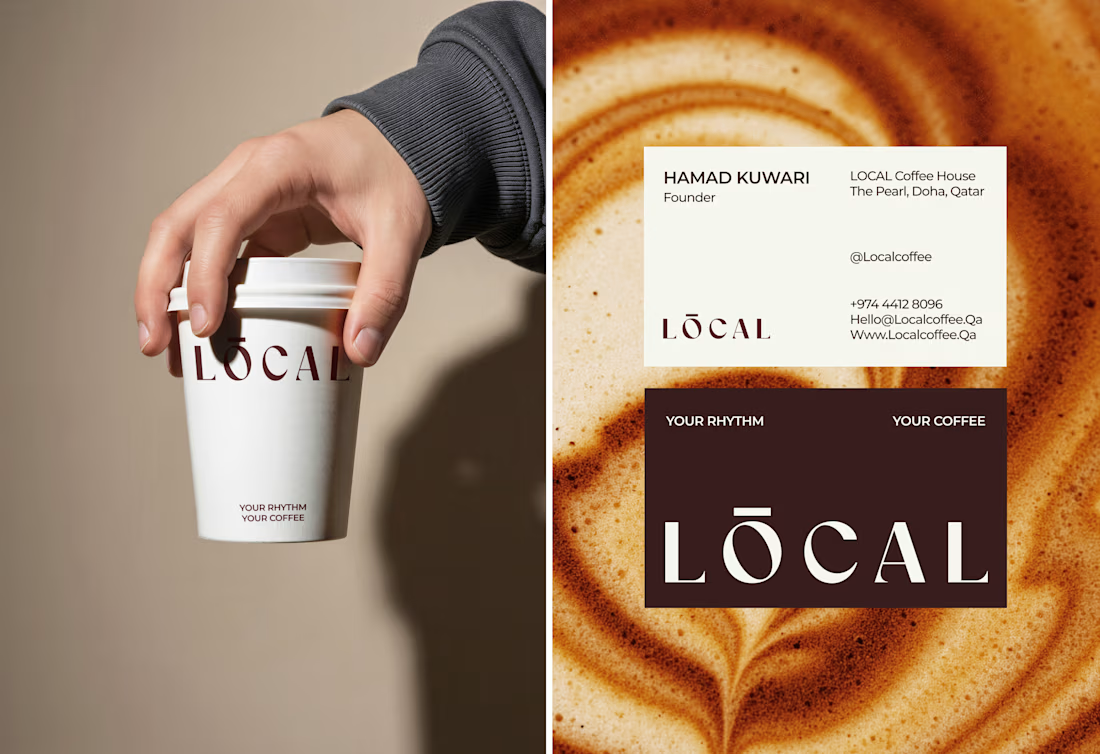
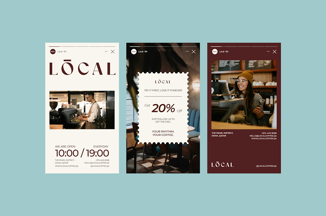
Built a coffee brand around the feeling of being local. ☕️
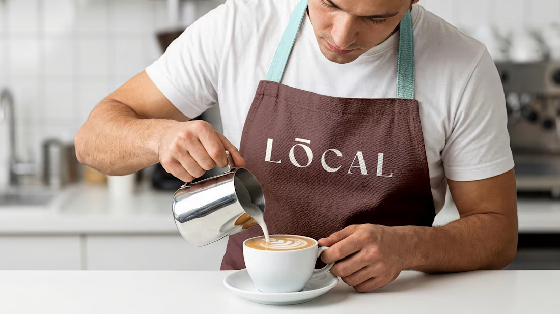
LOCAL is a modern café identity designed to feel warm, calm, premium, and familiar - without falling into the usual coffee-brand clichés.
From the wordmark and earthy color palette to typography, packaging, uniforms, and real-world applications, every detail was created to make the brand feel like a natural part of everyday life.
Brand Identity • Art Direction • Packaging • Visual System
What do you think - would you stop by LOCAL for a coffee? 👀
#BrandIdentity #Branding #CoffeeBrand #CafeBranding #PackagingDesign #VisualIdentity #GraphicDesign #BrandDesigner #CreativeDirection #ContraDesigner


Branding 😍