The network for creativity
Join 1.25M professional creatives like you
Connect with clients, get discovered, and run your business 100% commission-free
Creatives on Contra have earned over $150M and we are just getting started
Back to feedPost
Taste Test
Which one do you think is more attractive?


0 voted
0%
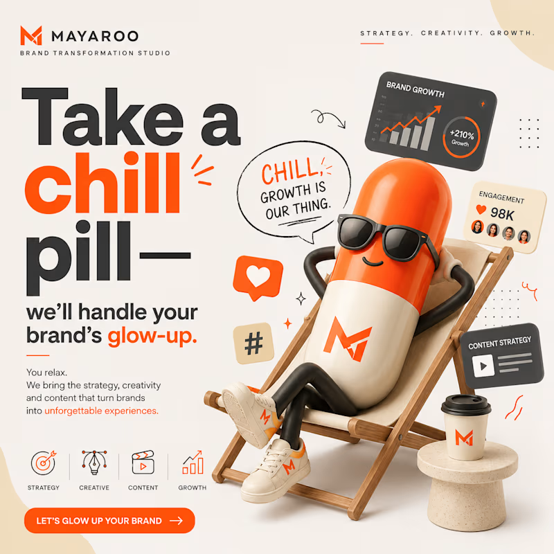
1 voted
100%
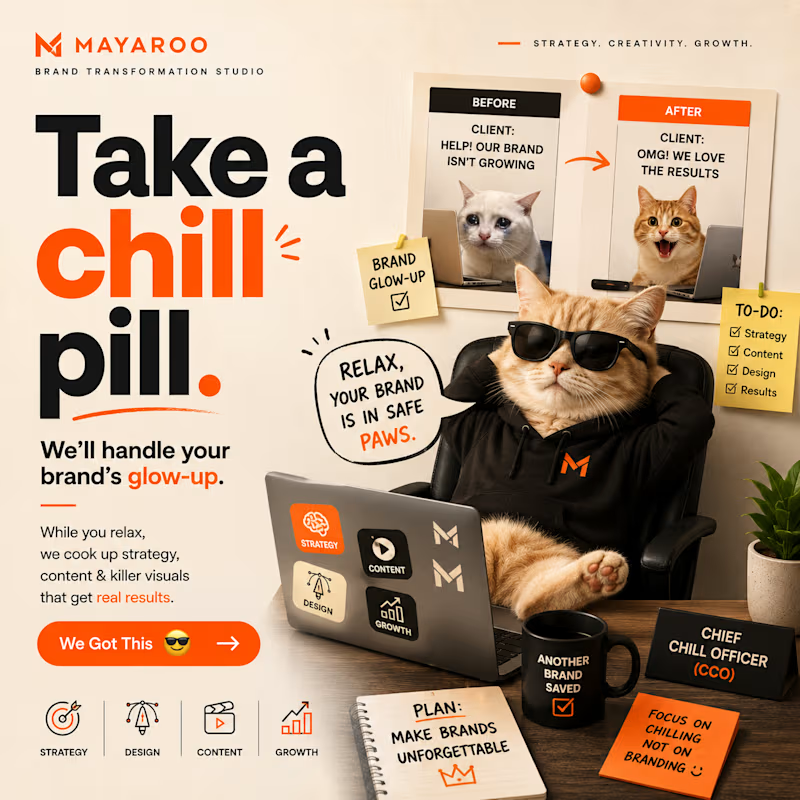
1 vote
Closed

Incredible work, on which platform did u design it?

Adobe Photoshop
The network for creativity
Join 1.25M professional creatives like you
Connect with clients, get discovered, and run your business 100% commission-free
Creatives on Contra have earned over $150M and we are just getting started





Related posts

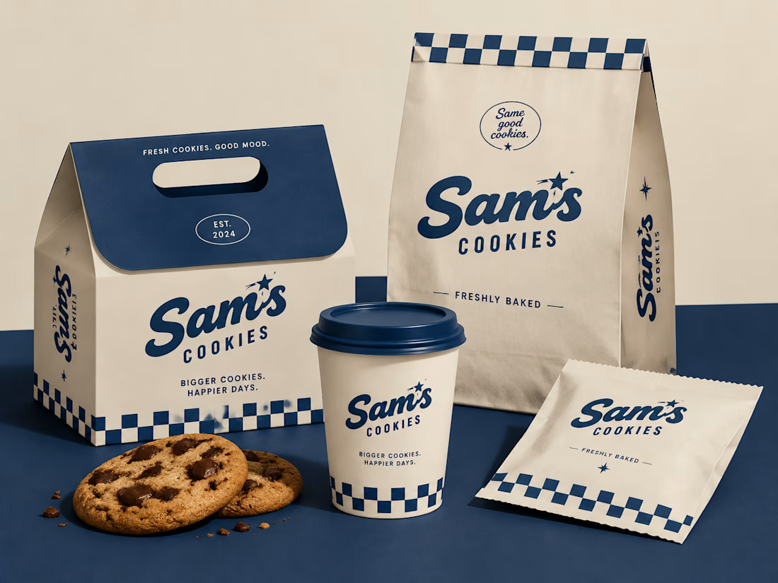
Turning a simple cookie into a memorable brand experience.
A packaging concept created to combine strategy, nostalgia, and a timeless American feel.
#BrandIdentity #PackagingDesign #FoodBranding #CreativeDirection

Beautiful design 😍

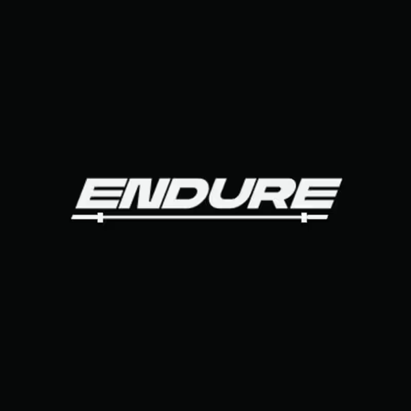
Design Direction Poll!
Two versions of the same Endure logo concept; same aggressive italic letterforms, same racing DNA. One detail changes the entire read.
Which version hits harder? 👇
14 voted
78%

4 voted
22%
18 votes
Closed



Took me a second to see the fold in the mark and now I can't unsee it, perfect for a dual-screen phone store. Was the slash always part of it or did it start as two plain stacked bars?