The network for creativity
Join 1.25M professional creatives like you
Connect with clients, get discovered, and run your business 100% commission-free
Creatives on Contra have earned over $150M and we are just getting started
Back to feedPost

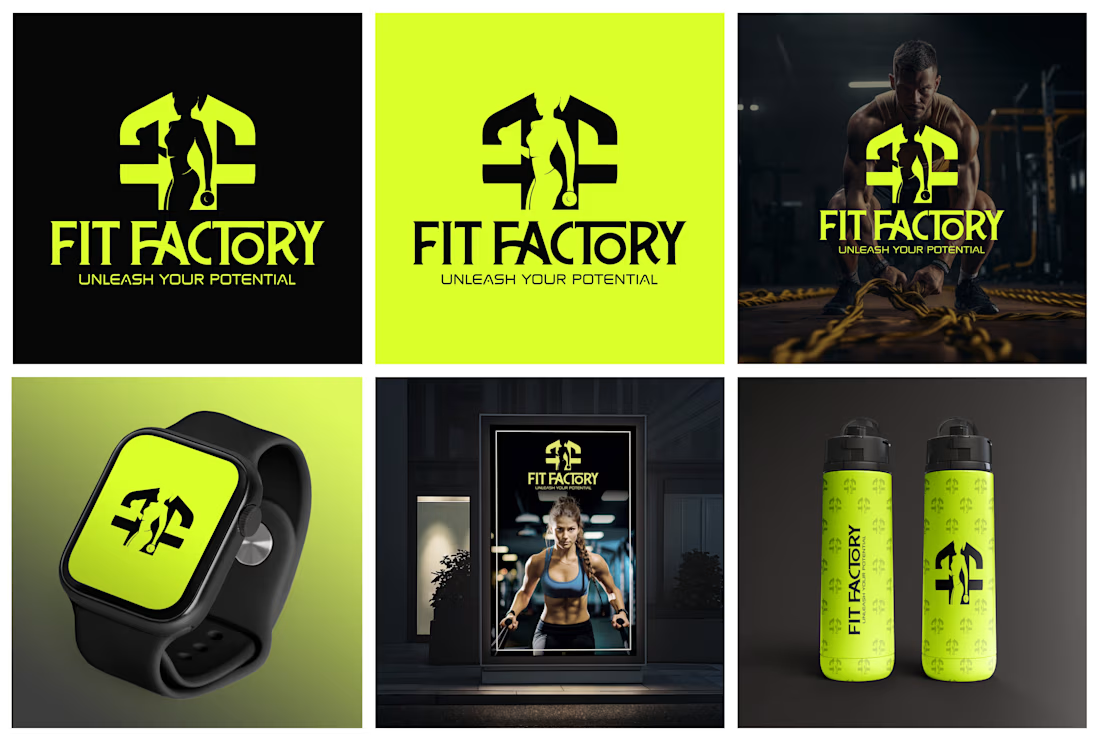

in love with that logo! this green's never been a color i gravitate towards naturally, but i could say for a fact this brand would draw me in not in spite of it, but in part, because of the boldness.

Thank you so much for your lovely comment! I love being bold with color, so this truly means a lot to me 🤍

Branding 😍
Thank you! Glad you liked it 😊

I love this
Thank you! 😊
you're welcome
Yeah, I really like what you're doing. I’d love for us to connect and learn more from you. I’m always looking for ways to improve my skills and see what else I can add to my creative and digital marketing journey. I’d really appreciate the opportunity to learn from you.

Carrying that exact neon-green across the watch face, poster, and bottles is what makes this read as one brand instead of a logo plus merch — most fitness identities let the accent color drift between touchpoints.
Thank you, Mark! That consistency was a key part of the concept, so I really appreciate you noticing it.

first impression, it really looks 'fit', you can feel those energy
Thank you! I’m glad the brand’s energy comes through so clearly.

Fit Factory is a strong name to design around. Gym branding usually swings either loud-and-aggressive or clean-and-minimal, which way did you take this one?
I went with the bold-and-aggressive direction. It felt like the right choice to reflect Fit Factory’s strength and energy.
Thanks for asking!

Awesome
Thank you! 😊
The network for creativity
Join 1.25M professional creatives like you
Connect with clients, get discovered, and run your business 100% commission-free
Creatives on Contra have earned over $150M and we are just getting started
Challenges
View all


Related posts




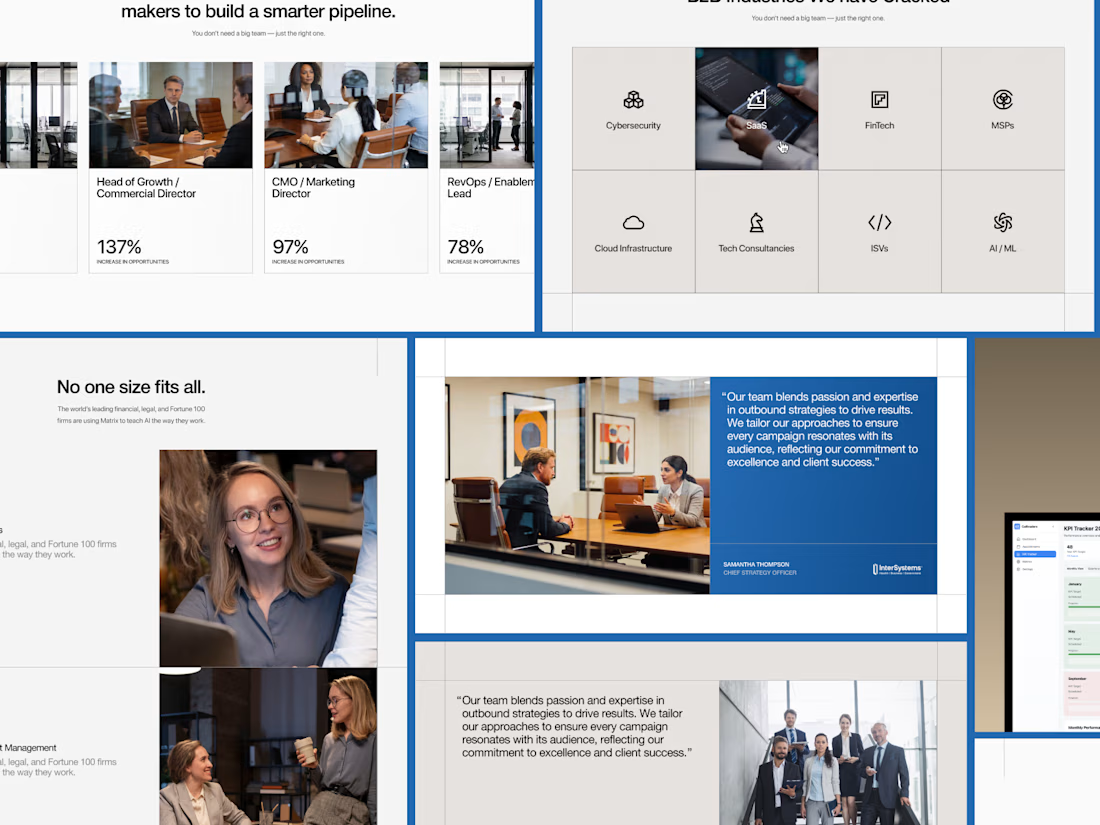
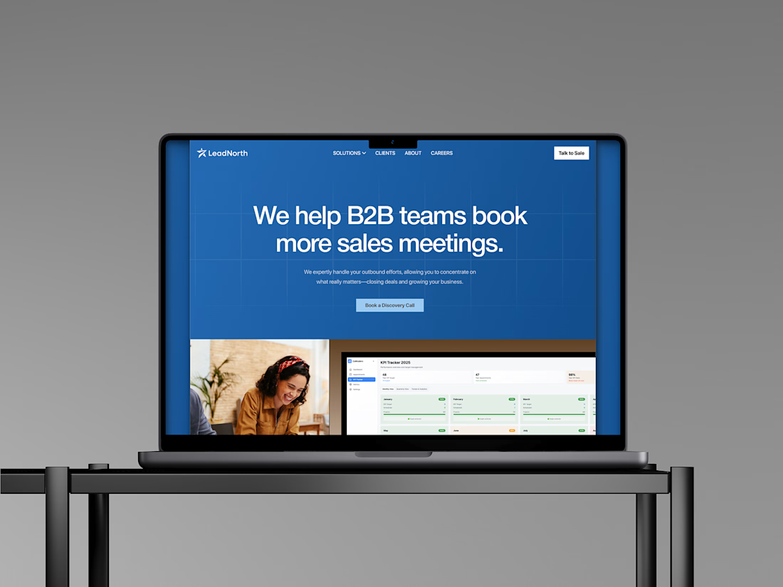
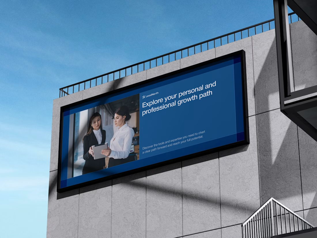
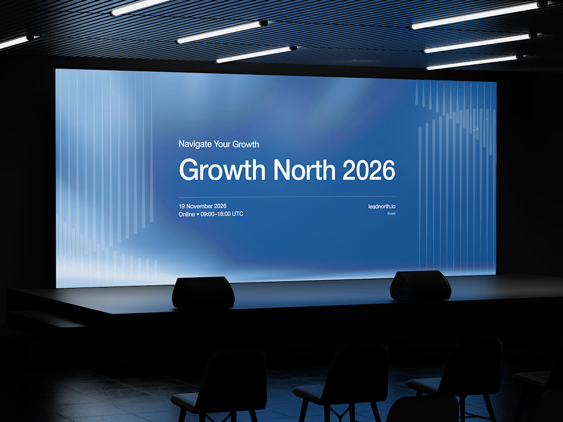


That saturated cobalt blue carries cleanly from the laptop hero onto the outdoor billboard and the Growth North 2026 stage screen.


Good logo