The network for creativity
Join 1.25M professional creatives like you
Connect with clients, get discovered, and run your business 100% commission-free
Creatives on Contra have earned over $150M and we are just getting started
Back to feedPost
Taste Test

I did micro editing on the Home page screen, the focus is on usability.

1 voted
100%

0 voted
0%

1 vote
Closed
The network for creativity
Join 1.25M professional creatives like you
Connect with clients, get discovered, and run your business 100% commission-free
Creatives on Contra have earned over $150M and we are just getting started

Challenges
View all


Related posts


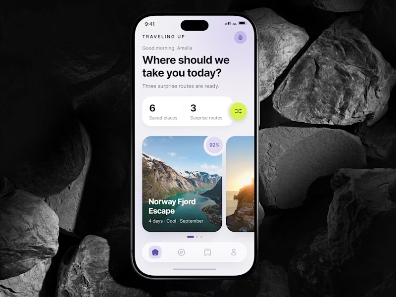
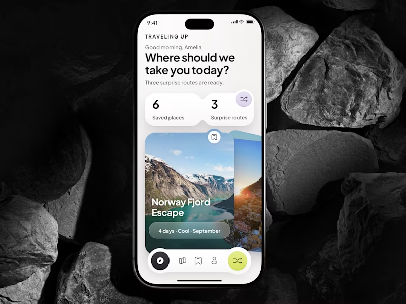
🎴 TASTY TEST 06/30: Which travel discovery experience would you choose?
Traveling Up is probably my first mobile concept outside client work in almost three years. It was inspired by a trip where not knowing the destination was part of the fun.
Same app. Same destination. Two ways to discover it.
🤍 A Clean Carousel
Calmer, lighter, more familiar.
💚 B Immersive Deck
Bigger imagery, stronger overlap, more tactile navigation.
Which one makes you want to swipe and see where the app takes you next?
A or B? 👇
#MobileAppDesign #TravelApp #MobileUX #UIDesign #ProductDesign #AsolDesign
23 voted
49%
24 voted
51%
47 votes
Closed


A or B? 😇👈
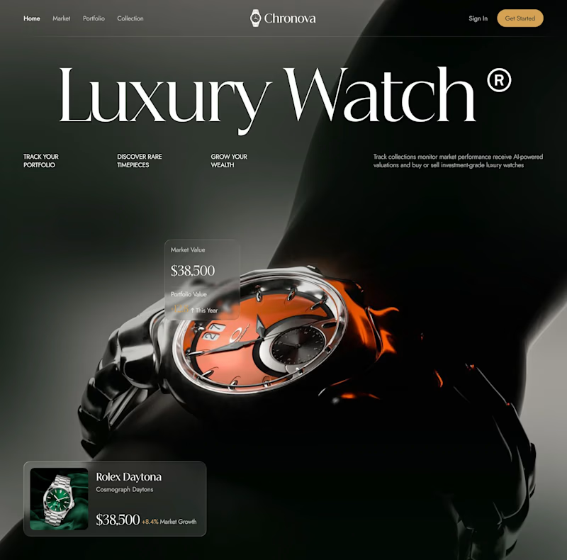
Which design delivers the better luxury feel and overall visual experience?

3 voted
17%

15 voted
83%
18 votes
Closed

Option B feels more luxurious to me—the watch gets a clearer hero moment and the warmer accent adds just enough energy against the dark field. The typography and product scale also make the comparison feel polished.


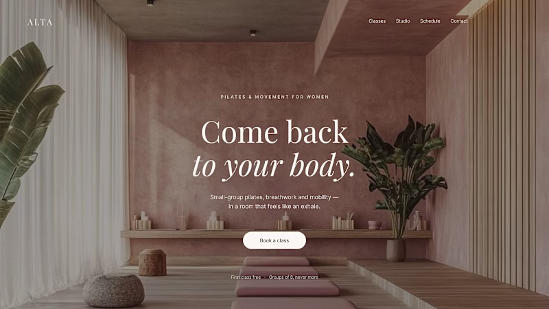
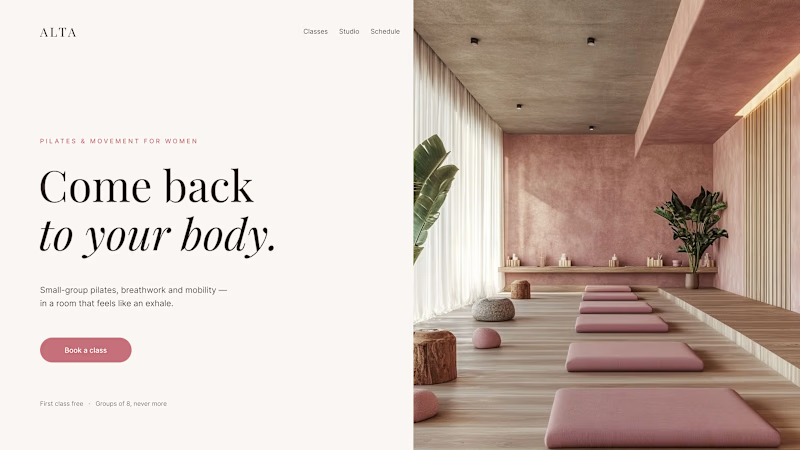
Where should the photo live - behind the words or beside them?
Same pilates studio, same headline.
01 - Photo as the background. Full-bleed atmosphere: the room wraps around the words. Immersive and cinematic, but the text only survives thanks to a darkening overlay laid over the image.
02 - Photo beside the text. A clean split: words on calm ground, the room in its own column. Everything readable at a glance, the trade is a little less drama.
One sells the feeling. The other sells the clarity. Which hero would make you book the class?

80 voted
75%
27 voted
25%
107 votes
Closed

1 nails it