The network for creativity
Join 1.25M professional creatives like you
Connect with clients, get discovered, and run your business 100% commission-free
Creatives on Contra have earned over $150M and we are just getting started
Back to feedPost
Why I audited Flourish through a neuro-inclusive lens.
Flourish is a mental wellbeing app. But decoration was drowning function, creating cognitive strain for users who need simplicity most.
I audited 14 screens and found 6 critical issues:
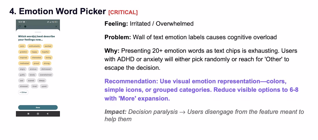
20+ emotion labels → Reduced to 6-8 visual options
Unexplained "Flourish Score" → Added plain language explanations
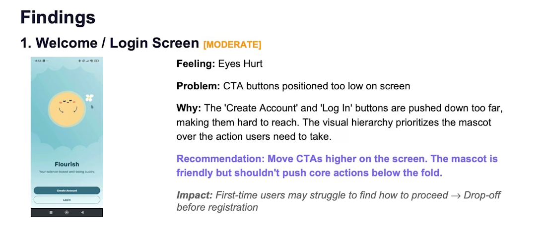
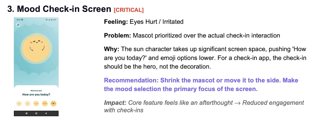
Mascot pushes check-in below fold → Prioritized function over decoration
Premature paywall → Delayed until users feel value
Mystery features with judgmental icons → Added context, removed guilt
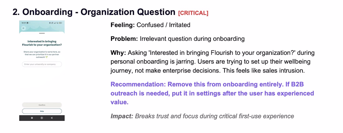
Enterprise questions in personal onboarding → Removed
The principle: When your user is struggling, every pixel counts.
Full case study: https://files.catbox.moe/6dvnxj.pdf
#UXDesign #Neurodiversity #MentalHealth #ProductDesign #Accessibility
The network for creativity
Join 1.25M professional creatives like you
Connect with clients, get discovered, and run your business 100% commission-free
Creatives on Contra have earned over $150M and we are just getting started
Related posts
Same dark SaaS aesthetic. Same orange-to-pink gradient accents. Same glass-card UI elements. Two different entry points. But the hero tells a completely different story.
Which hero would make you request a demo? 👇
19 voted
73%
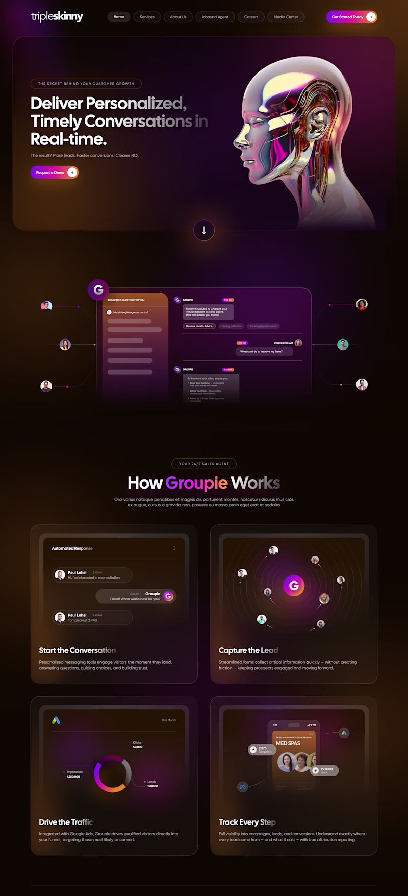
7 voted
27%
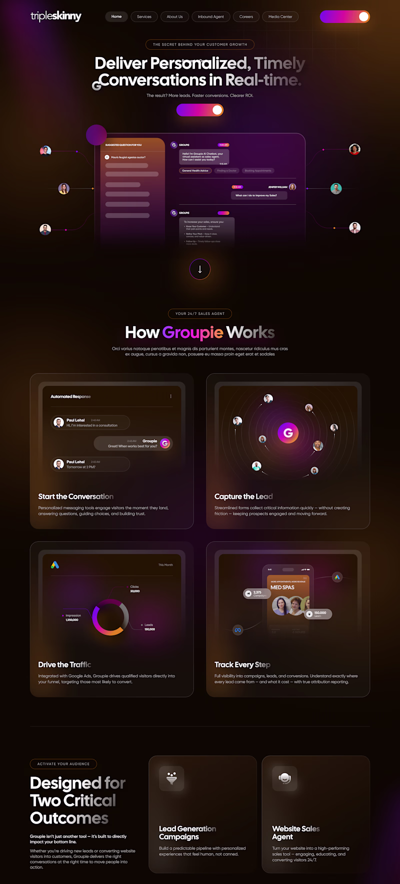
26 votes
Closed
Love this comparison. It’s a great reminder that great design isn’t just aesthetics it’s the story the hero tells. 👏
Wire Me is live 🟢
A premium B2B Finance SaaS template for Framer built for products like corporate cards, bill pay, and expense management.
What's inside:
12 pages including 3 pricing layouts, style guide, and legal pages
Full component library: navbar, cards, CTA banners, all reusable
Scroll-pinned features section with custom animated components
24-style type system (Inter Display + Inter), fully responsive across desktop, tablet, and mobile
Rebrand it in minutes swap the colors, drop in your copy, publish.
Launch price: $39 going up soon, so grab it early.
Live preview: https://wireme.framer.website/
Get Wire Me for $39: https://contra.com/payment-link/4rLxQn1i-wire-me-premium-fintech-saa-s-template
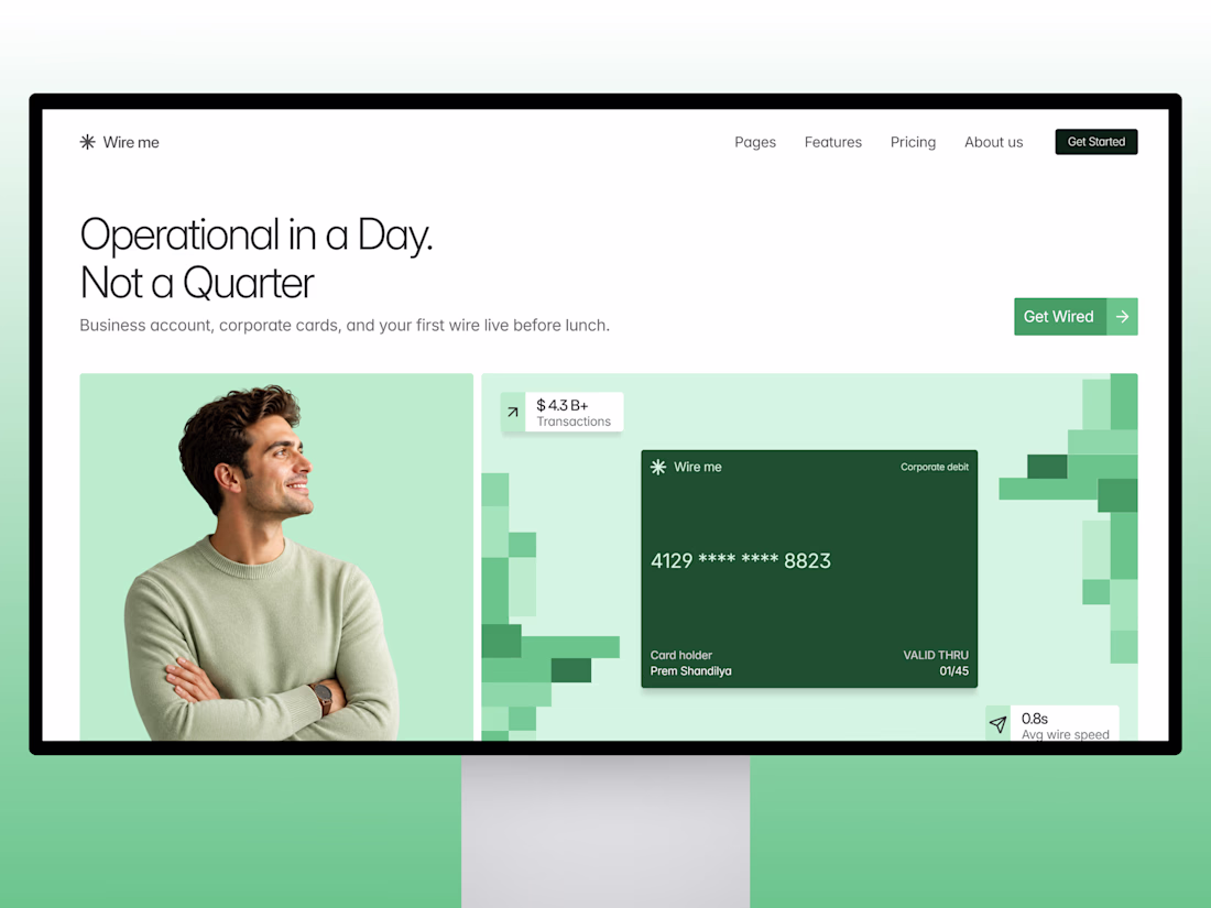
It's absolutely worth purchasing for anyone building a fintech product. Amazing work🔥🔥
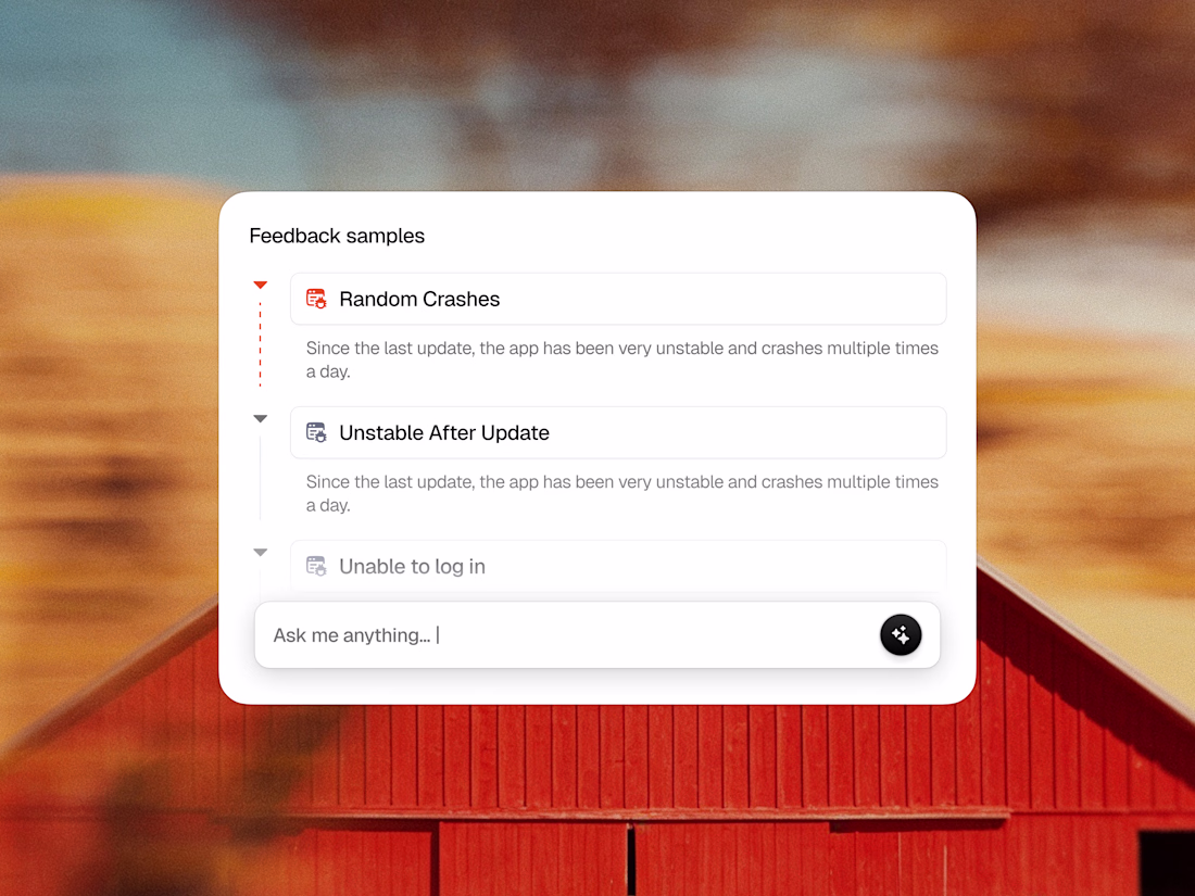
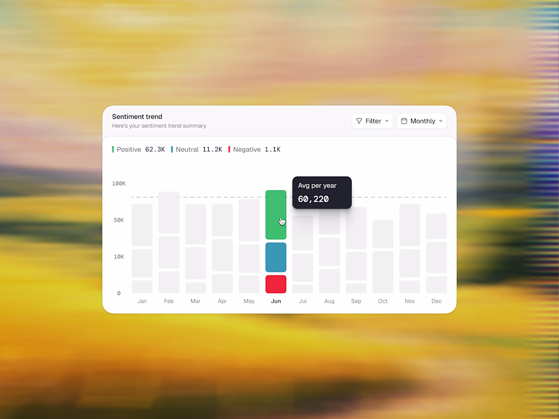
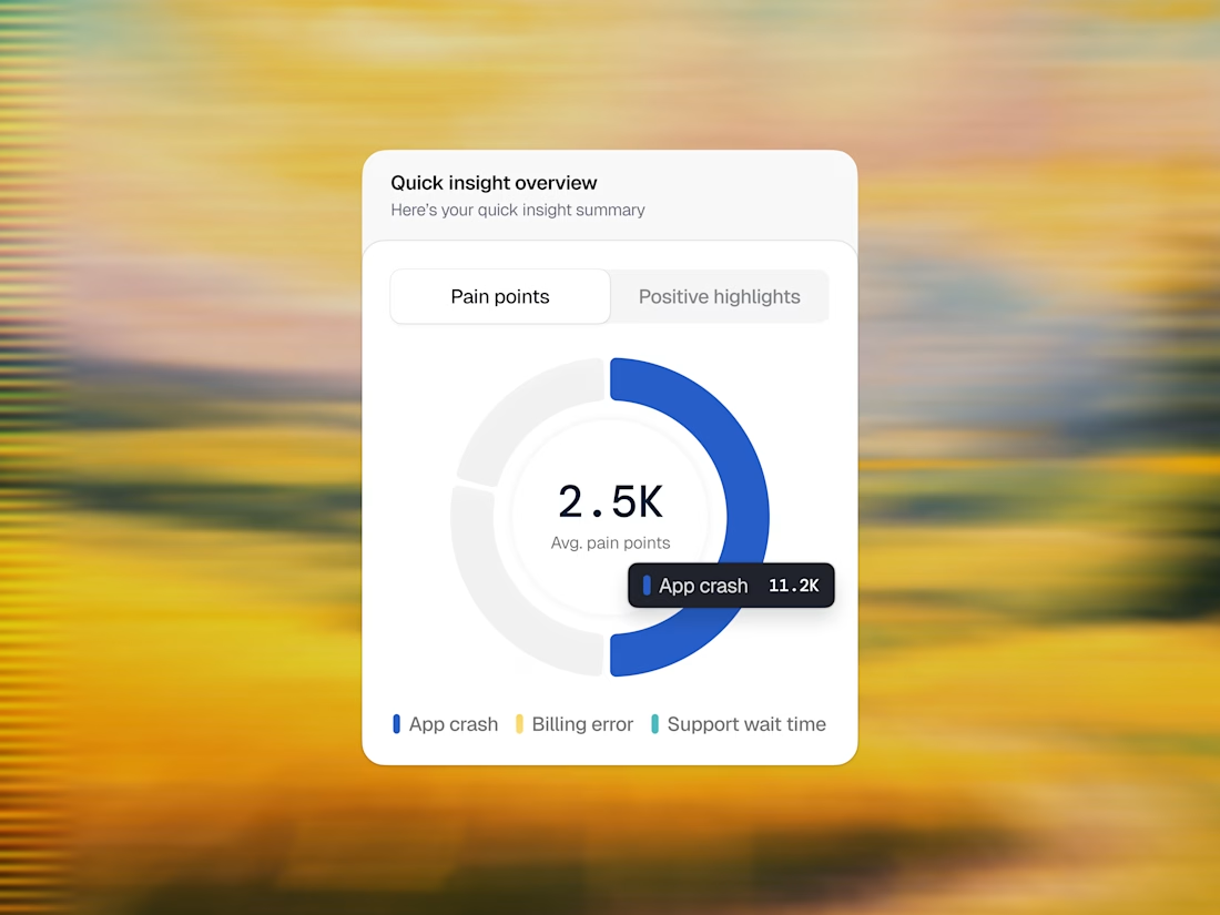
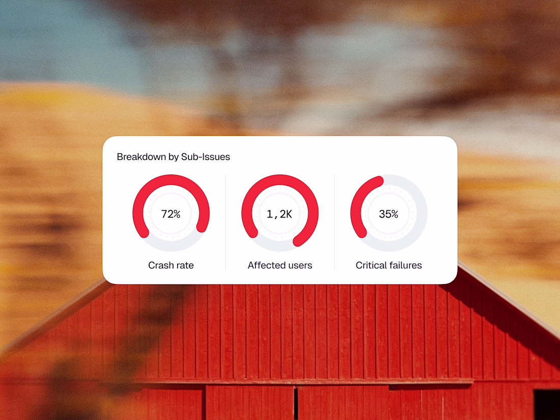
Enterprise design doesn’t have to feel clinical. It can feel like art. Here is a sneak peek into the UI components of Vega. 🛡️💡
Instead of building a massive, overwhelming dashboard grid, we focused on perfecting one isolated card at a time. By combining crisp typography, a soft neutral background, and high-contrast accents, these components pull critical errors out of the noise and turn them into clear, beautiful, and actionable data stories.
Swipe through to see the interaction states—from the AI search input bar to the color-coded metric loops.
Do you think the contrast hierarchy hits the right balance for real-world enterprise operations? 💬👇
Feedback, thoughts, and support are always appreciated. ❤️
Product DesignUX DesignAdobe IllustratorAdobe PhotoshopFigmafintechappuserinterfaceproductdesignUI Design
Challenges
View allTrending
Claude
Claude has entered the design space. How are you using Claude Design?
Contra University
Learn from expert creatives how to earn more using next-gen AI tools.
fifaworldcup2026
The World Cup is here and the whole world's watching. How are you designing for the world stage?
creativeaiflow
Creative AI workflows are evolving. What tools do you use, and what are their strengths and weaknesses?
freelancerlife
Freelancer life is wins, pivots, and everything in between. What’s yours right now?