The network for creativity
Join 1.25M professional creatives like you
Connect with clients, get discovered, and run your business 100% commission-free
Creatives on Contra have earned over $150M and we are just getting started
Back to feedPost

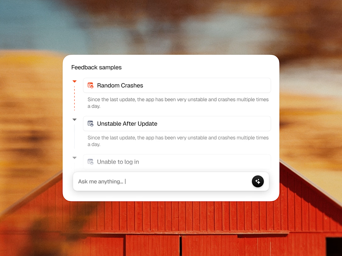
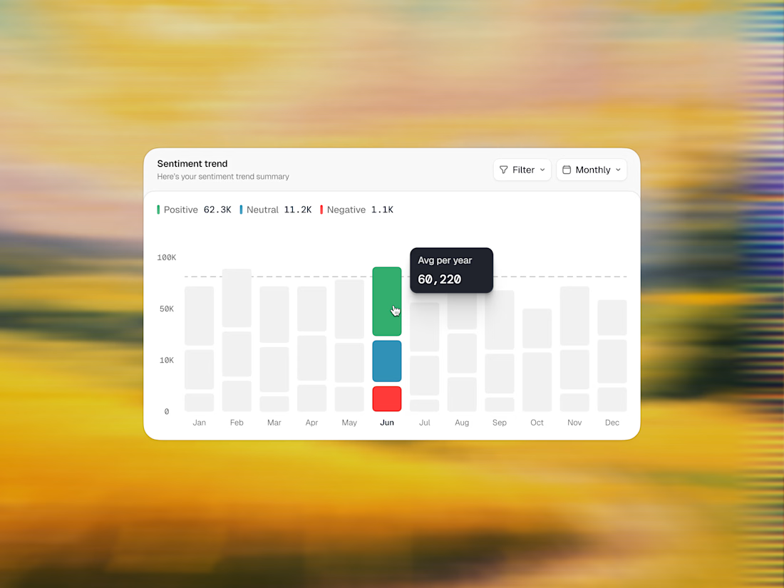
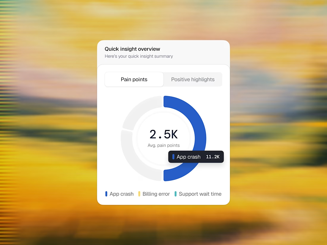
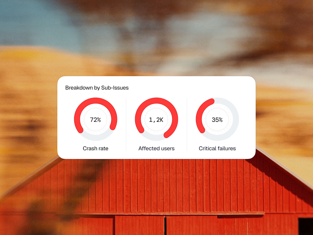
Enterprise design doesn’t have to feel clinical. It can feel like art. Here is a sneak peek into the UI components of Vega. 🛡️💡
Instead of building a massive, overwhelming dashboard grid, we focused on perfecting one isolated card at a time. By combining crisp typography, a soft neutral background, and high-contrast accents, these components pull critical errors out of the noise and turn them into clear, beautiful, and actionable data stories.
Swipe through to see the interaction states—from the AI search input bar to the color-coded metric loops.
Do you think the contrast hierarchy hits the right balance for real-world enterprise operations? 💬👇
Feedback, thoughts, and support are always appreciated. ❤️
Product DesignUX DesignAdobe IllustratorAdobe PhotoshopFigmafintechappuserinterfaceproductdesignUI Design



Looks great dude

this is awesome!!!

Everything looks polished! ✨
The network for creativity
Join 1.25M professional creatives like you
Connect with clients, get discovered, and run your business 100% commission-free
Creatives on Contra have earned over $150M and we are just getting started








Related posts



A personal brand concept exploring the future of AI-powered performance eyewear.
I wanted to create something that blends sports, technology, and futuristic aesthetics into one cohesive visual identity.
From the eyewear design and product visuals to art direction, 3D renders, and motion every detail was developed to give AVC its own distinctive character.
Not just another pair of sports glasses. A vision of what next-generation wearable technology could look like.
More explorations coming soon.

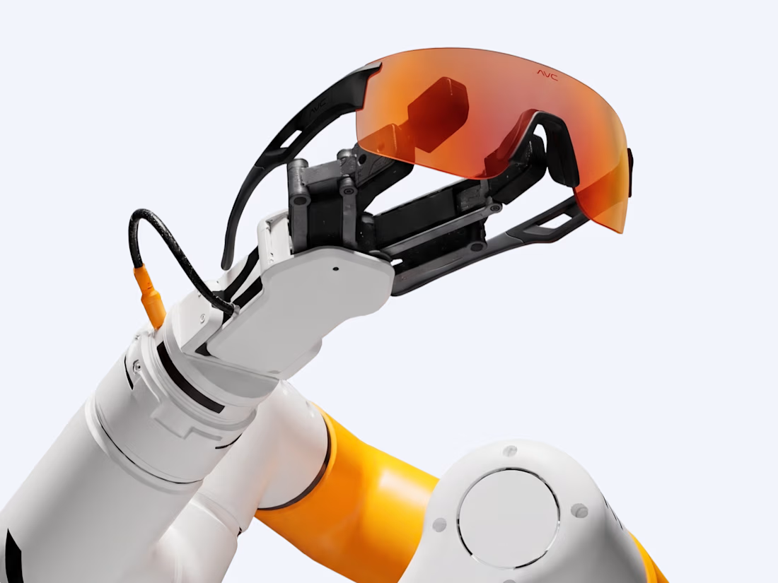
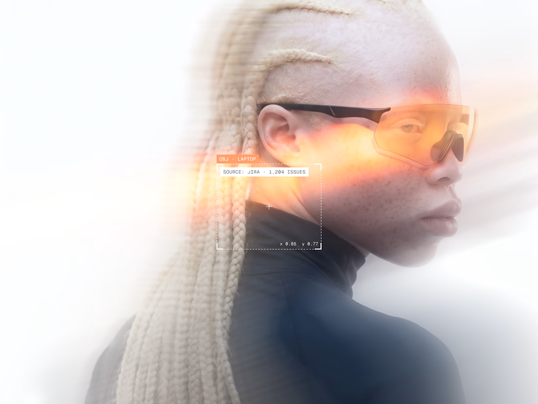
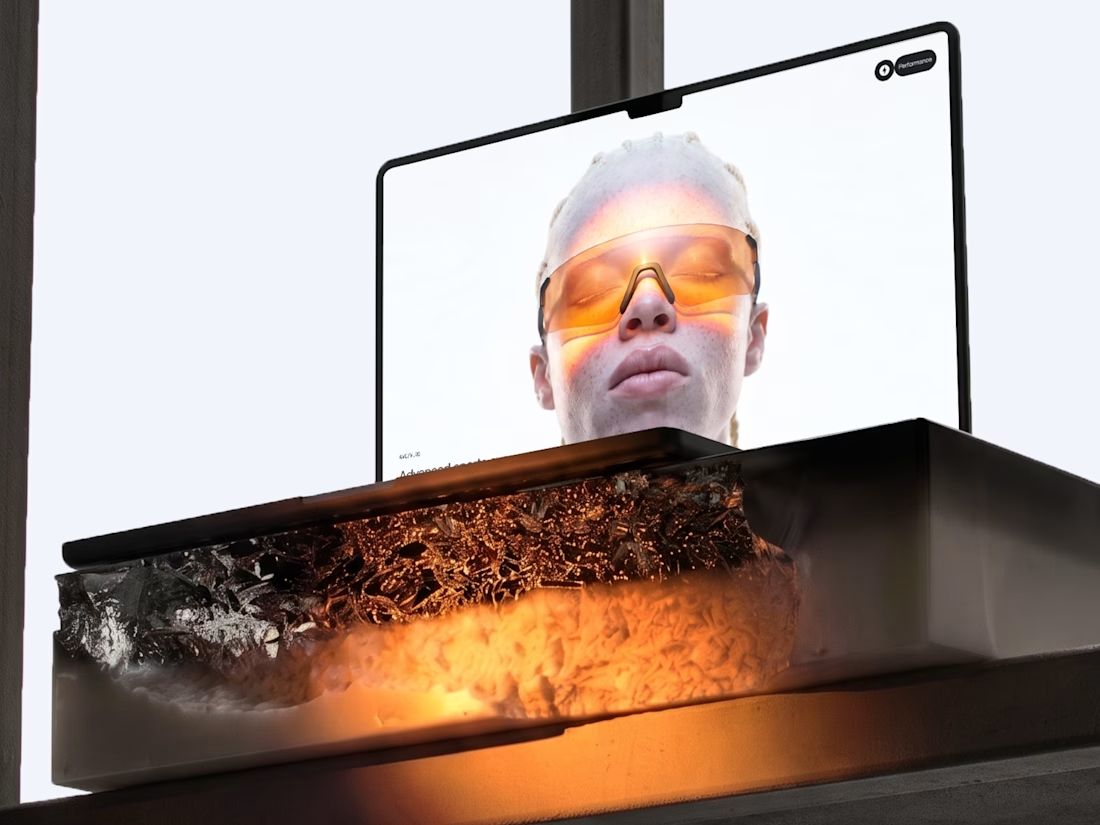

Blending sports and tech into eyewear is a tough positioning, but the system holds together — the renders, art direction, and product visuals all speak the same visual language rather than competing. Where the execution lands next will be in the packaging and retail touches; if...


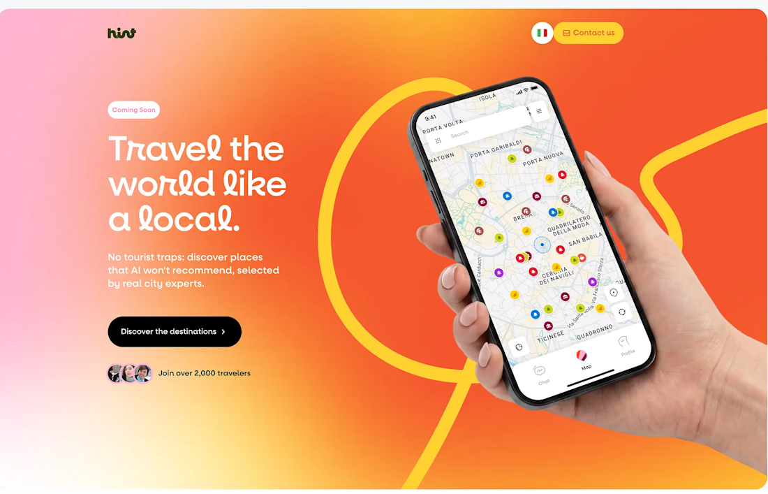
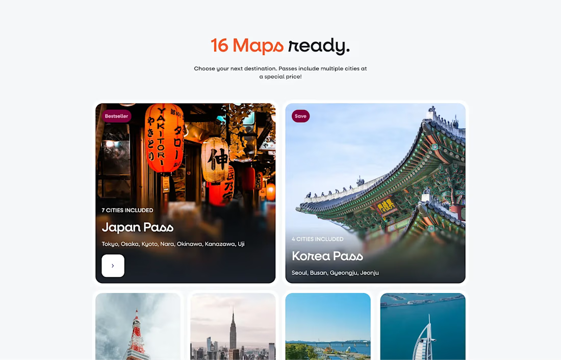
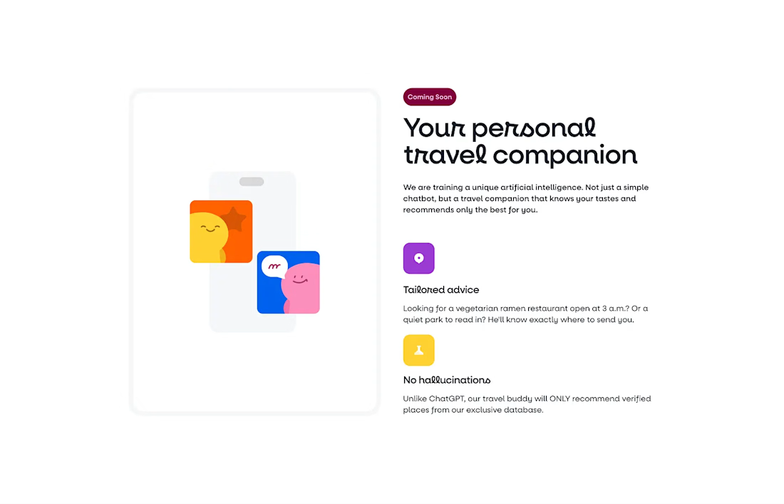
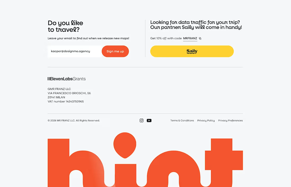


The design feels clean and inviting. Love the direction for Hint!