The network for creativity
Join 1.25M professional creatives like you
Connect with clients, get discovered, and run your business 100% commission-free
Creatives on Contra have earned over $150M and we are just getting started
Back to feedPost
Taste Test

Same dark SaaS aesthetic. Same orange-to-pink gradient accents. Same glass-card UI elements. Two different entry points. But the hero tells a completely different story.
Which hero would make you request a demo? 👇

19 voted
73%
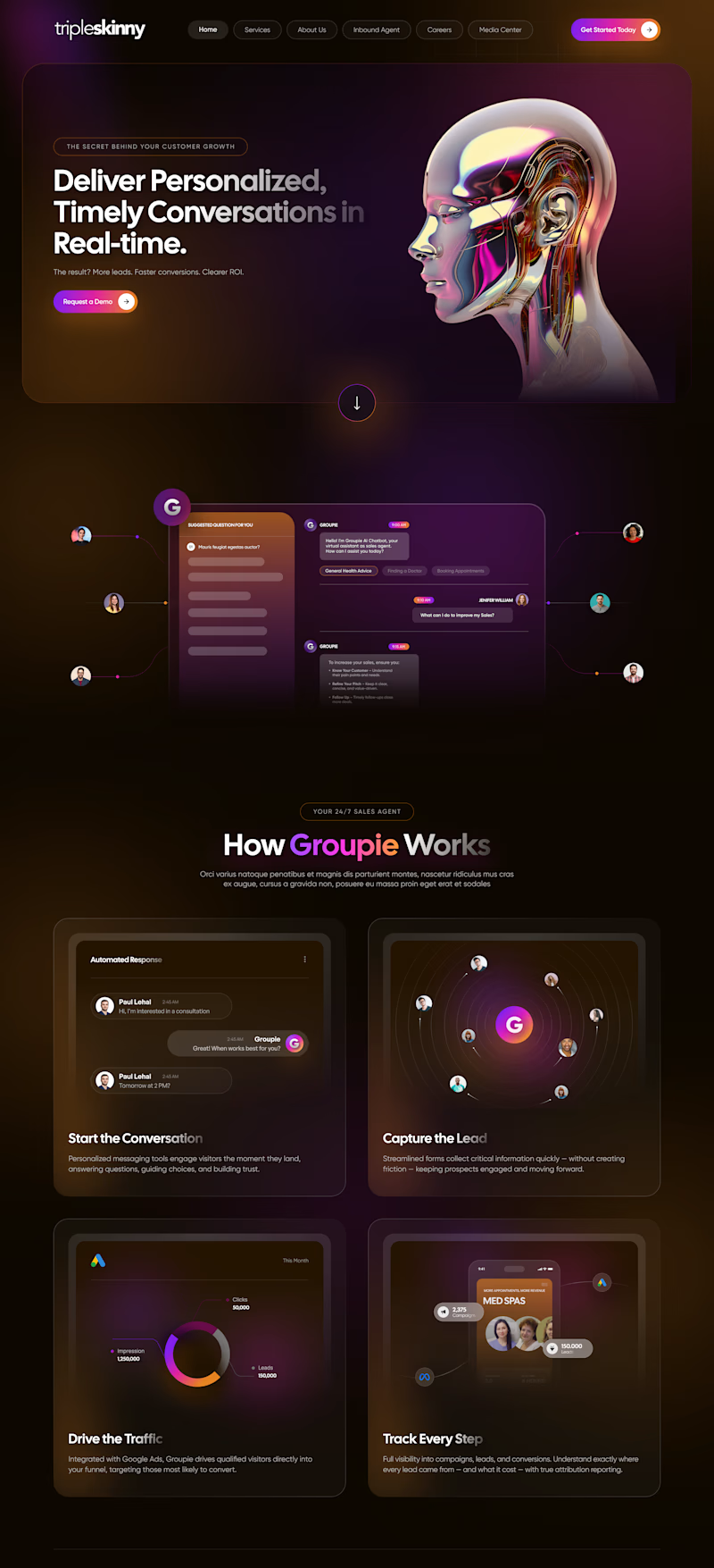
7 voted
27%
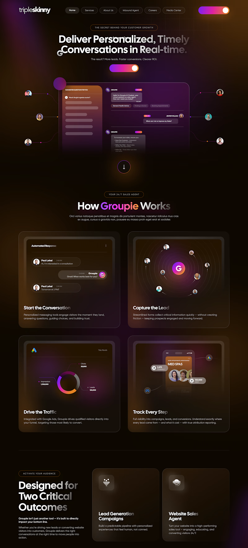
26 votes
Closed

Love this comparison. It’s a great reminder that great design isn’t just aesthetics it’s the story the hero tells. 👏

Going with the full blend ambient hero. 🔥 It drops you straight into the product's world rather than explaining it from the outside.

AI Visual Hero

One of the best designs I’ve seen today. Really solid work 👏 keep pushing. Option A definitely hits harder; that clean, ambient lighting is exactly what makes a web canvas feel premium

Design magic.


I prefer the AI visual Hero

I agree with you

I'd actually lean toward the full bleed ambient version. Seeing the actual chat dashboard interface right above the fold builds immediate clarity and trust. It shows exactly what the product does without forcing the user to scroll to find out.
A good hero never miss

the first one is amazing bro


Excellent work !
The network for creativity
Join 1.25M professional creatives like you
Connect with clients, get discovered, and run your business 100% commission-free
Creatives on Contra have earned over $150M and we are just getting started
Trending
retrofuturism
Share your favorite designs from the past exploring the distant future. Or your own take on the aesthetic 🚀
halftone
Dots. Texture. Grain. Let's see your designs using the halftone technique.

Midjourney
Creatives are showing off what they're making with Midjourney.
colorgrade
Video editors sound off: How do you enhance the mood of your video in color grading?
Related posts


Awesome!

How do you keep a brand's promise of calm intact once real users start clicking through checkout?
Mudita builds minimalist devices around one idea: technology that harmonizes with your life instead of competing for your attention. The brandbook lays that promise out in detail - tone, restraint, what the brand should never feel like. My job was carrying that same discipline into the product itself.
I worked across the checkout flow, the storefront and category browsing, and the product page above the fold - three surfaces where small frictions had quietly built up against the brand's own case for calm. The brandbook gave the rules. The UI work was making sure those rules survived contact with a real cart and a real user.
For the case study visuals, I used AI for the first time to produce product footage 🤖 - wind moving through a scene, an object drifting in place. Higgsfield was genuinely a good way to learn that workflow fast.
Full case study - actual before/after breakdowns - is up on Behance 🔗, linked below.
Genuinely curious where people land on this: generating production assets with AI is fast, and honestly kind of fun as a workflow - but there's real pushback that it's taking work away from people who used to shoot this stuff. Where do you fall on that?


The checkout flow detail is what stands out to me, that's usually where a brand's calm promise turns into three different button behaviors fighting each other. On your AI question, I think it matters less whether it's fast and more who's checking the output against the brand's...




COOOL ASF


