
David Balinga
Product Designer | Neuro-Inclusive UX
Ready for work
David is ready for their next project!

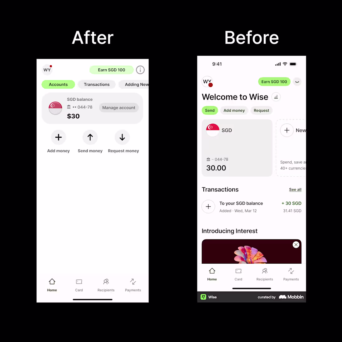
My first Wise redesign got 37% approval. So I iterated and tested again.
80% of neurodivergent users preferred my second version.
What changed: removed video clutter, made balance the primary focus, simplified icons with labels, matched the app's aesthetic.
Results from 30 ND users:
88% of anxiety users preferred it
81% of autistic users preferred it
79% of ADHD users preferred it
The lesson: my brain finds the friction. Testing tells me which solutions work.
I reduce emotional friction for neurodivergent users.
Full case study: davidbalinga.com (http://davidbalinga.com)
1
21
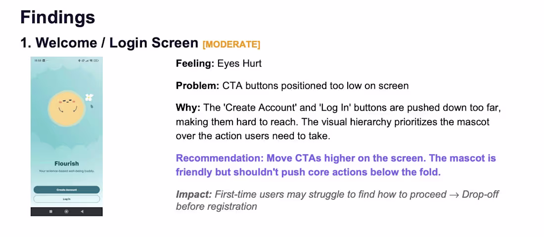
Why I audited Flourish through a neuro-inclusive lens.
Flourish is a mental wellbeing app. But decoration was drowning function, creating cognitive strain for users who need simplicity most.
I audited 14 screens and found 6 critical issues:
20+ emotion labels → Reduced to 6-8 visual options
Unexplained "Flourish Score" → Added plain language explanations
Mascot pushes check-in below fold → Prioritized function over decoration
Premature paywall → Delayed until users feel value
Mystery features with judgmental icons → Added context, removed guilt
Enterprise questions in personal onboarding → Removed
The principle: When your user is struggling, every pixel counts.
Full case study: https://files.catbox.moe/6dvnxj.pdf
#UXDesign #Neurodiversity #MentalHealth #ProductDesign #Accessibility
22
180
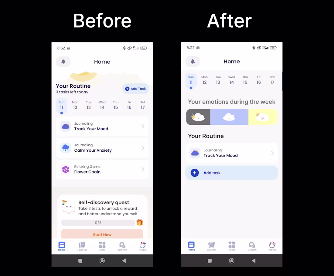
Breeze wants to help me build habits. But the home screen gave me decision paralysis.
Before:
→ 3 tasks at once, brain tries to read all simultaneously
→ "Add Task" top right, too far when overwhelmed
→ "3 tasks left", guilt, not motivation
→ "Self-discovery quest" on home, why?
After: → One task visible, no forced parallel processing
→ "Add task" inline, easy to reach
→ "Your emotions this week", now I know why I'm tracking
→ Quest moved to Tests, where it belongs
Original asked too much. Redesign says: "Here's one thing to do."
Calm. Clear. Completable.
1
22
212
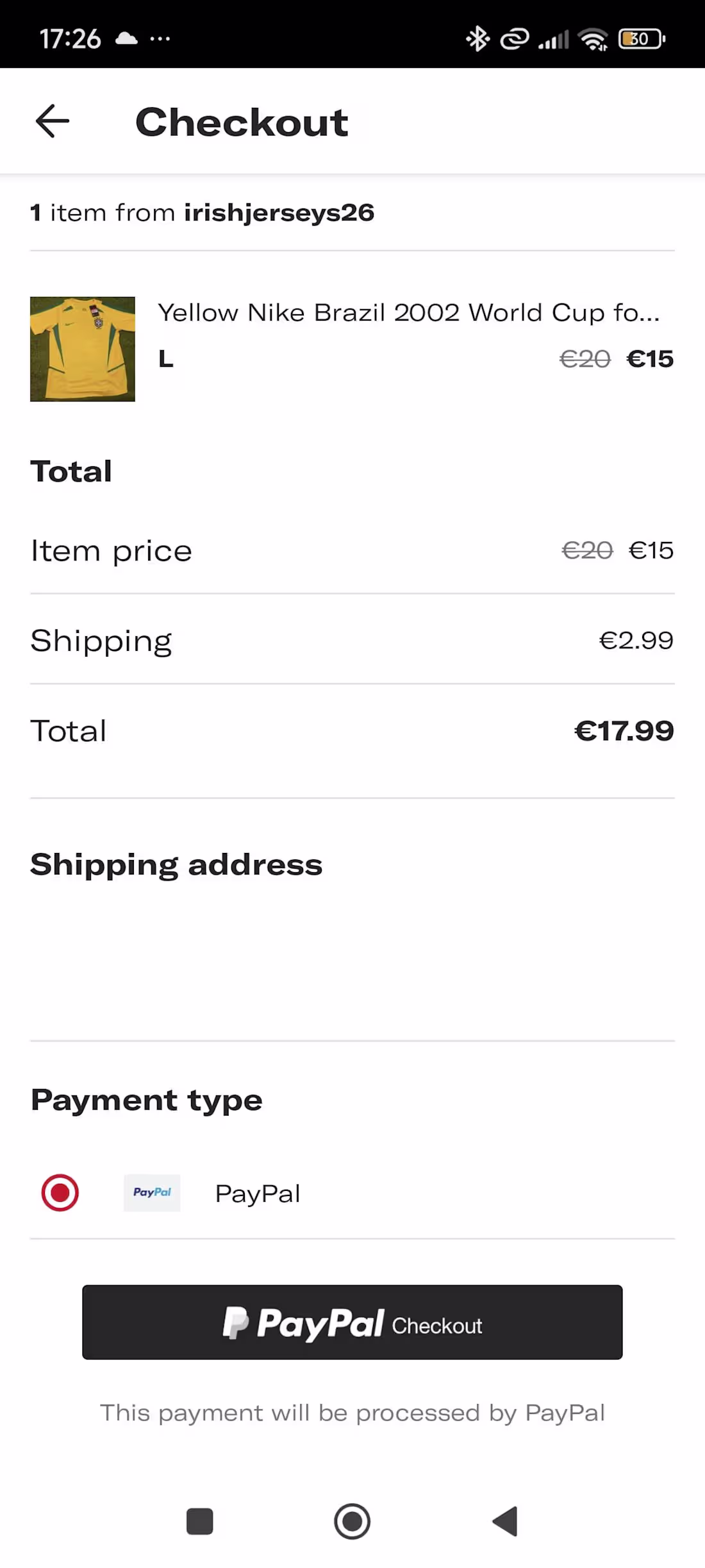
Depop's checkout is leaking money.
You see "€15" first. Feels good. Then you scroll. Shipping: €2.99. Then the real total: €17.99.
That's not a breakdown, it's a slow surprise. And for anyone with decision fatigue or math anxiety, it's enough to close the app.
Fix: Lead with the total. Show the breakdown underneath.
One change. Less abandonment.
I do neuro-inclusive UX audits. I find where stressed users drop off.
10
140
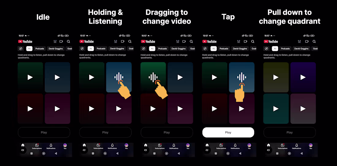
I was scrolling YouTube for 10 minutes trying to find something to watch.
Why is this so slow?
YouTube makes you think: → Look at thumbnail → Read title → Guess if it's worth watching
That's effort. For every video.
So I designed Spotlight: → 4 videos at a time → Drag to hear a preview → Your gut decides in 3 seconds
Thumbnails make you guess. Sound lets you know.
Stop processing. Start flowing.
15
197
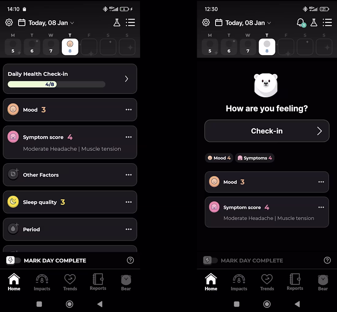
Health tracking apps serve vulnerable users.
The last thing they need is an interface that adds to their burden.
I audited Bearable as a neurodivergent user:
❌ Too many options fighting for attention
❌ '4/8' progress feels like guilt
❌ Data buried below the fold
My redesign:
✅ One clear CTA
✅ No pressure counters
✅ Summary visible at a glance
26
226
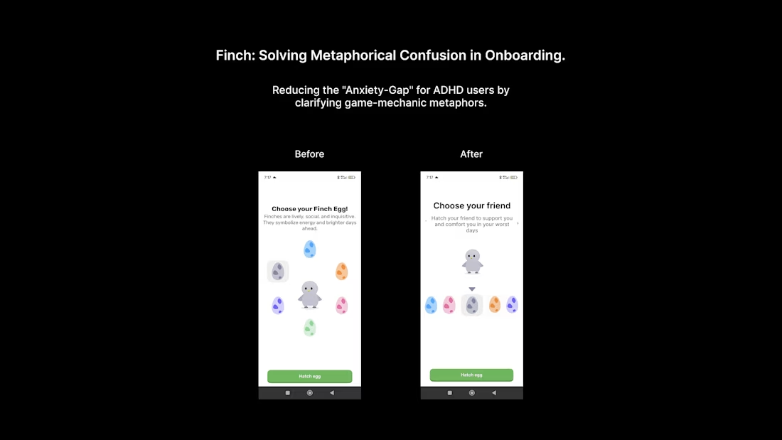
Why I redesigned Finch Care (https://www.linkedin.com/company/finchcare/) for the Neurodivergent 20%.
Most apps lose users on Day 1 because of Metaphorical Confusion. For an ADHD or Autistic brain, abstract game mechanics like "energy" can create a massive Initiation Block.
I conducted a Surgical Audit of the Finch onboarding to replace these metaphors with Literal Clarity.
The Goal: Reduce the "Anxiety-Gap" and increase first-day retention.
#UXDesign (https://www.linkedin.com/search/results/all/?keywords=%23uxdesign&origin=HASH_TAG_FROM_FEED) #Neurodiversity (https://www.linkedin.com/search/results/all/?keywords=%23neurodiversity&origin=HASH_TAG_FROM_FEED) #ADHD
(https://www.linkedin.com/search/results/all/?keywords=%23adhd&origin=HASH_TAG_FROM_FEED)View full case study here: https://files.catbox.moe/bgynec.pdf
17
157