The network for creativity
Join 1.25M professional creatives like you
Connect with clients, get discovered, and run your business 100% commission-free
Creatives on Contra have earned over $150M and we are just getting started
Back to feedPost

Sometimes one tiny detail is enough to build an entire brand identity.
Koto just redesigned Giffgaff, and my favourite part is how they've turned the final “f” in the logo into a small arrow.
That simple shape becomes the foundation of the whole visual system, appearing across the website, app, packaging, and marketing materials.
They've also introduced a bold acid-green palette, a custom typeface called Giffsans, and a more natural approach to photography.
What I like most is that the identity doesn't feel like a completely different brand. It's still recognizably Giffgaff, just more confident and expressive.
A good reminder that strong branding doesn't always require reinventing everything.

My favourite use is the arrow turning into the "Next" button in the app, so the logo literally becomes UI. I do something similar in presentation templates, where one shape from the logo ends up as the section divider.
The network for creativity
Join 1.25M professional creatives like you
Connect with clients, get discovered, and run your business 100% commission-free
Creatives on Contra have earned over $150M and we are just getting started



Related posts


This year we've done brand identities for companies in AI, pet health and car rental.
Before you ask a studio for a rebrand, write down the actual mismatch. Something like “enterprise buyers read us as a side project”. Then note where you've seen it, like lost deals or sales feedback.
A named mismatch is something a designer can scope.

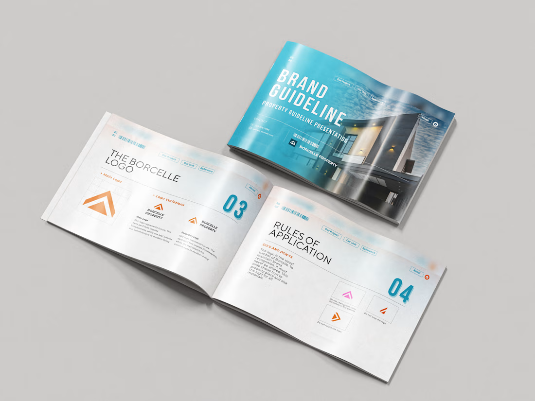
Just wrapped a brand identity concept for Haven Ridge Properties, a real estate developer selling to first-time buyers and investors.
The challenge: feel premium without feeling cold.
The answer was two ideas shelter and growth.
The mark is a roofline that doubles as an upward arrow: home and long term value in one symbol.
What's inside the guidelines:
• Primary and secondary logo lockups
• Logo usage rules
• Typography system
• Colour palette with clear roles
• Imagery direction
• Digital and print applications
Which detail stands out most to you?
#branding #brandidentity #logodesign #brandguidelines #realestate

The era of custom brand systems is here.
I’ve been building systems that make it easy to tweak, adapt, and evolve brand assets without starting from scratch every time.
Here’s a little preview of one I’m working on 👀