The network for creativity
Join 1.25M professional creatives like you
Connect with clients, get discovered, and run your business 100% commission-free
Creatives on Contra have earned over $150M and we are just getting started
Back to feedPost


The network for creativity
Join 1.25M professional creatives like you
Connect with clients, get discovered, and run your business 100% commission-free
Creatives on Contra have earned over $150M and we are just getting started

Challenges
View all


Related posts

Client’s choice vs. Designer’s choice 👀
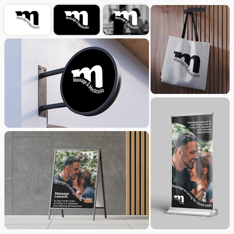
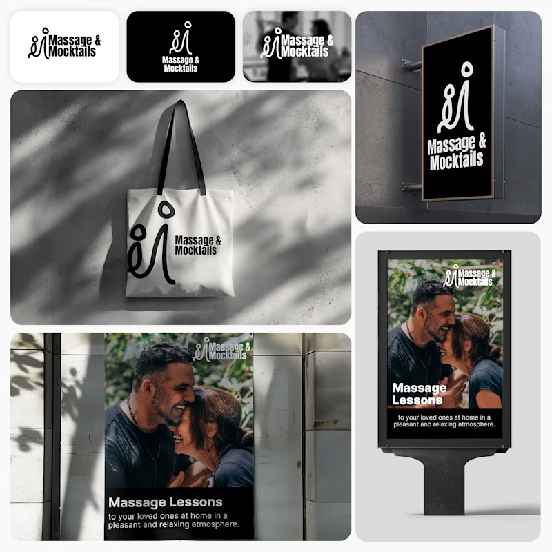
I’m currently working on a branding project for Massage & Mocktails — a concept built around couples learning massage together in a relaxed, social atmosphere.
These are two early, black & white directions from Stage 2 of my branding process, before moving into color, typography, and the full visual system.
The interesting part?
My client chose Concept 1. I chose Concept 2.
Now I’m curious what other creatives think.
Which direction would you choose — 1 or 2? And why?
Sometimes the most interesting part of branding is seeing how differently a client and a designer respond to the same brief.
21 voted
44%
27 voted
56%
48 votes
Closed

Concept 2 for me. That interlocking figure mark reads as two people meeting, which is the actual brief here, so it gives you more to build a system on. Concept 1 is the safer, more literal pick, which is usually why clients reach for it.



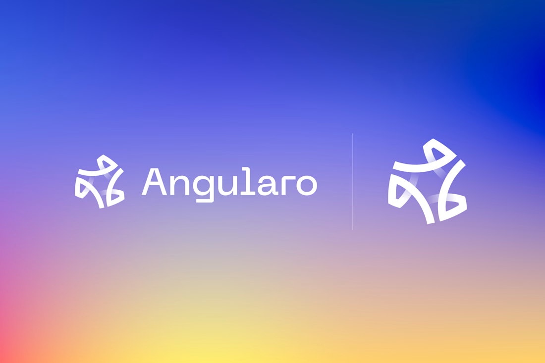
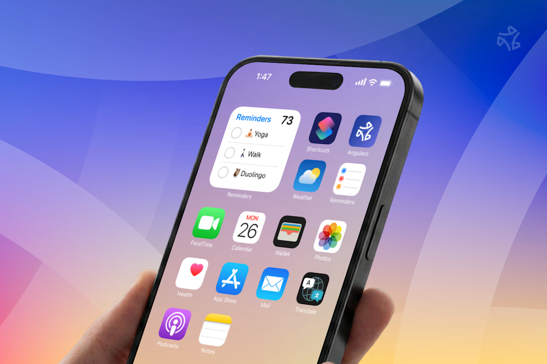
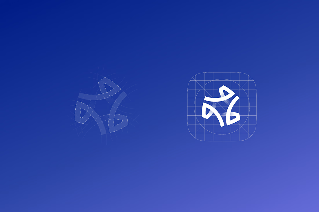

The wide counters are what let it survive the home screen — in that grid of other app icons it still reads as one shape instead of collapsing into noise, which is the real test for a CRM mark. Is the gradient locked to the logo, or does it shift across the product surfaces?

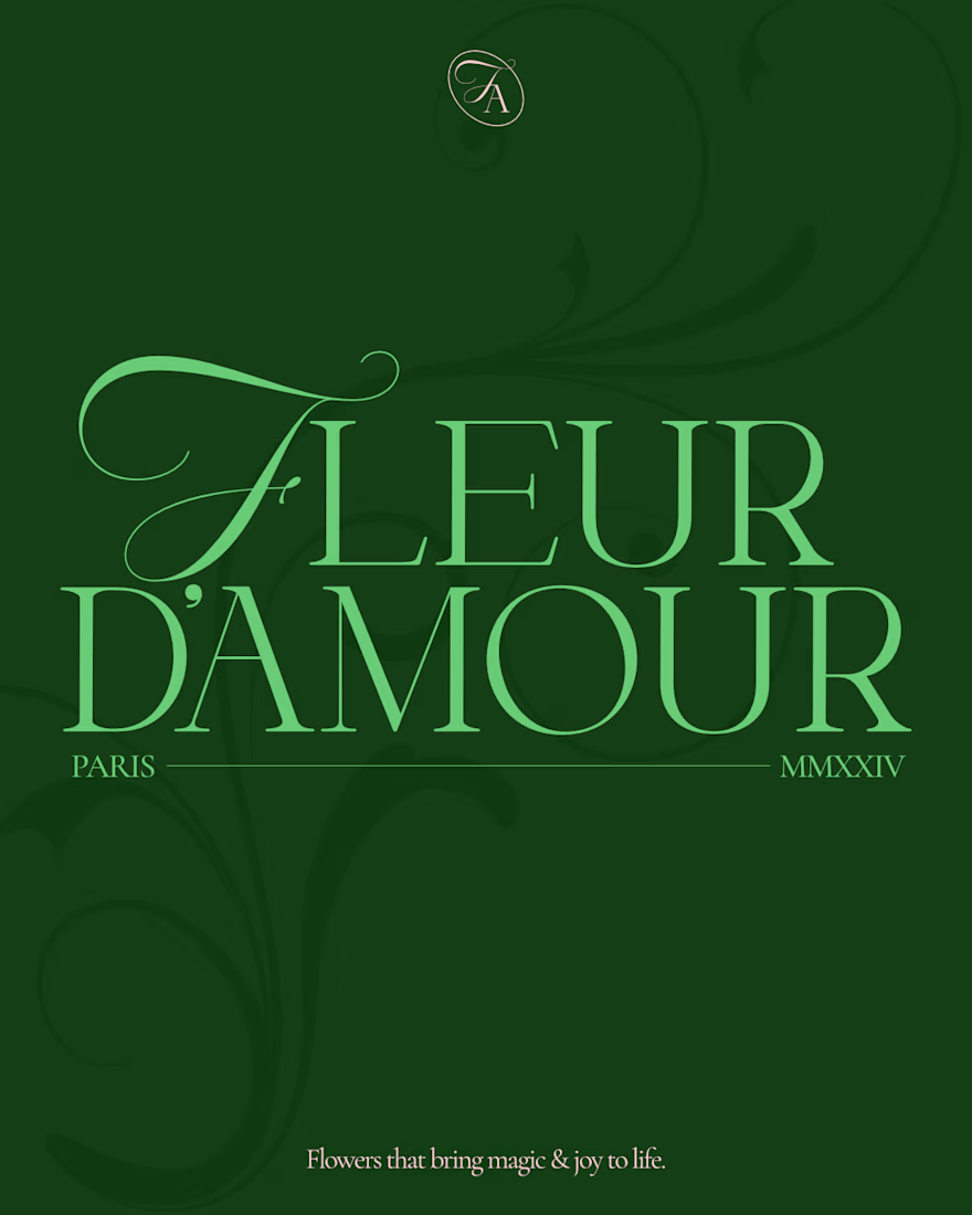
🌸 Fleur d'amour part 1.
Fleur d'amour is a beautiful flower shop in Paris, making sure the beauty and magic of their flowers reaches people lives to make them better, happier, and serene.
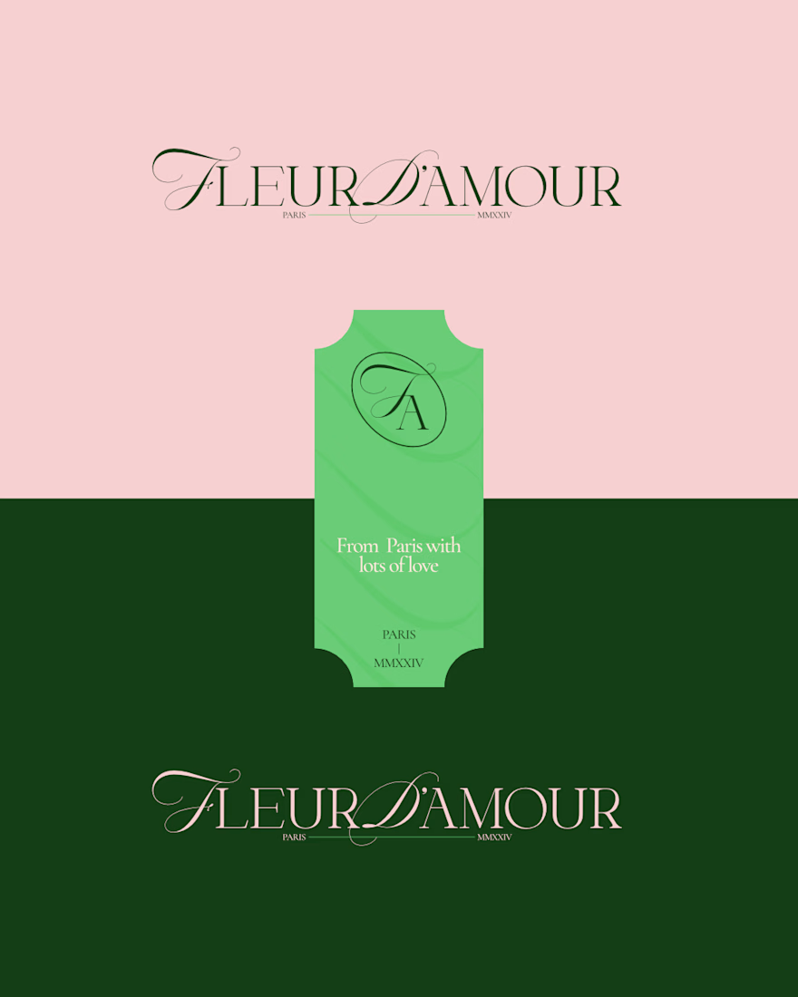
The brand direction is elegant, a bit premium, and somewhat minimal, communicated through a mix of curvy typography and a thin elegant serif.
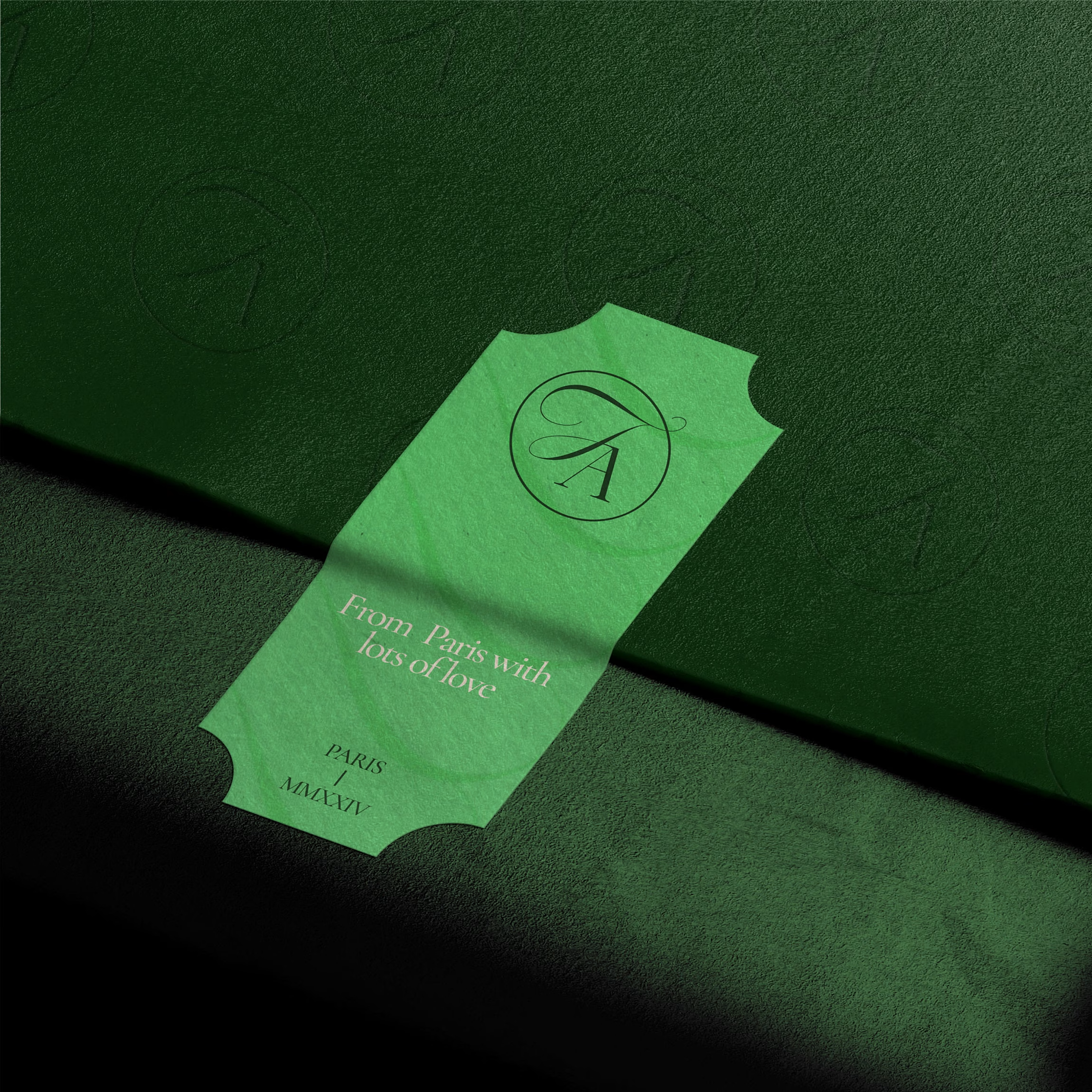
I developed a scalable logo suite to make sure each application can have an option that fits.
What do you think?
(This is a fictional project aimed for exploration)



The script mark next to that thin serif does the premium work without extra ornament. The ticket lockup feels especially right for a Paris flower shop.