The network for creativity
Join 1.25M professional creatives like you
Connect with clients, get discovered, and run your business 100% commission-free
Creatives on Contra have earned over $150M and we are just getting started
Back to feedPost

When Typography Breaks the Rules. 🖤
Bold 3D lettering, dramatic shadows, and twisted perspectives turn typography into an experience you can’t ignore.
Would you call this art or an obsession?
3dtypographymotiondesignexperimentaldesignGraphic DesignMotion DesignTypographyAdobe After EffectsAdobe IllustratorCinema 4D


Obsession, but the useful kind. The stacked extrusion makes the words read like a sculpture, so I'm curious how you kept any legibility as the letters twist, or is the unreadability part of the point?
The idea was to push typography beyond readability and treat it as a sculptural form. The rotation reveals different parts of the lettering, while the stacked extrusion adds depth and movement. I wanted the viewer to experience the typography visually, not just read it.
The network for creativity
Join 1.25M professional creatives like you
Connect with clients, get discovered, and run your business 100% commission-free
Creatives on Contra have earned over $150M and we are just getting started

Challenges
View all


Related posts

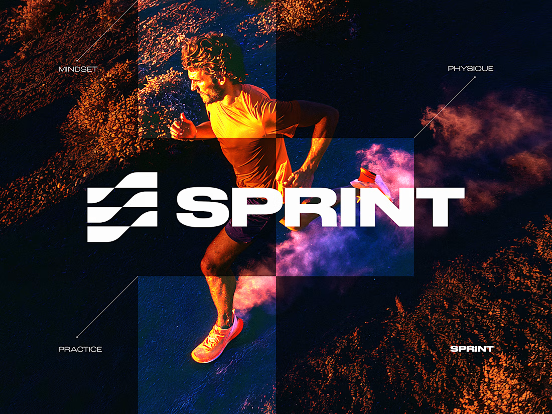
SPRINT — Experimental Brand Visual
A visual experiment built around an unused logo concept from a recent branding project.
The design was created manually, while exploring how AI-driven aesthetics are increasingly influencing contemporary visual language, even when AI itself isn’t part of the design process.
Logo design, art direction and visual exploration.



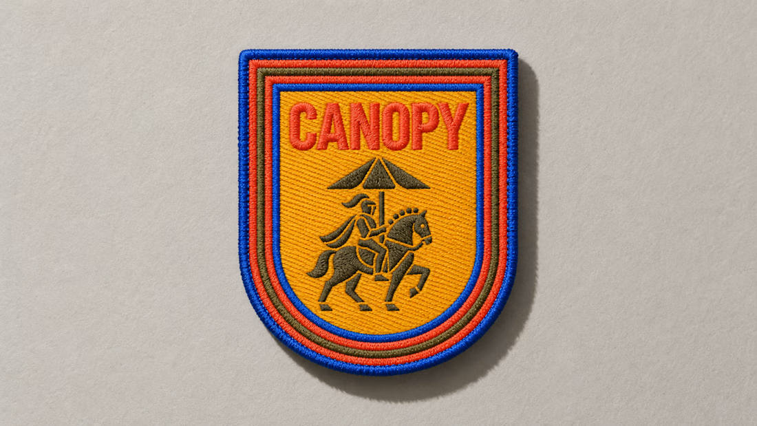
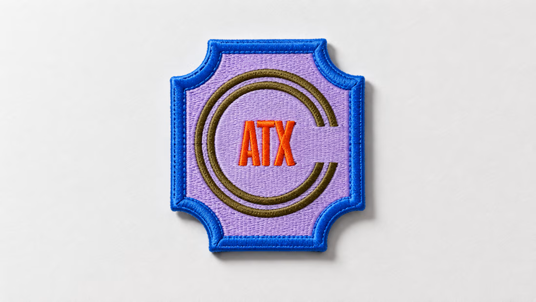
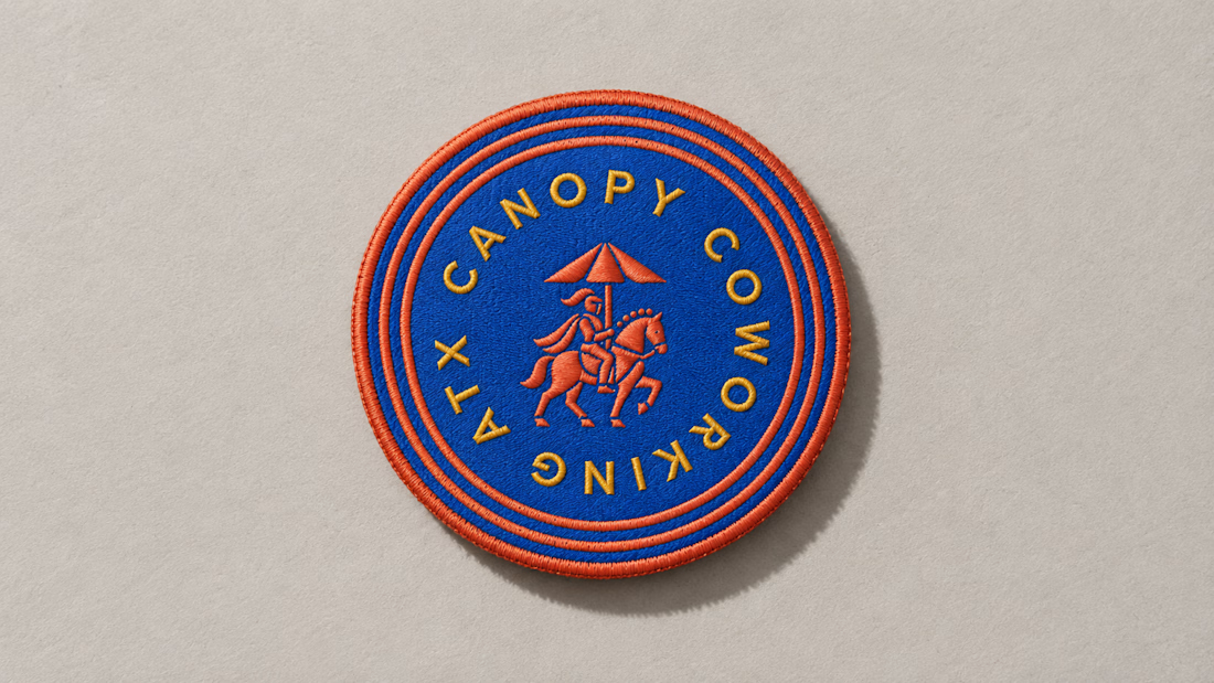
A little preview of something I’m working on.
These embroidered patches are a small part of a much larger brand system, but details like this matter. The challenge is making sure the identity still feels distinct and intentional when it moves from screen to something physical you can hold in your hand.
That’s where a strong brand system starts begins to prove itself. More soon :)

That video animation project was when we decided to move away from the currently popular black-and-white interfaces and try something different.
Which concept is more aesthetically attractive?
19 voted
79%

5 voted
21%

24 votes
Closed

A is more professional 😎