The network for creativity
Join 1.25M professional creatives like you
Connect with clients, get discovered, and run your business 100% commission-free
Creatives on Contra have earned over $150M and we are just getting started
Back to feedPost

If revenue is growing but cash feels tight,
you’re not scaling freely.
You’re scaling against your structure.
Revenue increases.
Margins hold.
Yet liquidity starts to compress.
Hiring feels heavier than expected.
Growth stretches the organization.
This is rarely a performance issue.
It is a capital design issue.
Profitability does not guarantee flexibility.
Structure does.
Liquidity capacity is not built by momentum.
It is built by intentional capital architecture.
When capital is designed properly,
growth stops feeling fragile.
Is your expansion constrained by the market —
or by your capital structure?

The network for creativity
Join 1.25M professional creatives like you
Connect with clients, get discovered, and run your business 100% commission-free
Creatives on Contra have earned over $150M and we are just getting started






Related posts

Standing apart doesn't always mean looking unconventional. It means knowing where to be different.
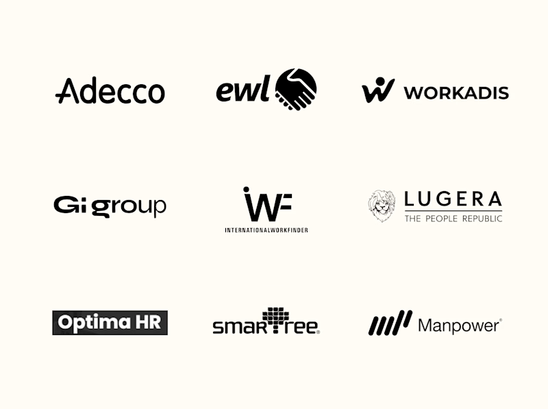
For Tandem, the challenge was building an identity that felt confident, dependable and approachable without looking like every other workforce management company.
We built that distinction through four key decisions:
1. Naming: Tandem. Simple, memorable and rooted in partnership.
2. Logo: Free from predictable workforce symbols and category clichés.
3. Visual & Motion Language: Bringing businesses and workers together to create momentum.
4. Brand Voice: Confident, dependable and approachable.
While much of the category focuses on workforce scale, Tandem positions itself as a trusted operational partner.
Which would you choose? Familiar market conventions or Tandem's point of view?

5 votes
Ends in 17h

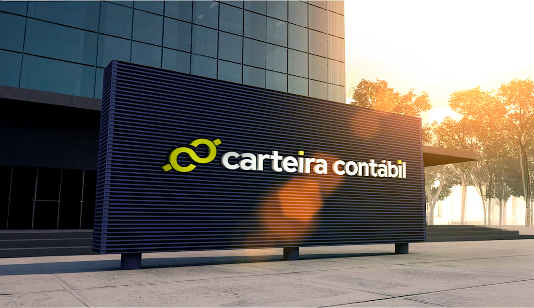
Who said accounting has to look like a 1998 spreadsheet?
Here’s a look at the new visual identity for Carteira Contábil, a digital accounting service built to simplify life for entrepreneurs. I paired a bold, dark architectural vibe with a vibrant lime-yellow mark to make it stand out in a sea of corporate blue.
Designers, rate this color combo from 1 to 10! And tell me: what's the hardest industry you've ever had to rebrand?

Shogun Financial · Geometric Trust & Institutional Identity
Financial advisory firms often default to generic column icons that look identical across every pitch binder.
For Shogun Financial, my goal was to establish calm institutional authority through an architectural crest applied to blind-embossed duplex cotton cards, corporate ledger seals, and clean investor folders.
Measured spacing and crisp print production let the firm project stability without decorative excess.
How do you help financial or advisory brands stand apart while keeping institutional restraint intact?