The network for creativity
Join 1.25M professional creatives like you
Connect with clients, get discovered, and run your business 100% commission-free
Creatives on Contra have earned over $150M and we are just getting started
Back to feedPost
Recently, I worked on a UX/UI and conversion analysis for a platform focused on alternative assets and tokenization.
The biggest challenge? Making the value proposition clearer and more impactful at first glance.
The redesign focused on creating a more modern, tech-driven visual experience aligned with the future of digital finance.
Key improvements:
✅ Stronger product and technology presence in the hero section
✅ Simpler and more scannable content structure
✅ New visual hierarchy to reinforce innovation and trust
Many fintech companies face the same challenge: How do you make complex financial products feel clear, intuitive, and desirable?
What do you think about this new visual direction?


Details are crazy on this.

Thanks! 🚀


Really Nice work🔥👏👏
Thanks! 😊

Beautifully executed!
Thanks!
The network for creativity
Join 1.25M professional creatives like you
Connect with clients, get discovered, and run your business 100% commission-free
Creatives on Contra have earned over $150M and we are just getting started





Related posts





🔥 🔥

A great app should not just function, It should feel visually distinct
When the market is full of similar-looking products, design becomes part of the product’s well identity
For this finance project, we focused on a sleek UI, intuitive UX, and a visual language that doesn’t feel generic
Both dark and light modes were designed to feel equally intentional.
Which one do you prefer?
10 voted
56%
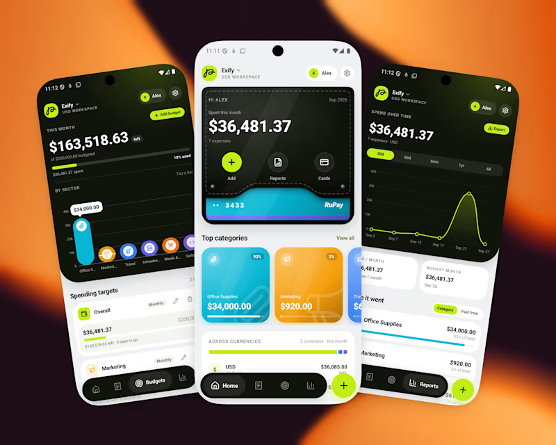
8 voted
44%
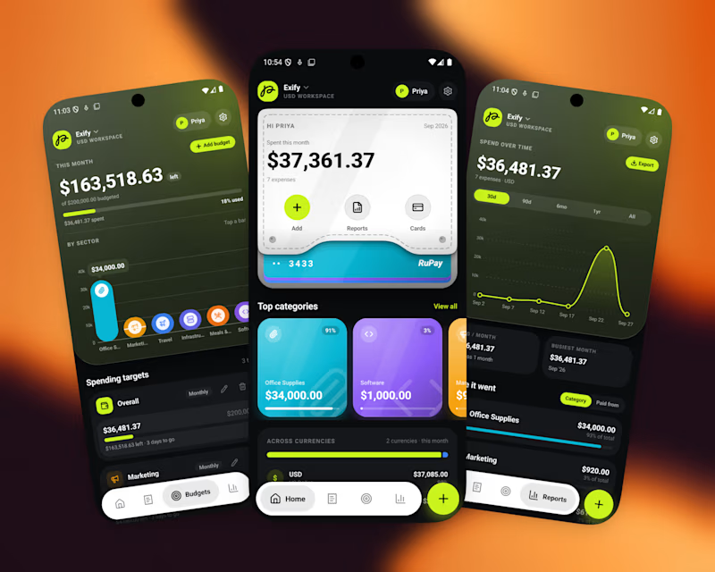
18 votes
Closed

I’d go with Light Mode. 👌 It feels fresh, clean, and the UI elements stand out beautifully against the background. Both are strong, though! 🔥

A first look at Morrow, my upcoming Framer template for AI products.
Soft gradients, clean layouts and thoughtful interactions across desktop and mobile. Here’s a short preview of how it all comes together.
Coming soon.
