The network for creativity
Join 1.25M professional creatives like you
Connect with clients, get discovered, and run your business 100% commission-free
Creatives on Contra have earned over $150M and we are just getting started
Back to feedPost
Not every portfolio needs a grid.
OVERLAP is a new Framer component built around a different way of presenting projects.
Instead of separating each piece of work into its own card, projects share the same space — creating depth, movement and a more editorial way to browse.
Less grid. More composition.


This is a lovely alternative to the default portfolio grid—the shared canvas creates real editorial rhythm without losing wayfinding. The overlap treatment feels especially strong for work that deserves to be experienced as a sequence.

Thanks! The idea of treating the projects as a sequence rather than isolated cards was a big part of it 🙌
The network for creativity
Join 1.25M professional creatives like you
Connect with clients, get discovered, and run your business 100% commission-free
Creatives on Contra have earned over $150M and we are just getting started

Challenges
View all


Related posts
A SaaS website can explain every feature perfectly and still leave one question unanswered:
Why should I care?
That's why CORESPACE includes Stories.
Instead of only describing what the product does, Stories give those features context — showing how they're used and what they make possible.
Features explain the product.
Stories make it relatable.
The “why should I care?” framing is exactly the right antidote to feature tours. Turning real team stories into the connective tissue between the product and its impact makes the homepage feel human, not just informative.

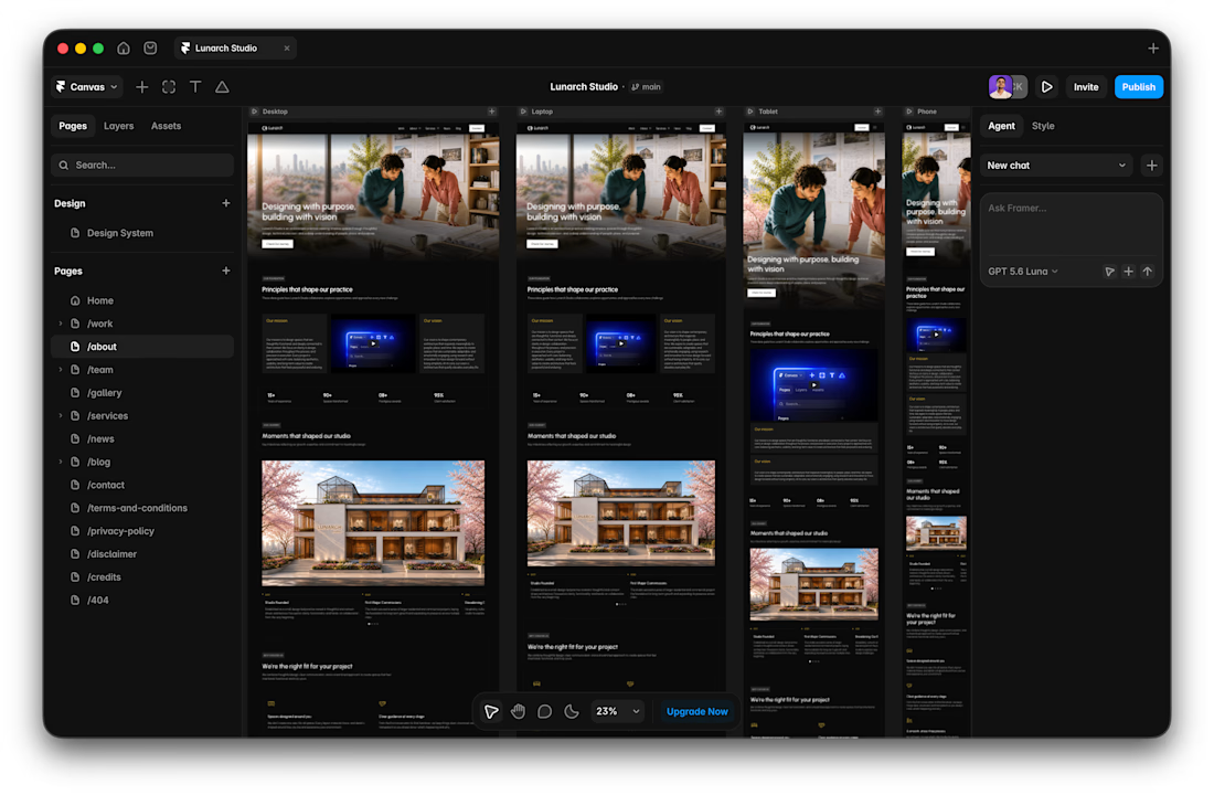
I usually don't stop at 3 breakpoints when building a website.
Most people think about: Mobile, Tablet, Laptop
I like adding one more: Desktop
Because what looks great at 1440px can feel completely different at 1920px...
- The layout gets too wide.
- Spacing starts feeling off.
- Content loses its balance.
So I like testing the system across: Mobile → Tablet → Laptop → Desktop
Not because every website needs exactly 4 breakpoints. But because responsive design isn't about making a few screen sizes work.
It's about making the whole system work.
Follow Rushabh for more website fundamentals, experiments, and things I learn while building for the web.

A calm interface doesn't have to feel static.
With RISE, the interactions are deliberately restrained.
A subtle hover gives just enough feedback to make the interface feel responsive, without breaking the slower, more considered visual language.
No big effect.
Just a small response at the right moment.

Restraint like this is way harder to pull off than a flashy effect, most sites can't resist doing too much. Was there an interaction you built and then cut because it felt like it was showing off?