The network for creativity
Join 1.25M professional creatives like you
Connect with clients, get discovered, and run your business 100% commission-free
Creatives on Contra have earned over $150M and we are just getting started
Back to feedPost
A Shopify store can have great products and still be difficult to shop if the collections aren't organized properly.
When I structure collections, I think about how a customer naturally wants to browse.
For example:
→ Group similar products together
→ Use clear collection names
→ Avoid overlapping categories
→ Make important collections easy to find
→ Add useful filters
→ Keep product organization consistent
→ Make the same structure work well on mobile
The goal is simple:
Customers should be able to find what they're looking for without having to figure out how your store works.
Good collection structure isn't just about keeping products organized.
It's part of the overall shopping experience.
How would you organize collections for a Shopify store with a large number of products?

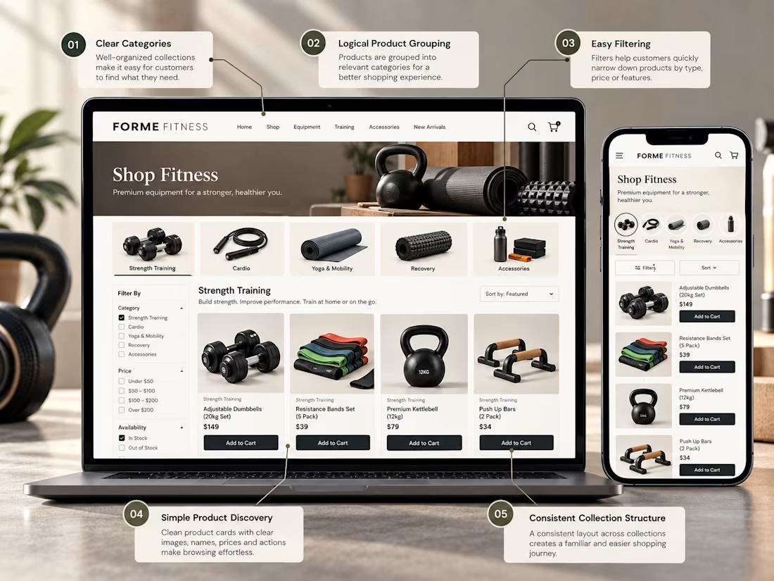

Exactly. A well structured collection system makes large stores much easier to browse and helps customers find what they need faster.

Well said. Clear collections and useful filters can make navigating a large Shopify store much easier.

For a big catalog I lean on automated collection rules (tags for material, use case, price tier) so it stays consistent as new products get added, then manually pin a few bestsellers at the top of each collection for merchandising. The other thing that matters is the mega menu...

Nice strategy
The network for creativity
Join 1.25M professional creatives like you
Connect with clients, get discovered, and run your business 100% commission-free
Creatives on Contra have earned over $150M and we are just getting started





Related posts
A product page has one important job:
Help the customer understand the product and feel confident enough to take the next step.
For this Shopify concept, I focused on the things that matter most:
→ Clear product photography
→ Easy to understand product information
→ Visible pricing
→ Simple variant selection
→ Strong Add to Cart placement
→ Useful product details
→ Trust building information
→ A clean mobile experience
A product page doesn't need to be overloaded with information.
It needs to present the right information in the right order.
That's where good e-commerce UX makes a difference.
What would you improve first on a Shopify product page?
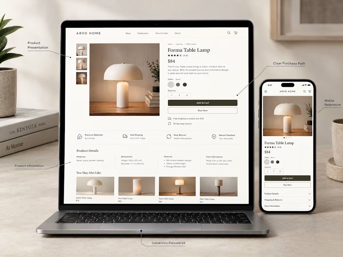
Exactly. The right information in the right order can make the buying decision much easier.


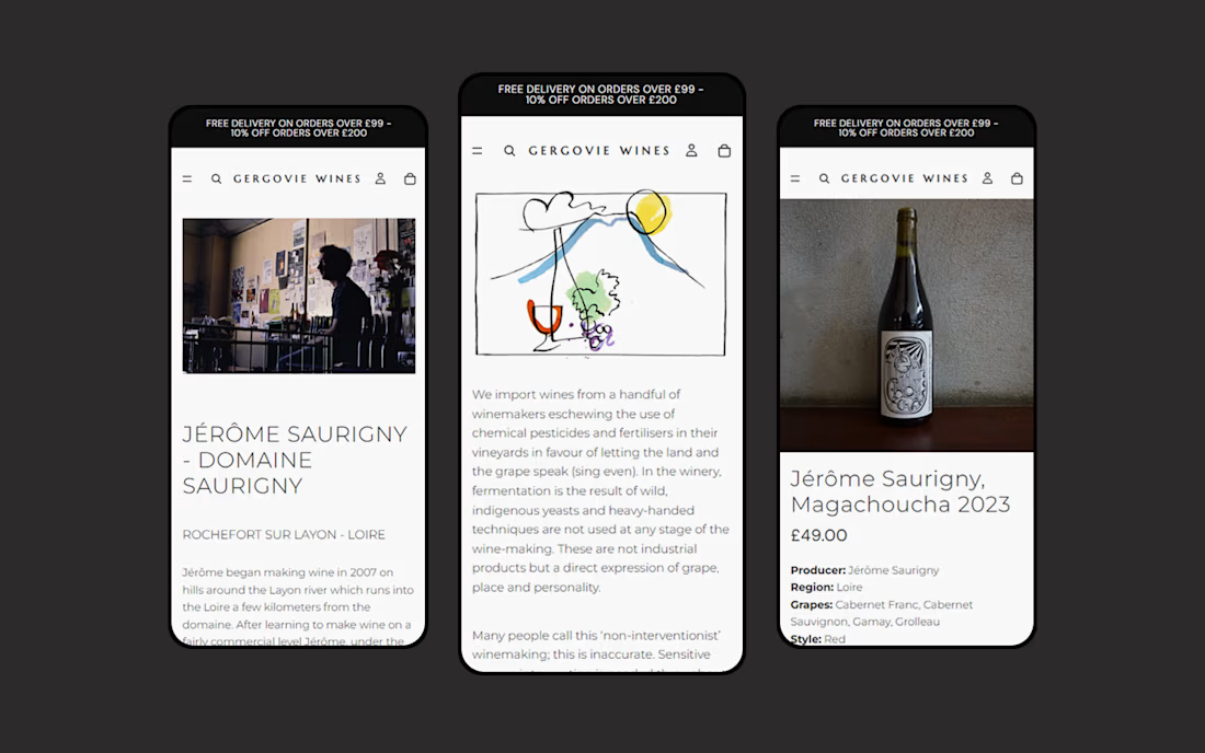
Gergovie Wines partnered with GreenBerry to migrate their existing Squarespace website to Shopify, creating a new ecommerce storefront for their wine collection.
The project brought products, content and key pages into Shopify, with a responsive design that makes browsing wines and placing orders straightforward across mobile and desktop.
The new website gives the Gergovie Wines team an easier way to manage their catalogue, orders and website content, while providing a flexible foundation for the business to grow.


Just wrapped up this high-converting Shopify product page for Haloven, designed and built in Replo. 🚀
The focus was simple: turn product interest into purchase confidence through strong offer presentation, social proof, customer testimonials, product education, comparison, trust signals, and CRO-focused UX.
The client loved the final result and said she’d happily recommend my work to others. 🙌
Built with Replo + Shopify + CRO thinking.


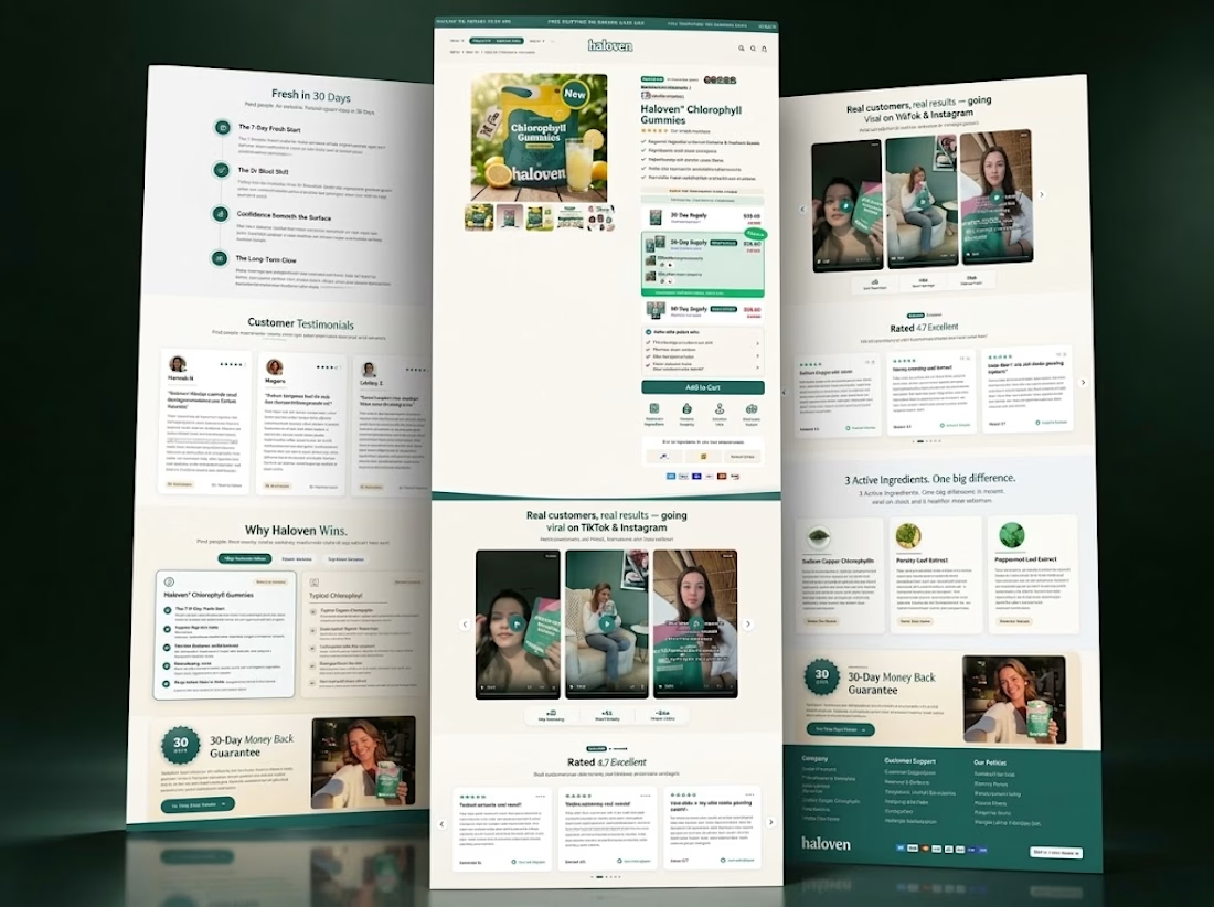
Nice work. Putting the guarantee badge next to the testimonials instead of on a separate policy page is the right call, that kind of trust signal only helps if it shows up right when someone is deciding.