The network for creativity
Join 1.25M professional creatives like you
Connect with clients, get discovered, and run your business 100% commission-free
Creatives on Contra have earned over $150M and we are just getting started
Back to feedPost

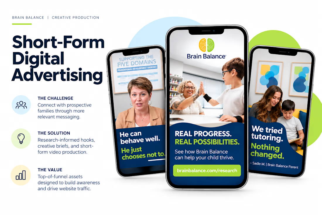
☞ Challenge: Brain Balance needed to reach prospective families with messaging that addressed their concerns, challenged common misconceptions, and communicated the value of its services.
☞ Solution: I developed a series of short-form, hook-driven social ads informed by messaging gap research, creating the creative briefs, messaging concepts, video edits, and final branded assets.
☞ Value: The resulting top-of-funnel campaign assets were designed to build awareness, position Brain Balance as a potential solution to families' challenges, and drive traffic to its website.


The network for creativity
Join 1.25M professional creatives like you
Connect with clients, get discovered, and run your business 100% commission-free
Creatives on Contra have earned over $150M and we are just getting started





Related posts

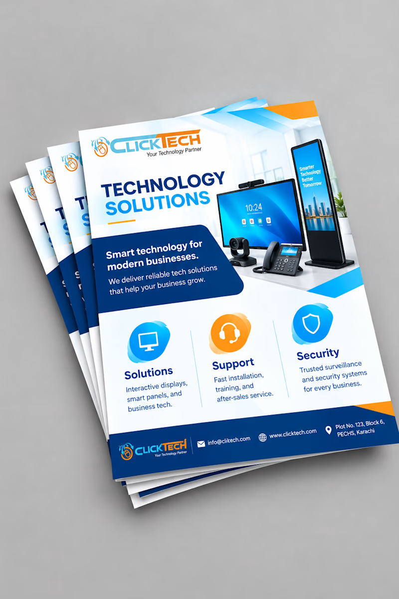
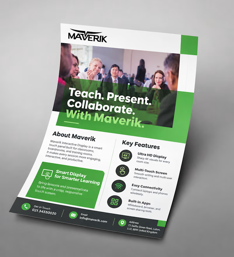
Same goal, different approach: a light, icon-based flyer vs a bold, photo-driven one.
Which would make you stop and read? Vote and tell me why!
2 voted
50%
2 voted
50%
4 votes
Closed

Malaika both are good but the first one (Maverik) would make me stop! Photo-driven creates instant trust and human connection, especially for education tech. Icon-based is cleaner but photo wins for engagement. Great work!

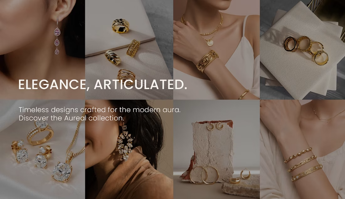
Elegance is in the details. Every brand has a story to tell.
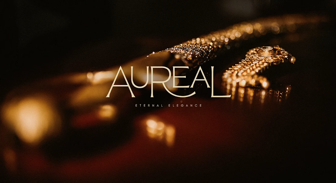
Excited to share our Jewelry Brand Design project! This concept explores how thoughtful design can transform a jewelry brand into a visual experience that feels elegant, memorable, and timeless.
From the visual identity to the overall presentation, we crafted every detail with intention to create a brand that captures attention and leaves a lasting impression.
Let’s talk design! If you were building a jewelry brand, would you go for a minimalist and timeless look or a bold and luxurious aesthetic? Tell us your choice in the comments!
We’d love to hear your thoughts.
Explore the full project on Behance: https://www.behance.net/gallery/246733595/Jewelry-Brand
#JewelryBrand #BrandIdentity #BrandingDesign #GraphicDesign #VisualIdentity #PackagingDesign #LuxuryBranding #CreativePortfolio


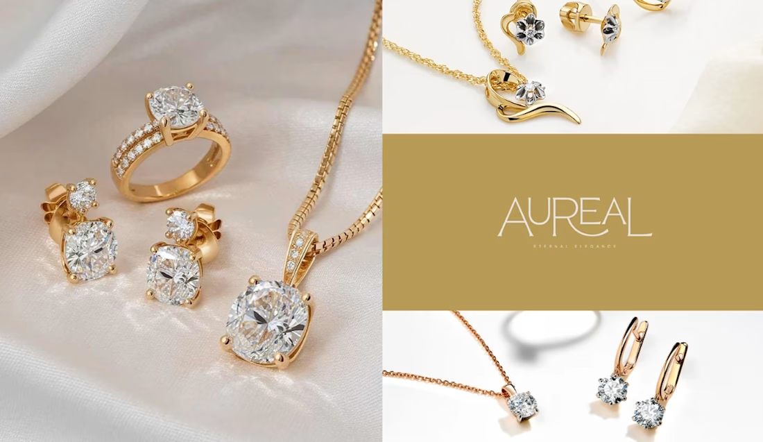
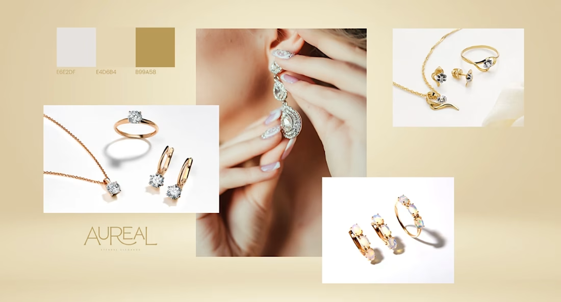

Love the warm color palette and elegant typography! Beautiful work ✨


Amazing work