The network for creativity
Join 1.25M professional creatives like you
Connect with clients, get discovered, and run your business 100% commission-free
Creatives on Contra have earned over $150M and we are just getting started
Back to feedPost

What if a logo could tell a story without saying a word?
Not just a symbol.
Not just a name.
But an idea built into every line, every curve, and every detail.
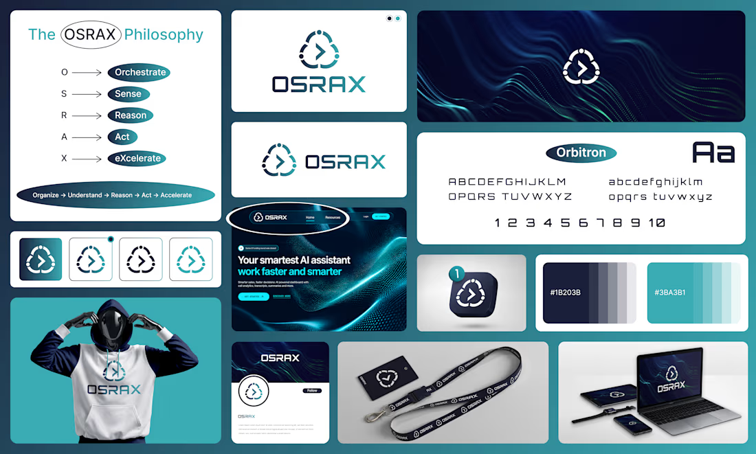
Meet OSRAX, an AI technology brand built around one simple belief:
Complexity should lead to clarity, not confusion.
So, what does OSRAX stand for?
O — Orchestrate
Bring everything together.
S — Sense
Find the signals that matter.
R — Reason
Turn information into understanding.
A — Act
Move from insight to action.
X — eXcelerate
Make progress happen faster.
Five letters.
One connected philosophy.
The logo follows the same thinking. A geometric symbol brings the ideas of connection, intelligence, and forward movement into one visual identity. The shapes work together, while the negative space gives the mark room to breathe.
No unnecessary details.
No decoration without purpose.
Just a symbol designed to feel clear, confident, and memorable.
The deep navy brings trust and precision. The teal adds energy and a sense of progress. The custom-style typography gives OSRAX its own distinct voice across digital products and brand touchpoints.
From the website and app icon to the dashboard, social media, and merchandise, every element is designed to feel like part of the same system.
Because a strong brand isn't just about how it looks.
It's about what people remember, what they feel, and what they understand.
That was the thinking behind OSRAX.
Make Complexity Actionable.
Now, one question for you:
When you look at this symbol, what do you see first, connection, intelligence, or movement?
I'd love to hear your thoughts.
Best Design: www.fiverr.com/sellers/rifatislam149/edit
Portfolio: https://dribbble.com/artoryxrifat
#OSRAX #BrandIdentity #LogoDesign #AISaaS #VisualIdentity #GraphicDesign
The network for creativity
Join 1.25M professional creatives like you
Connect with clients, get discovered, and run your business 100% commission-free
Creatives on Contra have earned over $150M and we are just getting started








Related posts

Logos & Marks — Volume 12
A curated selection of recent logo and identity work.
This collection brings together commissioned projects, unused concepts, and exploratory directions across technology, AI, finance, sports, retail, and other industries.
The work explores geometric symbols, custom typography, monograms, and abstract forms, with a focus on clarity, distinction, and strong visual character.
Selected marks are available for acquisition.
For licensing, customization, or brand identity inquiries, feel free to get in touch.

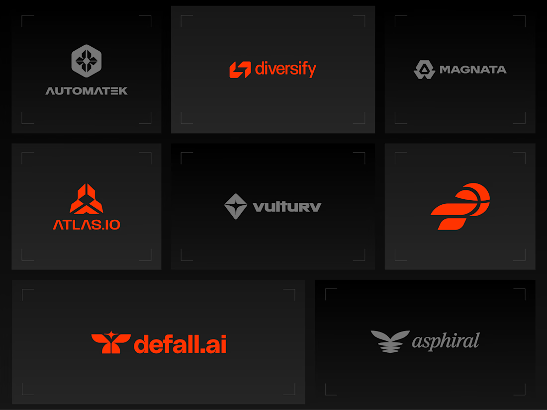
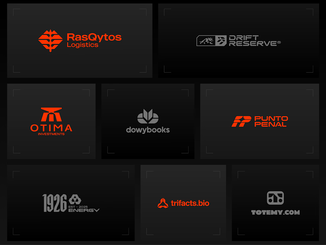
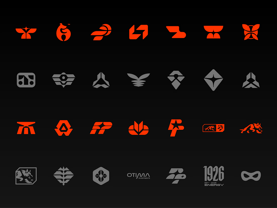
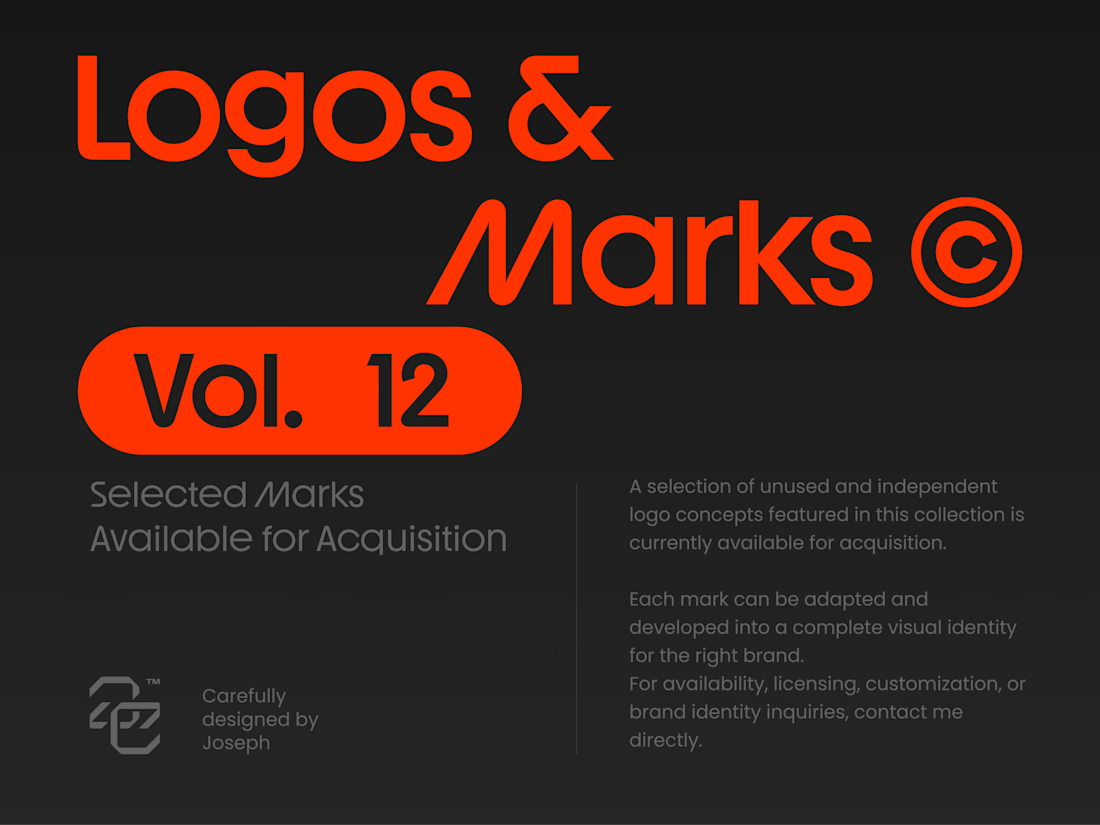


Holding the whole volume to one hot orange on charcoal makes the marks easy to compare, and the Otima symbol stacking a gate shape over the wordmark is my favorite of the set.

Recovery Brand Identity / Logo & Visual Direction
A new identity project for a recovery-focused brand that wanted to move away from the conventional clinical look of its category.
The direction combines clinical credibility with a more modern, movement- and performance-driven visual language.
First look at the logo. Full identity coming next.
Logo design and creative direction by Lepisov Branding
Social media Branding: collab with Mike Creative Mints


Which ZVEZRA logo direction do you prefer? 👀
I’ve been exploring two variations of the wordmark. Both follow the same visual direction, but each has its own character.
Vote below!
I’d love to hear your thoughts! 👇
39 voted
53%
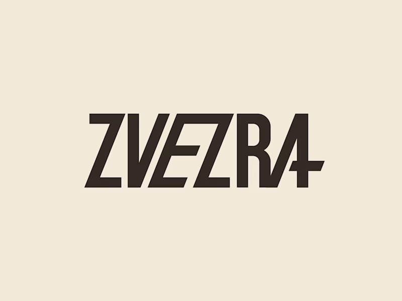
34 voted
47%
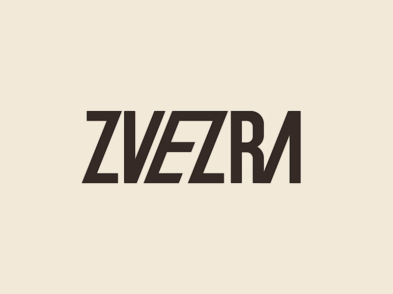
73 votes
Closed

Option 1 for me, it has a bit more personality. Both are strong though, tough call