The network for creativity
Join 1.25M professional creatives like you
Connect with clients, get discovered, and run your business 100% commission-free
Creatives on Contra have earned over $150M and we are just getting started
Back to feedPost

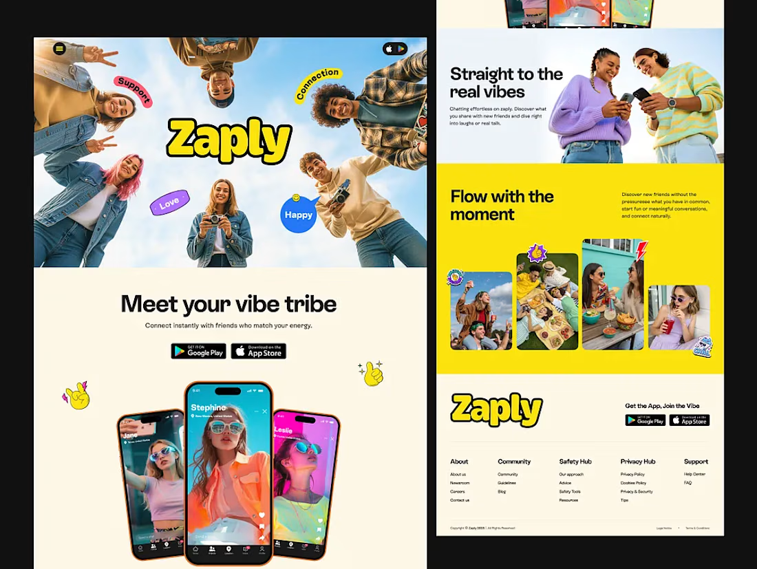
Landing page and marketing site for a Gen-Z social app. Bold yellow-black color system, upward-angle hero photography, and app store download flows.


The network for creativity
Join 1.25M professional creatives like you
Connect with clients, get discovered, and run your business 100% commission-free
Creatives on Contra have earned over $150M and we are just getting started











Related posts

KAJABI WEBSITE & LANDING PAGE DESIGN




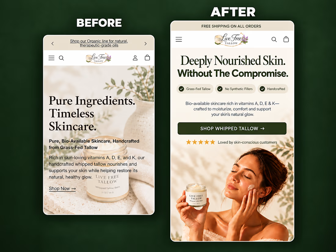
A self-initiated homepage hero redesign concept for Live Free Tallow, created to demonstrate how stronger visual hierarchy and clearer messaging can improve the mobile shopping experience.
The original hero had a compelling product, but the copy competed with the imagery, the product lacked visual prominence, and the next action wasn’t immediately clear.
For the redesign, I focused on:
• A sharper product-in-use lifestyle visual
• A clear, benefit-led headline
• Scannable product differentiators
• Improved spacing and visual hierarchy
• Social proof positioned near the CTA
• A prominent, action-focused shopping button
• Keeping the product and CTA visible above the fold
The result is a cleaner and more premium hero section that helps visitors quickly understand what the product is, why it is different, and where to go next.
I design and build conversion-focused Shopify landing pages, product pages and homepage sections for DTC brands.
Need help improving your store’s customer journey? Let’s work together.



Putting the proof next to the CTA is the right call on mobile. Did you check how much of the hero fits above the fold on a 390px-wide screen once the browser bar is counted? That's usually where the review stars get pushed out.

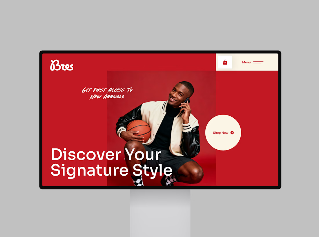
Introducing Bres, a bold fashion Website Landing page designed to capture attention through striking red visuals, confident typography, and a clean, conversion-focused layout.
The goal? Turn a simple browsing experience into a memorable brand experience that encourages shoppers to explore, connect, and shop.
✨ Bold visual identity
🎯 Clear call to action
🛍️ Fashion-focused user experience
💻 Modern, conversion-driven layout
Looking to give your fashion brand a website that stands out and turns visitors into customers? Let’s create something remarkable.
#WebDesign #LandingPage #FashionWebsite #UIUXDesign #EcommerceDesign #WebDesigner


Professional Design approach like your thinking