The network for creativity
Join 1.25M professional creatives like you
Connect with clients, get discovered, and run your business 100% commission-free
Creatives on Contra have earned over $150M and we are just getting started
Back to feedPost
Taste Test

AI Logo Challenge #01 | Part 1/4: Ideogram vs Gemini
Part of the mini-series comparing Ideogram with AI tools and human creativity.
Same prompt: Design a logo for a Penguin History Museum in Antarctica.
Which design gets your vote?
3 more posts coming by 21 October. Winner announced on 24 October!

0 voted
0%
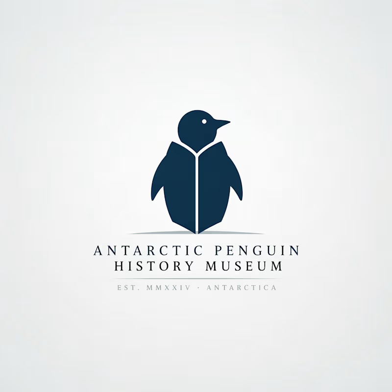
1 voted
100%
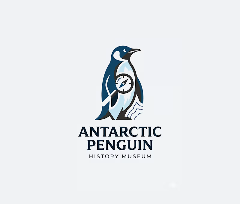
1 vote
Closed

My vote is Ideogram to kick off the series, Atin. That confident navy penguin silhouette reads like an actual museum identity, while the Gemini take feels more like an illustration than a logo.
The network for creativity
Join 1.25M professional creatives like you
Connect with clients, get discovered, and run your business 100% commission-free
Creatives on Contra have earned over $150M and we are just getting started



Related posts

Experimental layouts for Pace. Which one do you like?
23 voted
52%
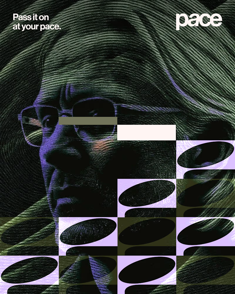
21 voted
48%
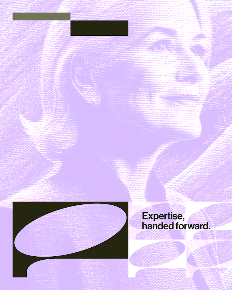
44 votes
Closed

Looks cool.

Exploring the listening state for an AI voice interface.
Which direction would you ship, A or B?
10 voted
29%
25 voted
71%
35 votes
Closed

The particle field looks more polished and beautiful🔥

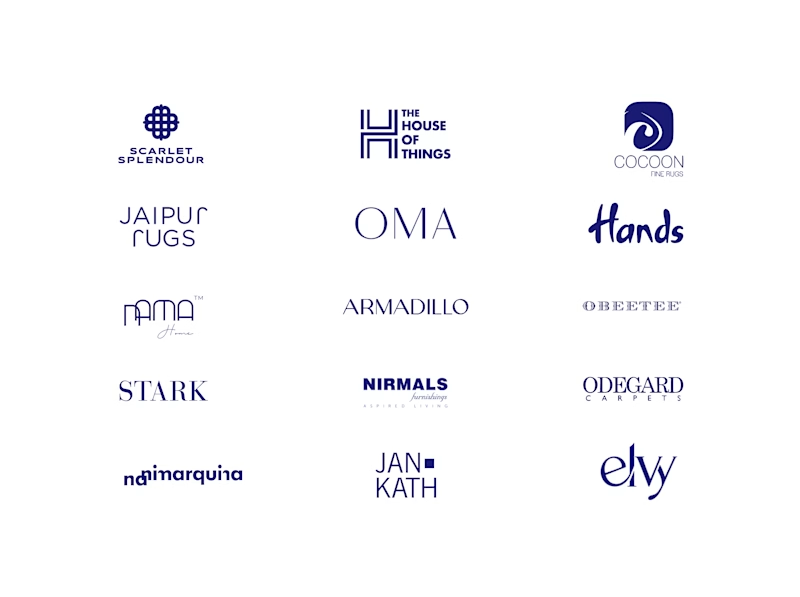
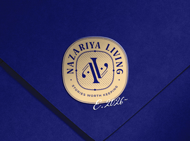
A little look at how Nazariya Living stands apart from its category.
On one side, familiar visual conventions. On the other, an identity with its own character, rooted in stories worth keeping.
We chose not to blend in. :)
Which side catches your eye?


3 voted
30%
7 voted
70%
10 votes
Closed

That side with all the competitor logos in one grid is the slide I'd steal for a client presentation. Nothing explains "why this direction" faster than showing the sea of sameness first. The navy seal wins easily after that.