The network for creativity
Join 1.25M professional creatives like you
Connect with clients, get discovered, and run your business 100% commission-free
Creatives on Contra have earned over $150M and we are just getting started
Back to feedPost

“𝐖𝐡𝐚𝐭’𝐬 𝐢𝐧 𝐚 𝐧𝐚𝐦𝐞?”- 𝐖𝐢𝐥𝐥𝐢𝐚𝐦 𝐒𝐡𝐚𝐤𝐞𝐬𝐩𝐞𝐚𝐫𝐞 𝐮𝐧𝐝𝐞𝐫𝐬𝐭𝐨𝐨𝐝 𝐁𝐫𝐚𝐧𝐝 𝐝𝐞𝐬𝐢𝐠𝐧.
Yah...You read that correctly.
Because if a brand needs its name spelled out every time to be recognised, the branding isn’t doing its job.
𝐓𝐡𝐚𝐭'𝐬 𝐭𝐡𝐞 𝐬𝐭𝐚𝐧𝐝𝐚𝐫𝐝 𝐰𝐞 𝐬𝐞𝐭 𝐟𝐨𝐫 𝐋𝐞𝐨𝐧𝐢𝐝𝐚𝐬 𝐂𝐫𝐚𝐧𝐞𝐬 𝐈𝐧𝐝𝐢𝐚
A mark bold and distinctive enough to stand on its own, even before the name is seen.
𝐈 𝐧𝐞𝐯𝐞𝐫 𝐝𝐞𝐬𝐢𝐠𝐧 “𝐣𝐮𝐬𝐭 𝐚 𝐥𝐨𝐠𝐨” 𝐚𝐧𝐝 𝐦𝐨𝐯𝐞 𝐨𝐧.
I always suggest my clients to atleast build fundamental brand systems:Primary & secondary logos, Logo marks, Color palettes, Typography.
𝐁𝐮𝐢𝐥𝐝𝐢𝐧𝐠 𝐚 𝐛𝐫𝐚𝐧𝐝 𝐭𝐡𝐚𝐭 𝐬𝐩𝐞𝐚𝐤𝐬 𝐛𝐞𝐟𝐨𝐫𝐞 𝐢𝐭 𝐢𝐧𝐭𝐫𝐨𝐝𝐮𝐜𝐞𝐬 𝐢𝐭𝐬𝐞𝐥𝐟? 𝐋𝐞𝐭'𝐬 𝐝𝐞𝐬𝐢𝐠𝐧 𝐢𝐭.
Brand identity projects open | DM to discuss.
logodesignbrandidentitydesigngrphicsdesignBrand StrategyLogo DesignBrand DesignAdobe After EffectsAdobe IllustratorFigma


The network for creativity
Join 1.25M professional creatives like you
Connect with clients, get discovered, and run your business 100% commission-free
Creatives on Contra have earned over $150M and we are just getting started







Related posts

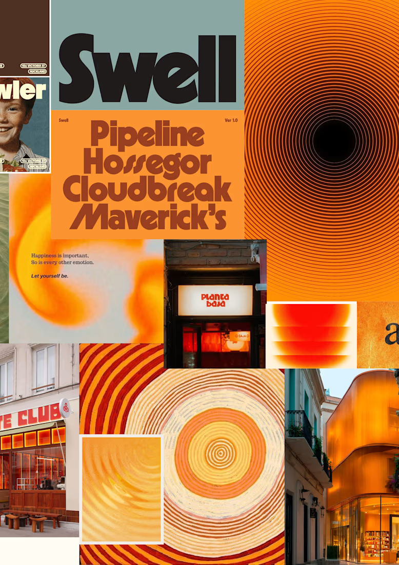
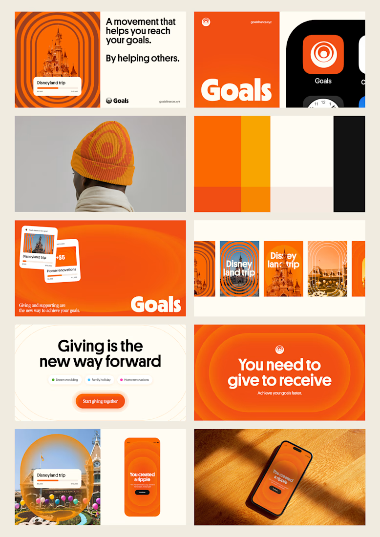
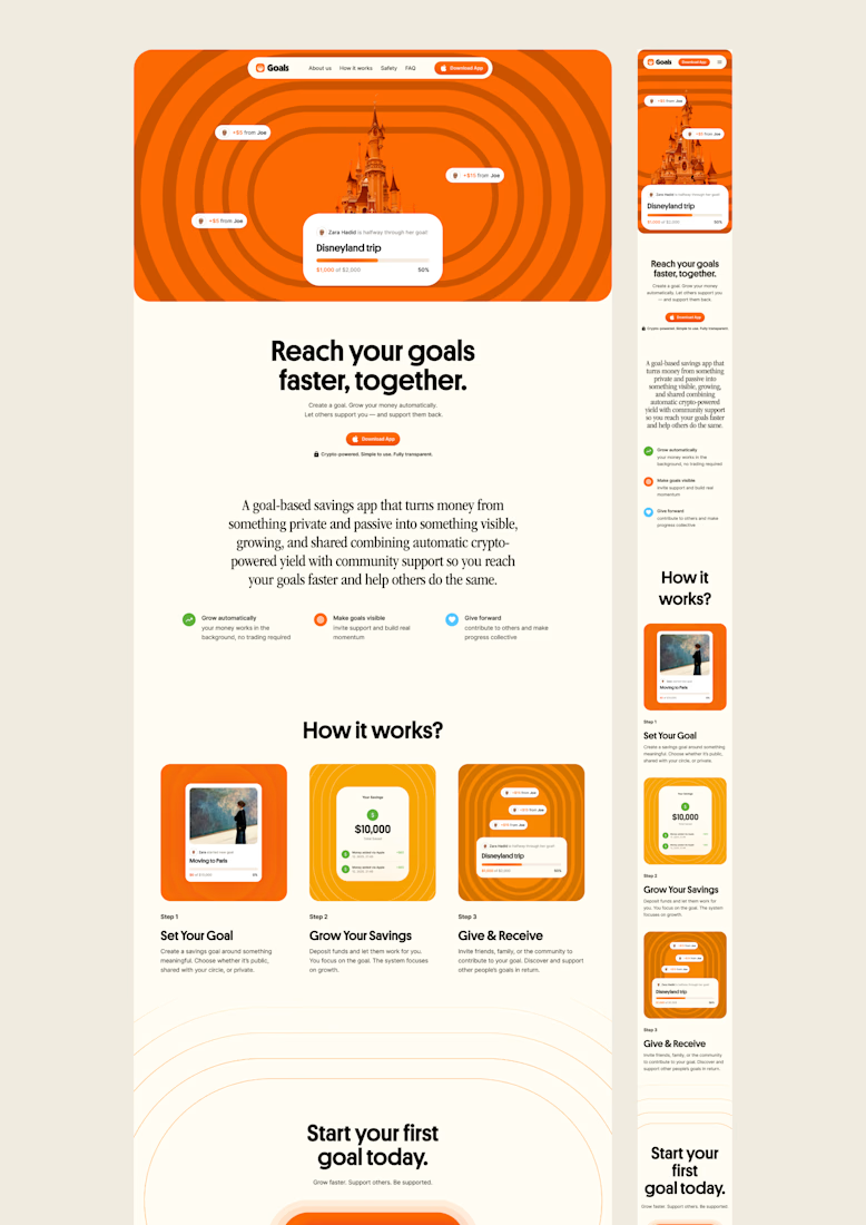
one of my favourite things about running a one-person studio is that nothing gets lost in translation.
the idea behind the brand is the same idea that shapes the website and the product.
no handovers, no starting from scratch, no trying to explain the vision to someone new.
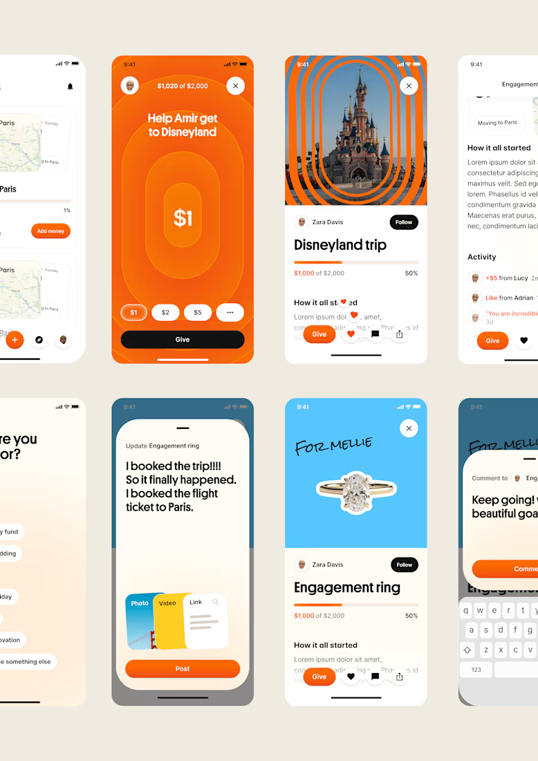
a little look at how that came together for goals, from the first moodboard to the app ↓

Love it!

What type of combination is that?
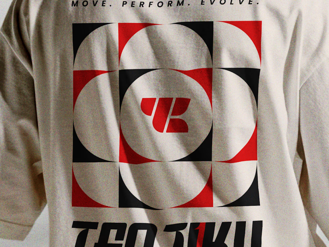
Indian spirituality × Japanese minimalism × personality-driven clothing.
That’s Tenjiku.
But getting this combination right wasn’t as simple as putting three ideas together. We started with research digging into what Tenjiku means, where the name comes from, its cultural roots, and how those ideas could shape a visual identity without feeling forced or predictable.
From that research came the logo, typography, symbols, and the overall visual language.
Every element has a reason behind it.
The logo is only the final result. The interesting part is how we got there.
We’ve documented the whole thinking & design process on Behance.
Go check out the story behind Tenjiku

The research showing through the design is what makes this work. Love the Indian x Japanese balance - not easy to pull off but you nailed it.

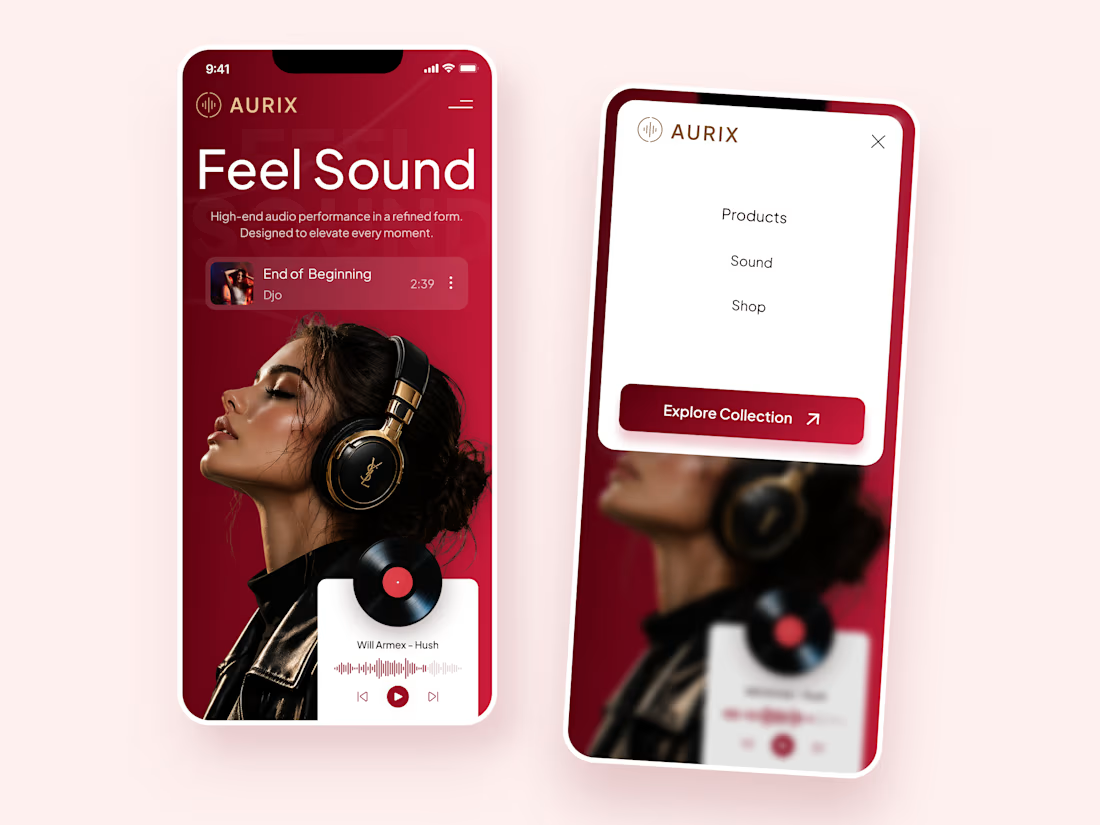
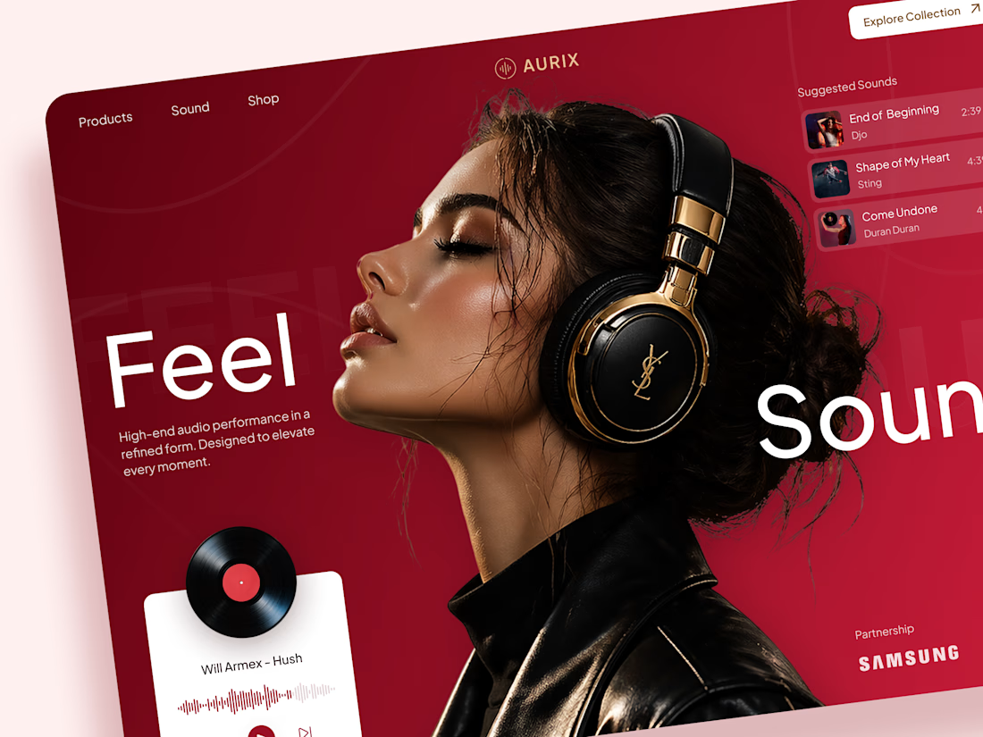
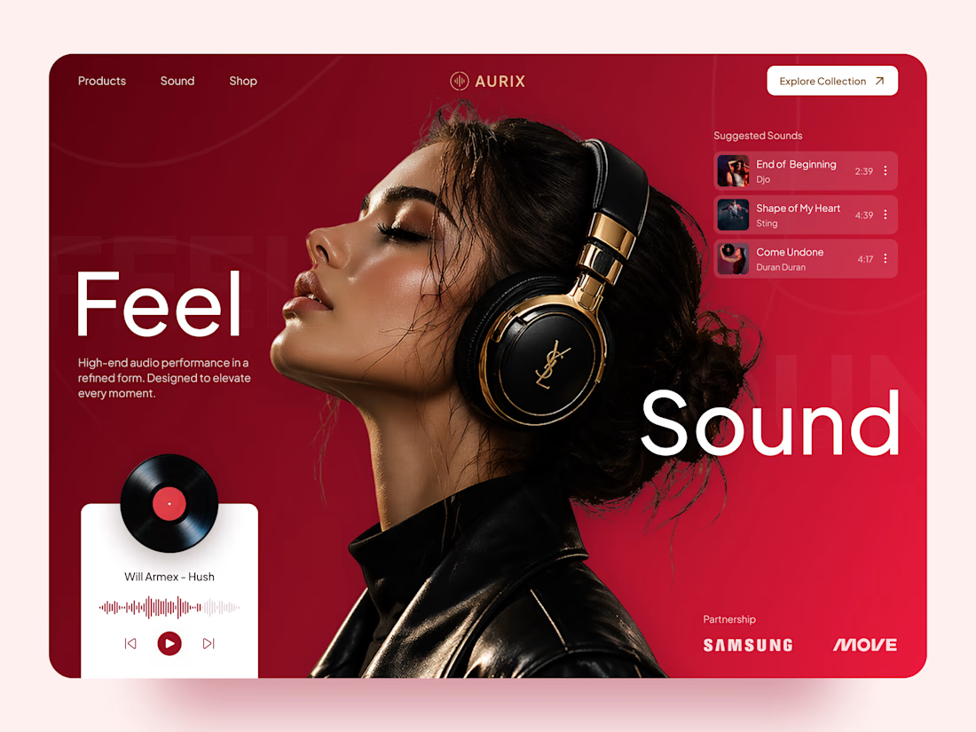
AURIX — Premium Headphones Landing Page 🎧❤️
A bold landing page concept for a premium audio brand, combining luxury headphones, music, and a strong lifestyle aesthetic
The design brings together deep red tones, elegant black and gold details, oversized typography, and immersive lifestyle imagery to create a modern, fashion-inspired experience
Special attention was given to:
• Bold lifestyle-focused hero composition
• Rich red and gold color palette
• Clean, oversized typography
• Music player and suggested tracks
• Premium product presentation
• Responsive mobile experience
• Minimal navigation and clear CTA
The result is a stylish, immersive landing page that connects premium audio with fashion, music, and everyday lifestyle ✨


Love the style!