The network for creativity
Join 1.25M professional creatives like you
Connect with clients, get discovered, and run your business 100% commission-free
Creatives on Contra have earned over $150M and we are just getting started
Back to feedPost

In the lighting industry there are a lot of generic products, and the ones that sell don't always compete on technical detail.
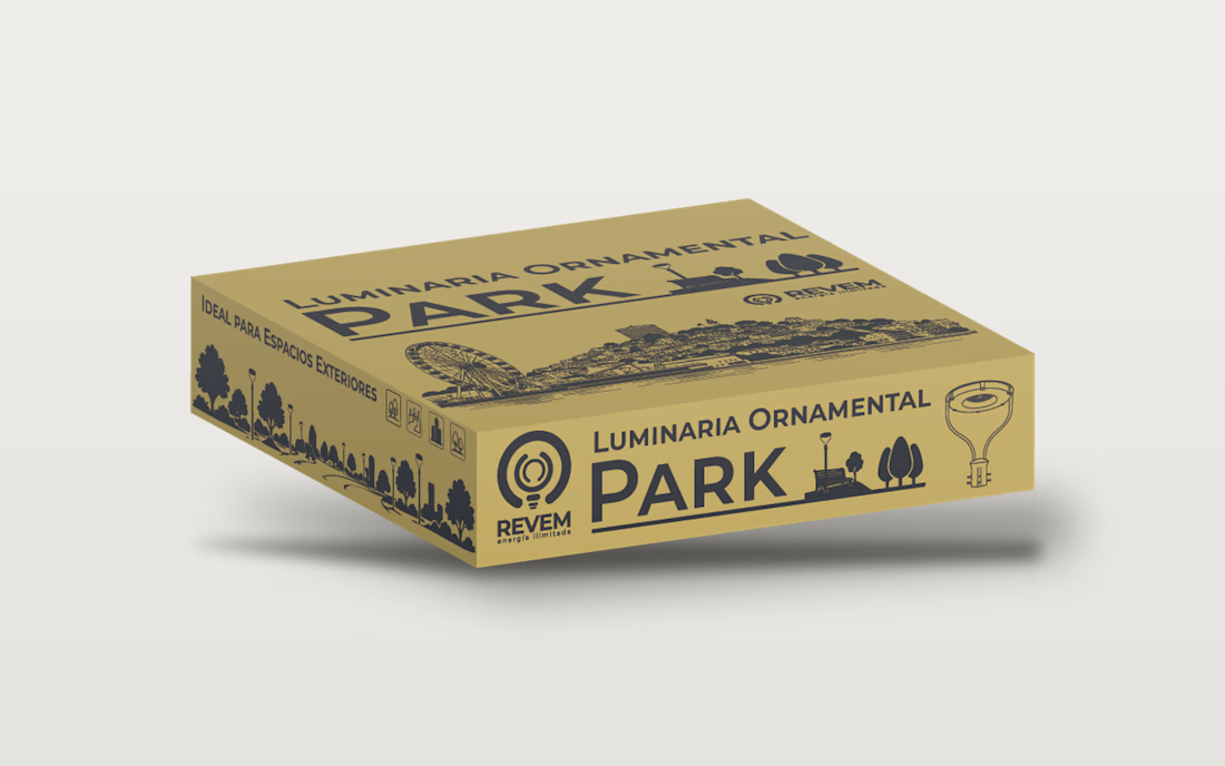
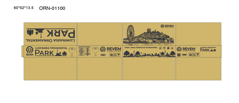
When I started designing here, I focused almost entirely on the technical side. Then, in a conversation with a stakeholder, an idea came up: our luminaires could light up some of the most popular places in Ecuador.
So I started adding illustrations of those places to the packaging of some products. The results have been good. People don't see just a technical product anymore. They see something they feel proud of, because relevant places from their country are part of it.
What can your product show that a simple image can't?

The network for creativity
Join 1.25M professional creatives like you
Connect with clients, get discovered, and run your business 100% commission-free
Creatives on Contra have earned over $150M and we are just getting started











Related posts

Have you ever designed packaging for a brand that never launched? 👀
Surprisingly, it’s happened to me more times than I expected.
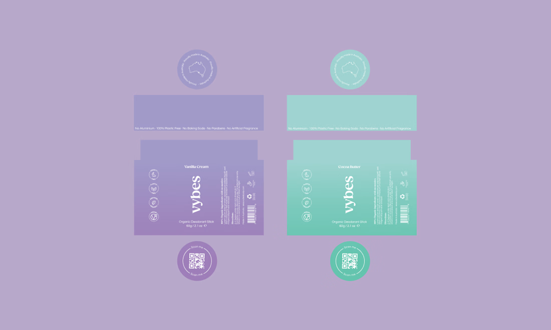
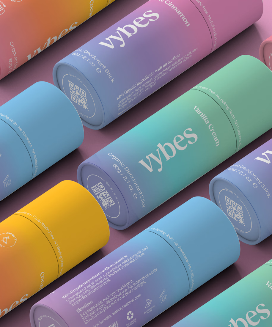
Vybes was an organic deodorant brand from Australia I worked on, designing packaging for a product that, in the end, never made it to market.
It’s a weird feeling putting so much thought into packaging for a product that people will never see on a shelf.
How many unreleased projects are hiding in your folders? 😂



An existing brand identity showcased across a new campaign. This was one of my favourite projects ever!
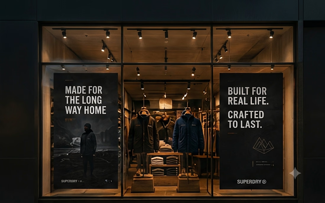
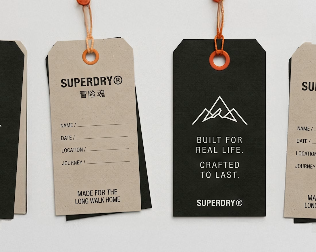
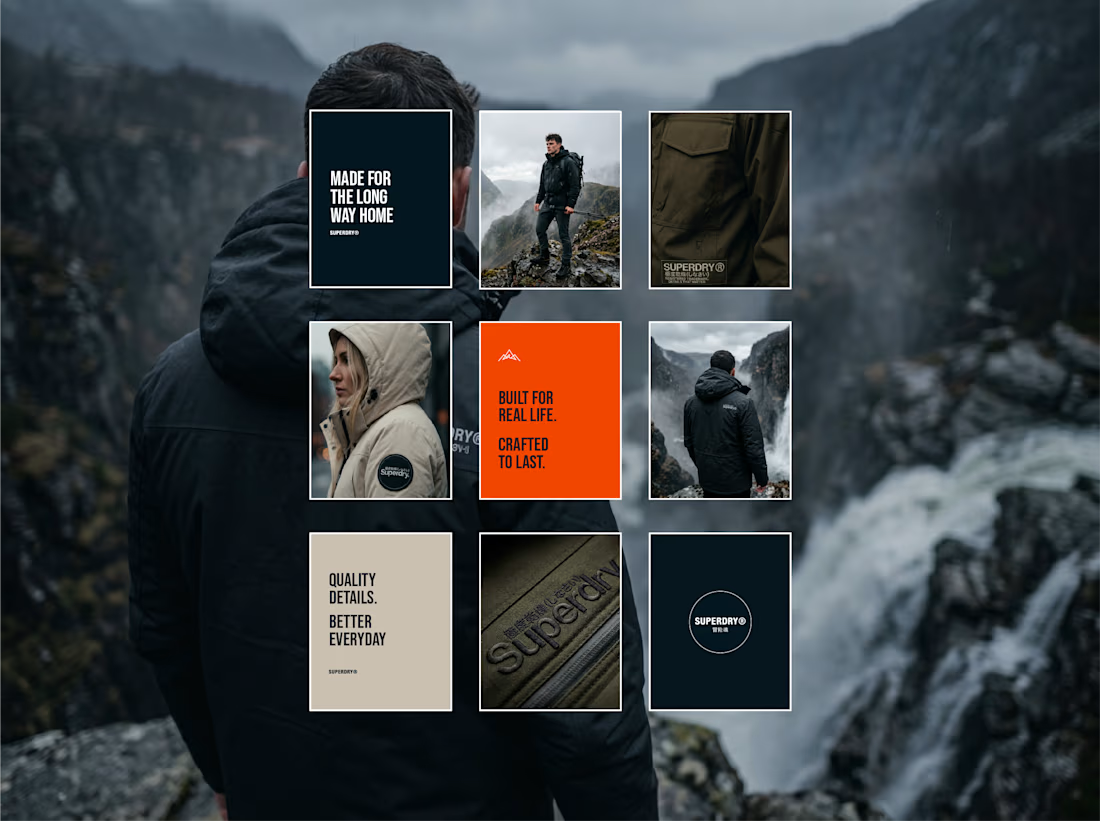

Taking an existing identity and stretching it across a whole new campaign is such a good test of a system. This looks like one of those projects where everything just clicked.

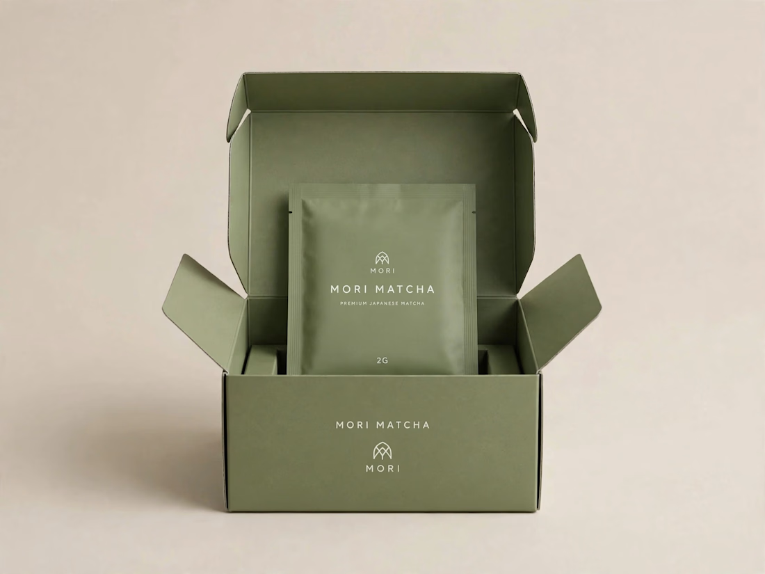
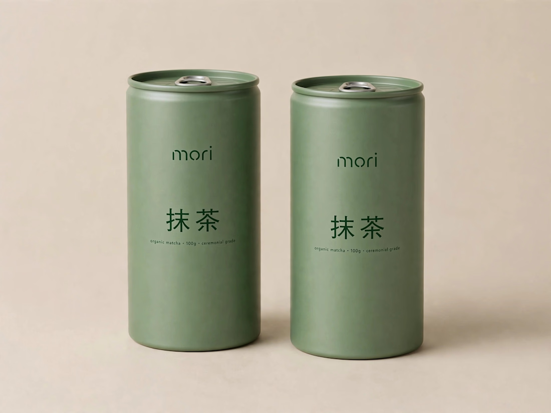
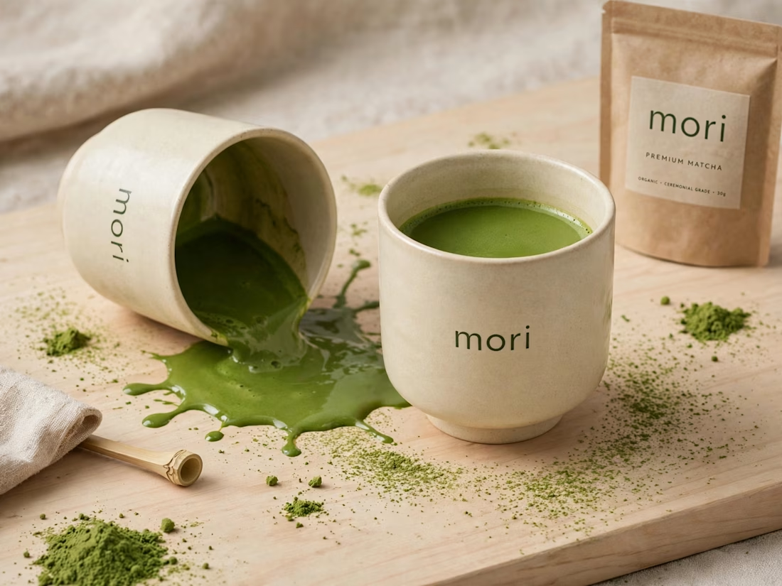
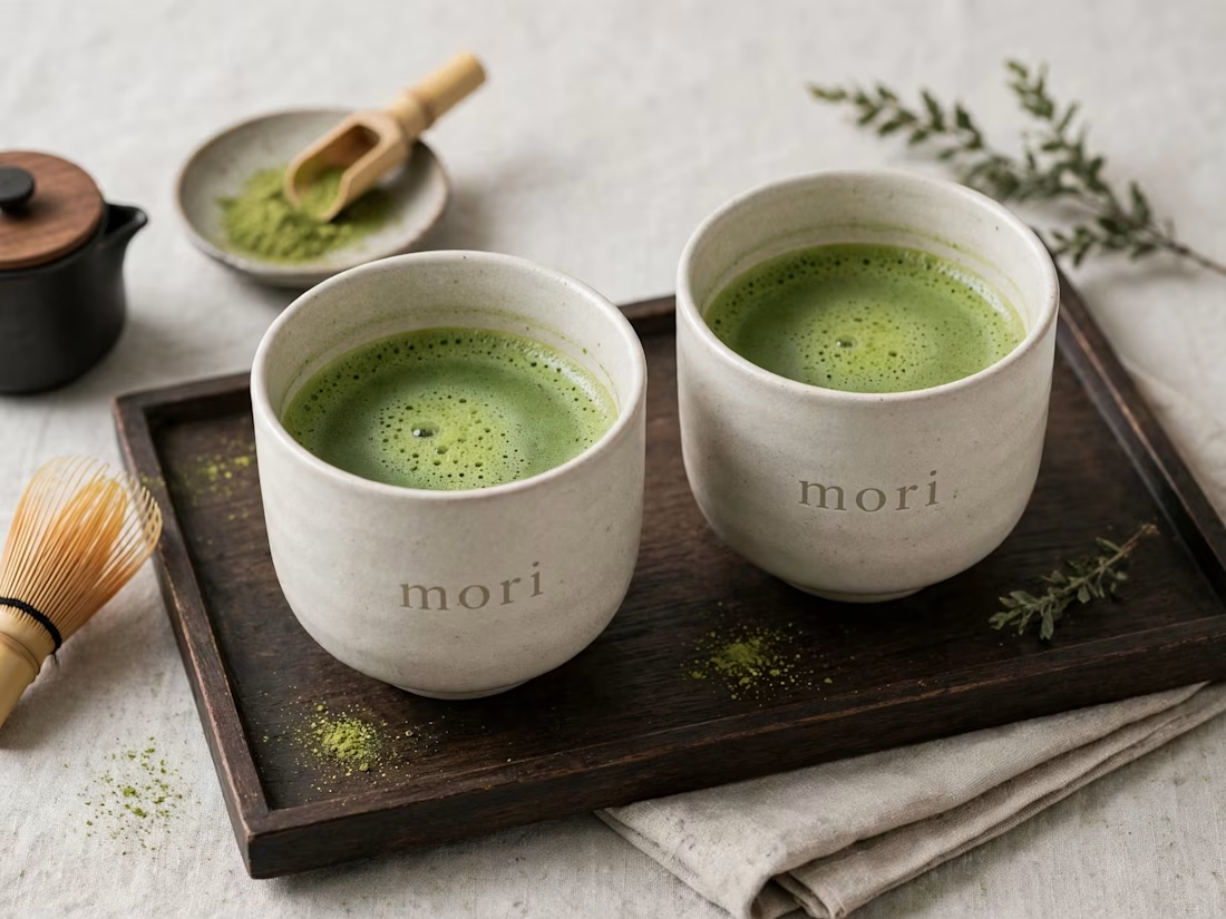
more visuals from my latest project — mori matcha 🍵
explored minimal Japanese packaging with earthy greens and calm typography.
focusing on premium ceramic cups and clean can design.
#branddesign #packagingdesign #visualidentity #brandstrategy #matcha #minimaldesign #japanesedesign #figma #mockup #branding