The network for creativity
Join 1.25M professional creatives like you
Connect with clients, get discovered, and run your business 100% commission-free
Creatives on Contra have earned over $150M and we are just getting started
Back to feedPost

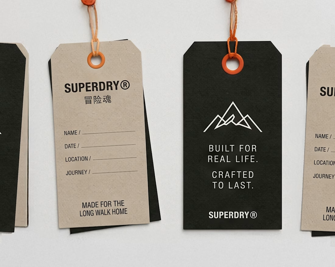
An existing brand identity showcased across a new campaign. This was one of my favourite projects ever!

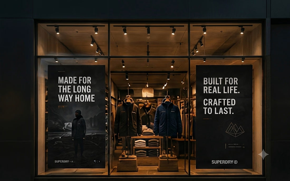
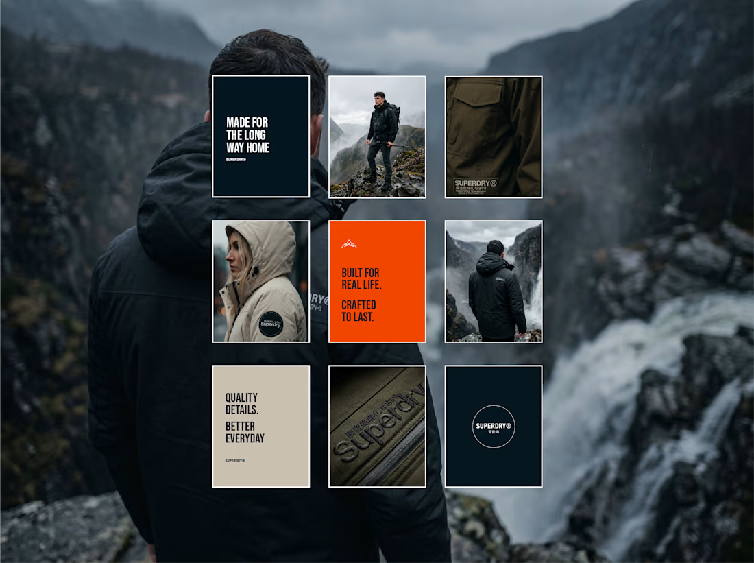
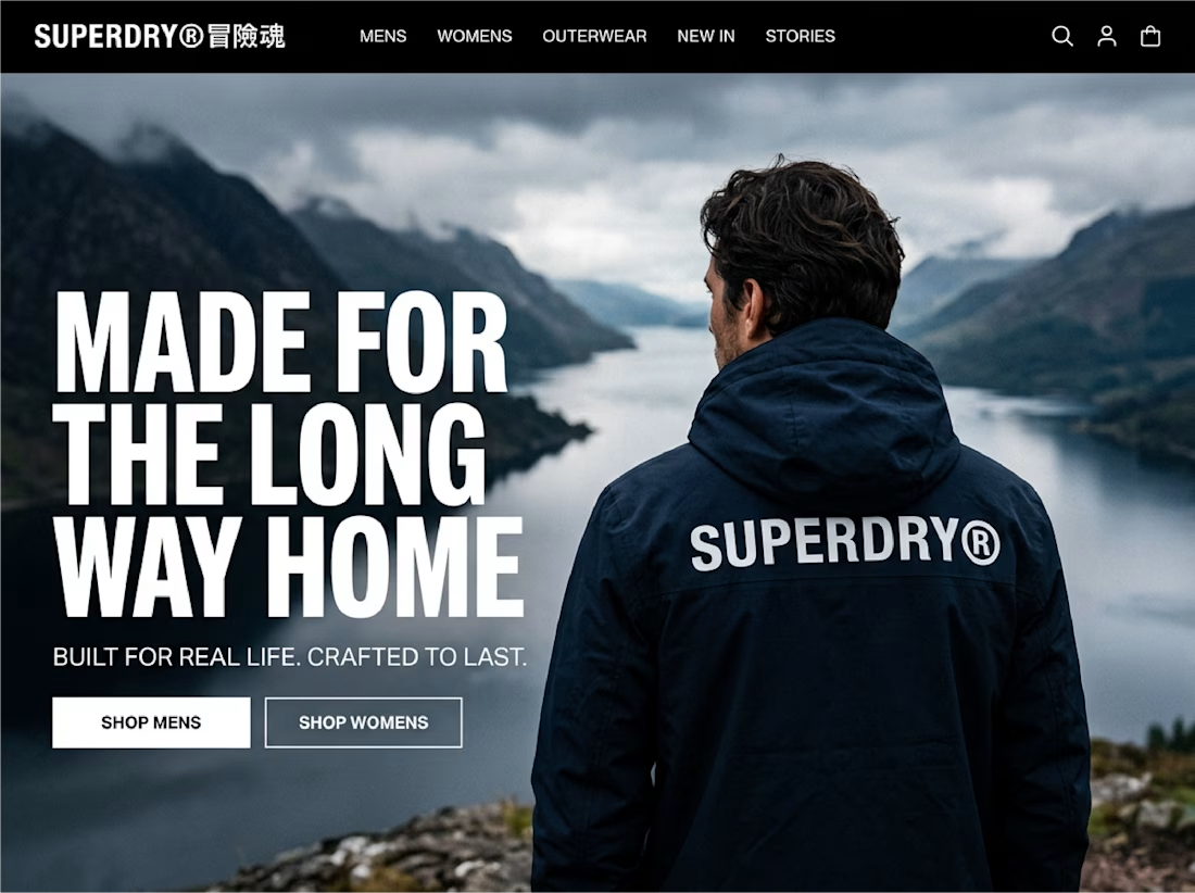


made for the long way home across the back of that jacket is so good
Couldn't agree more!!

Great brand identity design specially bottom right and bottom left designs ❤️❤️
Great job Seadhna🔥🔥
Thank you so much Mostafa, as always!
Pardon Seadhna❤️
How you get your first client❓ help me please😊

Love this!
Thank you so much Bella!

Amazing
Thank you so much Noah!

That gold foil on textured paper is just perfect. Really love the soft swirl in the logo, feels so calm. Saved for inspiration!

Love the bold type against those mountain photos, Seadhna 🤍
Thank you so much Thayline, really captures the atmosphere doesn't it?


Nice 👍
Thank you!!

Taking an existing identity and stretching it across a whole new campaign is such a good test of a system. This looks like one of those projects where everything just clicked.
Ah, thanks so much Timothy. It really is! It is such a great brand identity that it was a really easy project to undertake honestly and it was a pleasure to work with the assets.

The "Made for the long way home" hoodie shot is great. Those hang tags feel like a real outdoor brand.
Thank you so much Rafee! Love hearing your thoughts!

The 'Made for the long way home' line does a lot of heavy lifting here — it holds on the jacket back, the store interior and the hang tags without feeling repeated. That's the sign the identity was strong before the campaign started. The mountain type treatment is my favourite...
Thank you so much Olanrewaju, i'm so glad you see the vision! I'm loving reading your thoughts. Thank you for sharing them!

Awesome case study! The visual hierarchy and brand consistency here look so clean.
The network for creativity
Join 1.25M professional creatives like you
Connect with clients, get discovered, and run your business 100% commission-free
Creatives on Contra have earned over $150M and we are just getting started



Related posts

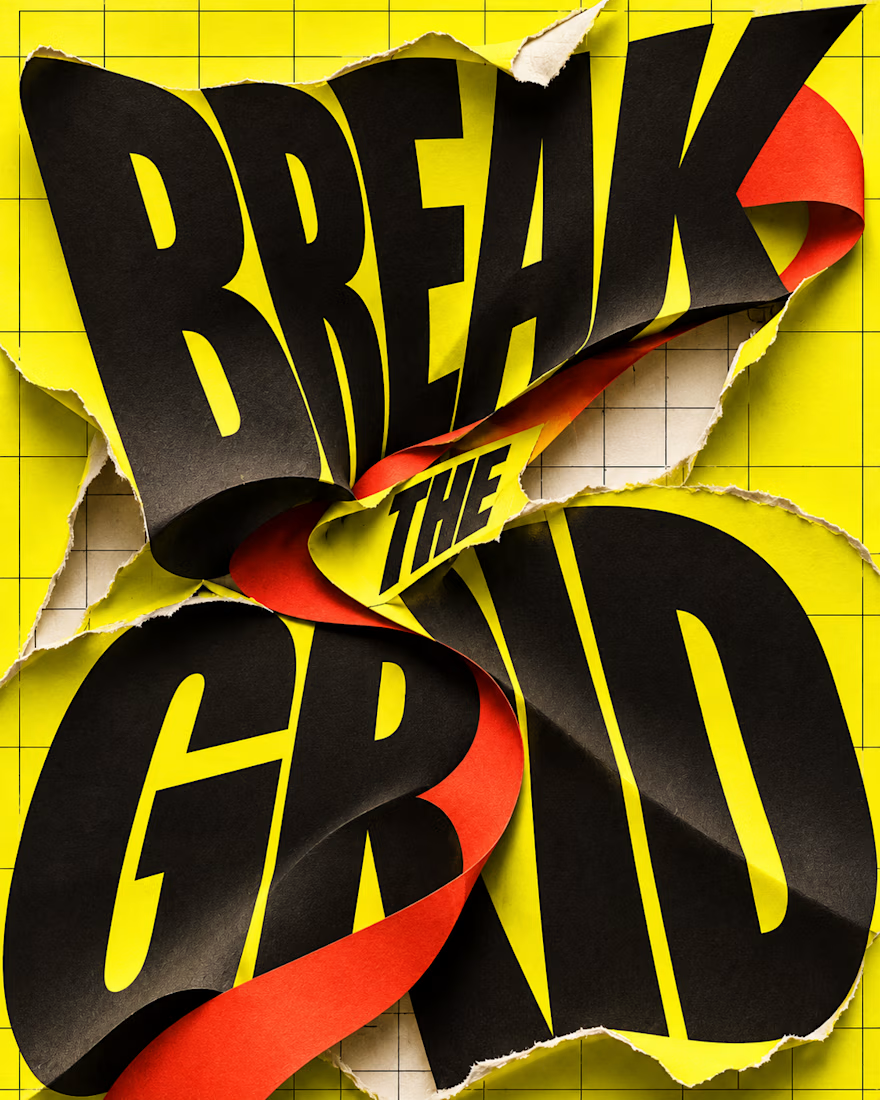
What happens when typography refuses to stay inside the grid?
BREAK THE GRID — an AI-generated visual experiment combining oversized lettering, torn-paper textures and bold colour. The words become the action: bending, tearing and breaking through the layout.
Controlled structure or creative chaos—which draws you in?

Day-02 of Poster Design
Style: Swiss International | Word: Order
The Quote i used i from benjamin franklin.
"A place for everything, everything in its place."
If someone ask you a question that 'define design in a single quote'
This is the perfect one to say.
Which design do you like?

3 voted
38%
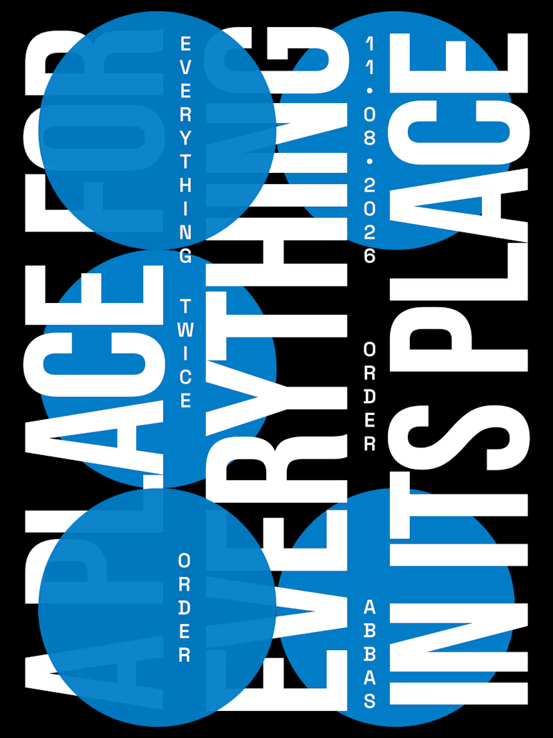
5 voted
62%
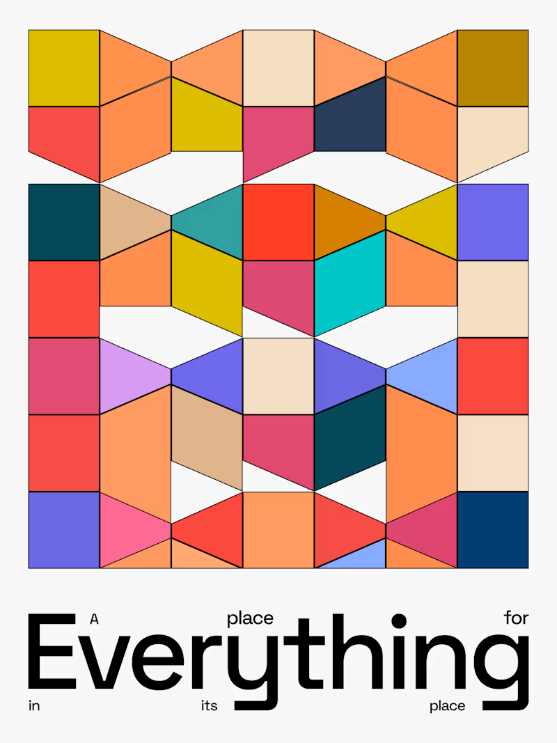
8 votes
Closed


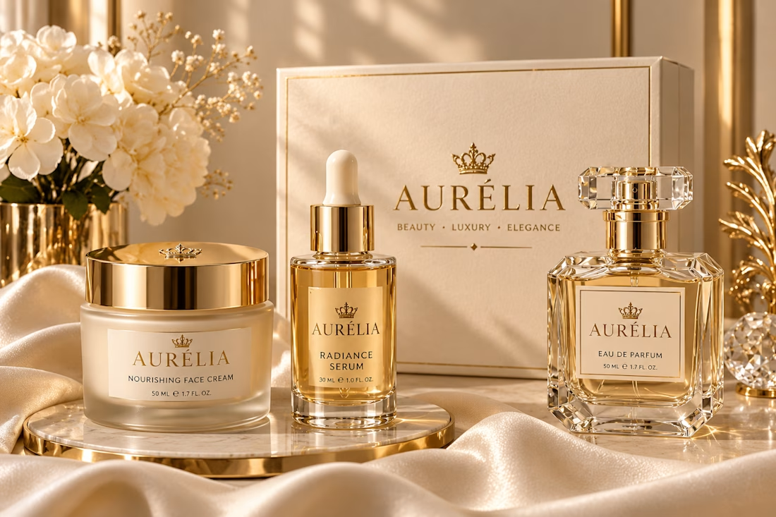
AURÉLIA - Luxury Beauty Brand Identity & Packaging I designed a complete luxury beauty brand concept for AURÉLIA. What I created: - Gold Crown Logo - Luxury Packaging for Face Cream, Serum & Perfume - Beige & Gold Brand Color Palette - Elegant Product Photography Style My goal was to make the brand feel Royal, Soft & Premium. If you want a luxury brand like this for your beauty business, let's work together!