The network for creativity
Join 1.25M professional creatives like you
Connect with clients, get discovered, and run your business 100% commission-free
Creatives on Contra have earned over $150M and we are just getting started
Back to feedPost
One thing I’ve noticed after working with different SaaS, AI, and technical startups is how surprisingly similar their branding can become.
Different products.
Different industries.
Different technologies.
Yet somehow, the logos often start looking the same: abstract gradients, connected nodes, neural-network-inspired shapes, generic geometric symbols, or the usual “futuristic” aesthetic.
And I get why.
When you’re building a technical product, it’s easy to rely on visual language that immediately says AI, technology, innovation.
But the problem is: when everyone speaks the same visual language, nobody really stands out.
A strong tech logo doesn’t necessarily need to look technical.
It needs to be recognizable, distinctive, scalable, and connected to the company’s actual identity.
That’s something I’ve become much more conscious of when designing for SaaS and AI companies, creating a visual identity that feels like their company, rather than simply another “AI startup.”


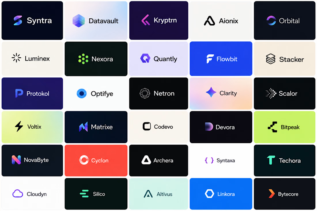

That distinction matters on the website too. A recognizable logo can still get lost if the headline, typography and product story all feel interchangeable. One useful check: hide the company name and ask what on the page could only belong to this particular product.

Exactly! The logo can’t do all the heavy lifting. The whole brand experience needs to feel unmistakably yours.
The network for creativity
Join 1.25M professional creatives like you
Connect with clients, get discovered, and run your business 100% commission-free
Creatives on Contra have earned over $150M and we are just getting started











Related posts

Behind the scenes of the Treal Studio brand film.
Built in one week, from creative direction to sound design.


Love the overall feel, looks amazing 👌🏼

It’s been a minute since my last post here on Contra.
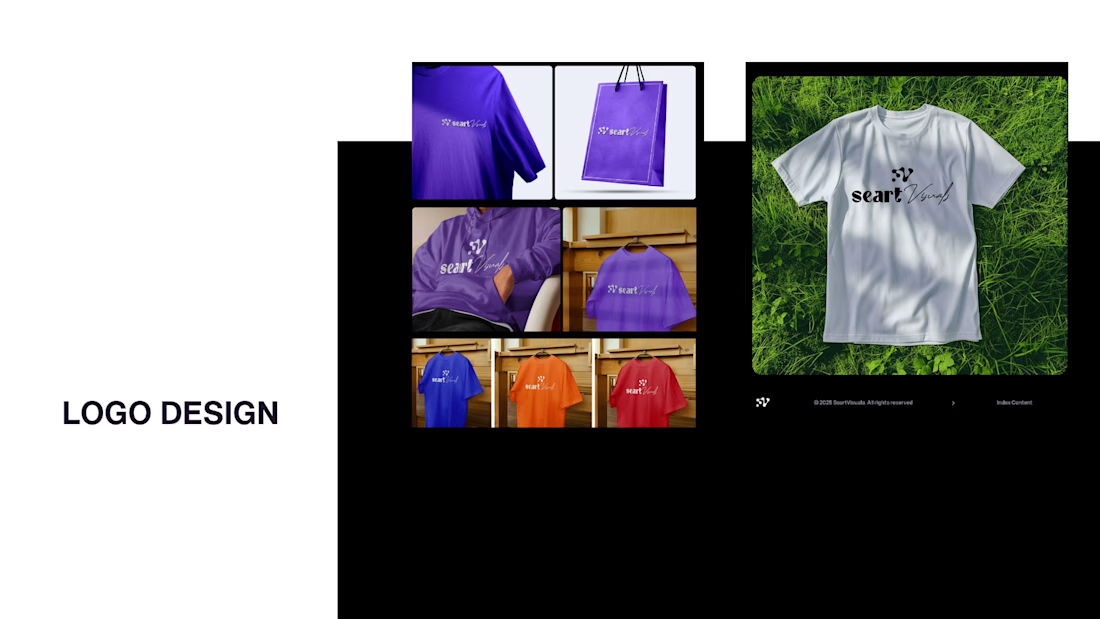
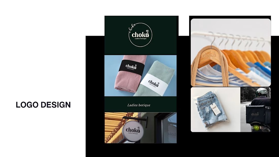
While my main focus usually lives in photo editing and digital design, I was digging through the archive recently and thought it’d be fun to share a couple of branding projects from the past:
Slide 1: Seart Visuals apparel & merchandise branding (1 year ago)
Slide 2: Choku Ladies Boutique identity and mockups (2 years ago)
Brand identity isn't my everyday lane, but tackling projects like these taught me a lot about visual consistency across different mediums. I’d love to hear your thoughts or see any feedback from fellow designers. Great to connect with the community again.



That's really great typography logo design❤️❤️

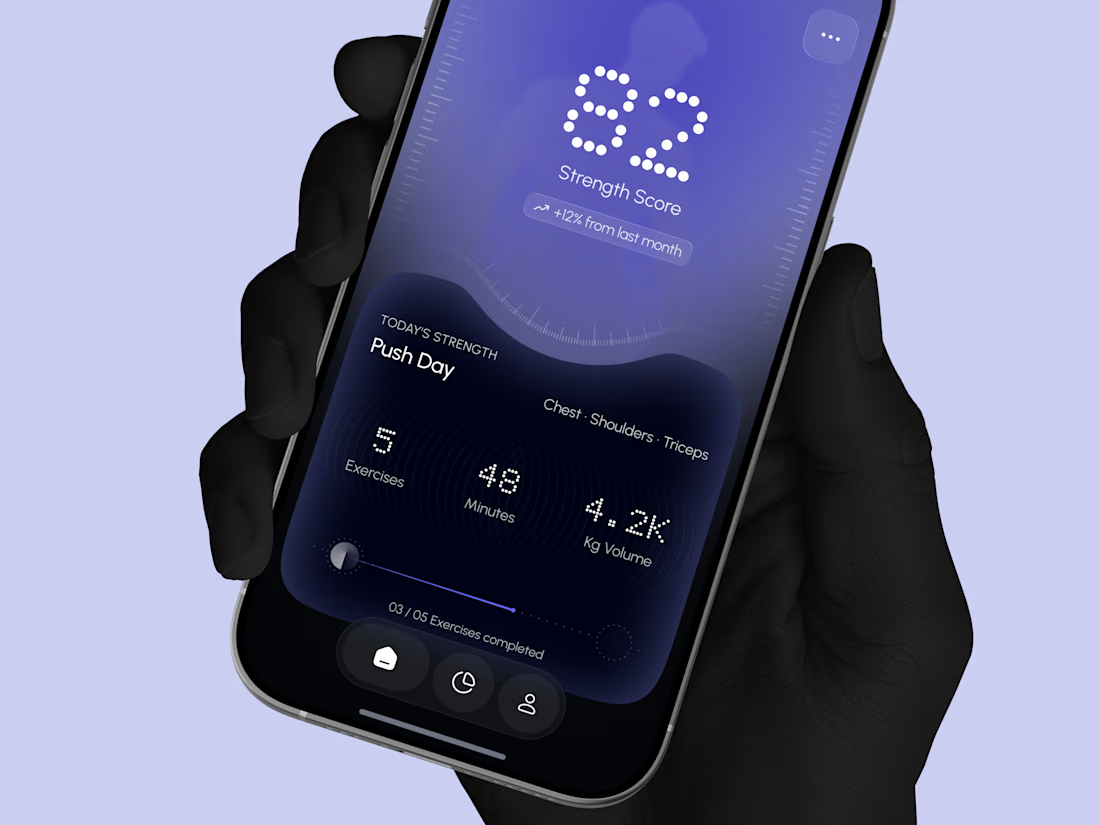
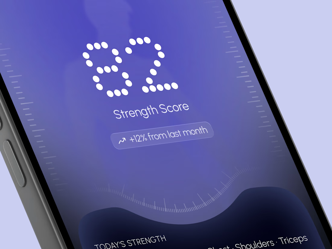
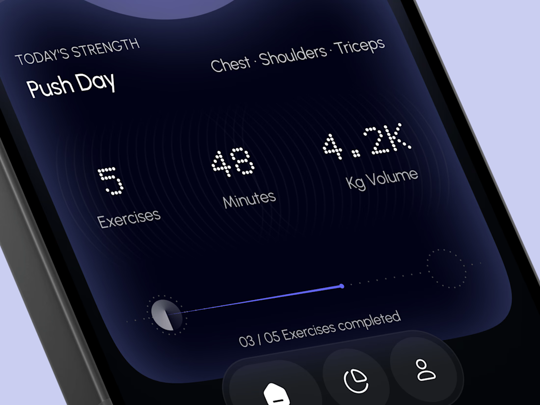
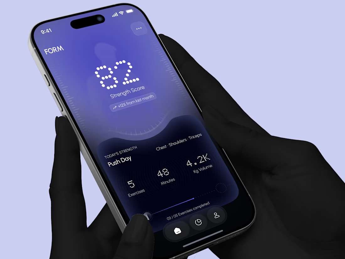
Designed a modern Strength Training Mobile App.
A deep indigo and violet gradient with a soft body silhouette and dotted display numbers for a bold and focused first impression.
A glowing strength score, a clear workout card with exercises, minutes, and volume, plus a simple progress bar make every training session easy to follow. A curved dark panel, fine tick marks, and a floating tab bar keep the whole app sleek, modern, and easy to use.


High end execution