The network for creativity
Join 1.25M professional creatives like you
Connect with clients, get discovered, and run your business 100% commission-free
Creatives on Contra have earned over $150M and we are just getting started
Back to feedPost

Does your team move the same job between documents, spreadsheets, and several tools?
That is the kind of product problem I like working on.
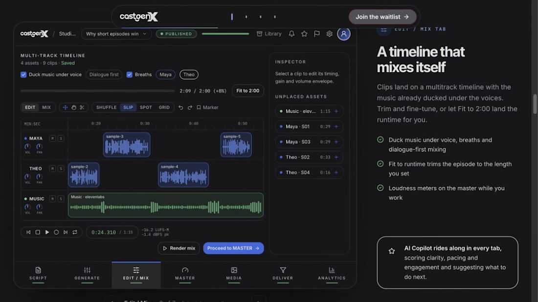
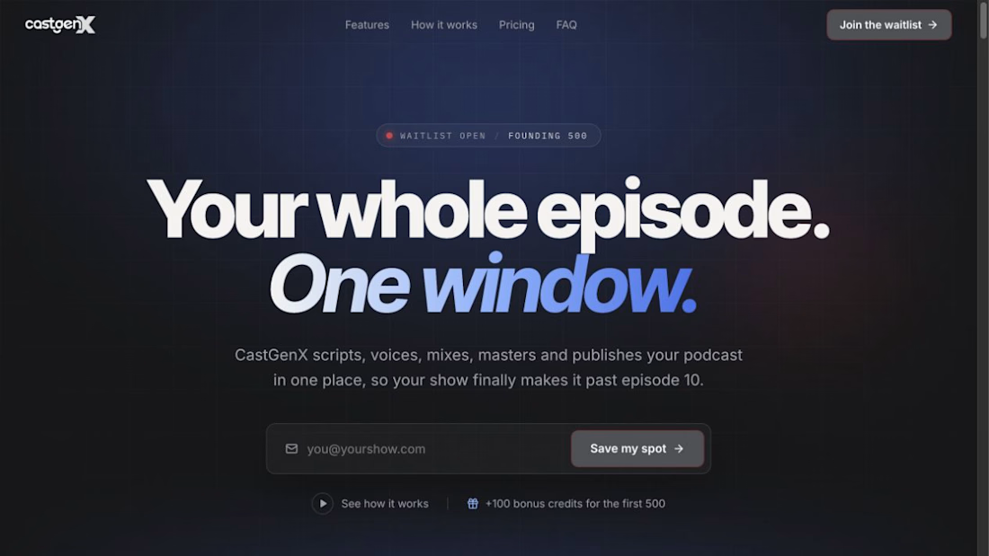
With CastGenX, I’m organizing podcast production around one episode, with connected workspaces for the steps from script to delivery. I led the product and UI direction, worked through reusable components in Figma, and used Claude’s guidance during development. The public tour also presents TypeSafe Jev quality feedback within the workflow.
The same design approach could help a content team manage approvals, an agency build a client workspace, or a founder turn a manual service into an app.
We would start by mapping your current process, identifying the costly handoffs, and choosing a focused first version. From there, I can help design the interface, implement the frontend, and explain the product on its launch website.
CastGenX is currently in pre-launch; you can see the product direction in my case study.
Message me on Contra with three things: who uses the workflow, where it gets stuck, and what a better result would look like.
#availablefornewprojects #WebDevelopment #UIDesign




building everything around one episode is smart, thats literally how podcast teams think about their week
The network for creativity
Join 1.25M professional creatives like you
Connect with clients, get discovered, and run your business 100% commission-free
Creatives on Contra have earned over $150M and we are just getting started
Related posts

Serious numbers, calm design.
512Financial is an Austin-based firm that steps in as the finance, HR and hiring team growth-stage companies don’t have yet. Their world is board meetings, due diligence and funding rounds, which can feel heavy and intimidating for founders.
My goal with the website was to make it feel the opposite: clear, steady and human. Deep green tones, lots of breathing room, and a “Readiness by Stage” section that lets every founder find their next step in seconds, from Seed to Series B and beyond.
Live now: 512financial.com


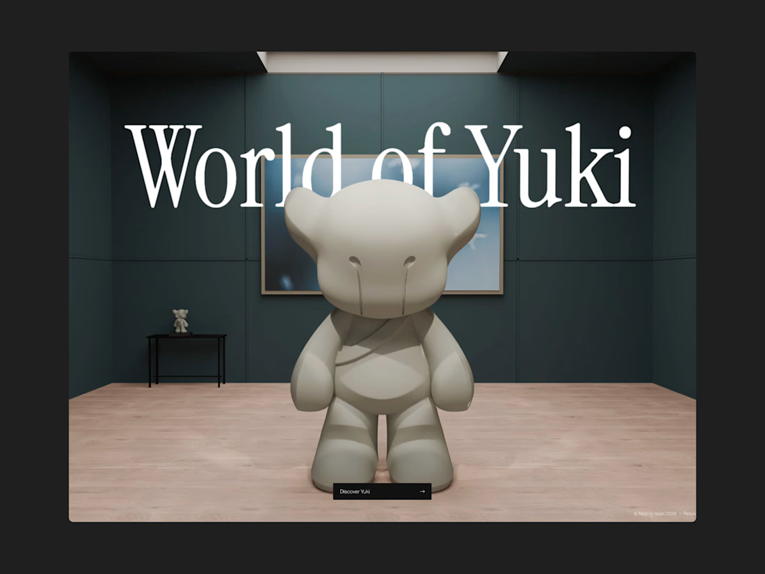
Our latest project for Nági by Isaac is live now! 🚀
A full 3D blender built website together with Higgsfield Scroll Environments is live now on Framer! We've put a crazy amount of work into this project, feel free to check it out here <3


Nice model

Casemate: making malware analysis feel calm instead of scary
Cybersecurity websites usually look the same: black background, green code, a hooded guy. I wanted to try the opposite for Casemate, a concept for a malware analysis tool.
The idea is simple: the product keeps a suspicious file in a sealed chamber and watches what it does. So I put a bug frozen in amber in the middle of a canyon. It’s dangerous and under control at the same time, and you get it without reading a word.
Then I made sure the page still works for a security lead who wants facts. The stats sit right next to the headline: threats isolated, latency, endpoints covered.
The hardest part was keeping it warm without losing trust. I stayed with one terracotta colour, wide capitals and mono labels, so it reads like a serious tool and not a poster.
I’m taking on new projects for SaaS and tech teams. If you have a product that’s hard to explain in one glance, send me a message.
What do you think, would you trust a security product with a canyon on the homepage?


I love it! It feels so calm, and I would definitely try it! This is amazing, Kris. I never thought cybersecurity could be this cool ❤️🔥