The network for creativity
Join 1.25M professional creatives like you
Connect with clients, get discovered, and run your business 100% commission-free
Creatives on Contra have earned over $150M and we are just getting started
Back to feedPost
Taste Test

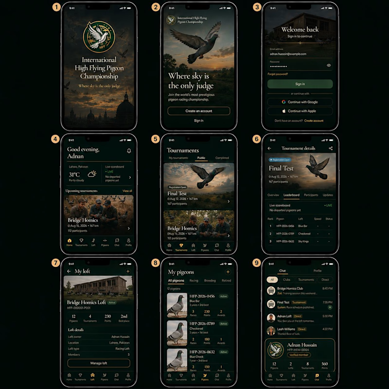
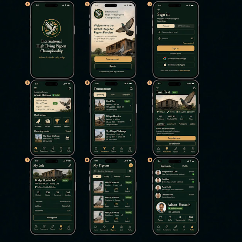
UI/UX Evaluation: Dark Emerald (V1) vs. Warm Gold (V2)
Which design best balances platform utility and premium visual hierarchy?
Visual Identity: Does V1’s atmospheric dark emerald glow feel more high-end, or does V2’s high-contrast gold theme offer better clarity?
Information Architecture: Do you prefer V1's scannable horizontal feed, or V2's action grid (Quick Action icons + featured hero card)?
Data Density: Which layout displays complex stats (ring numbers, race distance, standings) clearer on My Pigeons and Tournaments?
Navigation: Does V1’s bottom-heavy layout feel more ergonomic, or does V2’s top segmentation offer better control?
Which direction creates a stronger first impression for new members?
3 voted
100%
0 voted
0%
3 votes
Closed

The network for creativity
Join 1.25M professional creatives like you
Connect with clients, get discovered, and run your business 100% commission-free
Creatives on Contra have earned over $150M and we are just getting started







Related posts

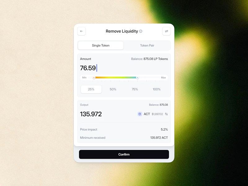
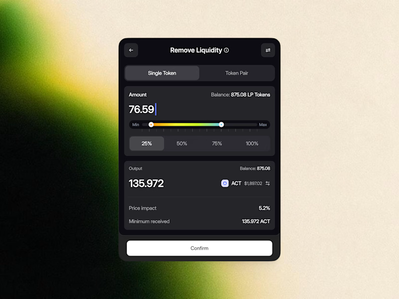
Remove Liquidity component cards for a recent Web3 design project—what would be the best direction for readability and focus? Dark Mode or Light Mode? ⚡️

12 voted
40%
18 voted
60%
30 votes
Closed

White one need bit more darker bg on elements to make them visible like the dark more does.

Two moods for one tutoring website🤩 Which would you click?
These were two early website concepts we put together for TutorIQ before choosing the main design.
Tell us in the comments what caught your eye:
🧩 1 — Light and playful
☀️ 2 — Softer and calmer
Mini case study with the final website design is coming here very soon!
11 voted
55%
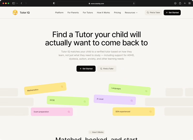
9 voted
45%
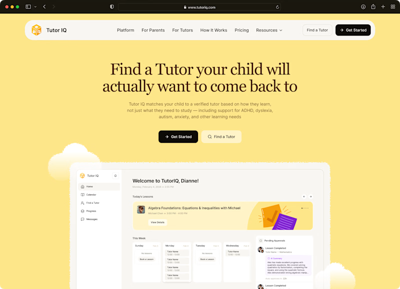
20 votes
Closed

I'm going with Light and playful 🧩

These 2020 banners for Sports Timing Systems took me hours upon hours. I had to use various tools and resources: 3D Max, 3D models, stock images, all mixed and edited in Photoshop.
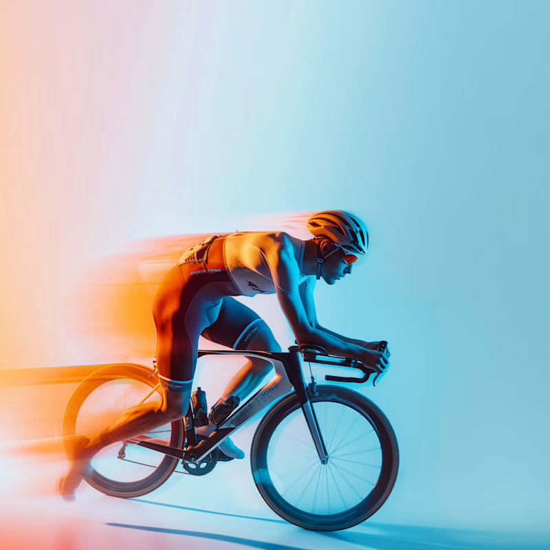
When I did the brand evolution in 2024, I swapped the 3D models for AI-gen, yet the final looks/effects were post-produced in Adobe PS.
Which one feels neater, better, cooler, eye-catching?
In both cases visuals were made as series, matching the full branding I developed at the time.

8 voted
26%
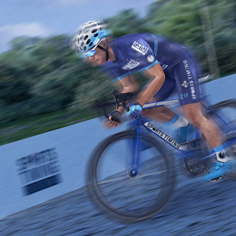
23 voted
74%
31 votes
Closed

Definitely A looks current and the design feels neater and cleaner