The network for creativity
Join 1.25M professional creatives like you
Connect with clients, get discovered, and run your business 100% commission-free
Creatives on Contra have earned over $150M and we are just getting started
Back to feedPost
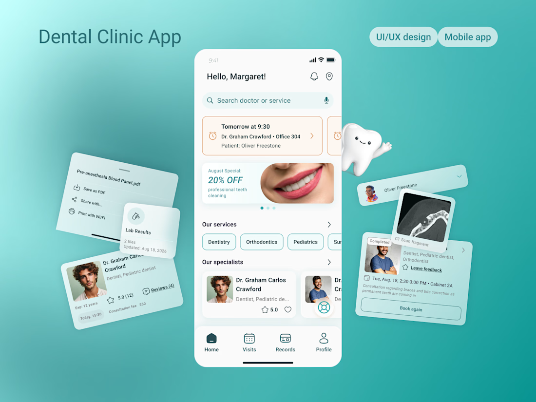
Just published my latest Dental Clinic App case study on Contra!
Designed to simplify the patient journey - from finding a specialist to booking appointments and managing medical records.
Check it out and let me know what you think! 💙

Beautiful work! 👏 I really love the clean visual style and attention to detail. The experience feels intuitive, polished, and perfectly suited for the healthcare industry. Great job! ✨

Thank you so much 💚 I really appreciate your feedback! Keeping the experience intuitive and stress-free for healthcare users was my main priority during the design process, so it means a lot to hear that!

I really like the clean and modern style!😍
Thank you 😊

Really nice work! I like how the visual design feels calm and welcoming while keeping the information easy to scan
Thank you 😊

Love how simple and approachable the whole experience feels. Great work!🙌 🔥
Thank you so much 😊

i really loove it 😍 great job!
Thank you so much 🥰

Great job on the case study 👏
Thank you!


Great work! Amazing design!
Thanks a lot 😊

So creative 👏
Thank you

Awesome work!
The network for creativity
Join 1.25M professional creatives like you
Connect with clients, get discovered, and run your business 100% commission-free
Creatives on Contra have earned over $150M and we are just getting started









Related posts


The app looks amazing, but do you think the number font might be a bit hard for people to read quickly when checking their money?

Wellness shouldn’t feel like another task on your to do list.
Elixra turns breathing, sleep, and mindful routines into an immersive digital experience through cinematic visuals, soft interactions, and rewarding micro moments.
What if wellness felt like this?


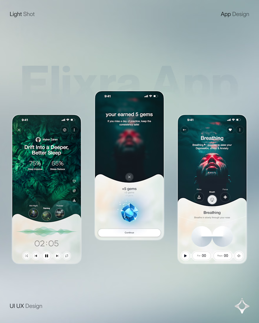
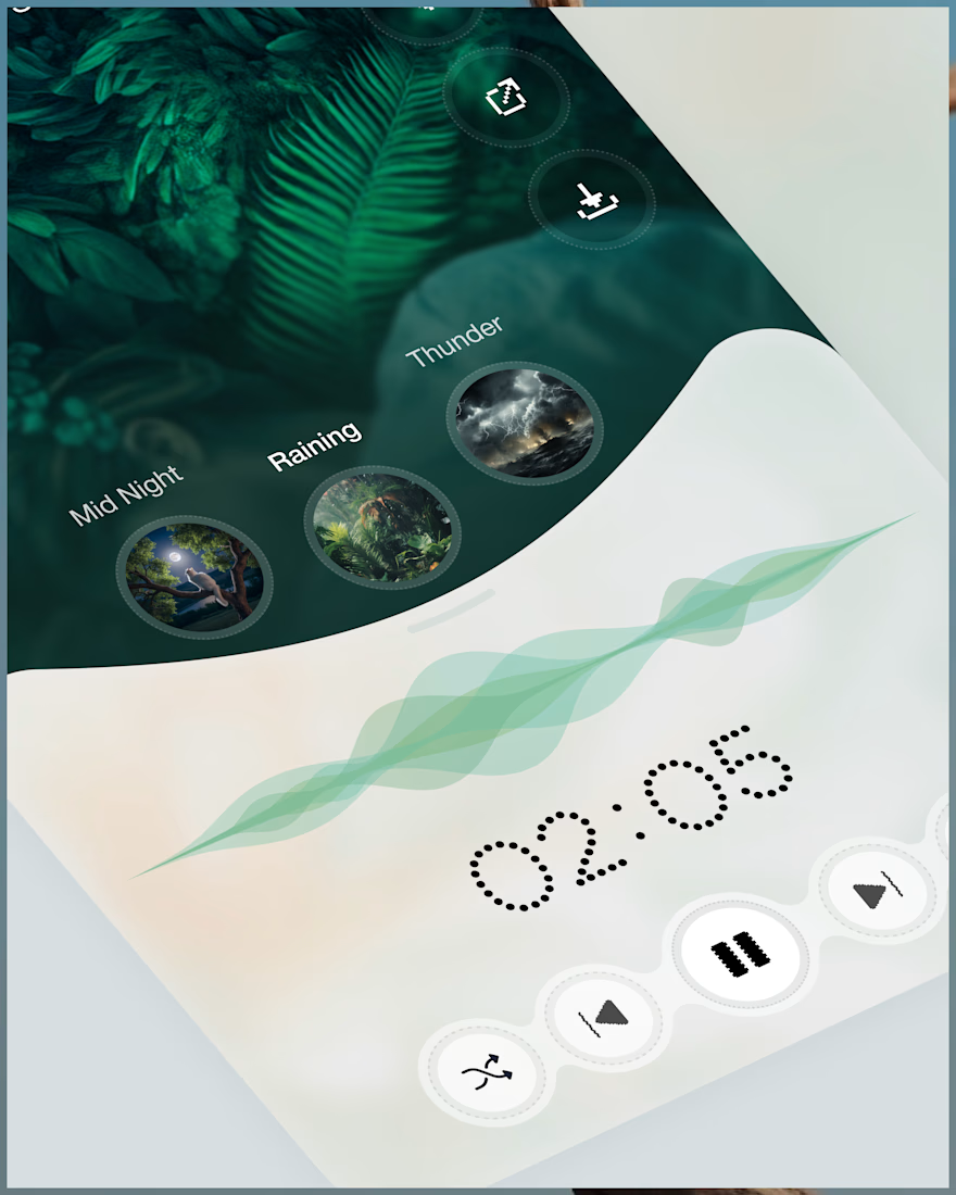
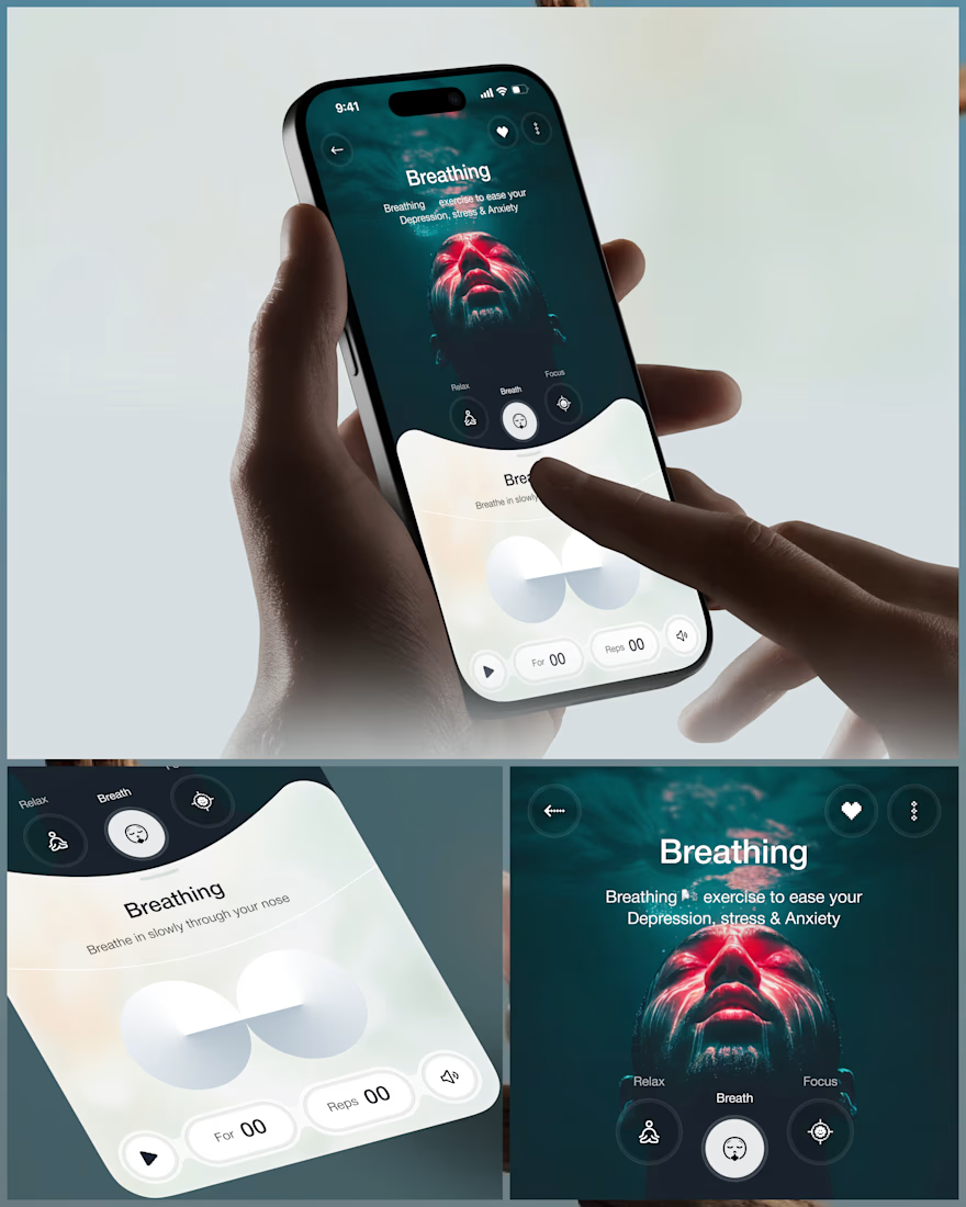
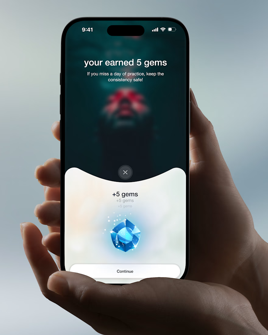

Love the soft interactions and micro moments idea. The cinematic approach makes wellness feel calm, not clinical.

Designed a modern Healthcare Landing Page.
A calm teal and soft blue interface with elegant serif typography for a warm and trusted first impression.
A quick doctor search, friendly doctor profiles, hand-drawn medical illustrations, and patient reviews make finding care feel simple and human. Clean cards, generous spacing, and a smooth mobile booking section keep the whole page clear and easy to explore.
healthcarewebsitedesignmedicallandingpageProduct DesignUI DesignWeb DesignAdobe After EffectsFigmaJitter


I love this very much