The network for creativity
Join 1.25M professional creatives like you
Connect with clients, get discovered, and run your business 100% commission-free
Creatives on Contra have earned over $150M and we are just getting started
Back to feedPost
Taste Test
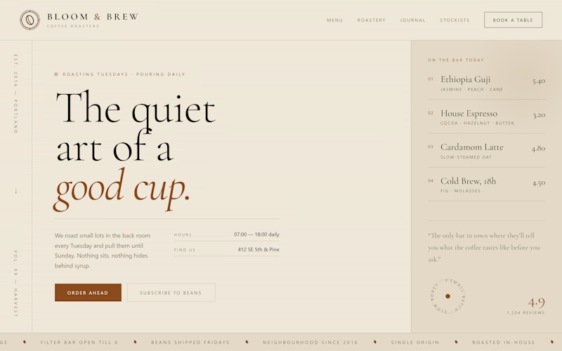
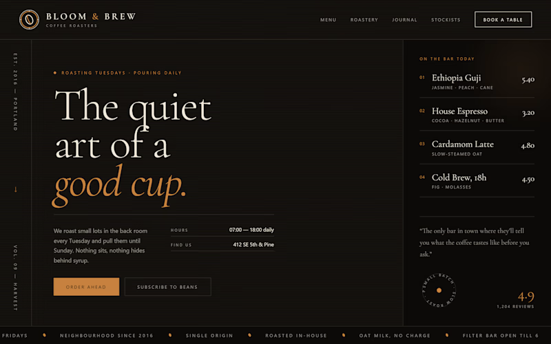
Currently working on a café landing page for a client, and I’m stuck between two directions:
☕ Dark, moody, rich roast
☕ Clean, bright, light roast
Both give the brand a completely different feel.
Which one feels more premium for a specialty café?
Light or Dark?

14 voted
54%
12 voted
46%
26 votes
Closed

Dark feels more premium to me, especially for a specialty café

Interesting, dark seems to be getting some love 👀


Dark and moody instantly evokes that rich, artisanal espresso bar depth, but a clean, bright layout communicates high-end specialty light roasts so well. Dark gives that exclusive evening lounge vibe, while Light feels fresh and daily. Dark takes the edge for sheer premium atmosphere!
I agree, dark feels more premium and classy. It gives the brand a strong and unique look.

We developers and a lot of techies mostly prefer the Dark modes, but here I think the theme of the light one is good, it just need the little improvement in text-visibility. I suggest you to use any shades of brown for smaller texts and nav-btn or links. It would be great to...
I agree. The light theme looks good, just improve text visibility with brown shades. A theme toggle would also be a nice addition.

Both looks great !
Thank you

I'd decide this from the café's busiest hours. Dark fits an evening crowd; light feels more like a daytime coffee stop.
True, it really depends on the café’s crowd. Dark works better for evenings, while light feels more natural for daytime.

Dark wins the premium first impression, but I’d keep the ordering and menu sections lighter for readability. A dark, moody hero flowing into warm cream content blocks could preserve the specialty-roast atmosphere without sacrificing conversion.
Yeah, I like that. Dark for the first impression, lighter sections for readability. Best of both.

Dark always attracts...... Go for dark
Thank you

Light one


dark feels premium. the coffee menu looks great
The network for creativity
Join 1.25M professional creatives like you
Connect with clients, get discovered, and run your business 100% commission-free
Creatives on Contra have earned over $150M and we are just getting started
Trending
retrofuturism
Share your favorite designs from the past exploring the distant future. Or your own take on the aesthetic 🚀
halftone
Dots. Texture. Grain. Let's see your designs using the halftone technique.

Midjourney
Creatives are showing off what they're making with Midjourney.
colorgrade
Video editors sound off: How do you enhance the mood of your video in color grading?





Related posts


I’ve been staring at these two for too long, so I’ll let you decide.
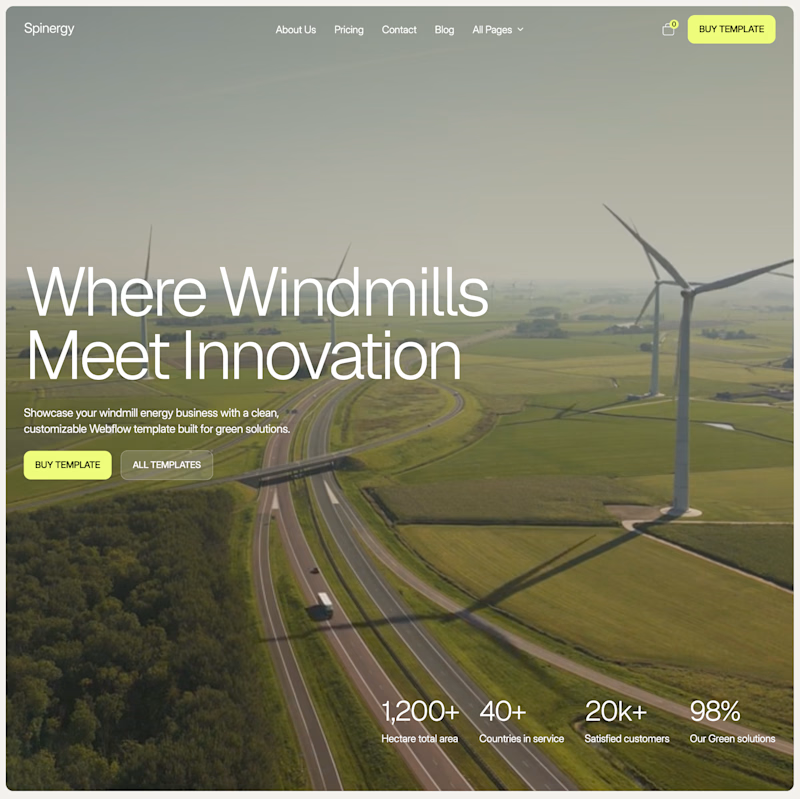
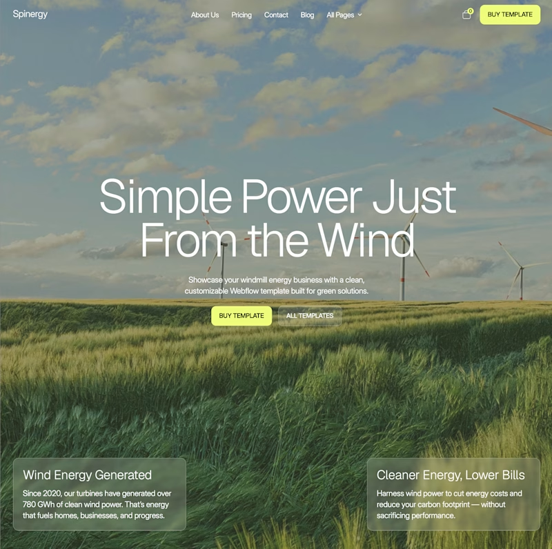
Both are homepage directions for Spinergy, a Webflow template for wind energy companies.
Which one would you choose?

50 voted
68%
24 voted
32%
74 votes
Closed


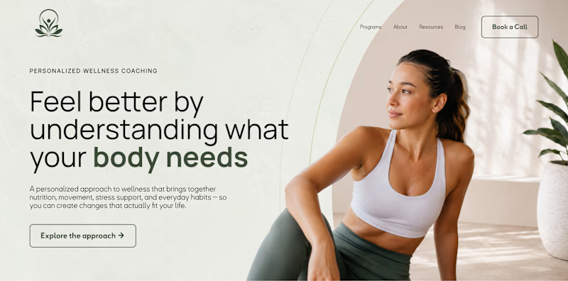
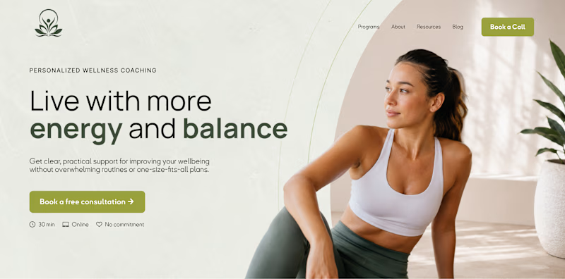
What should a homepage prioritize first: understanding or action?
A hero section can look almost identical visually and still be built around a completely different goal.
Version A focuses on clarity. Version B focuses on conversion.
One helps users understand before they decide. The other makes the next step immediately obvious. Neither approach is automatically better. The right one depends on what visitors need most at that stage of the journey.
Which would you prioritize on a homepage: clarity first or action first?
14 voted
27%
38 voted
73%
52 votes
Closed

I love the filled button more than the outline however I recommend to use one filled button and the other should be secondary otherwise users will be confused “where should I click”


Outstanding work, I really like it! 🔥