The network for creativity
Join 1.25M professional creatives like you
Connect with clients, get discovered, and run your business 100% commission-free
Creatives on Contra have earned over $150M and we are just getting started
Back to feedPost

Visual Identity Design for Aoki. Aoki Pastry Shop is a modern pastry brand inspired by Japanese simplicity, softness, and craft. The shop offers fresh pastries, baked goods, seasonal desserts, and takeaway treats in a calm and welcoming space.
The visual identity concept features a custom wordmark that represents the various layers involved in baking cookies, as well as their premium and authentic taste. The warm and vibrant color palette is inspired by the ingredients and baking process, complemented by minimalist yet elegant graphic motifs.
logovisualidentitybrandingBrand DesignLogo DesignMotion DesignAdobe After EffectsAdobe IllustratorAdobe Photoshop



The network for creativity
Join 1.25M professional creatives like you
Connect with clients, get discovered, and run your business 100% commission-free
Creatives on Contra have earned over $150M and we are just getting started



Related posts


Is text on album covers really tacky?
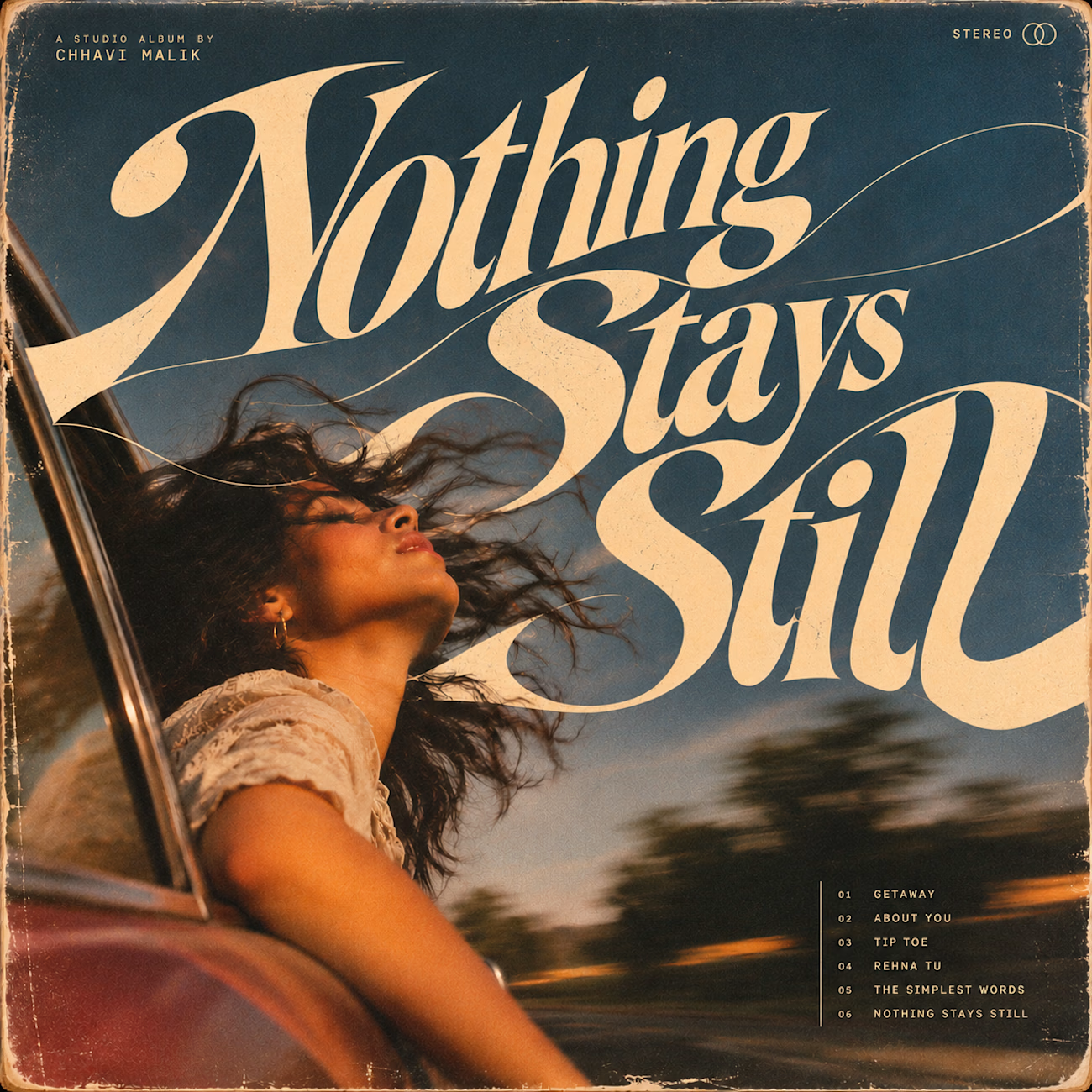
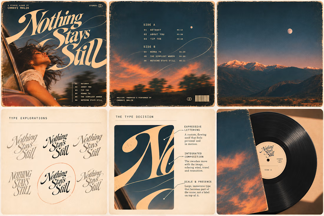
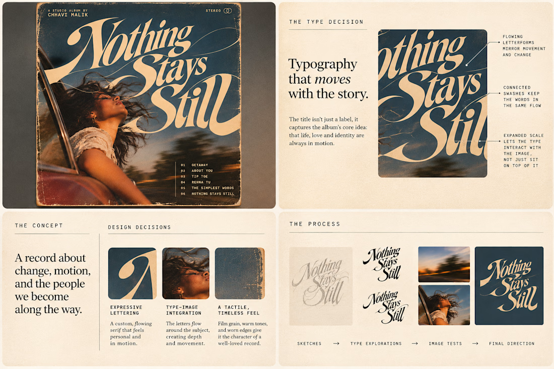
This question has been doing the rounds on X and I have to say, I'm firmly on the other side of that argument. I've always loved seeing typography become part of the artwork rather than just a title sitting on top of it.
So I wanted to put that idea to the test with an imagined album called Nothing Stays Still, inspired by change, fleeting moments and everything in between:)
I played around with the lettering until it felt expressive, a little restless, and inseparable from the photograph.
Because I think badly considered typography is tacky. Typography itself? Give it a chance :)
What's an album cover where the type really makes it for you?


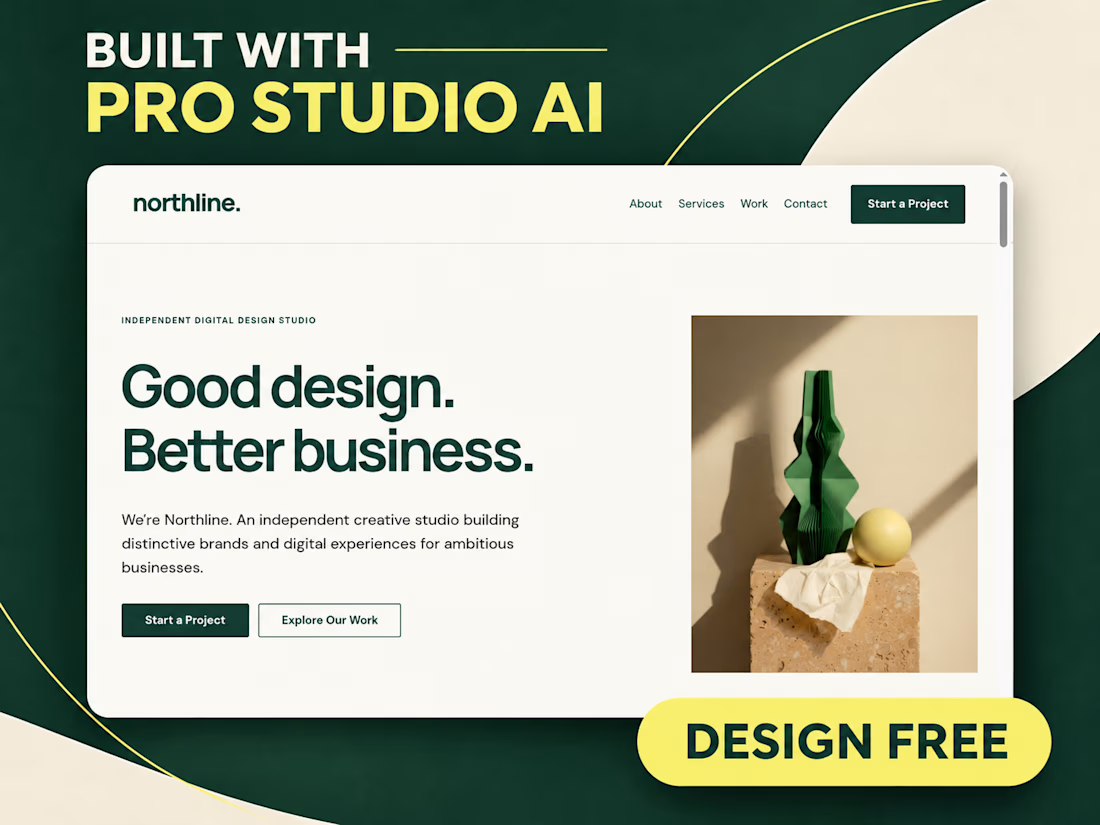
Meet Northline, a Kajabi template I just built with Pro Studio’s in-app AI.
Big typography. Forest green and citron. Beautiful project layouts. And animations I added right inside Pro Studio.
Open the demo and give it a scroll:
https://mm-themes.mykajabi.com/northline
If you design for Kajabi, I invite you to try it. You can build, experiment and refine your designs for free. You only pay when you export to Kajabi.
Comment if you want a copy of the zip file and I'll DM it to you!


Great job bringing this concept together. Wishing you more exciting projects and opportunities ahead!

What happens when a hummingbird gets translated into thread, then into pixels, then dropped into the sky?
Design exploration of the day: Relic Signal.
Bayer dithering, difference blend, five brand colors, one tiny messenger.
Craft on one side, static on the other.