The network for creativity
Join 1.25M professional creatives like you
Connect with clients, get discovered, and run your business 100% commission-free
Creatives on Contra have earned over $150M and we are just getting started
Back to feedPost

Reimagining Resolve AI's Visual Identity
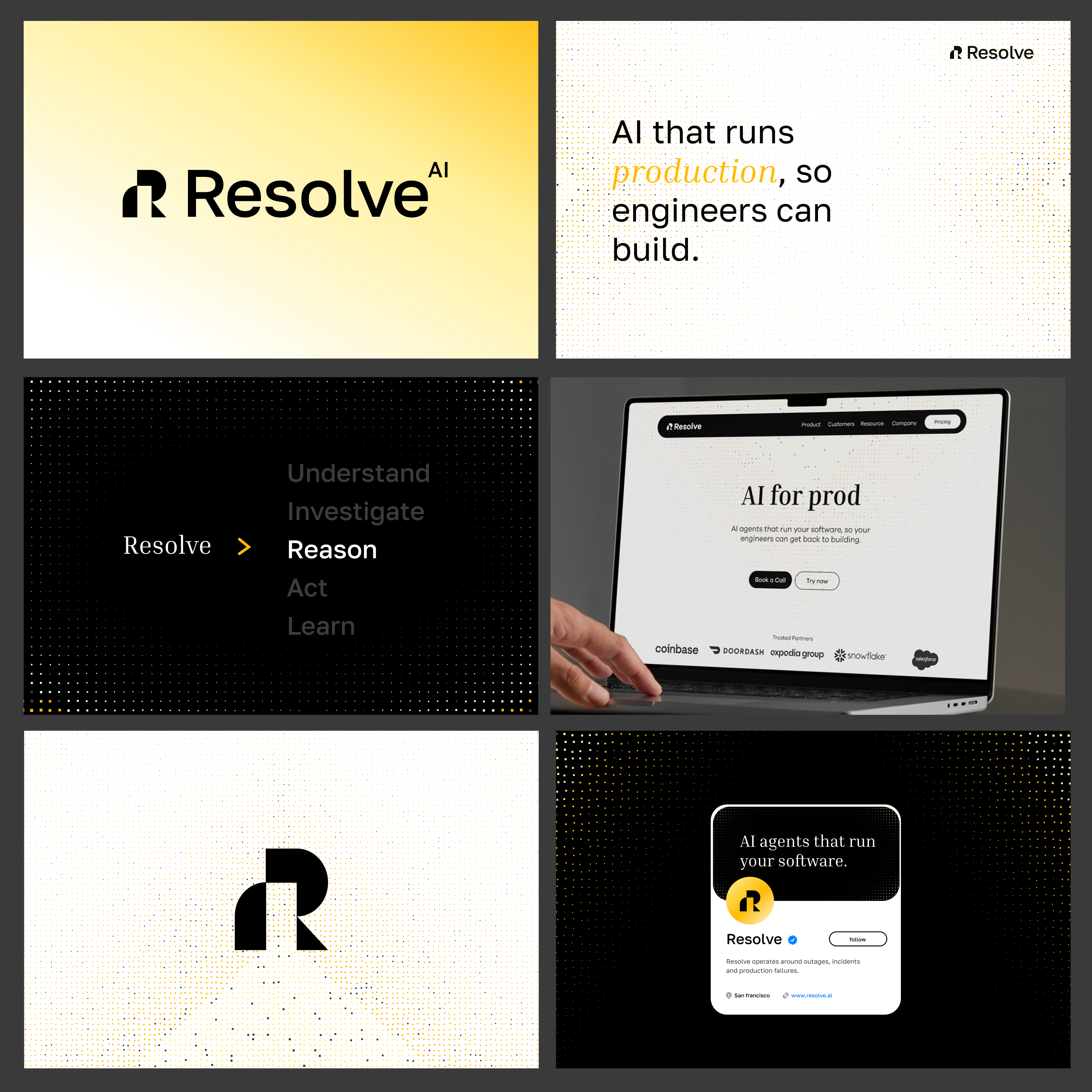
For this reimagination, I wanted the visual identity to communicate what Resolve AI actually does: intelligent systems that understand, reason, and act across production environments.
The logo builds on the letter R, using geometric forms and negative space to create a symbol that feels structured, technical, and recognisable without becoming overly complex.
The typography combines a clean, modern sans serif for clarity and technical confidence with a contrasting serif treatment for emphasis. This creates a balance between engineering precision and human intelligence.
I also introduced a warmer, more energetic yellow alongside black and off-white. The shift gives the identity more personality and uses yellow as a visual signal for intelligence, action, and moments of activity within an otherwise technical system.
The dot-grid language is central to the system. The dots represent nodes, connections, data points, and structured systems, visually referencing the network of processes that AI agents operate across. By changing density, scale, and placement, the grid can move from a subtle texture to a more expressive graphic element.
The result is a visual system designed to make AI infrastructure feel intelligent, structured, and alive.


Clean work & presentation!
The network for creativity
Join 1.25M professional creatives like you
Connect with clients, get discovered, and run your business 100% commission-free
Creatives on Contra have earned over $150M and we are just getting started
Trending
retrofuturism
Share your favorite designs from the past exploring the distant future. Or your own take on the aesthetic 🚀
halftone
Dots. Texture. Grain. Let's see your designs using the halftone technique.

Midjourney
Creatives are showing off what they're making with Midjourney.
colorgrade
Video editors sound off: How do you enhance the mood of your video in color grading?
Related posts

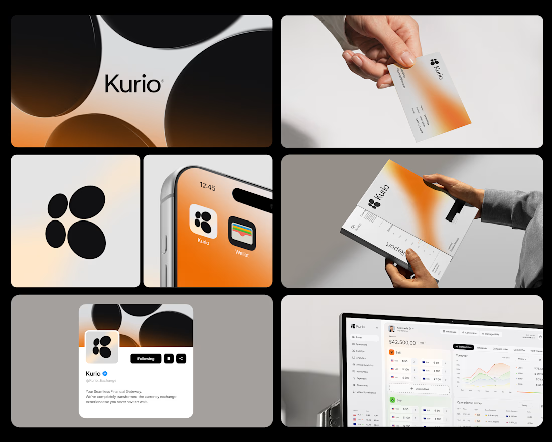
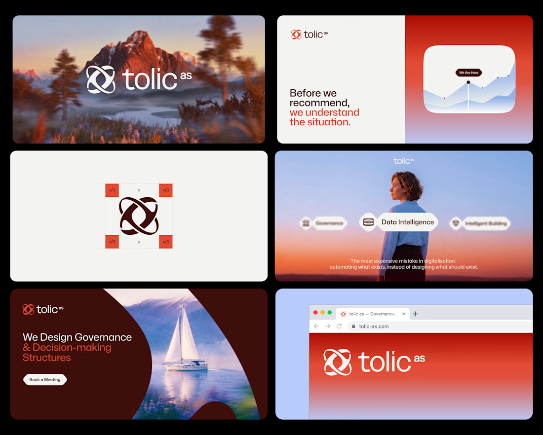
A few highlights from part of my fav projects I’ve worked on over the past few years. Some of them are brand identity, some websites+brand identity products.
Different industries and different stages, but the goal was always the same: build crispy, flexible visual systems that scale cleanly from screens to physical materials.


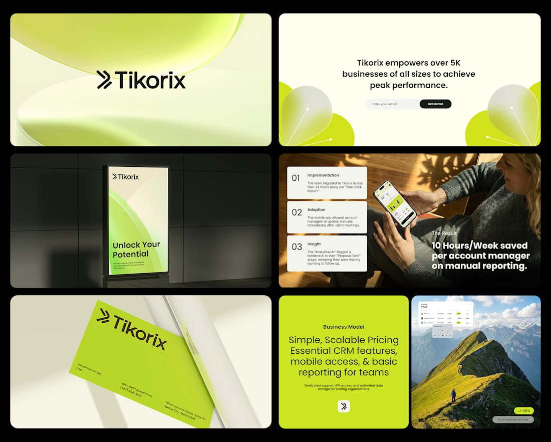

Watching the best design of the day.


Concept exploration for Crown, part of the my full process
Strategy and positioning lock first
Then logo
Then the identity system
Then full delivery
Every phase is decided before the next one starts

Great work

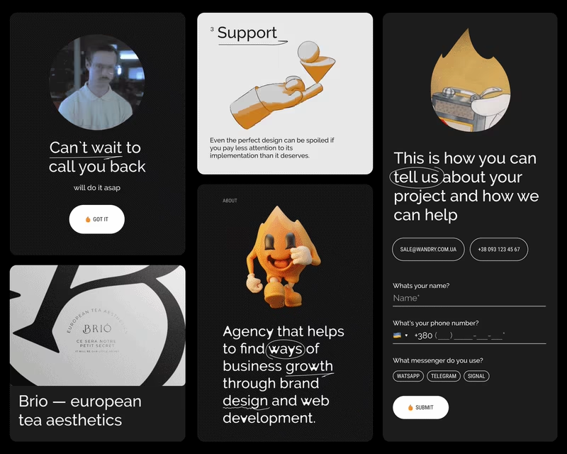
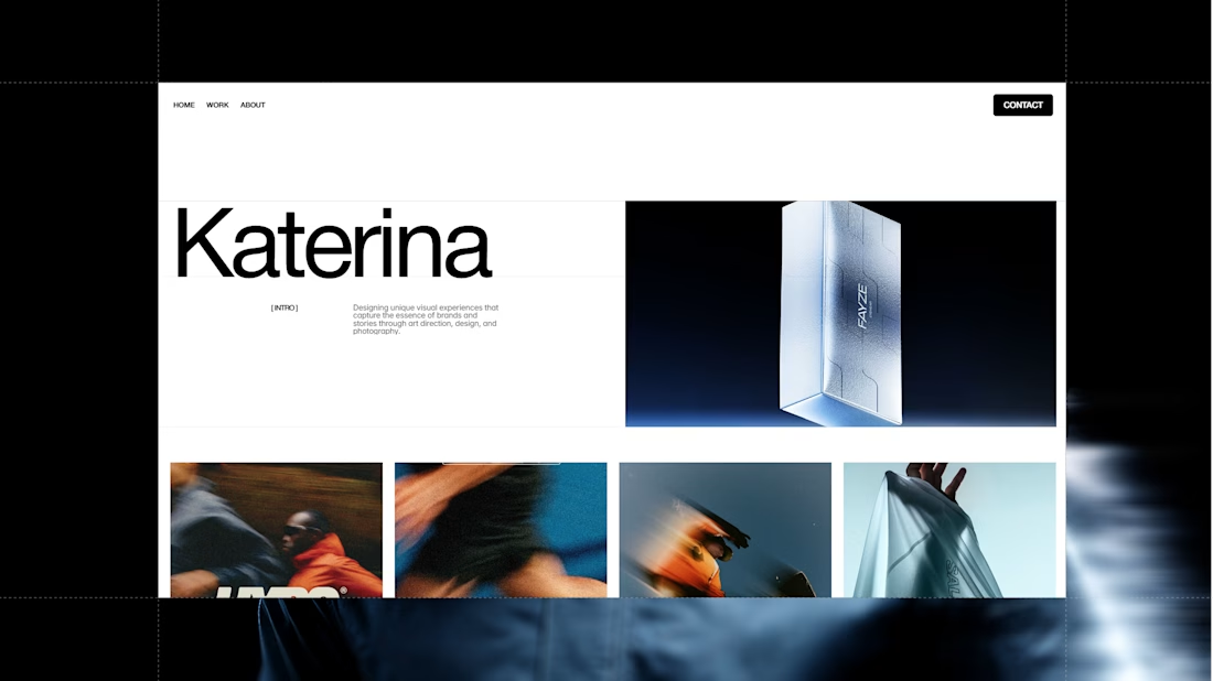
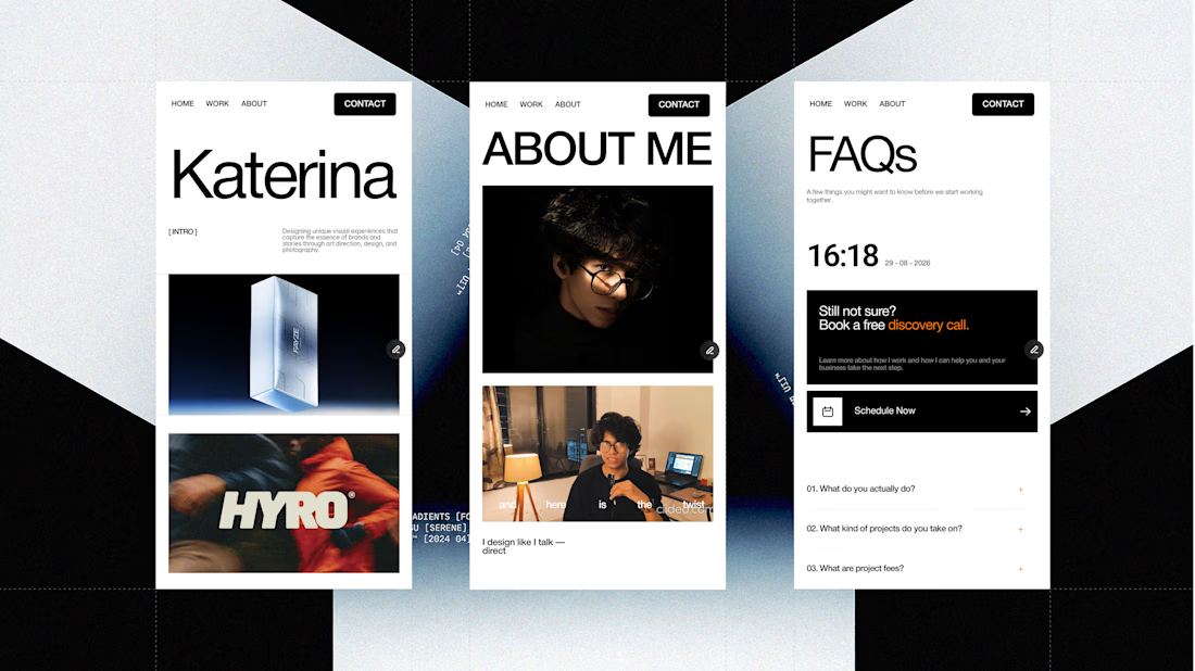
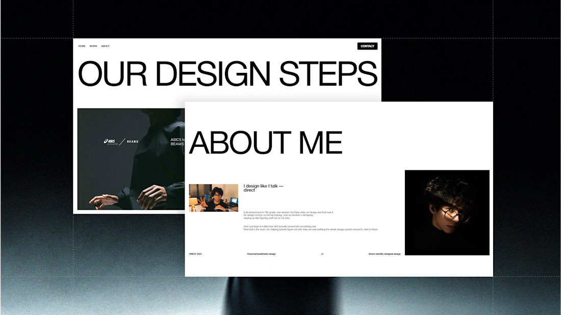
Been working on my portfolio for the past 10 days.
From designing everything in Figma to bringing it all to life in Framer it’s taken a lot of time, but seeing it come together has been worth it.
Still a work in progress, but I’m getting very close to wrapping it up.
Here’s a look at some of the pages so far. 👀

Great work but I have a question that designing everything in figma and then going to framer works better or just do all together in the framer from the start. I learning framer do let me know if thats hard or easy?