The network for creativity
Join 1.25M professional creatives like you
Connect with clients, get discovered, and run your business 100% commission-free
Creatives on Contra have earned over $150M and we are just getting started
Back to feedPost
Taste Test


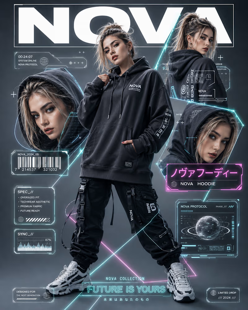
One goes full future, magazine cover energy, HUD overlays, barcodes, spec panels, neon wireframes pulling your eye across the frame. Dense, loud, engineered to feel like a limited drop.
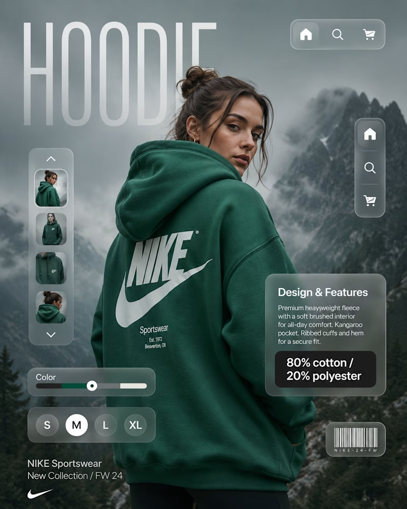
The other goes quiet and clean, a single hero shot, soft product UI, size selector, one clear focal point. Room to breathe. Every element earning its place.
Same product category, but the real work here is structure: where the eye lands first, how information stacks, what you leave out. The layout is the brand.
Which post design would stop your scroll? 👇
#graphicdesign #brandidentity #contentdesign
12 votes
Ends in 1h


Both layouts are incredibly strong, but the real magic in the Nova concept is the subtle typographic depth behind the main model—specifically how the bold "NOVA" title layers perfectly behind her head while the sharp, technical HUD lines and neon text overlays crisp up...

Nova's HUD-and-barcode direction feels way more memorable to me than the quiet Nike route, even though quiet is usually the safer pitch to a client. Was this a real brief with two options on the table, or more of a personal exercise contrasting the two directions?
The network for creativity
Join 1.25M professional creatives like you
Connect with clients, get discovered, and run your business 100% commission-free
Creatives on Contra have earned over $150M and we are just getting started
Related posts


Which one do you like better? Same image, same prompt.

27 voted
35%
50 voted
65%
77 votes
Closed


The Shake and realism is more felt through the one Grok made.

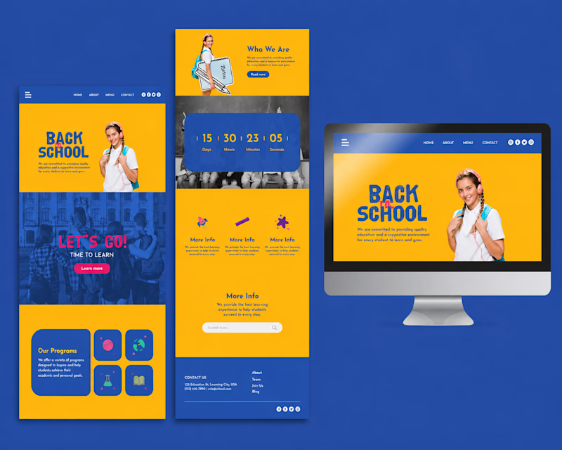
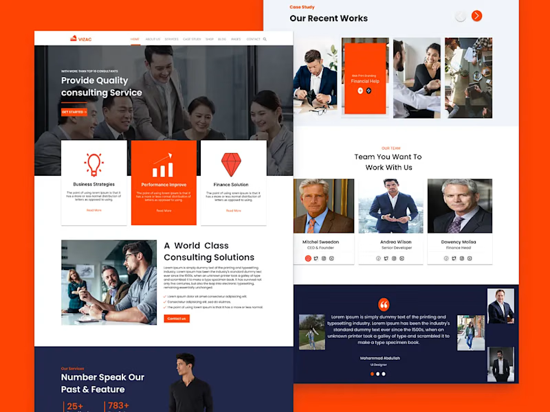
Which design would you choose first? Design A or Design B? Let us know your favorite and why! 🤎

4 voted
31%
9 voted
69%
13 votes
Closed


Design B

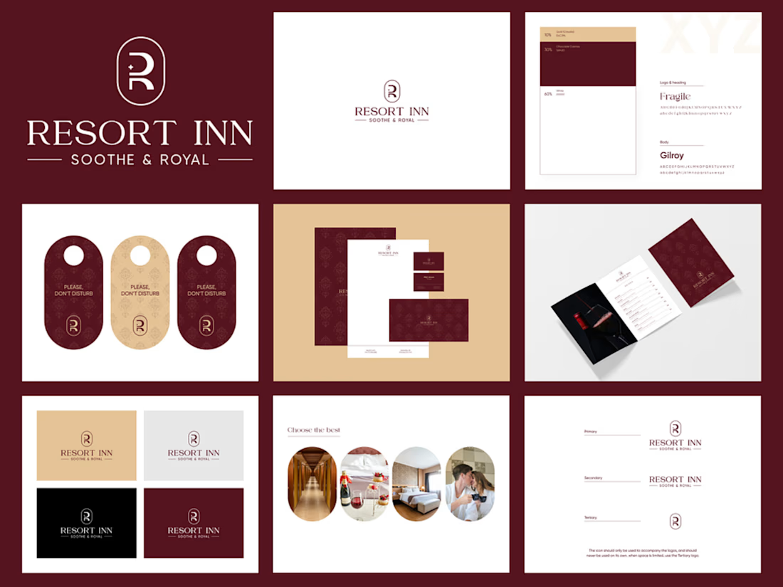
Luxury Hotel Brand Identity Design | Resort Inn
Resort Inn is a luxury hospitality branding project created to establish a sophisticated and memorable visual identity for a premium hotel. The goal was to design a cohesive brand system that communicates elegance, comfort, and professionalism while remaining consistent across both print and digital touchpoints.
The project included designing a custom monogram logo, defining a refined color palette and typography system, and creating comprehensive brand guidelines. I also developed supporting brand assets such as business cards, letterheads, brochures, hotel door hangers, and stationery to demonstrate how the identity would be applied in real-world scenarios.
Every design decision was made to ensure versatility, scalability, and a premium guest experience. The final result is a polished visual identity that helps the brand stand out in the competitive hospitality industry while maintaining consistency across all customer-facing materials.
#BrandIdentity #LogoDesign #Branding #GraphicDesign #VisualIdentity #LuxuryBranding #HotelBranding #BrandDesigner #DesignPortfolio #ContraCreator



Good job








Trending

Claude
Claude has entered the design space. How are you using Claude Design?

Contra University
Learn from expert creatives how to earn more using next-gen AI tools.
fifaworldcup2026
The World Cup is here and the whole world's watching. How are you designing for the world stage?
creativeaiflow
Creative AI workflows are evolving. What tools do you use, and what are their strengths and weaknesses?
freelancerlife
Freelancer life is wins, pivots, and everything in between. What’s yours right now?