The network for creativity
Join 1.25M professional creatives like you
Connect with clients, get discovered, and run your business 100% commission-free
Creatives on Contra have earned over $150M and we are just getting started
Back to feedPost
Taste Test


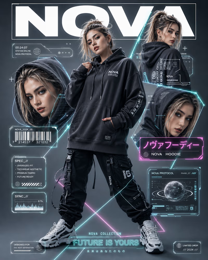
One goes full future, magazine cover energy, HUD overlays, barcodes, spec panels, neon wireframes pulling your eye across the frame. Dense, loud, engineered to feel like a limited drop.
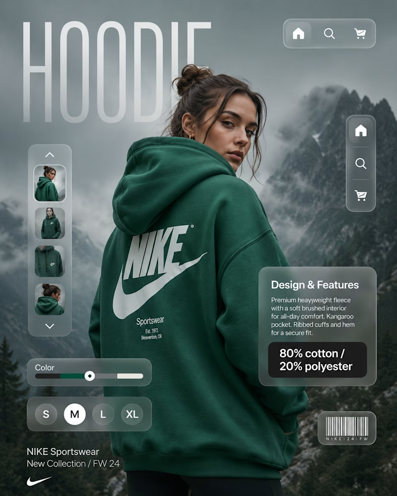
The other goes quiet and clean, a single hero shot, soft product UI, size selector, one clear focal point. Room to breathe. Every element earning its place.
Same product category, but the real work here is structure: where the eye lands first, how information stacks, what you leave out. The layout is the brand.
Which post design would stop your scroll? 👇
#graphicdesign #brandidentity #contentdesign
8 votes
Ends in 1d

Nova's HUD-and-barcode direction feels way more memorable to me than the quiet Nike route, even though quiet is usually the safer pitch to a client. Was this a real brief with two options on the table, or more of a personal exercise contrasting the two directions?
The network for creativity
Join 1.25M professional creatives like you
Connect with clients, get discovered, and run your business 100% commission-free
Creatives on Contra have earned over $150M and we are just getting started
Related posts



Great Work
Choose your favorite design

15 voted
65%
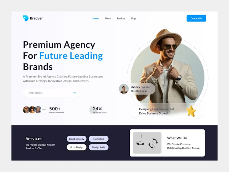
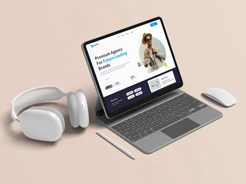
8 voted
35%
23 votes
Closed

A 💯

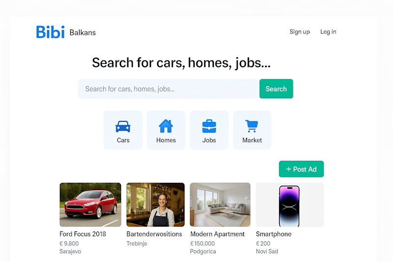
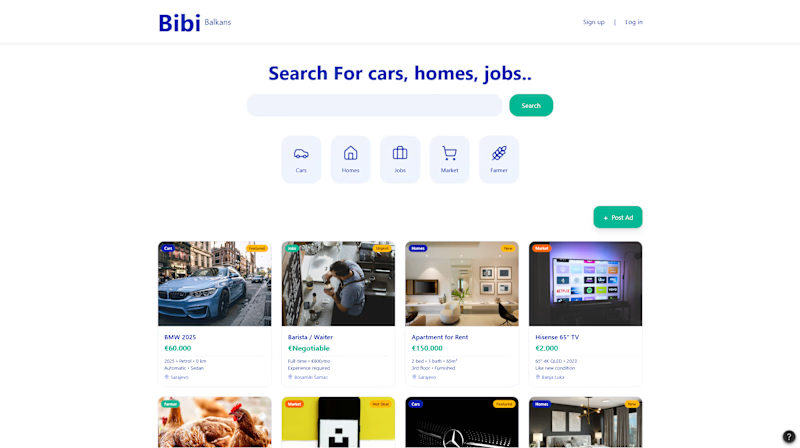
Modern








Trending

Claude
Claude has entered the design space. How are you using Claude Design?

Contra University
Learn from expert creatives how to earn more using next-gen AI tools.
fifaworldcup2026
The World Cup is here and the whole world's watching. How are you designing for the world stage?
creativeaiflow
Creative AI workflows are evolving. What tools do you use, and what are their strengths and weaknesses?
freelancerlife
Freelancer life is wins, pivots, and everything in between. What’s yours right now?