The network for creativity
Join 1.25M professional creatives like you
Connect with clients, get discovered, and run your business 100% commission-free
Creatives on Contra have earned over $150M and we are just getting started
Back to feedPost

What if the power grid went down tomorrow and hashtag#AI crashed? How many of today’s design projects would still move forward?
It’s tempting to start with a flat vector, write a good hashtag#prompt, and get a photorealistic render in seconds. It’s an incredible visual tool, but we risk confusing image generation with solving a real project.
Design demands much more: interpreting a brief, understanding volumes, anatomy, materials, moulds, product morphology and manufacturing costs. It means solving complex problems on a blank sheet of paper, with no algorithm to guide you.
After 20+ years in the world of hashtag#design and hashtag#advertising , I’ve seen many technological waves come and go. My takeaway is always the same: tools evolve, but judgement and technical foundations are what truly sustain a product. Of course, I integrate generative AI into my workflow to speed up processes and explore paths. But I use it as an amplifier for my ideas, never as a crutch to cover technical gaps. Taste and design judgement can’t be downloaded.
Here’s a real case, run as an AI vs. no-AI comparison.
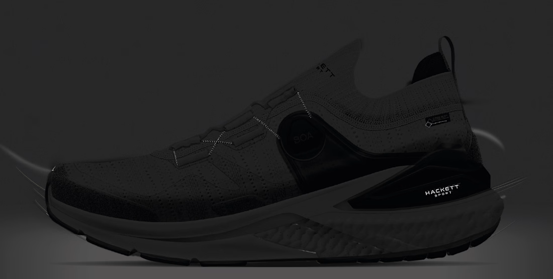
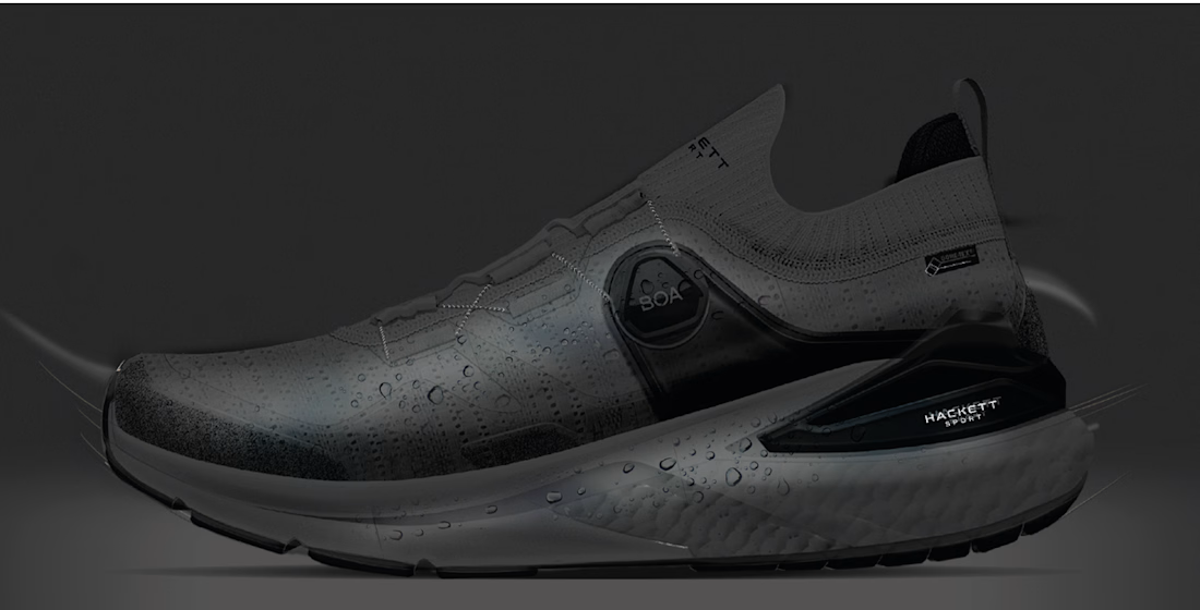
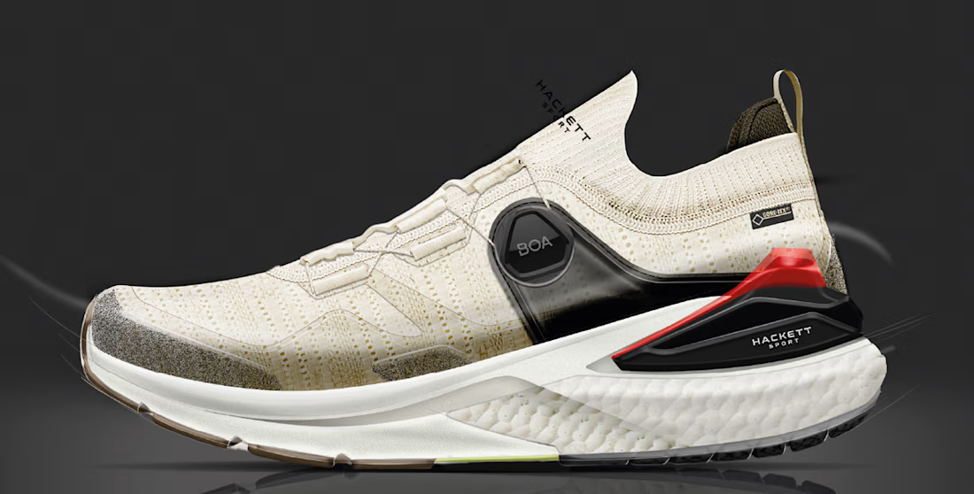
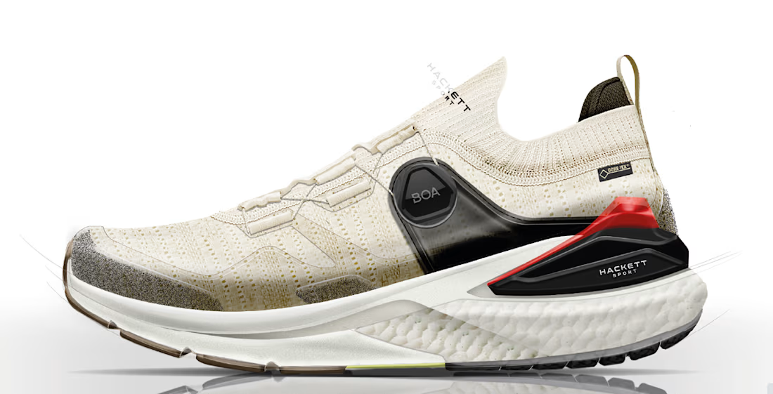
The Golf Challenge at Hackett Sport AW25
At AWWG, we worked on the concept development to enter a highly competitive niche: golf, for Hackett London’s Sport division. The goal was to lay the foundations for a new footwear line from a very demanding brief.
I developed it alongside Tono Reche and Francisco Mateo Crespo working hand in hand with suppliers. Working with professionals of their calibre shapes a career.
I ran the exercise in two phases:
Generative AI exploration. First, I tested how far AI could go in brainstorming initial sketches and proposals from the brief. The results were visually striking, but they lacked technical coherence and didn’t solve the construction requirements the brand demanded.
Traditional process (no AI). Then I developed the project entirely from my freehand sketches, creating three complete upper and outsole proposals in Illustrator and Photoshop. This work allowed us to produce the first pullover samples and mock moulds for the three soles, ready for the presentation in London.
The conclusion was clear: AI is great for exploring quickly, but for technical detail and a complex brief, freehand drawing, mastery of the craft and close collaboration with suppliers make the difference.
The traditional route met every requirement and reached prototyping. The project was ultimately shelved due to brand budget adjustments, but it remains a perfect example of how a real product is built, from a hand sketch to technical definition.
So, back to the blackout: no power, no AI? The sketch, the judgement and the supplier relationships still stand.
Where do you draw the line between using AI and relying on it? I’d love to read your thoughts below
👇 🔗 Full case study (AI vs. no AI) and more portfolio projects here: https://piotrekperez.com/awwg-i-hackett-sport-i-aw25
#FootwearDesign #IndustrialDesign #ProductDevelopment #DesignProcess #HackettLondon #AWWG #Golfsneakers #Golf #FashionRecruitment #ProductDevelopment #CreativeDirector #ShoeManufacturing
#Opentowork #ShoeLast #FootwearManufacturing #FootwearDevelopment #OEM #ODM #FootwearProduction #SupplyChain #FootwearIndustry #Design #FootwearDesigner #ShoeDesign #DesignStrategy #PiotrekPerez #Opentowork


The network for creativity
Join 1.25M professional creatives like you
Connect with clients, get discovered, and run your business 100% commission-free
Creatives on Contra have earned over $150M and we are just getting started


Related posts

A few months ago I got to work with Coderhouse, one of the leading education brands in Argentina, and the place where I took several courses myself.
So this one feels like a full circle. A brand that shaped my career and helped me grow as a designer, and now I got to design for it.
The funny part is Chris had no idea I was a former student when he reached out. I was really happy when that message came in.
I built a visual system for their 60+ course covers, made so their team can keep producing them on their own. Today it lives across their app, website and Meta ads.
Thanks Chris for trusting my work and for the opportunity 🧡 And thanks @Contra HQ for making connections like this one possible.


This looks great


ClueGo turns any Italian city into a riddle trail, and we built the brand to feel like a travel journal: riddles come on torn paper notes, a dotted line of footprints shows how far you’ve walked, and each finished trail is saved as a stamped postcard.
Which Italian city would you want to work out one riddle at a time?


Palermo🙌

Everafter is a modern, imaginative, and playful brand identity concept created for a New York City-based publishing house.
Inspired by the magic of storytelling and the lasting connection between readers and books, the identity brings a fresh, expressive perspective to the world of publishing. ✨

I really love what the color palette is doing here. I think it introduces the playful side of the brand so naturally without making the identity feel childish. The balance between the softer colors and the darker tones is particularly interesting. It's playful, but still feels refined.