The network for creativity
Join 1.25M professional creatives like you
Connect with clients, get discovered, and run your business 100% commission-free
Creatives on Contra have earned over $150M and we are just getting started
Back to feedPost

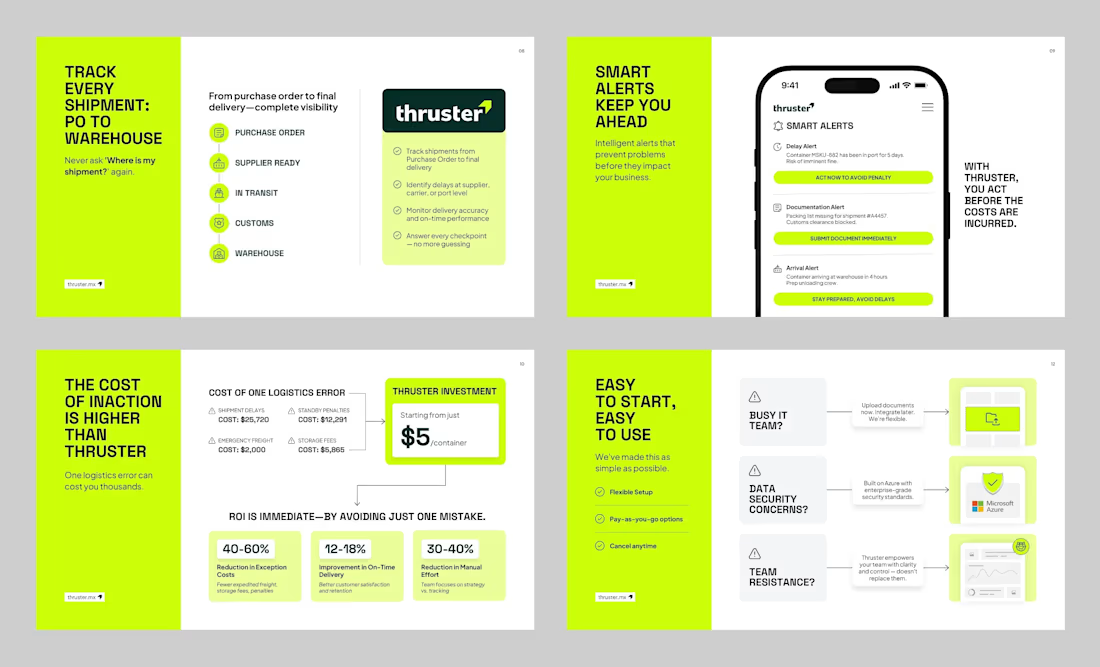
Really like how these slides handle a fairly dry topic like logistics without making the deck feel dry.
The hierarchy is clear, the visuals actually support the message, and there’s enough breathing room to let each idea land.
Nothing feels over-designed just for the sake of looking fancy.
Good presentation design is often just making the information easier to get.
and these slides do that really well.
See the full case study here:
https://lnkd.in/d9ai24nQ
More work on
madebyswayam.com
The network for creativity
Join 1.25M professional creatives like you
Connect with clients, get discovered, and run your business 100% commission-free
Creatives on Contra have earned over $150M and we are just getting started
Challenges
View all


Related posts

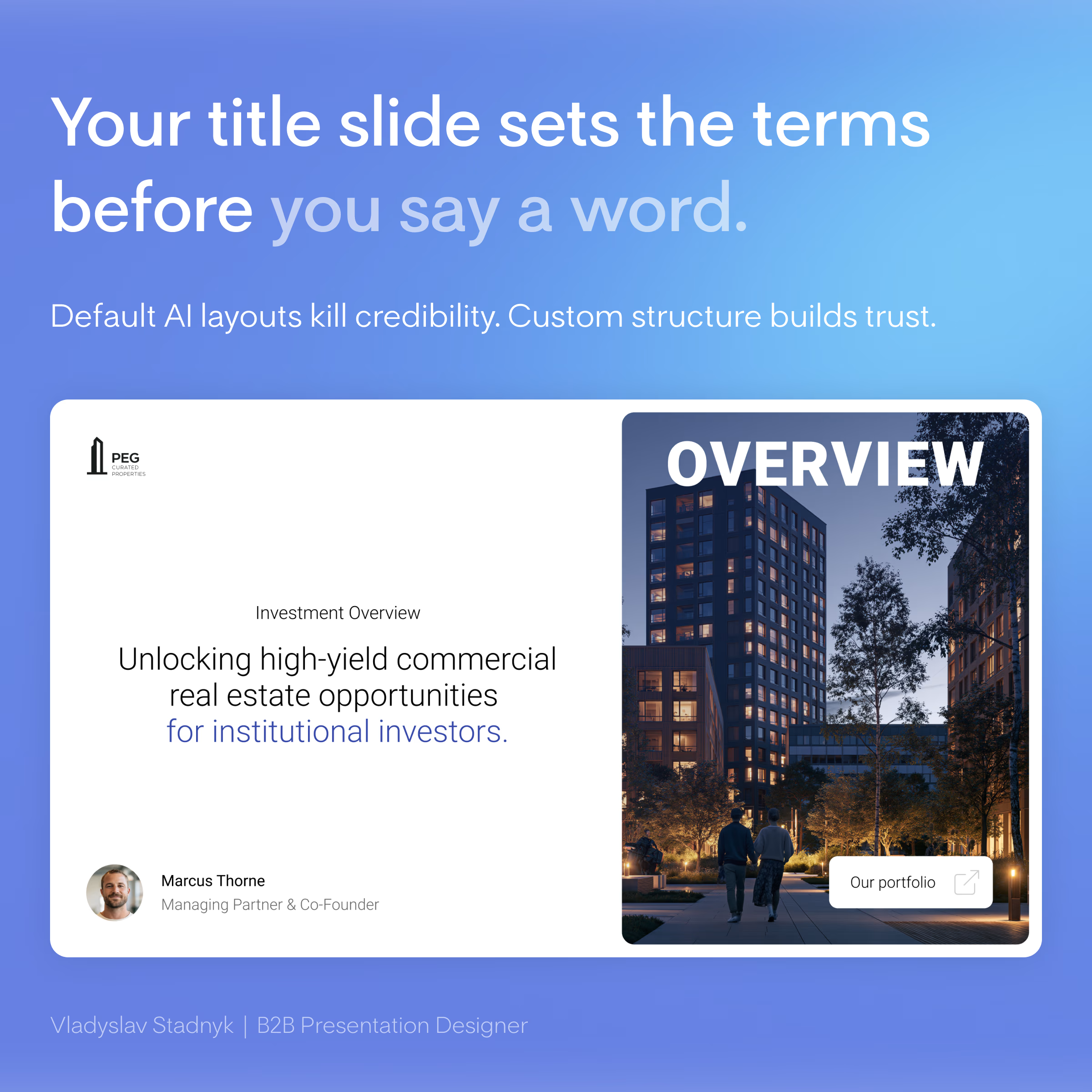
Your title slide decides if investors keep reading. Right now, it looks like an AI generated it in 2 minutes.
Investors open dozens of files a week. Every second deck starts with the exact same AI-generated layout... same default fonts... same generic "Company Update 2026"... 🤖
When you ask for millions to fund commercial properties, aesthetics equal trust. A lazy title slide sends a clear message. It says you cut corners. It shows a massive lack of attention to detail. You burn your credibility before the investors even see your financial models.
I recently redesigned a deck for a real estate investment group. They used a basic AI template with a low-quality stock photo of a skyline. We scrapped it entirely. We built a custom grid, added a single high contrast architectural shot, and wrote a one-sentence value proposition. That simple shift instantly framed them as top-tier institutional players.
What is the biggest red flag you see on a pitch deck title slide? 🚩
Infographic DesignAdobe IllustratorAdobe PhotoshopPresentation DesignPitch Deck DesignerMicrosoft PowerPoint



Great work 🙂

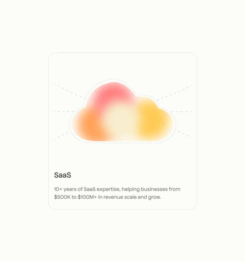
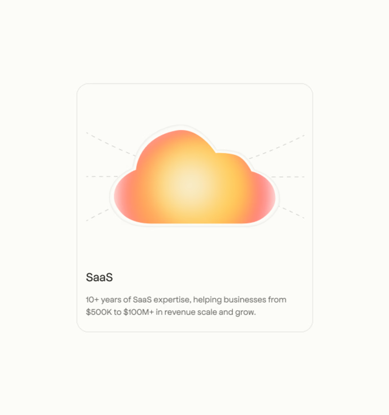

I’d pick A. The stronger gradient gives the card more visual impact.


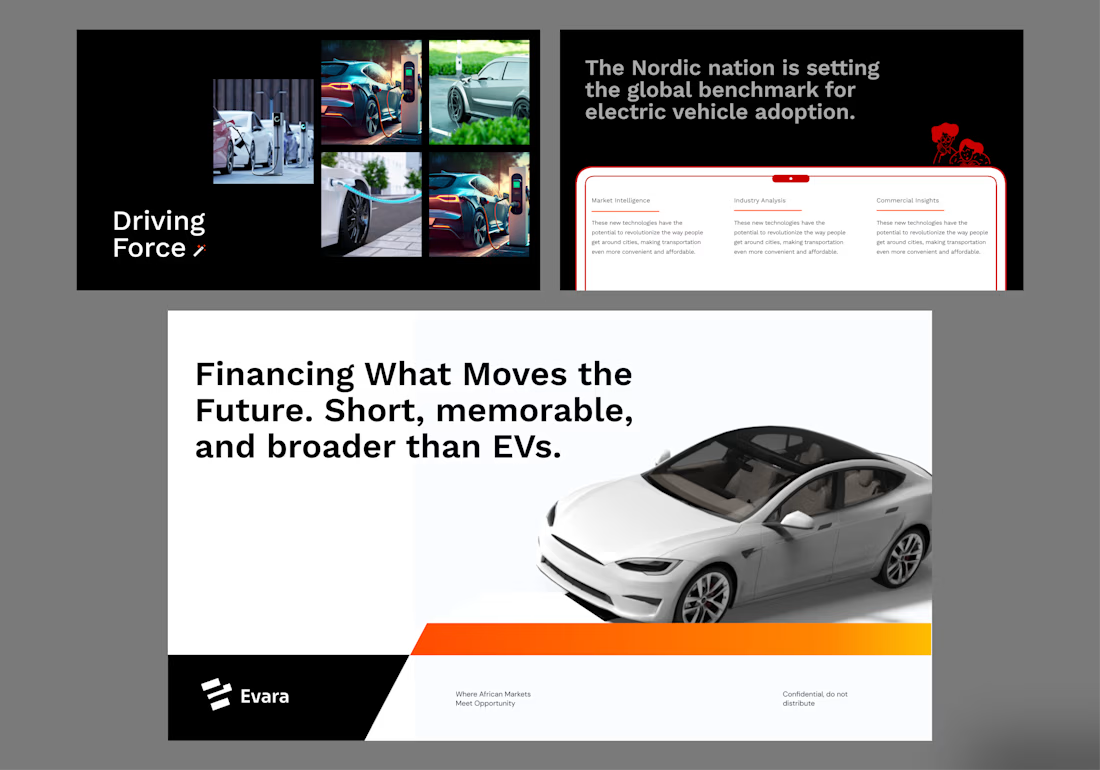
Few presentation slides on Evara Electric Vehicles.
Financing What Moves the Future.
Mobility is changing. But the opportunity goes far beyond the vehicle.
New infrastructure.
New energy systems.
New business models.
New ways of moving people and goods.
All of them need one thing to grow:
Access to capital.
This concept explores a financial platform built around that transition — connecting finance with the companies, infrastructure and ideas shaping the next generation of mobility.
Not just financing vehicles. Financing progress.
A visual direction built around movement, technology, confidence and the feeling of a financial system designed for what comes next.
#Fintech #Mobility #ProductDesign #BrandDesign #CreativeDirection #FutureOfMobility

Great work 🙂