The network for creativity
Join 1.25M professional creatives like you
Connect with clients, get discovered, and run your business 100% commission-free
Creatives on Contra have earned over $150M and we are just getting started
Back to feedPost

Complete Visual Identity for AYA Supermarket
Built to be seen. Designed to be remembered.
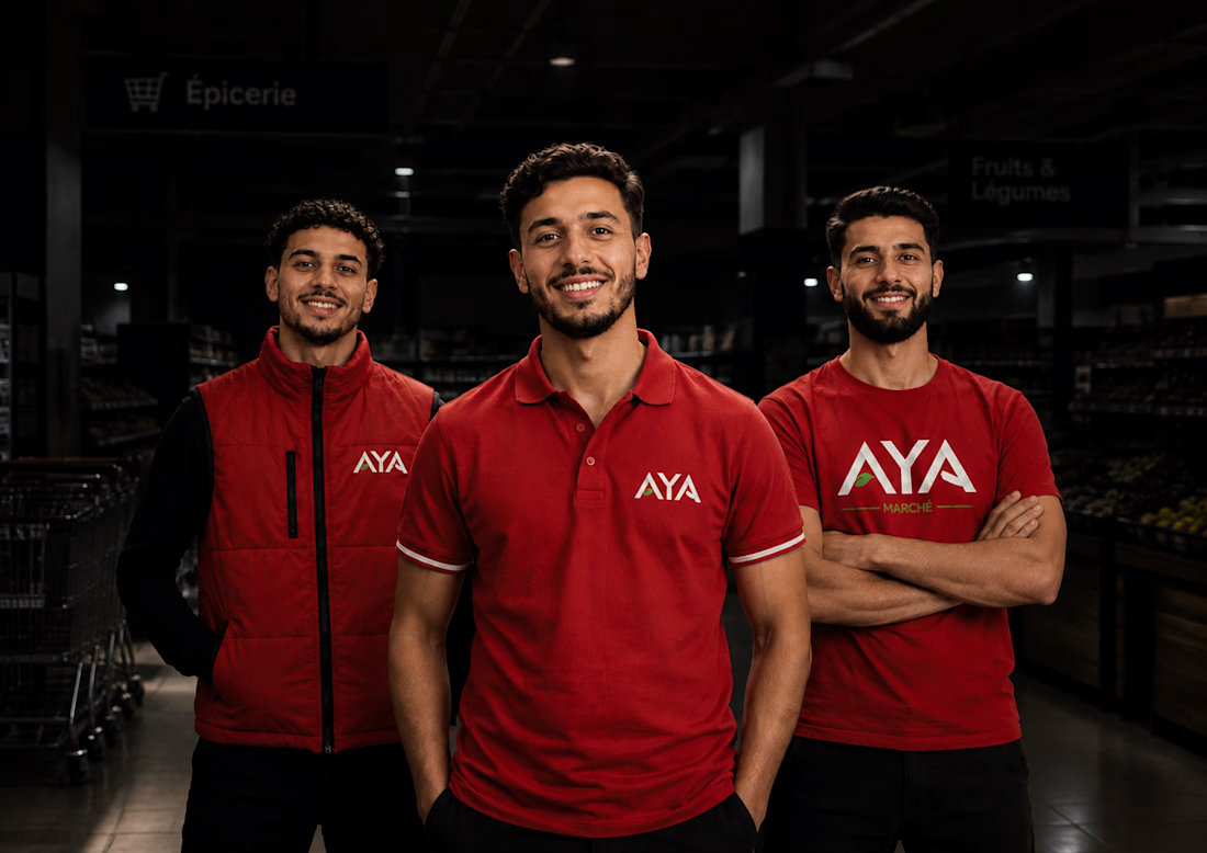
AYA Marché is a visual identity concept created for a modern supermarket, combining a bold geometric logo, a vibrant red palette, and a distinctive visual language.
The identity goes beyond the logo to create a cohesive brand presence across staff uniforms, store communication, and customer touchpoints. Strong typography and a recognizable graphic system bring consistency to the brand while reinforcing a clear sense of unity across the supermarket.
The goal was to create an identity that feels bold, recognizable, and built for the retail environment.
VIEW THE FULL PROJECT: https://www.behance.net/gallery/252779881/Complete-Visual-Identity-for-AYA-Supermarket
#BrandIdentity #RetailBranding #LogoDesign #VisualIdentity #BrandDesign
Art DirectionGraphic DesignPackaging DesignAdobe IllustratorAdobe InDesignAdobe PhotoshopBrand Design


The network for creativity
Join 1.25M professional creatives like you
Connect with clients, get discovered, and run your business 100% commission-free
Creatives on Contra have earned over $150M and we are just getting started





Related posts

You've tasted the chocolate. Now, you want to see where it grows 🌳
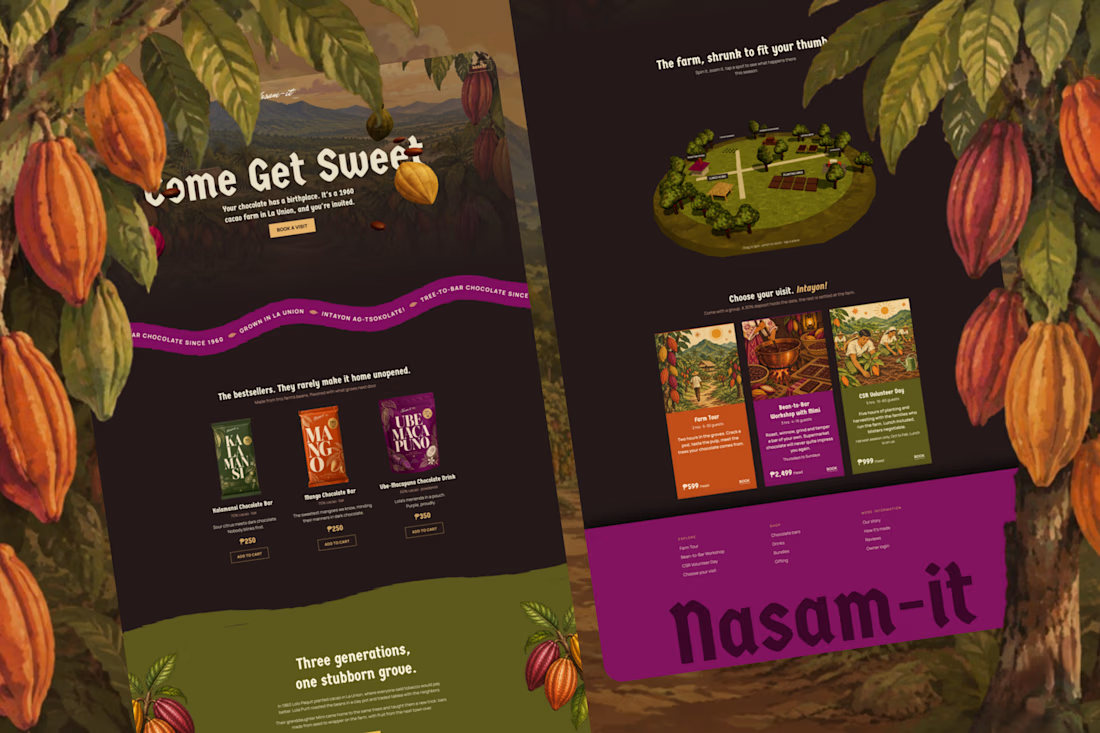
Meet Nasam-it Farm, a family cacao farm in the Philippines, planted in 1960 by a grandfather who was told tobacco would pay better. His granddaughter brought the grove back as a bean-to-bar brand. Nasam-it is Ilocano for "sweet." The problem: Mimi spends her days fermenting, drying, and roasting, not on her phone 24/7, so inquiries go unanswered. Every missed message is a lost visit, and lost income for the farmers who tend the farm.
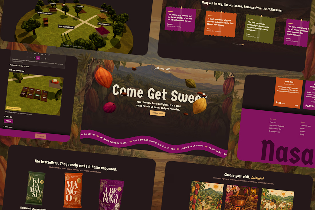
So I designed and built a booking experience in that answers for her. Guests explore the farm in 3D, see what's happening this season, and choose a farm tour, a bean-to-bar workshop, or a volunteer day. The price updates as the group grows, a 30% deposit holds the date, and they're confirmed without a single message. By the time Mimi is back from the grove, the bookings are already waiting.
I started with her, not the screens: her schedule, her signal, the quirks of a real farm (harvest-only volunteer days, group sizes, deposits to stop no-shows). The look comes from the farm itself, with cacao-pod maroon, banana-leaf green, and copy that sounds like a place rather than a platform.
Check it out: https://nasam-itfarm.lovable.app/
Booking made sweet! 🍫 #lovablechallenge


im obsessed with the colors 🔥

👍

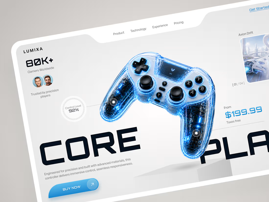
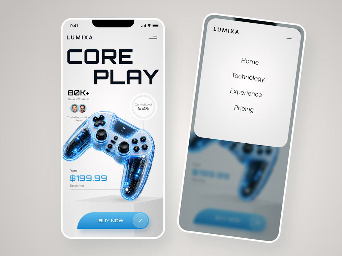
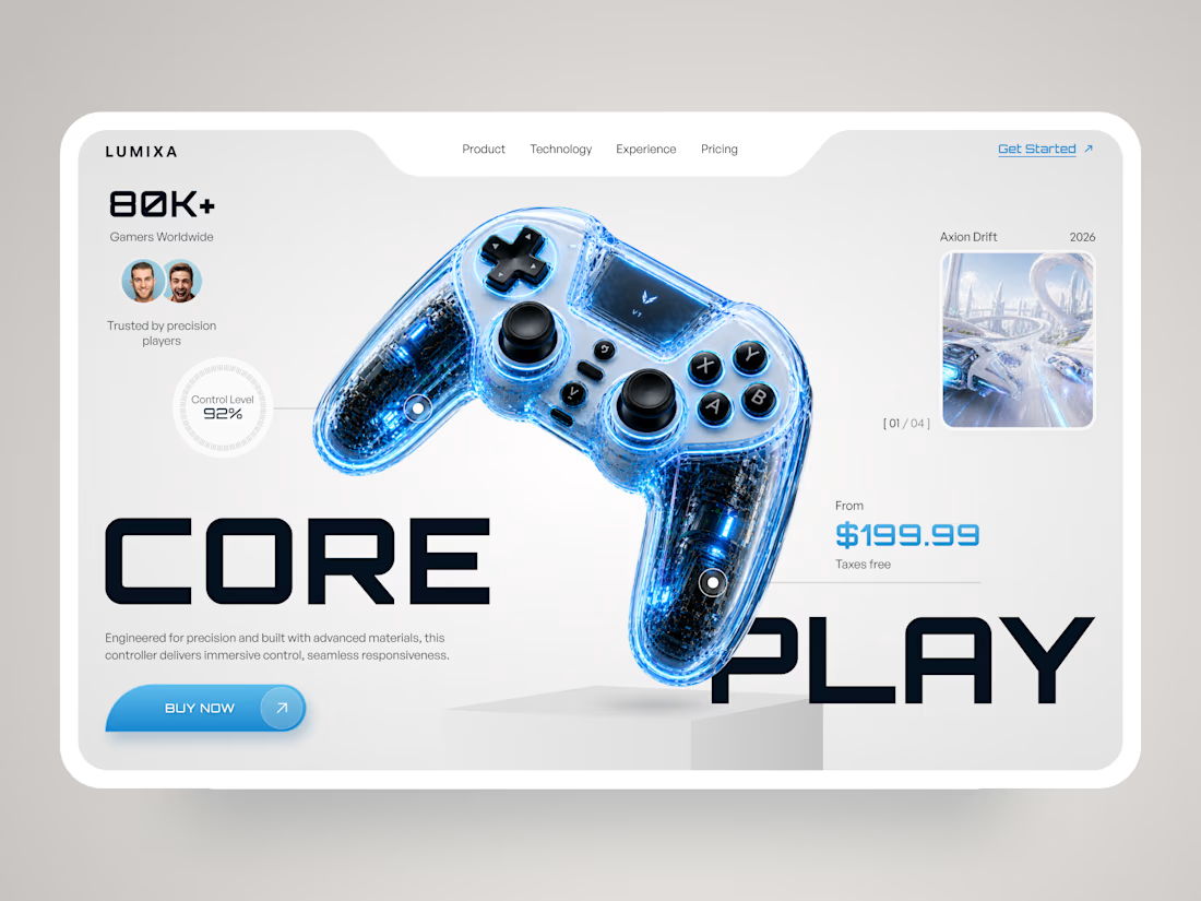
LUMIXA — Gaming Controller Product Landing Page 🎮⚡
LUMIXA is a futuristic product landing page concept created for a premium gaming controller built around precision, performance, and immersive play.
The goal was to make the product itself the center of the experience while...

A complete branding and packaging project for Hayat Juice. I designed the brand logo, juice packaging, product mockups, tripod designs, and billboard advertisements, creating a consistent and eye-catching visual identity across the brand.

the pink box with the strawberry guy is so cute. did you draw him yourself?