The network for creativity
Join 1.25M professional creatives like you
Connect with clients, get discovered, and run your business 100% commission-free
Creatives on Contra have earned over $150M and we are just getting started
Back to feedPost


The network for creativity
Join 1.25M professional creatives like you
Connect with clients, get discovered, and run your business 100% commission-free
Creatives on Contra have earned over $150M and we are just getting started




Related posts

Took a WebGL fabric physics simulation and pushed it to the absolute limit.
Built a complete visual concept for a Peptides brand around it. Pure interaction, zero boring static layouts. Let's go!


Pushing fabric physics that far for a peptides concept is a strong choice. The quiet editorial layout lets the motion carry the brand instead of competing with it.

A bold graphic design exploration for 1286 CRAFT, built around expressive typography, editorial layouts, poster design, and experimental visual composition.
The project combines strong typographic hierarchy, layered textures, geometric elements, and high-contrast graphics to create a distinctive campaign system. Each composition was designed to work as part of one cohesive visual language while maintaining its own energy and character.
Graphic Design • Typography • Poster Design • Editorial Design • Art Direction
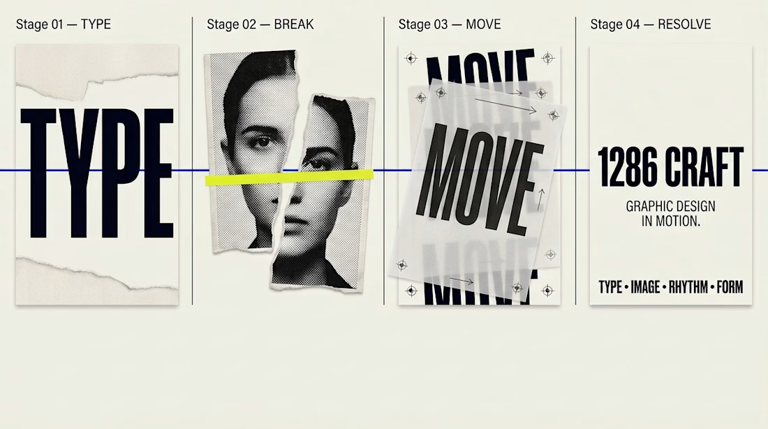
The yellow crop line through the portrait makes the editorial cut feel deliberate. Huge TYPE sitting against the torn MOVE poster is the contrast that holds the system.

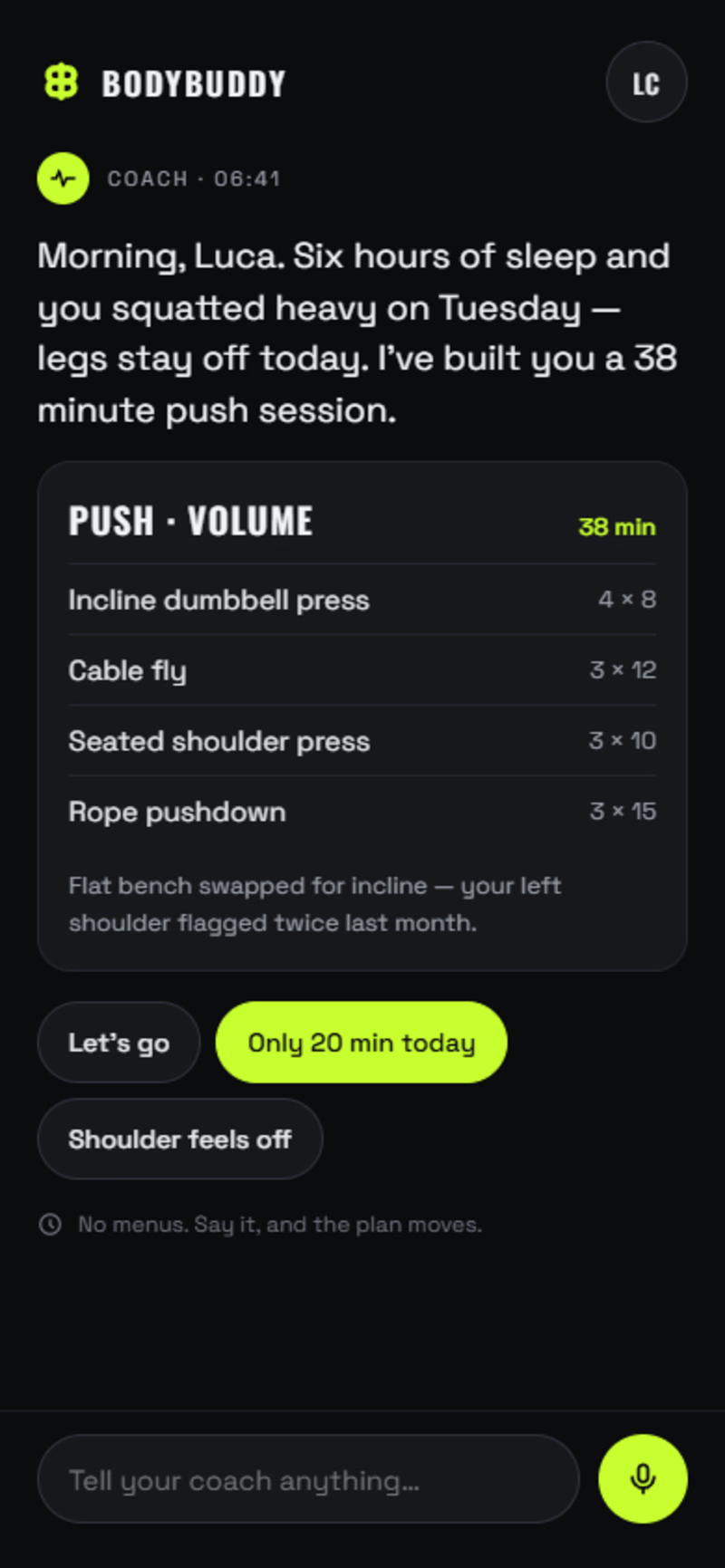
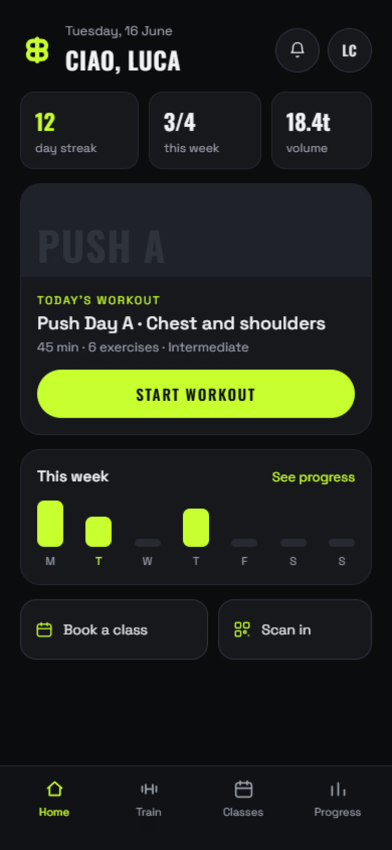
Two ways to build the same fitness app.
A: AI-first. No tabs, no dashboards. The app is one conversation with a coach that already knows you slept six hours and squatted heavy on Tuesday. You log sets by talking. The plan rewrites itself mid-workout.
B: The modern standard. Home, today's workout, set-by-set logging, class booking, progress. Everything a member expects, done properly.
Same brand, same components, same build quality. The only real difference is how much you're asking the user to unlearn.
Most gyms should ship B. A few should bet on A.
Which one would you open tomorrow morning?
1 voted
25%
3 voted
75%
4 votes
Closed

Going with A here, the idea of the plan rewriting itself mid-workout instead of you scrolling a dashboard feels like where fitness apps eventually land. Would you actually ship the AI-first version to real users right now, or is it more of a thought experiment at this stage?