The network for creativity
Join 1.25M professional creatives like you
Connect with clients, get discovered, and run your business 100% commission-free
Creatives on Contra have earned over $150M and we are just getting started
Back to feedPost

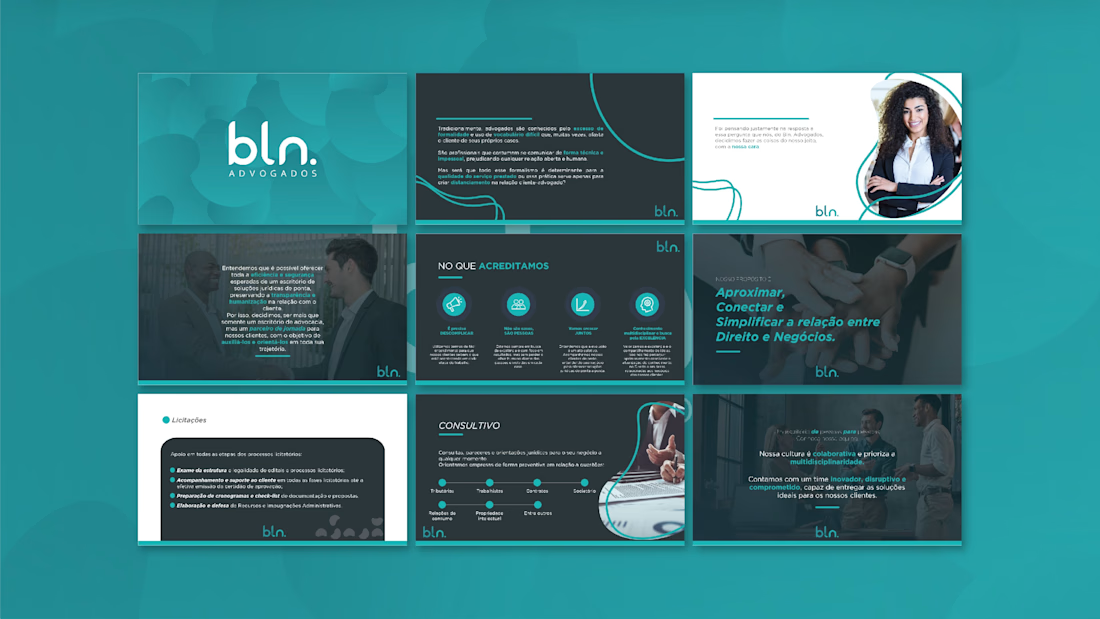
This presentation was developed for BLN Advogados to communicate legal services in a clearer and more approachable way. The goal was to translate formal legal content into an organized and client-friendly narrative.
Structured layouts, soft contrasts, and visual highlights guide the reader through the information while maintaining credibility and professionalism. The design balances institutional tone with accessibility, reinforcing trust and transparency.
A modern legal presentation designed to simplify communication between law and business.


The network for creativity
Join 1.25M professional creatives like you
Connect with clients, get discovered, and run your business 100% commission-free
Creatives on Contra have earned over $150M and we are just getting started

Challenges
View all


Related posts

More visuals from the rejected brand direction I shared earlier.
Really good to see this direction resonating with so many of you. It was one of our favourite explorations to build, from the narrative behind it to the visual world that brought it to life.
Great work doesn’t always make the final cut, and sometimes the reason has little to do with the quality of the direction.
Curious why this one was rejected? I’ve shared the story in the first comment✨


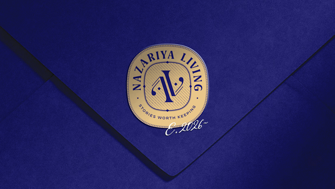
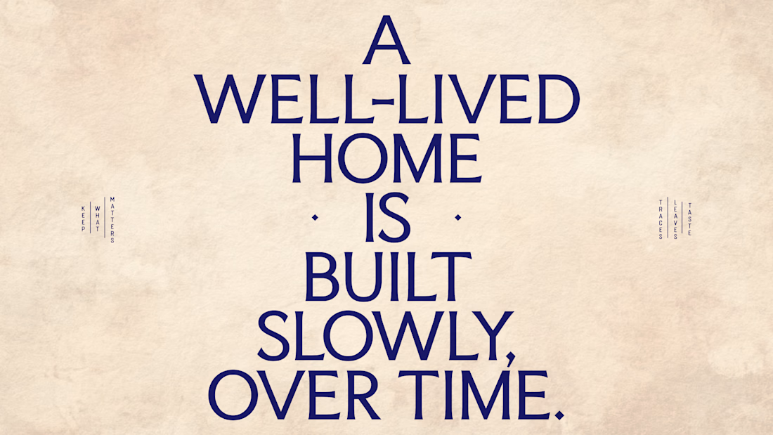
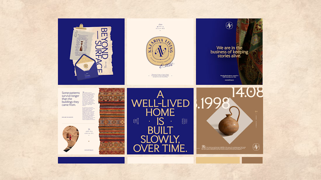
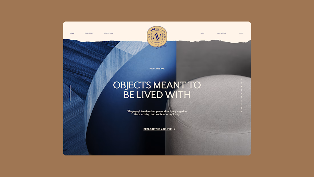
Nazariya Living is a premium carpet and home décor brand shaped by craftsmanship, culture and the stories objects carry into our homes.
This direction brought that idea to life through a seal-inspired logo, archival textures, unexpected colours and editorial typography, creating...

Brand identity design for Adventum Fitness, a fitness and personal development brand built around physical performance, mental fitness, and personal growth.
The challenge was to create a visual identity that could bring strength, movement, discipline, and personal development together without falling into the usual fitness branding clichés.
The identity was developed as a cohesive visual system across logo design, typography, color, graphic elements, and supporting brand assets, giving Adventum a distinctive and consistent presence across digital and marketing applications.
Full case study available on my Contra profile.
#BrandIdentity #BrandDesign #FitnessBranding #VisualIdentity #LogoDesign #BrandStrategy #GraphicDesign #BrandDesigner #FitnessBrand #PersonalDevelopment


If an investor needs more than five seconds to understand your chart, you have already lost their attention...
Founders often assume raw data speaks for itself. They drop a massive spreadsheet on a slide and expect the audience to find the insight.
Data dumping just kills your momentum. The room goes quiet. People start squinting at the screen instead of listening to your pitch.
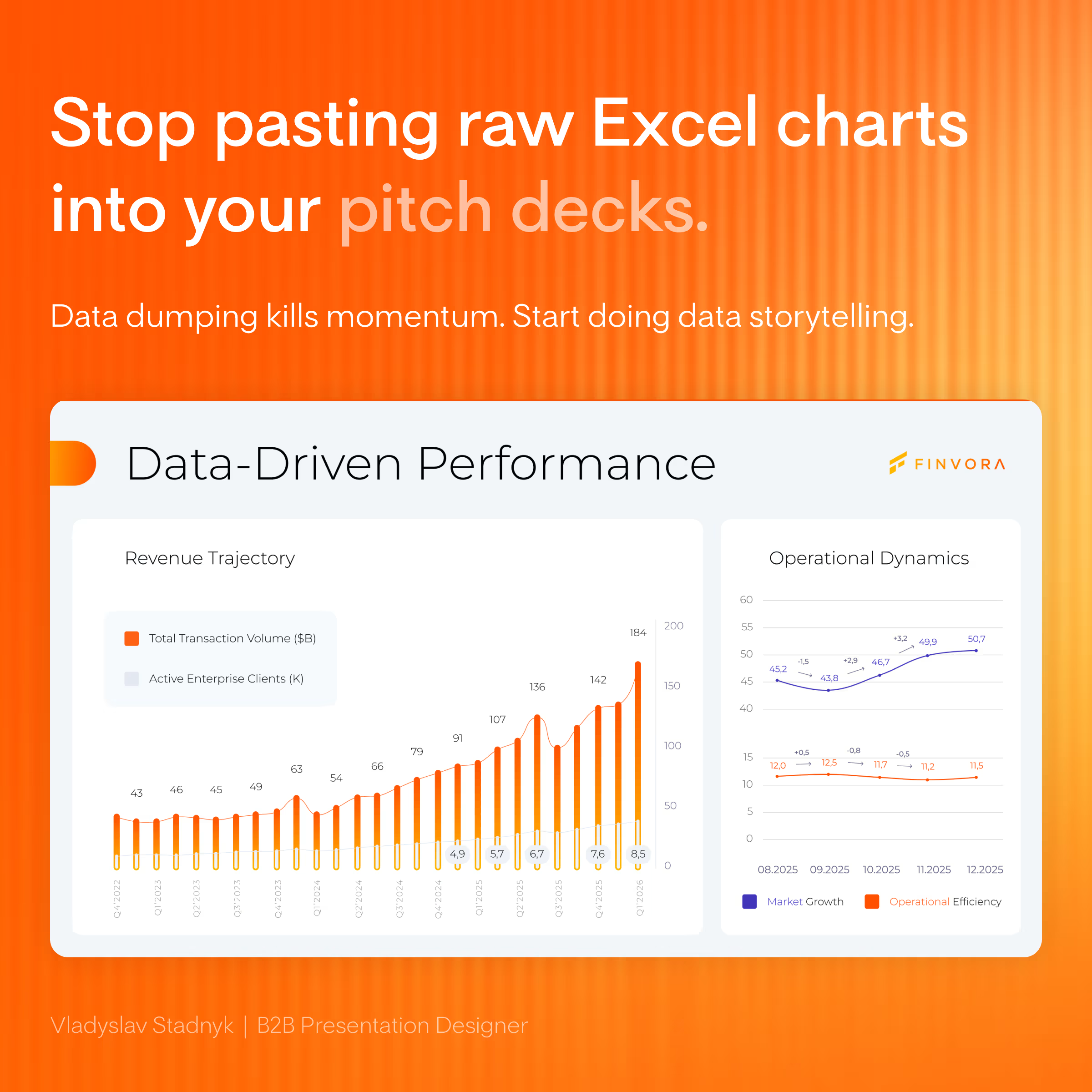
I recently reworked a B2B fundraising deck. The original traction slide had four different metrics layered together under heavy gridlines.
We stripped away the noise, split the metrics into 2 clean blocks, and used color strictly to highlight the revenue trend ⚡
The new slide looked expensive. More importantly, it made their core argument impossible to miss 📊
pitchdeckdatavisualizationpresentationdesignGraphic DesignPitch Deck DesignerPresentation DesignFigmaGoogle SlidesMicrosoft PowerPoint


Nice work ❤️