The network for creativity
Join 1.25M professional creatives like you
Connect with clients, get discovered, and run your business 100% commission-free
Creatives on Contra have earned over $150M and we are just getting started
Back to feedPost
Cavielle // Caviar Branding Identity 🐋
Designing this caviar brand meant stepping away from predictable luxury aesthetics.
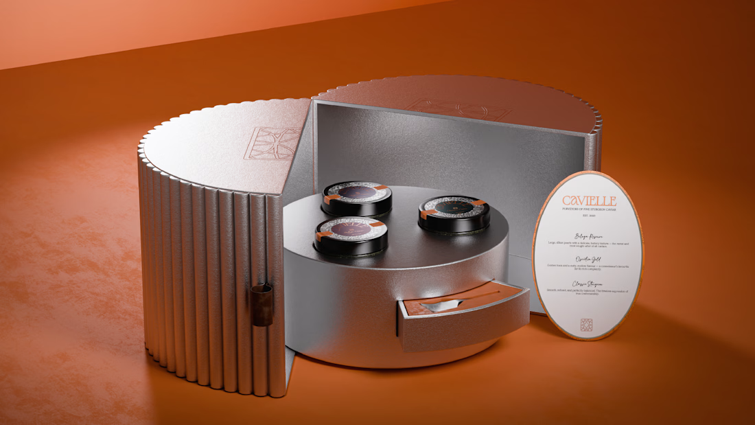
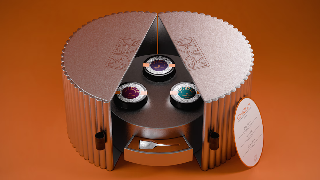
Every element from the monogrammed spoon to the layered packaging was considered with intent.
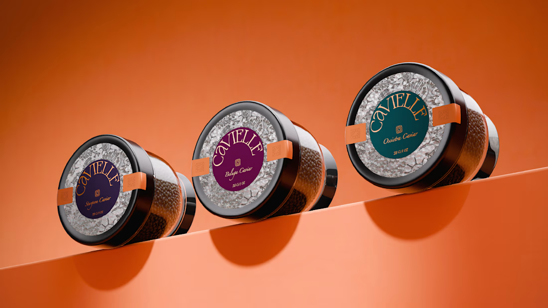
Instead of the usual gold or deep blues and greens, a bold orange was paired with chrome to create a more contemporary expression of luxury.
All of it anchored by a clear creative direction that allowed each detail to stand out.



Obsessed with everything! 😍

Thank you Bella! ✨

Giving up gold and deep blue in caviar means giving up a lot of free category signalling, so the orange and chrome have to earn that read back on their own. Was that a hard sell, or did the client already want the distance from the category?
This was a personal project, but yes, referring to this, the client actually chose to move away from the category conventions and use a bright, cool purple and chartreuse for her caviar brand. So the distance from the usual gold and deep blue cues was intentional.


Soo clean and premium!
The network for creativity
Join 1.25M professional creatives like you
Connect with clients, get discovered, and run your business 100% commission-free
Creatives on Contra have earned over $150M and we are just getting started





Trending
retrofuturism
Share your favorite designs from the past exploring the distant future. Or your own take on the aesthetic 🚀
halftone
Dots. Texture. Grain. Let's see your designs using the halftone technique.

Midjourney
Creatives are showing off what they're making with Midjourney.
colorgrade
Video editors sound off: How do you enhance the mood of your video in color grading?
Related posts

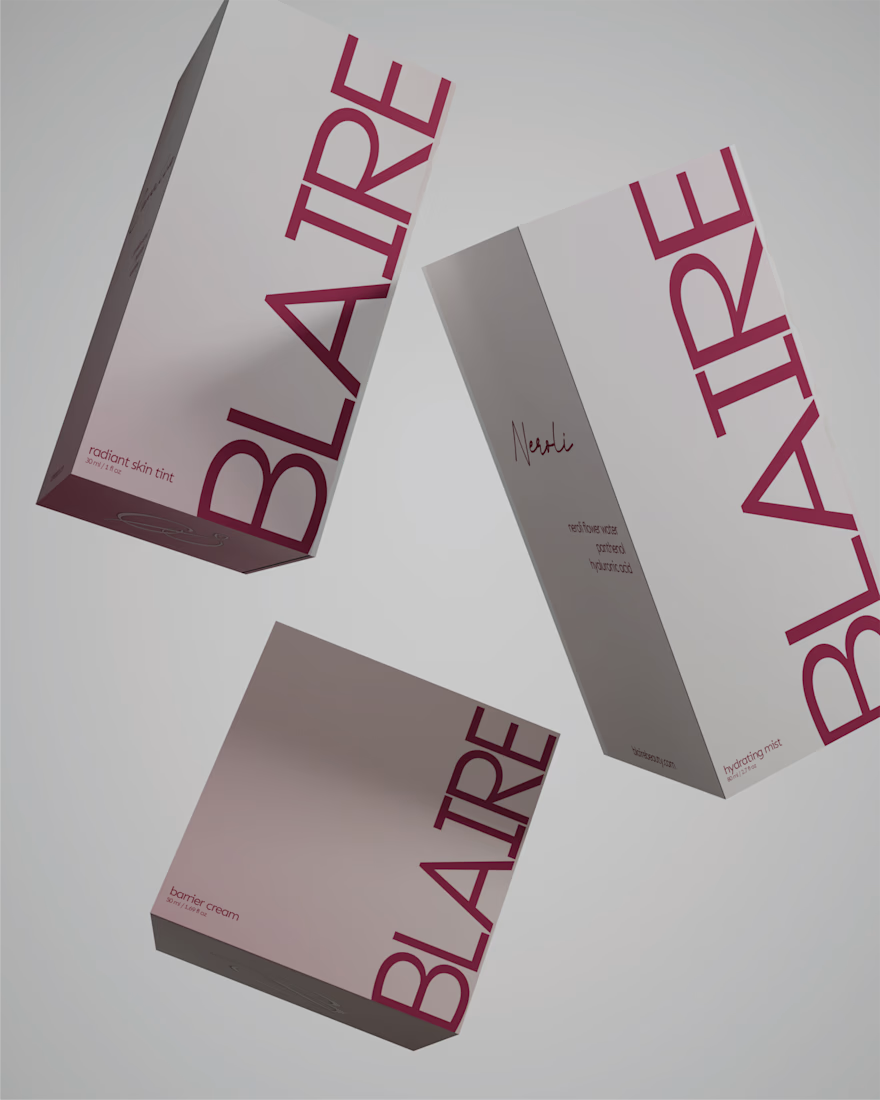
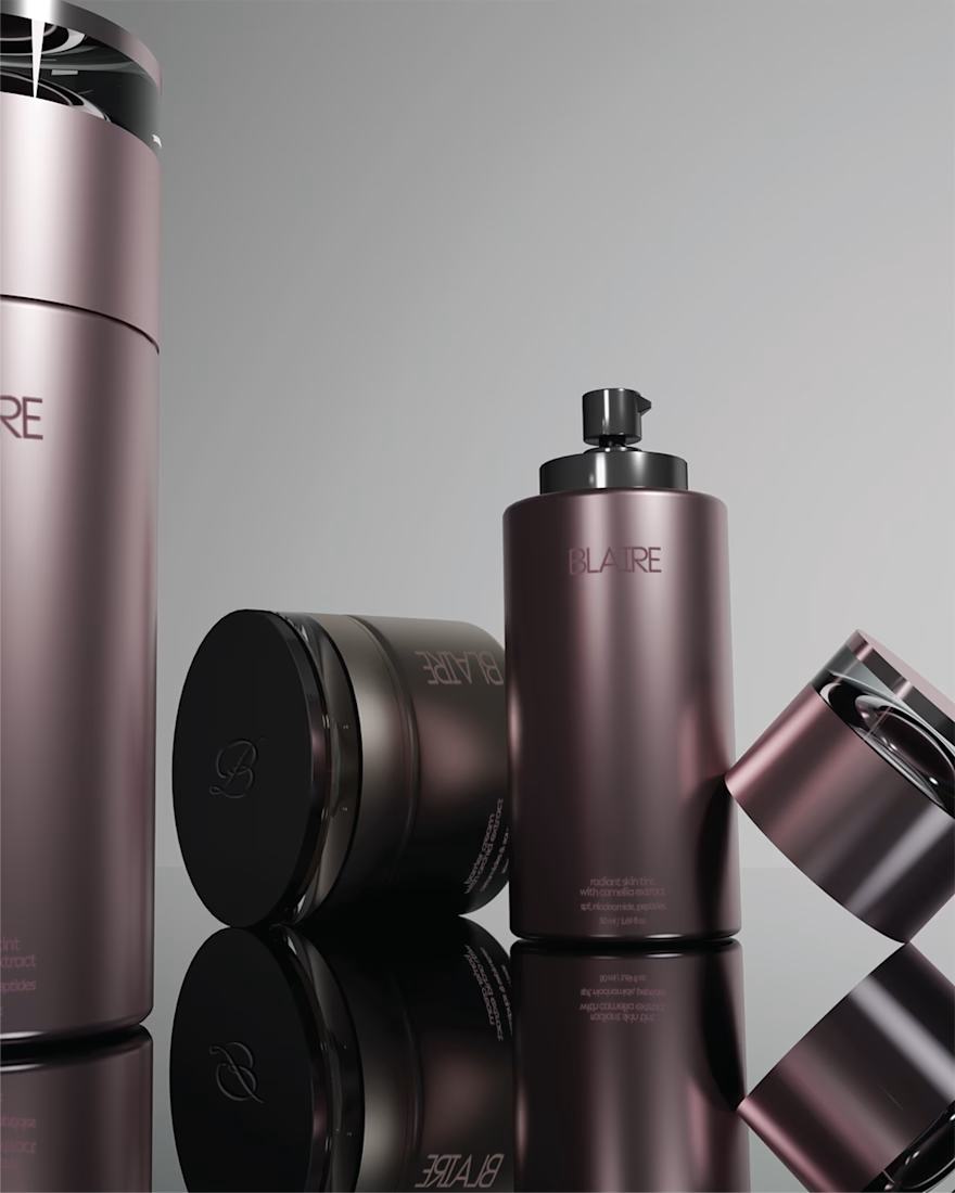
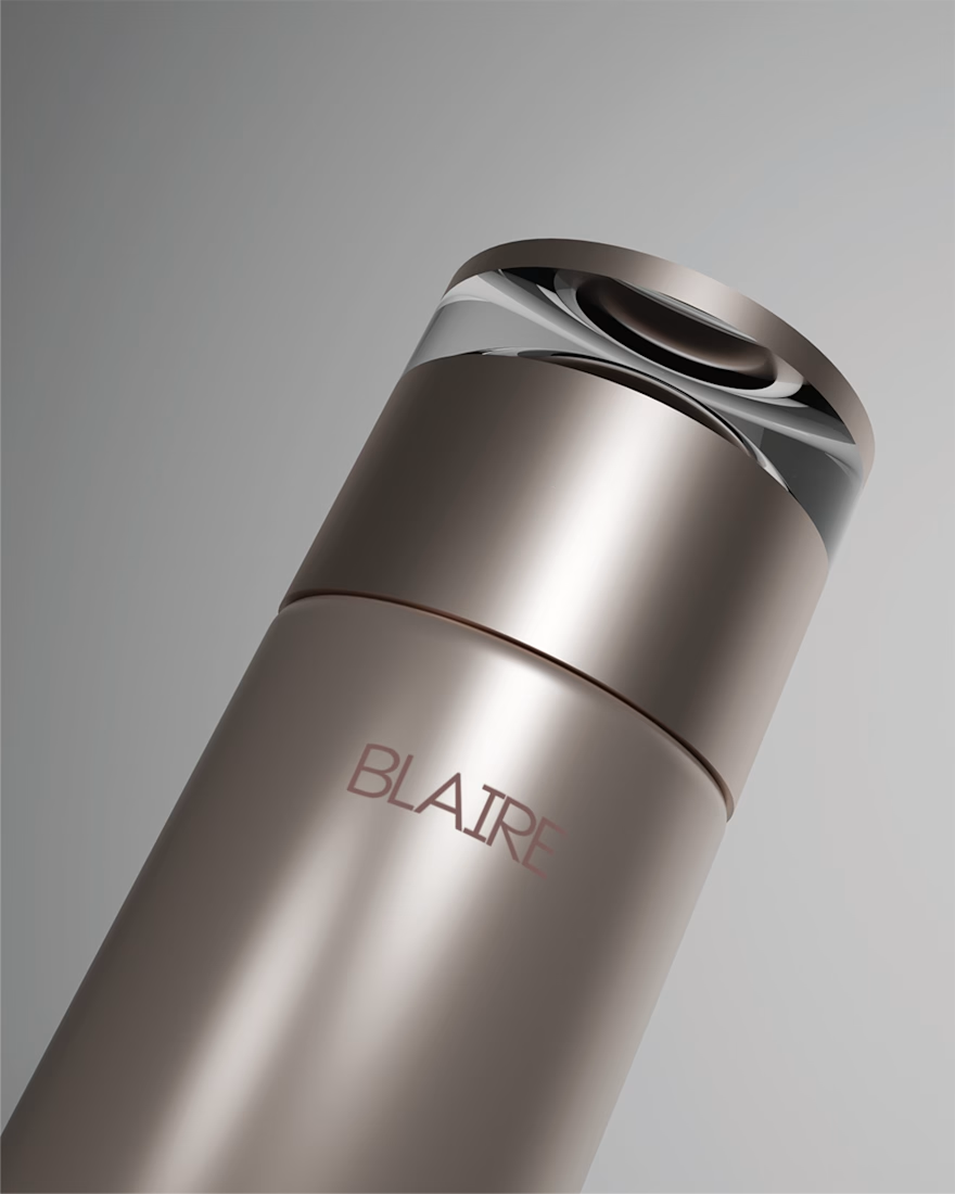
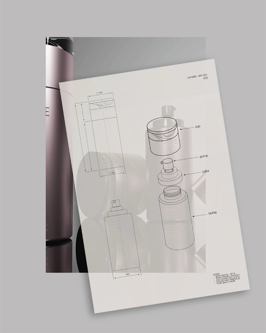
BLAIRE | Brand Identity & Packaging
Blaire was built around the idea of making a minimal brand feel distinctive without relying on excess.
The visual direction combines a restrained palette, confident typography and metallic packaging details to create something that feels clean and elevated, while still carrying enough personality to be recognisable.
Rather than treating the logo, packaging and supporting graphics as separate pieces, the identity was designed as one system. Repetition, scale and typography become part of the brand language, allowing it to stay consistent across both product and communication.
A closer look at some of the applications that brought the Blaire identity together.


Great job. I like it.

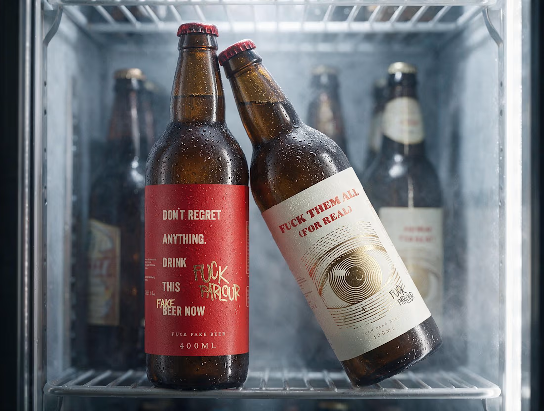
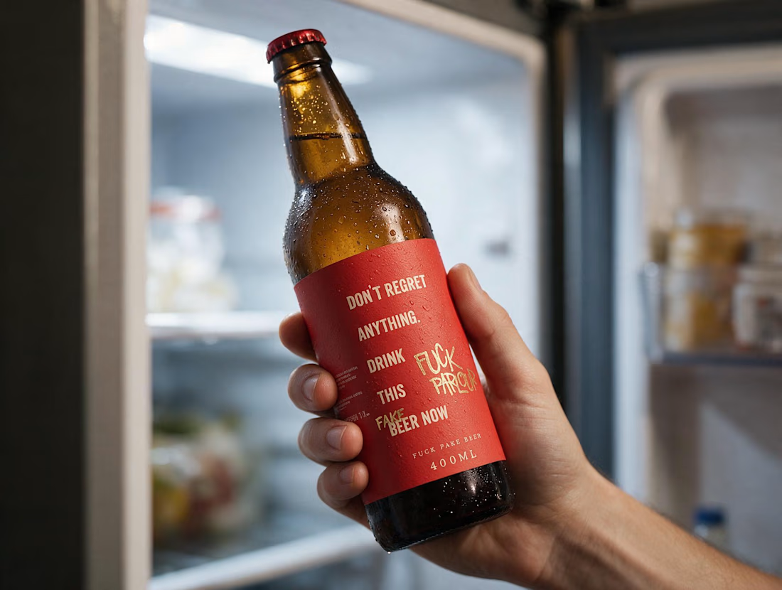
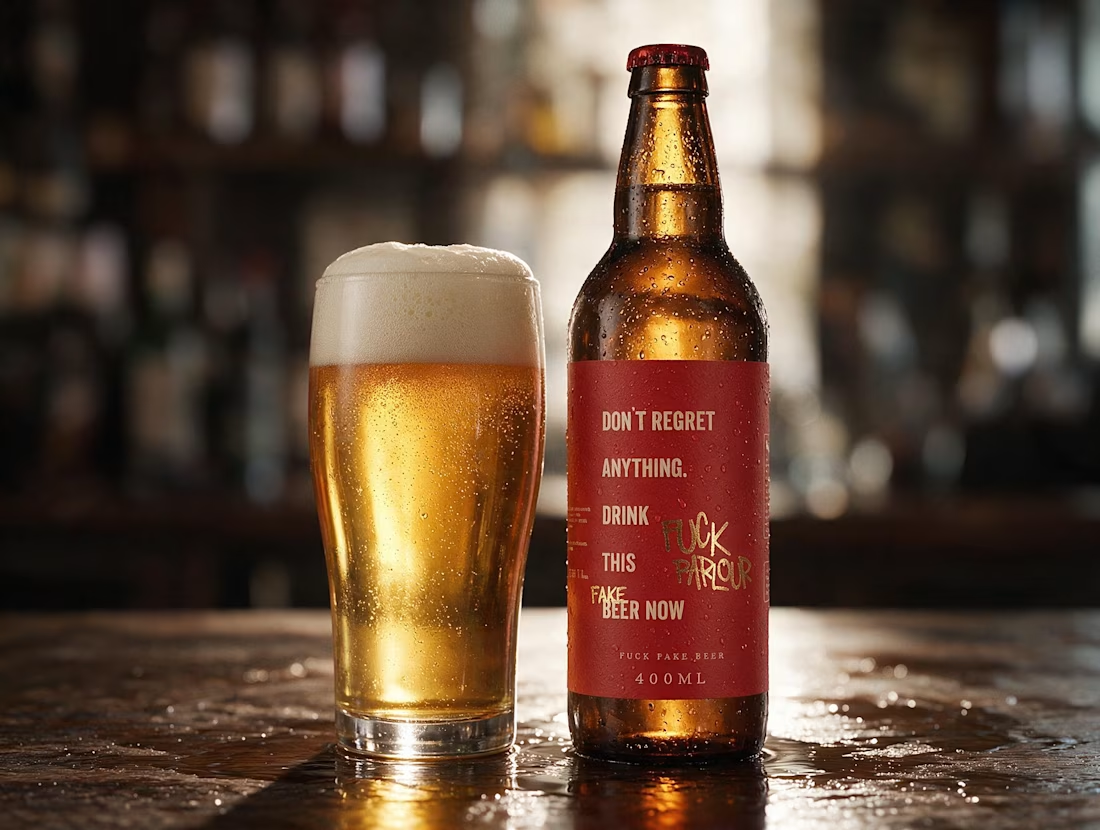
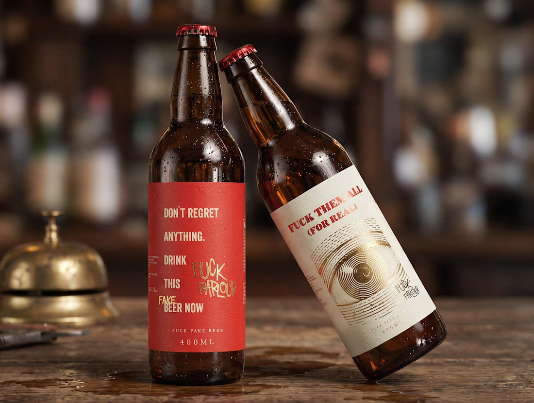
Two beer labels designed from scratch for Fuck Parlour.
From concept to final artwork, I developed the visual direction for both labels, exploring typography, illustration, color and composition while keeping them connected to the same brand universe.
Branding + Packaging Design
Fuck Parlour
Cool work!

I recently worked on a US based stealth startup that needed branding, UX for the saas app as well as the website. Sharing a sneak peak of the branding work coming along. I hope you guys like it. 🔥


Stealth startup projects are always interesting. Curious to see how the branding and product come together once you can show more.