The network for creativity
Join 1.25M professional creatives like you
Connect with clients, get discovered, and run your business 100% commission-free
Creatives on Contra have earned over $150M and we are just getting started
Back to feedPost
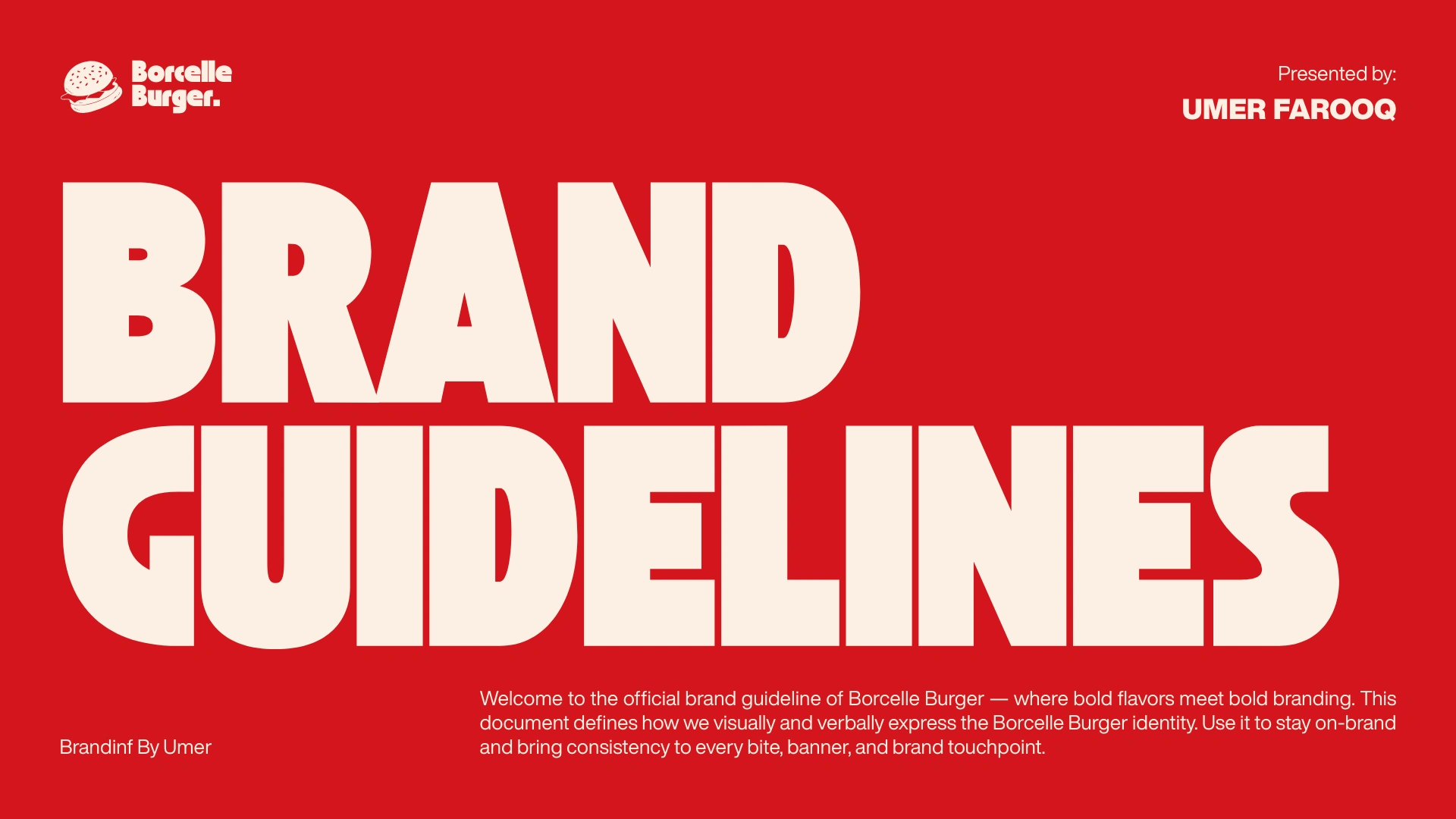
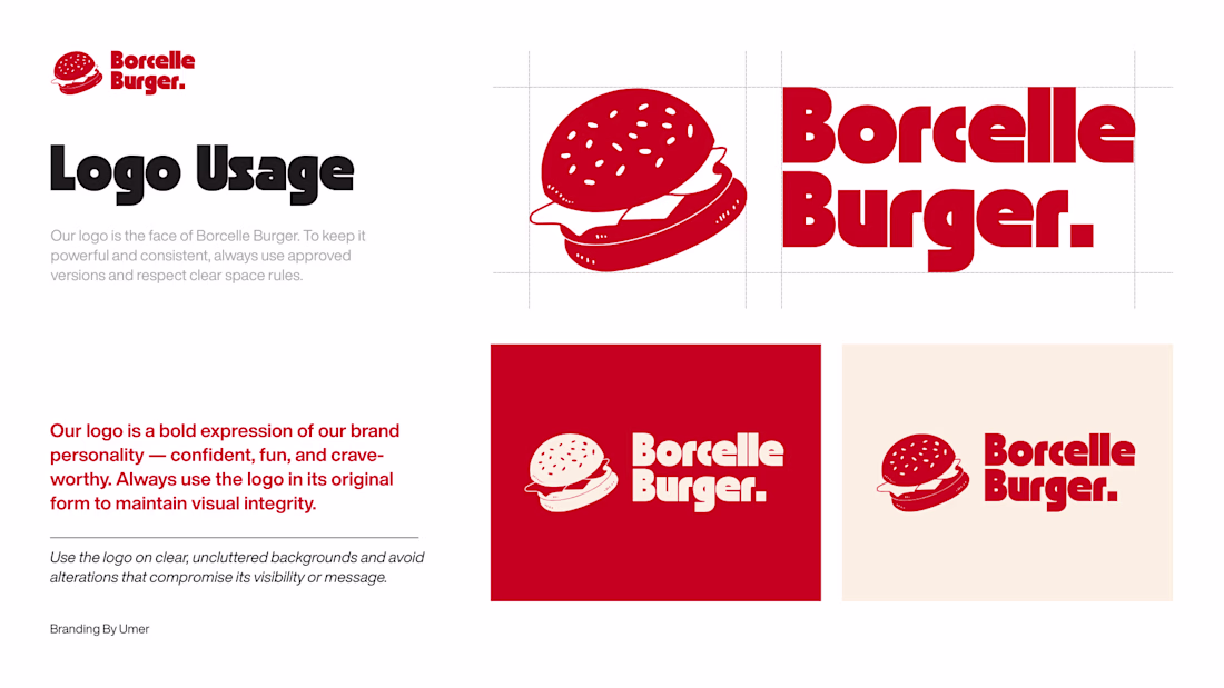
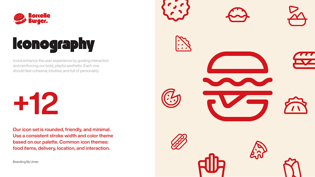
Strong colors. Clean typography. Powerful presence.
The Borcelle Burger brand guideline defines consistency, flavor, and confidence across every touchpoint.
Because great burgers deserve great branding. 🔥
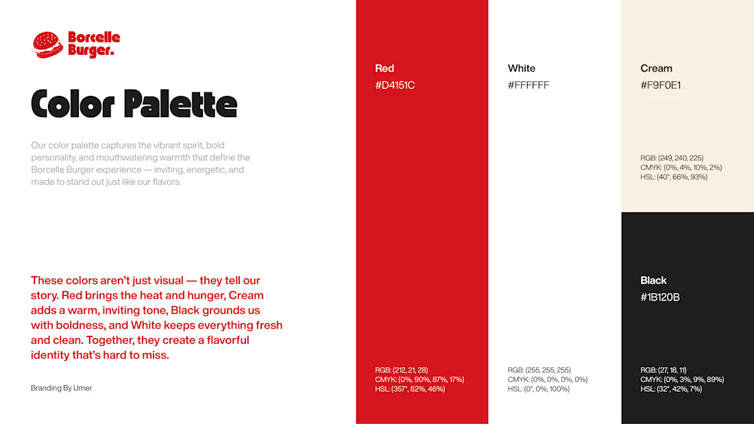
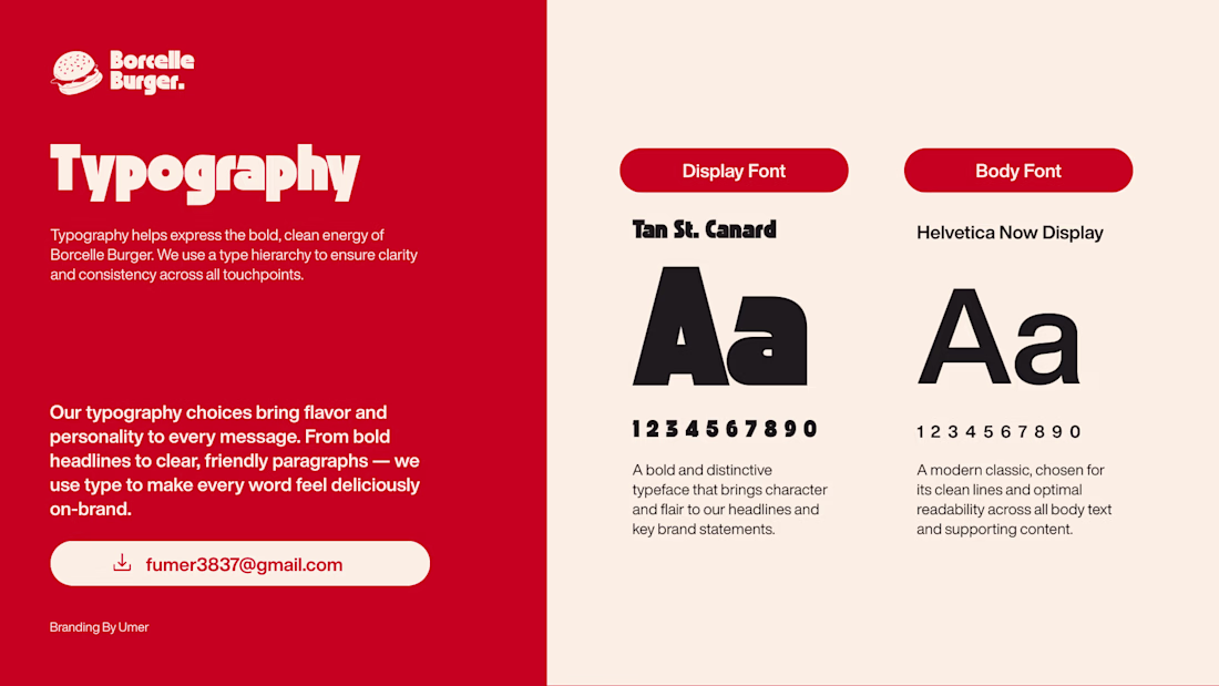
Love the bold color palette and clean typography. The consistency across touchpoints really gives the brand a confident presence.
I explored a similar balance of strong visuals and structured guidelines while working on Cocoa Sisters.
https://on.contra.com/GdHdLk
on.contra.com
Crafting the Cocoa Sisters: Premium Brand Design Success
Connect with next-gen talent and tools to get work underway. Hire more independents. Start more projects. Get more creative.
Thank you so much! 🙌 I truly believe strong visuals mean nothing without structure. Glad you noticed the balance — that was exactly the intention.
Thank you so much bro 🔥 🫶
The network for creativity
Join 1.25M professional creatives like you
Connect with clients, get discovered, and run your business 100% commission-free
Creatives on Contra have earned over $150M and we are just getting started
Related posts
Logo explorations for a Korean pop-up store 🇰🇷🧋
Stunning!
Working on different moodboards and logo directions for a men's fashion brand right now.
Three completely different routes, three very different attitudes.
Curious to see how people read them…
Which one would you choose? 👀
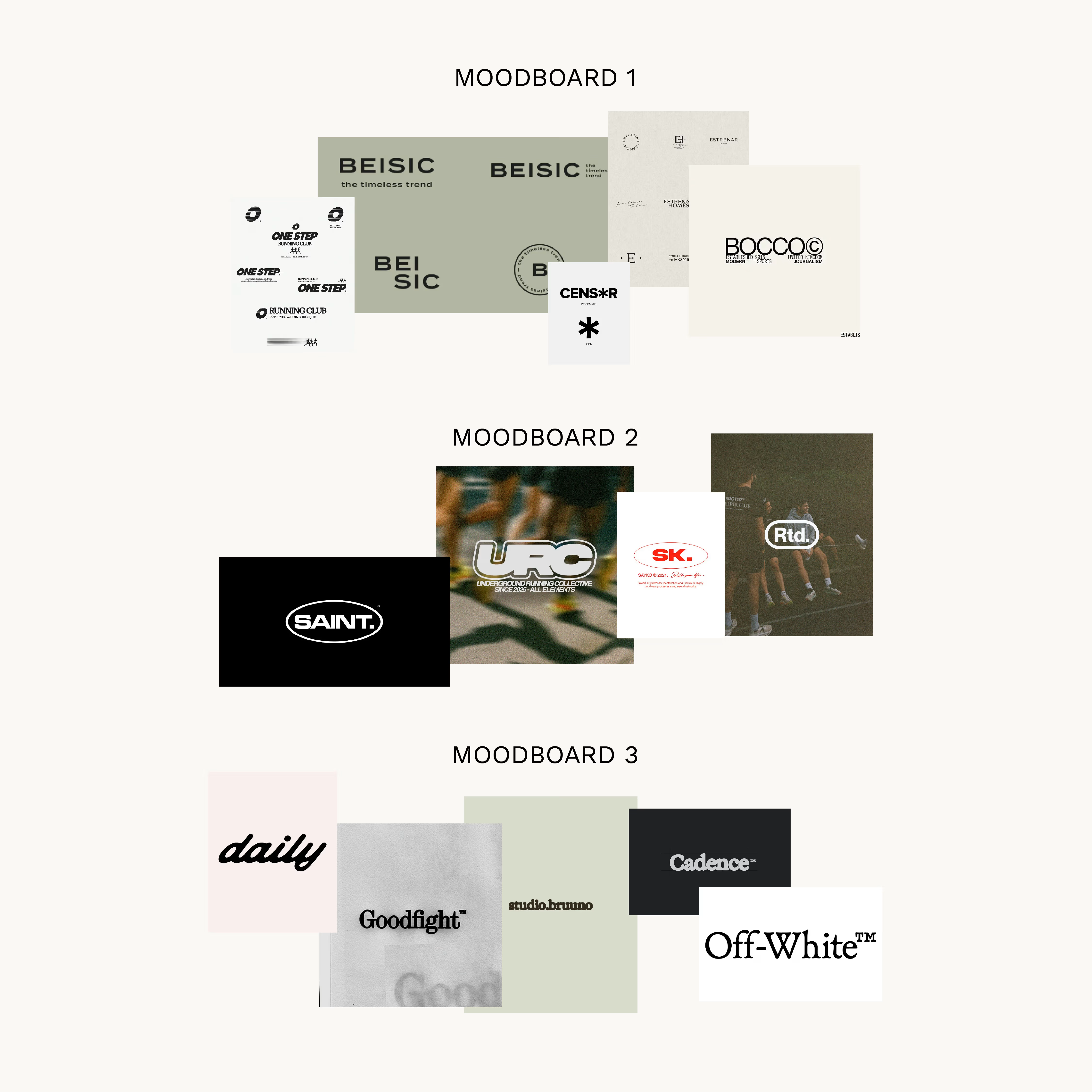
All are sick but I love the second one the most
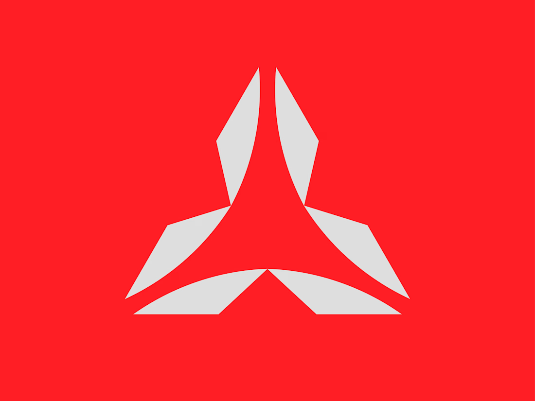
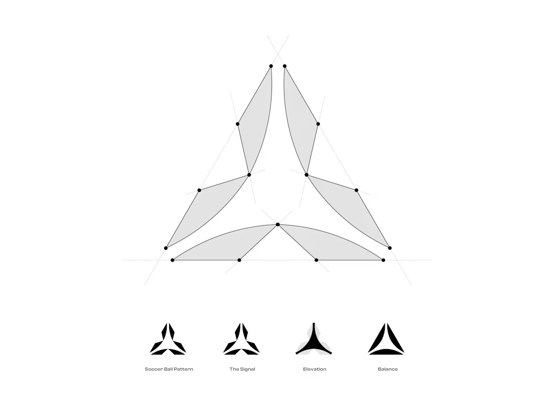
👉🏻 It’s hard not to love triangles🔺
I was tasked with creating a triangular shape for this soccer apparel project, and it wasn’t easy to come up with something original. But working through different ideas and iterations made it come together in the end.
Definitely worth the effort 💪🏻
Available for sale in my shop.
👉🏻dbworkplay(dot)com/shop
#logo #logodesign #logoinspirations #branding #brandidentity
Very strong mark Davor! 🔥
Trending
Runway
AI video generation is exploding. What are you dreaming up in Runway?
Contra University
Learn from expert creatives how to earn more using next-gen AI tools.
creativeaiflow
Creative AI workflows are evolving. What tools do you use, and what are their strengths and weaknesses?
portfolioreview
The best portfolios tell a story, not just show a grid. Share yours for feedback.
freelancerlife
Freelancer life is wins, pivots, and everything in between. What’s yours right now?